WP7 LongListSelector in depth | Part1: Visual structure and API
In the "WP7 LongListSelector in depth" series of two posts I am going to talk about the key properties, methods, events and the main features of the windows phone 7 LongListSelector in details. In the first "Part1: Visual structure and API " I will explain the visual structure of the control and all abut the available public API. In "Part2: Data binding scenarios" I will talk about using the API and populating LongListSelector in different ways.
One of the new components in the November update of the Silverlight Toolkit is the LongListSelector which is actually an advanced ListBox that supports full data and UI virtualization, flat lists and grouped lists. It helps users to scroll through long lists of data. Basically a quick jump grid overlays the list when the user select one of the group headers after that when an item is selected from the grid the user is automatically redirected back to the long list at the selected point.
(For more information about all new controls in the updated version of the toolkit please visit the previous article.)
To begin using LongListSelector first add a reference to the Microsoft.Phone.Controls.Toolkit.dll assembly which is installed with the toolkit and you can find it in :
C:\Program Files (x86)\Microsoft SDKs\Windows Phone\v7.0\Toolkit\Nov10\Bin\Microsoft.Phone.Controls.Toolkit.dll.
You will also need to add the "toolkit" prefix declaration. Make sure that your page declaration includes the "toolkit" namespace:
xmlns:toolkit="clr-namespace:Microsoft.Phone.Controls;assembly=Microsoft.Phone.Controls.Toolkit"
The sample code should look like:
|
1
2
3
4
5
6
7
8
|
<
toolkit:LongListSelector
ItemsSource
=
"{StaticResource movies}"
ListHeaderTemplate
=
"{StaticResource movieListHeader}"
GroupHeaderTemplate
=
"{StaticResource movieGroupHeader}"
GroupFooterTemplate
=
"{StaticResource movieGroupFooter}"
GroupItemTemplate
=
"{StaticResource groupItemHeader}"
ItemTemplate
=
"{StaticResource movieItemTemplate}"
>
</
toolkit:LongListSelector
>
|
Note:Part1 is focused on explaining the structure and the api in details so I will use the example given in the toolkit demos. You can get is from here. In "Part2: Data binding scenarios"I will give more examples and the full source code will be available for download. Generally when talking about the LongListSelector and populating it with data you have two chaises:
- to use it as a standard ListBox with flat lists.
- to use it as an advanced ListBox with grouped lists.
Visual structure
Flat List scenario
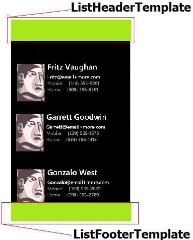
When using LongListSelector in flat mode it behaves as a ListBox with header and footer(without any groups). In the following schemes you can see the basic visual elements:

Grouped List scenario
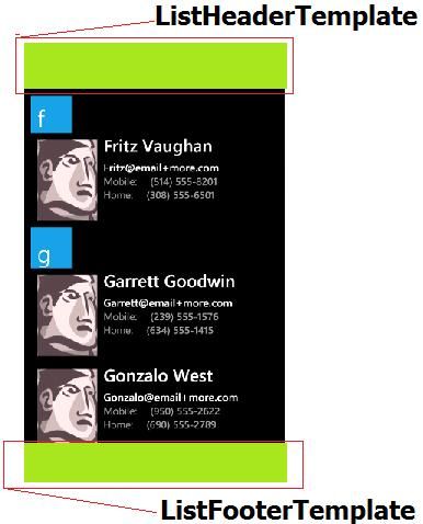
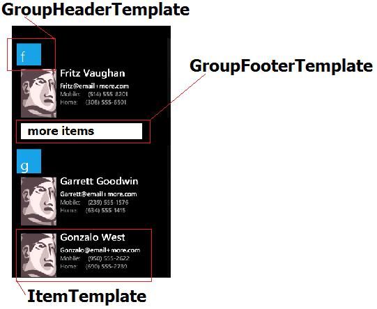
In the following schemes you can see the basic visual elements:


Now lets focus on some of the most specific and important properties of the LongListSelector.
Key Properties
BufferSize
BufferSize is a dependency property of type double. It controls the number of "screens" (as defined by the ActualHeight of the LongListSelector) above and below the visible items of the list that will be filled with items. The default value is "1.0".
DisplayAllGroups
DisplayAllGroups is a dependency property of type bool. It displays all groups whether or not they have items.The default is false.
GroupFooterTemplate
GroupFooterTemplate is a dependency property of type DataTemplate. It provides the template for the groups in the items view.
Example:
<DataTemplate x:Key="movieGroupFooter">
<Border Background="{StaticResource PhoneAccentBrush}" Padding="{StaticResource PhoneTouchTargetOverhang}">
//add some content here
</Border>
</DataTemplate>
<toolkit:LongListSelector ListFooterTemplate="{StaticResource movieListFooter}" GroupFooterTemplate="{StaticResource movieGroupFooter}"
GroupItemTemplate="{StaticResource groupItemHeader}" ItemTemplate="{StaticResource movieItemTemplate}">
GroupHeaderTemplate
GroupHeaderTemplate is a dependency property of type DataTemplate. It provides the template for the groups in the items view.
Example:
<DataTemplate x:Key="movieGroupHeader">
<Border Background="{StaticResource PhoneAccentBrush}" Padding="{StaticResource PhoneTouchTargetOverhang}">
<TextBlock Text="{Binding Key}" Style="{StaticResource PhoneTextLargeStyle}"/>
</Border>
</DataTemplate>
<toolkit:LongListSelector ListFooterTemplate="{StaticResource movieListFooter}" GroupHeaderTemplate="{StaticResource movieGroupHeader}"
GroupItemTemplate="{StaticResource groupItemHeader}" ItemTemplate="{StaticResource movieItemTemplate}">
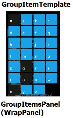
GroupItemsPanel
GroupItemsPanel is a dependency property of type ItemsPanelTemplate. It specifies the panel that will be used in group view mode. Example:
<toolkit:LongListSelector.GroupItemsPanel>
<ItemsPanelTemplate>
<toolkit:WrapPanel Orientation="Horizontal"/>
</ItemsPanelTemplate>
</toolkit:LongListSelector.GroupItemsPanel>
GroupItemTemplate
GroupItemTemplate is a dependency property of type DataTemplate. It specifies the template that will be used in group view mode. Example:
<DataTemplate x:Key="groupItemHeader">
<Border Background="{StaticResource PhoneAccentBrush}" Margin="{StaticResource PhoneTouchTargetOverhang}" Padding="{StaticResource PhoneTouchTargetOverhang}">
<TextBlock Text="{Binding Key}" Style="{StaticResource PhoneTextLargeStyle}"/>
</Border>
</DataTemplate>
<toolkit:LongListSelector ListFooterTemplate="{StaticResource movieListFooter}" GroupFooterTemplate="{StaticResource movieGroupFooter}" GroupItemTemplate="{StaticResource groupItemHeader}" ItemTemplate="{StaticResource movieItemTemplate}">
IsBouncy
IsBouncy is a dependency property of type bool. It controls whether the list can be (temporarily) scrolled off of the ends.
IsFlatList IsFlatList is set to true when the list is flat instead of a group hierarchy.
IsScrollingIsScrolling is a dependency property of type bool. It returns true if the user is manipulating the list, or if an inertial animation is taking place.This property has a private seter so you can only get its value.
ItemTemplateItemTemplate is a dependency property of type DataTemplate. It provides the template for the items in the items view.
Example:
<DataTemplate x:Key="movieItemTemplate">
<Grid Margin="{StaticResource PhoneTouchTargetOverhang}">
//add some content here
</Grid>
</DataTemplate>
<toolkit:LongListSelector ListFooterTemplate="{StaticResource movieListFooter}" GroupFooterTemplate="{StaticResource movieGroupFooter}"
GroupItemTemplate="{StaticResource groupItemHeader}" ItemTemplate="{StaticResource movieItemTemplate}">
ListFooter
ListFooter is a dependency property of type object. It will be used as the first scrollItem in the list.
ListFooterTemplate
ListFooterTemplate is a dependency property of type DataTemplate. It provides the template for the ListFooter.
Example:
<DataTemplate x:Key="movieListFooter">
<TextBlock Text="List footer" Style="{StaticResource PhoneTextTitle1Style}"/>
</DataTemplate>
<toolkit:LongListSelector ListFooterTemplate="{StaticResource movieListFooter}"GroupHeaderTemplate="{StaticResource movieGroupHeader}" GroupItemTemplate="{StaticResource groupItemHeader}" ItemTemplate="{StaticResource movieItemTemplate}">
ListHeader
ListHeader is a dependency property of type object. It will be used as the first scrollItem in the list.
ListHeaderTemplate
ListHeaderTemplate is a dependency property of type DataTemplate. It provides the template for the ListHeader.
Example:
<DataTemplate x:Key="movieListHeader">
<TextBlock Text="list header" Style="{StaticResource PhoneTextTitle1Style}"/>
</DataTemplate>
<toolkit:LongListSelector ListHeaderTemplate="{StaticResource movieListHeader}"GroupHeaderTemplate="{StaticResource movieGroupHeader}" GroupItemTemplate="{StaticResource groupItemHeader}" ItemTemplate="{StaticResource movieItemTemplate}">
MaximumFlickVelocity
MaximumFlickVelocity is a dependency property of type double It controls the maximum velocity for flicks, in pixels per second.The default value is "4000.0".
SelectedItem
Gets or sets the selected item.
ShowListFooter
ShowListFooter is a dependency property of type bool. It controls whether or not the ListFooter is shown.The default is true.
ShowListHeader
ShowListHeader is a dependency property of type bool. It controls whether or not the ListHeader is shown.The default is true.
Events
Link
Indicates that the ContentPresenter with the item is about to be "realized".
Example:
selector.Link += new EventHandler<LinkUnlinkEventArgs>(selector_Link);
void selector_Link(object sender, LinkUnlinkEventArgs e)
{...}
SelectionChanged
The SelectionChanged event.
Example:
selector.SelectionChanged += new SelectionChangedEventHandler(selector_SelectionChanged);
void selector_SelectionChanged(object sender, SelectionChangedEventArgs e)
{... }
ScrollingCompleted
Raised when the user has finished a drag or a flick completes. Example:
selector.ScrollingCompleted += new EventHandler(selector_ScrollingCompleted);
void selector_ScrollingCompleted(object sender, EventArgs e)
{...}
ScrollingStarted
Raised when the user is manipulating the list.
Example:
selector.ScrollingStarted += new EventHandler(selector_ScrollingStarted);
void selector_ScrollingStarted(object sender, EventArgs e)
{...}
StretchingBottom
Raised when IsBouncy is true and the user has dragged the items up from the bottom as far as they can go.
Example:
selector.StretchingBottom += new EventHandler(selector_StretchingBottom);
void selector_StretchingBottom(object sender, EventArgs e)
{...}
StretchingCompleted
Raised when the user is no longer stretching.
Example:
selector.StretchingCompleted += new EventHandler(selector_StretchingCompleted);
void selector_StretchingCompleted(object sender, EventArgs e)
{...}
StretchingTop
Raised when IsBouncy is true and the user has dragged the items down from the top as far as they can go. Example:
selector.StretchingTop += new EventHandler(selector_StretchingTop);
void selector_StretchingTop(object sender, EventArgs e)
{...}
Unlink
Indicates that the ContentPresenter with the item is being recycled and is becoming "un-realized".
Example:
selector.Unlink += new EventHandler<LinkUnlinkEventArgs>(selector_Unlink);
void selector_Unlink(object sender, LinkUnlinkEventArgs e)
{... }
Methods
AnimateTo(object item)
C#:
public void AnimateTo(object item)
Animate the scrolling of the list to the specified item. Scrolling speed is capped by MaximumFlickVelocity. (The item to scroll to).
DisplayGroupView
C#:
public void DisplayGroupView()
Will invoke the group view, if a GroupItemTemplate has been defined.
GetItemsInView
C#:
public ICollection<object> GetItemsInView()
Returns all of the items that are currently in view. This is not the same as the items that have associated visual elements: there are usually some visuals offscreen. This might be an empty list if scrolling is happening too quickly.Returns The items in view.
ScrollTo(object item)
C#:
public void ScrollTo(object item)
Instantly jump to the specified item(The item to scroll to).
That was all about the windows phone 7 LongListSelector structure, key properties, methods and events and the end of Part1 of this article. In the next "Part2: Data binding scenarios" I will talk about using the API and populating LongListSelector in different ways.
I hope that the article was helpful.
You can also follow us on Twitter @winphonegeek