html/css初学笔记
mark up your content with the element that most closely matches the meaning of your content.
one example: using CSS display-table is a way of creating a certain kind of presentation layout, while HTML tables are all about structuring your data.
make css more specific
Adjust font size:
- Choose a keyword(be careful using pixel sizes cause some browsers have problems resizing those) --we recommend small or medium-- and specify it as the font size in your body rule. This acts as the default size for your page.
- Specify the font sizes of your other elements relative to your body font size using either em or percentages (the choice between em and percentages is yours, as they are essentially two ways to do the same thing).
body { font-size: small; } //"body{font-size:90%;}" means 90% of the default sizeBy defining your fonts relative to the body font size, it’s really easy to change the font sizes in your web page simply by changing the body font size.
h1 { font-size: 150%; }
h2 { font-size: 120%; }
Font-family:
The font-family property gives you a way to create a list of preferred fonts. Hopefully, most browsers will have one of your first choices, but if not, you can at least be assured that the browser will provide a generic font from the same family.
body { font-family: Verdana, Geneva, Arial, sans-serif; }or, use the @font-face property(at the cost of longer loading time) to your css if you have to use a rarely seen font:
@font-face {some font-family available on the web :http://www.google.com/fonts , http://www.fontsquirrel.com/
font-family:"Emblema One";
src:url("EmblemaOne-Regular.woff"),
url("http://wickedlysmart.com/hfhtmlcss/chapter8/journal/EmblemaOne-Regular.ttf");
}
border vs padding:
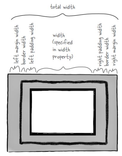
One difference between padding and margins is that the element’s background color (or background image) will extend under the padding, but not the margin.
order matters with css:
a stylesheet can override the styles in the stylesheets linked above it.
css for different media:
<link type="text/css" href="corporate.css" rel="stylesheet">another way to do it:
<link type="text/css" href="beverage-division.css" rel="stylesheet">
<link type="text/css" href="lounge-seattle.css" rel="stylesheet">
@media screen and (max-device-width: 480px) {
#guarantee { margin-right: 30px; }
}
@media print {
body { font-family: Times, "Times New Roman", serif; }
}
p.specials { color: red; }
There are a variety of propeties you can use in your queries, like min-
device-width, max-device-width (which we just used), and the
orientation of the display (landscape or portrait), to name just a few.
box model:

If you use a percentage to specify the width property, then the width is calculated as a percentage of the width of the container the element is in.
text-align:
text-align will align all the inline content in a block element(image included); the text-align property should be set on block elements only. It has no effect if it’s used directly on inline elements.
img:
if you rely on the browser to scale your image, you may be downloading more data than you need (if the image is larger than you need).
line-height:
div {
font-size:small;
line-height:1em;//1 times the font size of div, which is small
line-height:1;//1 times of each element in div
}
link:
Q: Can’t my links be in multiple states at the same time? For instance, my link could be visited, have the mouse hovering over it, and the user could be actively clicking on it all at once.
A: They sure can. You determine which style is applied by the ordering of your rules. So, the right ordering is generally considered to be: link, visited, hover, focus, and then active. If you use that ordering, you’ll get the results you expect.
GET or POST:
If you want users to be able to bookmark pages that are the result of submitting a form, then you have to use GET, because there is no way to bookmark a page that has been returned as a result of a POST.
A situation when you’d never want to use a GET is when the data in your form is private, like a credit card or a password. Because the URL is in plain view, the private information is easily found by others if they look through your browser history or if the GET somehow gets bookmarked.
Finally, if you use a <textarea>, you should use POST, because you’re probably sending a lot of data. Both GET and POST requests have a limit on the amount of data you can send, but the limit on a POST request is usually much larger. POST method must be used when element <input type="file"> is in the form.
--《head first html and css》