d3.js——柱状图
我在做bar图的时候感觉他就是先创建一个svg的容器,然后创建比例尺、坐标轴,柱形,文字,这些元素,然后转换一个角度,变换一下位置,把很多元素组合成一个g元素中加入svg标签中。剩下的就是一些方法的使用,这个得看官网的api,其实对于d3.scale.ordinal()、rangeRoundBands([0, width], 0.1)这些方法也不是特别懂,还得再学习。
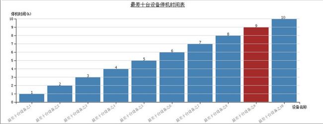
1、效果
2、html页面
<div id="barChart"></div>
3、css
<style type="text/css">
    /*柱状图样式*/
    .chart rect {
        stroke: white;
        fill: steelblue;
    }

    .chart rect:hover {
        fill: brown;
    }

    /*控制坐标轴样式*/
    .axis path,
    .axis line {
        fill: none;
        stroke: black;
        shape-rendering: crispEdges;
    }

    .axis text {
        font-family: sans-serif;
        font-size: 11px;
    }

    .axis g text {
        font-family: sans-serif;
        font-size: 11px;
        color: black;
    }
</style>
4、js
<script src="~/Scripts/d3.v3.min.js"></script>
// 查询数据,数据就是后台返回的json数据
grid.load(obj, function (result) {
    if (result.total > 0) {
        //grid.setData(mini.decode(result.data));
        //grid.setTotalCount(result.total);
        BarChart(result.data);
    } else {
        mini.alert("没有查询到相关数据,请重新筛选!");
    }
}, function (e) {
    mini.alert("出现错误,请重新查询!");
});
//柱状图表js,我下面的东西都是一块一块的,用上哪段就能得到想要的效果
<script type="text/javascript">
    function BarChart(data) {
        //?d3.scale.ordinal()和他们的domain,,,translate,dy属性

        // 1、清空图表区内的图表,重新生成
        $('#barChart').html("");

        // 2、定义初始化数据,图表的上下左右距离和宽高,连续定义
        var margin = { top: 60, right: 30, bottom: 70, left: 50 },
            width = 1000 - margin.left - margin.right,
            height = 400 - margin.top - margin.bottom;

        // 3、创建容器并移动位置到合适(注意:这点因为append了一个g所以返回的svg其实是这个g,后面的元素都在这里,定位也是相对于他)
        var svg = d3.select("div#barChart").append("svg")
            .attr("class", "chart")
            .attr("width", width + margin.left + margin.right)
            .attr("height", height + margin.top + margin.bottom)
            .append("g")
            .attr("transform", "translate(" + margin.left + "," + margin.top + ")");

        // 4、定义计算X轴的线性比例尺的方法
        //散列值 把width平均分配到data的每个数据段(比如是6个) 0~80,80~160,...值为(0,80,160,...)域宽80
        var xScale = d3.scale.ordinal()
            .domain(data.map(function(d) { return d.EquipName; }))
            //.rangeRoundBands([0,width], .1,1);//两种效果不一样
            .rangeRoundBands([0, width], 0.1);

        // 5、定义计算Y轴的比例尺的方法
        var yScale = d3.scale.linear()
            .domain([0, d3.max(data, function(d) { return d.Downtime; })])
            .range([height, 0]);

        // 6、创建X坐标轴函数
        var xAxis = d3.svg.axis()
            .scale(xScale)
            .orient("bottom");

        // 7、创建Y轴坐标轴函数
        var yAxis = d3.svg.axis()
            .scale(yScale)
            .orient("left");

        // 8、创建柱状图(注意:貌似定位都是相对于左上角)
        svg.selectAll(".barRect").data(data).enter().append("rect")
            .attr("class", "barRect")
            .attr("x", function(d) { return xScale(d.EquipName); })//相当于function(d){return xScale(d);}
            .attr("y", function(d) { return yScale(d.Downtime); })//svg的坐标以左上角为原点,通过高度运算转成原点在左下角的效果
            .attr("width", xScale.rangeBand()) //获取散列值每段的长度 为矩形的宽
            .attr("height", function(d) { return height - yScale(d.Downtime); }); // 通过函数yScale  function(d){return  (420/42)*d}  得到矩形的高

        // 9、加背景横线
        svg.selectAll("line")
            .data(yScale.ticks(10))   //y.ticks 根据权重 把数据进行划分层次,增加可读性。可以自己改变ticks的值察看效果来理解
            .enter().append("line")   //画线 (x1,y1) ------> (x2,y2)
            .attr("x1", 0)
            .attr("x2", width)
            .attr("y1", function(d) { return height - yScale(d); })
            .attr("y2", function(d) { return height - yScale(d); })
            .style("stroke", "#ccc");

        // 10、加图表标题
        svg.append("text")
            .attr("x", (width / 2))
            .attr("y", -40)
            .attr("text-anchor", "middle")
            .style("font-size", "16px")
            .style("text-decoration", "underline")
            .text("最差十台设备停机时间表");

        // 11、添加矩形上方的数字
        svg.selectAll(".label")
            .data(data)
            .enter().append("text")
            .attr("class", "label")
            .attr("x", function(d) { return xScale(d.EquipName) + xScale.rangeBand() / 2; })  //散列值+散列宽度的一半
            .attr("y", function(d) { return yScale(d.Downtime); })
            .attr("dx", ".35em") //  horizontal-align: middle 居中对齐
            .attr("dy", 0) // vertical-align: middle //垂直方向无偏移
            .attr("text-anchor", "end") // text-align: right
            .text(function(d) { return d.Downtime; });
            //.text(String); //设置数据为显示值 相当于.text(function(d){ return d;}


        // 最后加坐标轴否则影响很多东西
        // 99、添加X坐标轴及坐标轴名称
        svg.append("g")
            .attr("class", "axis")
            .attr("transform", "translate(0," + height + ")")
            .call(xAxis)
            .append("text")
            .attr("transform", "translate(" + (width) + "," + 20 + ")")
            .style("text-anchor", "middle")
            .text("设备名称");

        // 如果x轴名称太长将其倾斜
        svg.selectAll(".axis g text")
            .style("text-anchor", "end")
            .attr("dx", "-.8em")
            .attr("dy", ".15em")
            .attr("transform", "rotate(-35)");

        // 100、添加Y坐标轴及坐标轴名称
        svg.append("g")
            .attr("class", "axis")
            .call(yAxis)
            .append("text")
            .attr("transform", "rotate(0)")
            .attr("x", 50)
            .attr("y", -20)
            .attr("dy", ".71em")
            .style("text-anchor", "end")
            .text("停机时间(h)");
    }
</script>
5、福利时间


