定义segmented样式的toolbar
【原文地址:http://fxexperience.com/2012/02/customized-segmented-toolbar-buttons/】
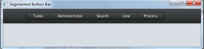
使用JavaFX实现上图中的工具栏样式。其实就是HBox的布局,第一个按钮左边是圆角边框,中间的按钮都是方形的,最后一个按钮的右边是圆角。
我们分别用java代码和FXML来实现view部分的定义,然后通过同一个css来调整外观。
SegmentedButtonBarApp – Just Java
package demo;

import javafx.application.Application;
import javafx.scene.Scene;
import javafx.scene.control.Button;
import javafx.scene.control.ToolBar;
import javafx.scene.layout.BorderPane;
import javafx.scene.layout.HBox;
import javafx.scene.layout.Region;
import javafx.stage.Stage;

public class SegmentedButtonBarApp extends Application {
    @Override
    public void start(Stage stage) throws Exception {
        BorderPane root = new BorderPane();
        root.setId("background");
        ToolBar toolBar = new ToolBar();
        root.setTop(toolBar);
        Region spacer = new Region();
        spacer.getStyleClass().setAll("spacer");
        HBox buttonBar = new HBox();
        buttonBar.getStyleClass().setAll("segmented-button-bar");
        Button sampleButton = new Button("Tasks");
        sampleButton.getStyleClass().addAll("first");
        Button sampleButton2 = new Button("Administrator");
        Button sampleButton3 = new Button("Search");
        Button sampleButton4 = new Button("Line");
        Button sampleButton5 = new Button("Process");
        sampleButton5.getStyleClass().addAll("last", "capsule");
        buttonBar.getChildren().addAll(sampleButton, sampleButton2, sampleButton3, sampleButton4, sampleButton5);
        toolBar.getItems().addAll(spacer, buttonBar);
        Scene scene = new Scene(root, 800, 600);
        scene.getStylesheets().add(getClass().getResource("segmented.css").toExternalForm());
        stage.setScene(scene);
        stage.setTitle("Segmented Button Bar");
        stage.show();
    }

    public static void main(String[] args) {
        launch(args);
    }
}
SegmentedButtonBarFXMLApp.java and SegmentedButtonBar.fxml – Java and FXML
<?xml version="1.0" encoding="UTF-8"?>
<?import java.lang.*?>
<?import javafx.scene.control.*?>
<?import javafx.scene.layout.*?>

<BorderPane xmlns:fx="http://javafx.com/fxml"
            id="background" prefWidth="800.0" prefHeight="600.0">
    <top>
        <ToolBar>
            <items>
                <Region styleClass="spacer"/>
                <HBox styleClass="segmented-button-bar">
                    <Button text="Tasks" styleClass="first"/>
                    <Button text="Administrator"/>
                    <Button text="Search"/>
                    <Button text="Line"/>
                    <Button text="Process" styleClass="last"/>
                </HBox>
            </items>
        </ToolBar>
    </top>
</BorderPane>
package demo;

import javafx.application.Application;
import javafx.fxml.FXMLLoader;
import javafx.scene.Parent;
import javafx.scene.Scene;
import javafx.stage.Stage;

public class SegmentedButtonBarFXMLApp extends Application {
    @Override
    public void start(Stage stage) throws Exception {
        Parent root = FXMLLoader.load(getClass().getResource("SegmentedButtonBar.fxml"));
        Scene scene = new Scene(root);
        scene.getStylesheets().add(getClass().getResource("segmented.css").toExternalForm());
        stage.setScene(scene);
        stage.setTitle("Segmented Button Bar From FXML");
        stage.show();
    }

    public static void main(String[] args) {
        launch(args);
    }
}
以上是两种实现方式,都可以实现同样的效果,运行时需要segmented.css文件,读者可以现在同一package下面建一个没有任何内容的segmented.css文件,运行上面两个例子看看效果:
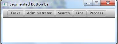
现在我们来一步一步的完成css,看看它是怎样影响程序外观的。
The CSS
首先在css文件中定义一些变量:
#background {
    -light-black: rgb(74, 75, 78);
    -dark-highlight: rgb(87, 89, 92);
    -dark-black: rgb(39, 40, 40);
    -darkest-black: rgb(5, 5, 5);
    -mid-gray: rgb(216, 222, 227);
    -fx-background-color: -mid-gray;
}
这段代码值做了两件事。首先,选取了id为background的节点,我们的程序里面,BorderPane的id是background,它也是我们的根节点。代码里还定义了一些颜色样式,在JavaFX的css文件里可以任意定义变量,例如-dark-black: rub(39, 40, 40);,然后你就可以引用这些变量了。
SegmentedButtonBar Palette
然后再运行我们的程序

背景色变成了mid-gray,但是其他部门还没有变化,我们继续。
.tool-bar {
    -fx-base: -dark-black;
    -fx-font-size: 12pt;
    -fx-background-color: linear-gradient(to bottom, derive(-fx-base, -30%), derive(-fx-base, -60%)),
                             linear-gradient(to bottom, -light-black 2%, -dark-black 98%);
    -fx-background-insets: 0, 0 0 1 0;
    -fx-padding: .9em 0.416667em .9em 0.416667em;
    -fx-effect: dropshadow(two-pass-box, black, 5, .2, 0, 0);
}
这里我选择我程序里的所有toolbar进行定义,其实也可以为toolbar定义一个class或者id来单独选取它,但是在我们这个例子里选择所有的toolbar也没有关系,因为整个app里面只有这一个toolbar。我将toolbar的底色设置为-dark-black,我想我这么做的唯一原因是系统自动衍生出的其他颜色在一个深色的底色上可以更好的表现。
I think the only reason for doing so isso that those automatically derived colorsthat I’m not about to override(of which I think only the text fill is ultimately going to be affected)will be styled correctly by default for being on a dark background.
我将字体大小设置12pt,为toolbar设置了新的背景色渐变,从顶部渐变到底部。实际上,我是从caspian.css中copy了这部分,然后把主渐变(渐变列表里的第二个)的颜色改了,从-light-black渐变到-dark-black。我对insets值进行微调,因此边框(border,渐变列表里的第一个)部分不会出现在toolbar的底部。我对padding部分也进行了微调,让它更接近设计者的意图,最后,我加了个阴影特效。
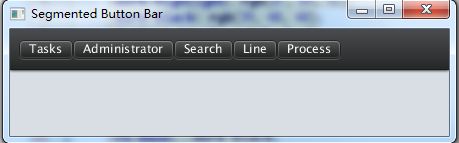
现在,我们已经对toolbar完成定制,现在我们对按钮部分进行定制。
.segmented-button-bar .button {
    -fx-background-color: -darkest-black, -dark-highlight, linear-gradient(to bottom, -light-black 2%, -dark-black 98%);
    -fx-background-insets: 0, 1 1 1 0, 2 1 1 1;
    -fx-background-radius: 0;
    -fx-padding: 0.4em 1.833333em 0.4em 1.833333em;
}

.segmented-button-bar .button.first {
    -fx-background-insets: 0, 1, 2 1 1 1;
    -fx-background-radius: 3 0 0 3, 2 0 0 2, 2 0 0 2;
}

.segmented-button-bar .button.last {
    -fx-background-insets: 0, 1 1 1 0, 2 1 1 1;
    -fx-background-radius: 0 3 3 0, 0 2 2 0, 0 2 2 0;
}

.segmented-button-bar .button:pressed {
    -fx-background-color: -darkest-black, rgb(55, 57, 58), linear-gradient(to top, -light-black 2%, -dark-black 98%);
}
segmented样式的按钮就这样定制好了,第一个和最后一个是half-rounded,中间部分是方形的。Web css中有first-class和last-child选择器,但在JavaFX中并没有实现这点,因此我在第一个和最后一个按钮上添加了first和last样式名称,这样我就可以将他们同toolbar上的其他按钮区分出来。
我的“segmented button bar”并不是一个组件,仅仅是一个HBox和一些定制的css样式而已,因此我将hbox的样式名称设为“segmented-button-bar”,然后我就可以再css文件里通过它来选择这个hbox。
按钮有三层背景色,第一层是dark的外圈,第二层是highlight--稍微亮点的线,最后是渐变色填充按钮的其余部分。唯一麻烦的就是需要正确的设置insets和radius,使它看起来像下面这样:
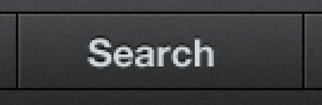
你可以注意到,在这个按钮的左边有一条黑线和一条白线。这条黑线是否属于“Search”按钮左边的那个按钮呢?是哪个组件画的?在我这个例子里,我决定左边的白线和右边的黑线都由这个按钮来画。然后你就可以将多个按钮拼在一起,让他们共一个边框。请注意,中间的按钮要画顶上和底下的黑线。所以我做的是将背景色为黑色,然后画一个白一点的背景色覆盖在上面,将绝大部分黑色部分都盖住,仅仅在顶部、底部和右边留1px。然后填充button的主体部分,尽在左边留1px。
最后就只需要为第一个和最后一个按钮画圆角。
这样就完成了。
你也许对spacer区域有点疑惑,我执行想让按钮离toolbar的左边稍微远一点。
.tool-bar .spacer {
    -fx-padding: 0 5.417em 0 0;
}
最后看看效果