Lesson 1: What is design? Why is it important?
Week 2: What is design? Why is it important?
Article 1: Startups, this is how design works.
It’s a state of mind. It’s an approach to a problem. It’s how you’re going to kick your competitor’s ass.
- Design is a method of problem solving.
The best designare notorious for not designed at all – or ‘undesigned’.- Dieter Rams’
Ten Principles of “Good Design”(Ten commandments)- innovative
- makes a product useful
- aesthetic (美学)
- makes a product understandable
- unobtrusive (谦虚、不引人注目)
- hostest
- long-lasting
- thorough (彻底的、周密的)
- environmentally friendly
- as little design as possible
- Good design can’t be achieved with glossy buttons or masterful wireframes alone. It’s a merger of all these principles into something that is meaningful and deliberate.
- Objectified: the documentary film.
There are different kinds of design.
- Graphic Design
- Print Design
- ...
- Interaction Design: focus on digital products and interactive software design.
- User Interface Design
- User Experience Design
- ...
- Industrial Design
Data: what does the industry think?
- 都是在说设计很重要。
Designer Founders: the missing link
- 团队组成:Business Peeps(业务人员) + Designers + Engineers.
- Design is the link missing from your founding team. The perfect balance of business, tech, and design is an incredibly powerful tool… and an even more powerful business model.
Finding Great Talent
- Founders need to share passion, drive, and vision. Find someone who can solve problems and think critically about more than just designing a website. Someone who makes your founding team unstoppable.
- Go where the designers are.
- Meetups and events are a great way to break into the design culture and mingle with prospective talent face-to-face. I strongly recommend you attend at least one design meetup – it’s really important to have that perspective going into your designer search.
- Zerply
- Dribbble
Resources!
- ...
Article 2: Making the Transition from Development to Design
- Don’t stop building things(意思是“不要停止做软件”)
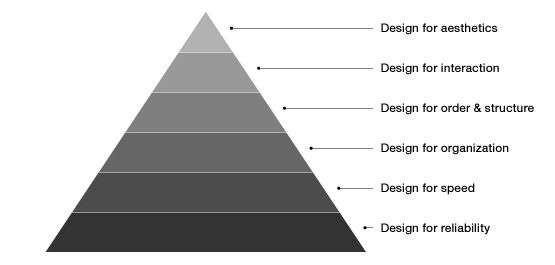
Learn design in order of dependency(按需要的顺序学习设计)
想要一下子把设计的所有内容学完是不可能的。强烈建议从软件最需要的内容(共功和形式
学起。按照下图的顺序来吧,这样有两个好处:
1. 每层都依赖它的前一层。
2. 这样的顺序可以让你从纯逻辑、理性思考变得更加感性、美学思考。
1.
2. 前两层是你正在做的(可靠性、性能)
3. 第三层是为了 `信息体系结构` 和 `内容层级结构`
4. 第四层就是相当于做线框图的阶段
5. 第五层(根据人们如何使用软件)把静态界面变为动态
6. 第六层,就是视觉/情感设计了
7. (不再金字塔上的)这几层的东西要在一起使用,不是孤立的。但是在学习时,如此复杂的东西是需要按此步骤一步一步来的。
Design everything you do
During my first internship out of college, Stella Lai gave me this tip and it has been the best professional advice I ever received. Try to practice this tip as literally as possible. The obvious areas are how you dress and how your house/apartment/room is organized. I would suggest not stopping there. Your emails should be written/composed clearly and beautifully. Your conversations with individuals should be designed through how you listen, how you maintain eye contact, how you respond (both spoken and unspoken). Everything you do should have a reason, no matter how small. Design requires constant practice, this is a great way to keep growing.
Care about your audience
I advise you to put your focus on the people your work will affect as much if not more than the subject of your work itself. If you care about your audience, you’ll automatically care more about the subject.
Talk about design and listen even more
Reading is great, but I have learned far more through discussions with experienced, knowledgable and trustworthy people. When you find yourself in such a situation, ask questions and listen.
Learn to write, then learn to speak
Early in your practice it will be important to absorb ideas to help you form your own philosophies and approaches(理念和方法). However, at some point (preferably earlier than it is comfortable for you), it will be important to start formulating those points of view to an audience.Thoughts kept in your head have the luxury of being biased, irrational or simply flawed. Communicating those thoughts to an audience and opening them up to scrutiny forces us to improve our thinking.
Focus on defining and solving problems
A lot of the work you see at design showcase websites are great examples of well executed decorations that lack substance. The people that can perform this type of work are countless and the skills highly commoditized. Avoid pixel-pushing at all costs – your job is to solve problems.
Good designers solve problems, great ones ensure they are solving the right ones.
people are having a hard time knowing where to go next in a flowListen to your gut, but trust your brain
“Because it felt right” is a fine way to start a conversation, but not a good way to end one.
Be your biggest critic
learn from the time-tested —— and emulate it
Few things prove a design’s success better than how long it remains relevant. Look to the timeless to guide your approach. This need not be limited to software, the thinking behind designing a great chair often parallels the thinking behind designing great software. Understand how others before you have solved similar problems and try to determine why it took the shape it did.
Blindly echoing design trends is a great way to have a dated portfolio in a couple years.(盲目跟随设计潮流用不了几年你就能拥有一个过时的作品集)
操作系统是最好的经时间检验的设计之一。Ideate romantically, create pragmatically
Our ideas should be bigger than reality, but our execution should be married to it. This allows us to see the grand future of a product while ensuring that it can exist to have any future at all. Both are important, but they can be detrimental if out of balance or practiced at the wrong times.
Article 3: We’re Not Unhappy, We’re Designers
观察,所有设计都有改进的空间,设计一定程度上就是关于“改进”。我们(designers)对于看到的事物的不满是改进它的基础。
Article 4: Complete Beginner’s Guide to Interaction Design(IxD)
WHAT IS INTERACTION DESIGN?
Unlike user experience design, which accounts for all user-facing aspects of a system, interaction designers are only concerned with the specific interactions between a users and a screen.
COMMON METHODOLOGIES
goal-driven design
`解决问题`是设计的首要目标(highest priority)。就是说,
目标驱动设计首先并且最关注的是满足用户指定的需求,而不是像以前一样关注于是否在技术方面可以实现。
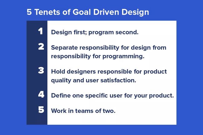
实践目标驱动设计时,需要我们对交互设计的思考有 5 种转变:
 

1. 设计第一;实现第二:
目标驱动设计首先考虑用户的交互,而不是如何实现。
2. 把设计的责任和程序的责任分开:设计的时候不要考虑技术能不能实现。
3. 交互设计师对屏幕那头的人是有责任的。
4. 确定产品的用户群(确定角色)。
5. 交互设计师永远不要自己干。和别人合作是关键。include marketing, a project manager, content strategist, information architect, and many others.
USABILITY
不少人都有自己的定义:
-
- Learnability: how easily can a new user learn to navigate the interface?
- Flexibility: how many ways can a user interact with the system?
- Robustness: how well are we supporting users when they face errors? 用户遇到问题的时候我们如何支持?
-
- Learnability: how easily can a new user learn to navigate the interface?
- Efficiency: how quickly can users perform tasks?
- Memorability: if a user hasn’t visited the system in a while, how well will they remember the interface?
- Errors: how many errors do users make, and how quickly can they recover from errors?
- Satisfaction: do users enjoy using the interface, and are they pleased with the results?
-
- Learnability: how easily can a new user learn to navigate the interface?
- Understandability: how well can a user understand what they are seeing?
- Operability: how much control does the user have within the interface?
- Attractiveness: how visually appealing is the interface? 界面在视觉上有多少吸引力?
- Usability compliance: does the interface adhere to standards? 界面是否遵守标准?
THE FIVE DIMENSIONS(交互设计语言的五个维度)
- words should be simple to understand, and written in such a way that they communicate information easily to the end user.
- visual representation are all graphics or images, essentially everything that is not text. They should be used in moderation, so as to not overwhelm.
- physical objects or space refers to the physical hardware, whether it’s a mouse and keyboard, or a mobile device a user interacts with.
- time is the length that the user spends interacting with the first three dimensions. It includes the ways in which the user might measure progress, as well as sound and animation.
behavior is the emotions and reactions that the user has when interacting with the system.
COGNITIVE PSYCHOLOGY(认知心理学)
- Mental models(智力模型) are the images in a user’s mind that inform their expectation of a certain interaction or system. By learning the user’s mental model, interaction designers can create systems that feel intuitive.
- Interface metaphors(界面隐喻) make use of known actions to lead users to new actions. For example, the trash icon on most computers resembles a physical trash can, in order to alert a user to the expected action.
Affordances(情境) are things that are not only designed to do something, but that are designed to look like they are designed to do something. A button that looks like a physical object you can push, for example, is an affordance designed so that someone unfamiliar with the button will still understand how to interact with it.
HUMAN INTERFACE GUIDELINES
This section is a bit of a misnomer; there actually is no single set of human interface guidelines. However, the idea behind creating human interface guidelines is in itself a methodology. Guidelines have been created by most major technology design businesses, including Apple and Android, Java and Windows. The goal is the same for all of them: to alert prospective designers and developers to advice and recommendations that will help them to create universally intuitive interfaces and programs.
DAILY TASKS AND DELIVERABLES (日常工作和可交付成果)
DESIGN STRATEGY(设计策略)
大概就是通过什么方式解决问题,比如用户需求是 半个小时到公司,那么策略可能是打车、公交、飞机、走路等。
制定设计策略的依据:
- who is designing for.
- what the user's goals are.
WIREFRAMES OF KEY INTERACTIONS
After the interaction designer has a good idea of the strategy motivating her design, she can begin to sketch the interfaces that will facilitate the necessary interactions.
PROTOTYPES
原型有很多种,可以html/css、paper prototypes 等。不细说。
STAY CURRENT
每天都有新的设计师尝试新的设计方向,用户也期待全新类型的交互。但是"正确的交互和技术是人们(目标人群)最需要的,根本不是最新的或者最令人激动的(the right interaction or technology is the one that best meets the persona’s needs, and not merely the newest or most exciting)"。
