数据统计神器 gnuplot 菜鸟入门
最近绘制一些ROC,CMC曲线之类的,发现LFW数据集给出的是gnuplot工具,就了解了下,发现这个工具真的是太好用了,简直就是神器。
gnuplot 官网: http://www.gnuplot.info/
虽然都是命令绘制,但是使用起来非常的方便,犹如使用LaTeX写paper一样,使用一次,就会发现以后不想用别的了。
先简单的给出一段绘制ROC曲线的代码:
#!/usr/bin/gnuplot
set term png size 800,800
set size 1,1
set output "lfw_roc_curve.png"
set xtics .1
set ytics .1
set grid
set size ratio -1
set ylabel "False Reject Rate"
set xlabel "False Accept Rate"
#set title "Image-Restricted and Aligned" font "giant"
set arrow from 0.0,0.0 to 1,1 nohead lt 0
set key right top
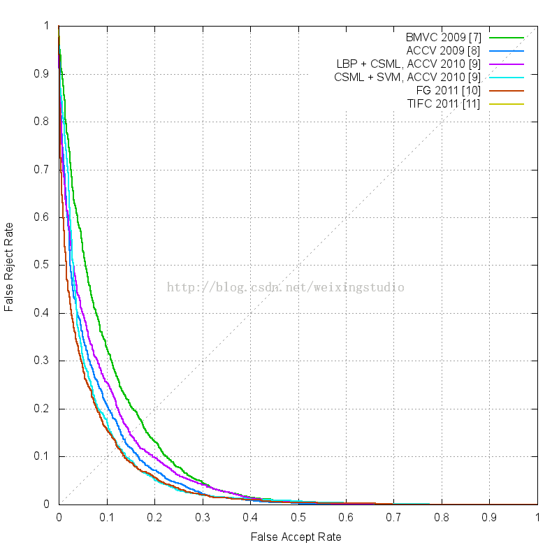
plot "hybrid_with_sift_aligned.txt" using 1:2 with line lt 2 lw 2 title "BMVC 2009 [7]", \
"accv09-wolf-hassner-taigman-roc.txt" using 1:2 with line lt 3 lw 2 title "ACCV 2009 [8]", \
"aligned_lbp_sqrt_csml_roc.txt" using 1:2 with line lt 4 lw 2 title "LBP + CSML, ACCV 2010 [9]", \
"aligned_csml_svm_roc.txt" using 1:2 with line lt 5 lw 2 title "CSML + SVM, ACCV 2010 [9]", \
"pinto-cox-fg2011-roc.txt" using 1:2 with line lt 6 lw 2 title "FG 2011 [10]", \
"Haejong_Milanfar_LARK_supervised.txt" using 1:2 with line lt 7 lw 2 title "TIFC 2011 [11]", \
#"dml_eig_SIFT_restricted_jmlr.txt" using 1:2 with line lt 8 lw 2 title "DML-eig SIFT", \
"dml_eig_combined_restricted_jmlr.txt" using 1:2 with line lt 9 lw 2 title "DML-eig combined, JMLR 2012 [12]"
很简单的设置图像的格式,大小,ROC曲线的相对大小,坐标尺度变化大小,坐标轴的标题,然后设置图例位置,根据数据文件绘制曲线,绘制曲线的过程中可以设置曲线的line style (lt), line width (lw) 曲线对应的标题 title
using 1:2的意思是使用文本文件中的第一列数据作为x轴,第二列数据作为y轴。
数据采用一个空格分隔开。
上面代码绘制得到的ROC曲线如图:
还是很强大的。
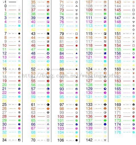
gnuplot绘图程序中对线型(linetype)、点型(pointtype)、线条宽度(linewidth)、点大小(pointsize)、图样(style)都有相应的设定值,具体设置如下:
(1)线型(linetype )。在此类型中主要设置线条的颜色,具体对应如下:
| n |
0 |
1 |
2 |
3 |
4 |
5 |
6 |
| linetype |
black |
red |
green |
blue |
pink |
浅蓝 |
yellow |
gnuplot对应的线的种类以及点的种类,如下图:
可以在绘制曲线的时候使用
with line lt 2 lw 2
指定线的样式,宽度,使用 pt 2 ps 1.5 指定点的类型,点的大小
(2)点型(pointtype)。此类型用于设置点得形状,可分为14中,具体对应如下:
| n |
0 |
1 |
2 |
3 |
4 |
5 |
6 |
7 |
8 |
9 |
10 |
11 |
12 |
13 |
| pointtype |
无 |
+ |
× |
* |
□ |
■ |
○ |
● |
△ |
▲ |
▽ |
▼ |
◇ |
◆ |
(3)线条宽度(linewidth)、点大小(pointsize)。两者都可以设置为整数或小数。
(4)图样(style):gnuplot 描绘数据数据图形是以读入档案中的坐标值后,以图样绘上。gnuplot可提供 9种图样,分别是:
lines : 将相邻的点以线条连接。如 plot sin(x) with lines。
points : 将每一点以一符号绘上。如 plot sin(x) with points
linespoints : 同时具有 lines 及 points 的功能。
impulses : 将每一点画一垂直线至 X 轴。如 plot sin(x) with impulses。
dots : 将每一点绘一细点。如 plot sin(x) with dots。
steps : 以垂直线及水平线各一条来连接两点,形成梯形。如连接 (x1,y1),(x2,y2)两点,以(x1,y1)到(x2,y1)和(x2,y1)到(x2,y2) 两线段连接。如 plot sin(x) with steps。
errorbars : 对每一点坐标值 (x,y),画一由 (x,ylow) 至 (x,yhigh) 的线段。并在线段两端做上 tic mark。如plot sin(x) with errorbars。
boxes : The boxes style draws a box centred about the given x coordinate from the yaxis to the given y coordinate.如plot sin(x) with boxes。
boxerrorbars : 组合 errorbars 与 boxes 两者功能。如 plot sin(x) with boxerrorbars。
(5) 图例(key)
若想改变显示的图例名称,可通过下述语句实现:
plot 'node1' title“node_1” #将图例显示的名称从“node1”改为“node_1”
也可以通过下述语句直接在画线条时显示:
plot 'node1' title“node_1”with lines
下为一个具体例子的应用程序:
gnuplot> set title “cbr_delay” font “Times-Roman,12” #该图的标头为cbr_delay,字体大小为12号
gnuplot> set xlabel “simulation time” #该图x轴的标示为simulation time
gnuplot> set ylabel “delay time” #该图y轴的标示为simulation time
gnuplot> xrange [0:10] #设置x轴的坐标范围为0到10
gnuplot> xtics 0,1,10 #设置x轴的坐标在0到10 之间以1为间隔分布
gnuplot> plot 'node1' with linespoints lt 0 lw 2 pt 1 ps 1.5 #绘制node1,线为黑色,线宽为2,
点的形状为“+”,点的大小为1.5
#下一语句实现的功能为在同一个gnuplot图上绘制node2,线为黑色,线宽为2,点的形状为“×”,点的大小为1.5
gnuplot> replot 'node2' with linespoints lt 0 lw 2 pt 2 ps 1.5