4.17、Bootstrap V4自学之路-----组件---模态框
由于HTML5定义了它的语义,autofocus HTML 属性在Bootstrap模态框中产生不了影响。为了实现同样的效果,使用一些自定义JavaScript:
$('#myModal').on('shown.bs.modal', function () {
  $('#myInput').focus()
})
确保不要在一个模态框还可见的时候打开另一个模态框。在同一时候显示超过一个模态框,需要自定义代码。
尽可能把一个模态框的HTML代码始终放置在document的顶层位置,以避免别的组件影响模态框的外观以及功能。
这里有一些在移动设备上使用模态框的警告,欲知详情,请看浏览器支持文档。
静态例子
一个经渲染的模态框,带有头、主体,以及有一些操作功能的脚。
这段代码调试失败了,怎么也不显像。或许是缺少东西吧。
Modle伪代码部分:
《div class="modal fade"》<br>
--| 《div class="modal-dialog" role="document"》<br>
--| --| 《div class="modal-content"》<br>
--| --| --| 《div class="modal-header"》<br>
--| --| --| --|《button class="class"》<br>
--| --| --| --|《h4 class="modal-title"》<br>
--| --| --| --|《.除了按钮和title应该就没了吧..》<br>
--| --| --| 《div class="modal-body"》<br>
--| --| --| --|《..主题内容.》<br>
--| --| --| 《div class="modal-footer"》<br>
--| --| --| --|《.一般是按钮..》
现场演示
利用JavaScript,通过点击下面的按钮,切换一个模态框。它将从网页顶上滑下来,并淡入。
<!-- 按钮触发模型 --> <button type="button" class="btn btn-primary btn-lg" data-toggle="modal" data-target="#myModal"> Launch demo modal </button> <!-- 模态框 --> <div class="modal fade" id="myModal" tabindex="-1" role="dialog" aria-labelledby="myModalLabel" aria-hidden="true"> <div class="modal-dialog" role="document"> <div class="modal-content"> <div class="modal-header"> <button type="button" class="close" data-dismiss="modal" aria-label="Close"> <span aria-hidden="true">×</span> <span class="sr-only">Close</span> </button> <h4 class="modal-title" id="myModalLabel">Modal title</h4> </div> <div class="modal-body"> 《div class="modal fade"》 <br> --| 《div class="modal-dialog" role="document"》<br> --| --| 《div class="modal-content"》<br> --| --| --| 《div class="modal-header"》<br> --| --| --| --|《button class="class"》<br> --| --| --| --|《h4 class="modal-title"》<br> --| --| --| --|《.除了按钮和title应该就没了吧..》<br> --| --| --| 《div class="modal-body"》<br> --| --| --| --|《..主题内容.》<br> --| --| --| 《div class="modal-footer"》<br> --| --| --| --|《.一般是按钮..》 </div> <div class="modal-footer"> <button type="button" class="btn btn-secondary" data-dismiss="modal">Close</button> <button type="button" class="btn btn-primary">Save changes</button> </div> </div> </div> </div>
PS:出发模态框的按钮可以在CSS中,根据文档内容介绍,模态框的位置应该至于html最顶层。
二货的我放在了<!DOCTYPE html>上一行,结果ID不认。太二了。
理论应当放置于<body>下的第一行。
可选的尺寸
模态框有两种可选的尺寸,利用修饰类放在.modal-dialog上就可用了。

<!-- Large modal -->
<button class="btn btn-primary" data-toggle="modal" data-target="#Demo01">Large modal</button>

<div class="modal fade" id="Demo01" tabindex="-1" role="dialog" aria-labelledby="myLargeModalLabel" aria-hidden="true">
  <div class="modal-dialog modal-lg">
    <div class="modal-content">
        《div class="modal fade"》\
        --| 《div class="modal-dialog modal-lg"》<!-- 在这里添加 modal-lg -->
        --| 《div class="modal-content"》
        --| --| 《 ... 只是想起来.modal-content里面有  .modal-header modal-body modal-footer 。》
    </div>
  </div>
</div>

<!-- Small modal -->
<button type="button" class="btn btn-primary" data-toggle="modal" data-target="#Demo02">Small modal</button>

<div class="modal fade" id="Demo02" tabindex="-1" role="dialog" aria-labelledby="mySmallModalLabel" aria-hidden="true">
  <div class="modal-dialog modal-sm">
    <div class="modal-content">
        《div class="modal fade"》\
        --| 《div class="modal-dialog modal-sm"》<!-- 在这里添加 modal-sm -->
        --| 《div class="modal-content"》
        --| --| 《 ... 只是想起来.modal-content里面有  .modal-header modal-body modal-footer 。》
    </div>
  </div>
</div>
PS:背景图有第一个按钮的样子,是我忘记删掉了。另外第一个按钮为什么这么大呢?因为那个按钮使用了 .btn-lg类。
PS:这里和文档代码不同,按钮的 data-target=".类" 也可以是 "#id"
移除动画
如果模态框仅要求它出现,但是不要淡出淡入效果,只需从模态框标记上移除.fade类。
<div class="modal" id="Demo02" tabindex="-1" role="dialog" aria-labelledby="mySmallModalLabel" aria-hidden="true">
请看最外层 class属性中,.fade类删掉了。效果就感觉稍微有些生硬了。
使用网格系统
为了在模态框中使用Bootstrap的网格系统,只需要在.modal-body内部嵌套一个container-fluid,然后在该容器中使用普通的网格系统类。
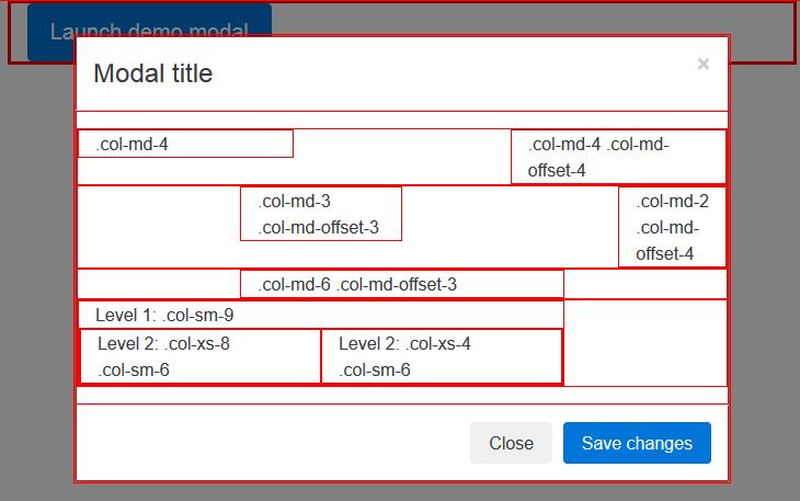
<button type="button" class="btn btn-primary btn-lg" data-toggle="modal" data-target="#gridSystemModal"> Launch demo modal </button> <div id="gridSystemModal" class="modal fade" tabindex="-1" role="dialog" aria-labelledby="gridModalLabel" aria-hidden="true"> <div class="modal-dialog" role="document"> <div class="modal-content"> <div class="modal-header"> <button type="button" class="close" data-dismiss="modal" aria-label="Close"><span aria-hidden="true">×</span></button> <h4 class="modal-title" id="gridModalLabel">Modal title</h4> </div> <div class="modal-body"> <div class="container-fluid bd-example-row"> <div class="row"> <div class="col-md-4">.col-md-4</div> <div class="col-md-4 col-md-offset-4">.col-md-4 .col-md-offset-4</div> </div> <div class="row"> <div class="col-md-3 col-md-offset-3">.col-md-3 .col-md-offset-3</div> <div class="col-md-2 col-md-offset-4">.col-md-2 .col-md-offset-4</div> </div> <div class="row"> <div class="col-md-6 col-md-offset-3">.col-md-6 .col-md-offset-3</div> </div> <div class="row"> <div class="col-sm-9"> Level 1: .col-sm-9 <div class="row"> <div class="col-xs-8 col-sm-6"> Level 2: .col-xs-8 .col-sm-6 </div> <div class="col-xs-4 col-sm-6"> Level 2: .col-xs-4 .col-sm-6 </div> </div> </div> </div> </div> </div> <div class="modal-footer"> <button type="button" class="btn btn-default" data-dismiss="modal">Close</button> <button type="button" class="btn btn-primary">Save changes</button> </div> </div> </div> </div>
PS:这里要注意的是,模态框内的.modal-body 里,加入 .container-fluid。
如果不加,直接使用.row。我感觉也没有什么不同。
基于触发按钮的多样化模态框
有几个按钮触发同样的模态框,只是内容有一些不同?使用event.relatedTarget以及HTML的data-* 属性根据点击的是哪个按钮,多样化模态框的内容。参阅relatedTarget以增进对模态框事件的了解。
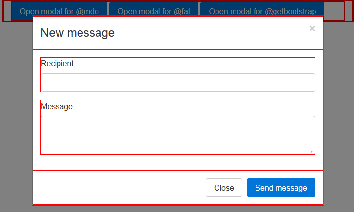
<div class="bd-example"> <button type="button" class="btn btn-primary" data-toggle="modal" data-target="#exampleModal" data-whatever="@mdo">Open modal for @mdo</button> <button type="button" class="btn btn-primary" data-toggle="modal" data-target="#exampleModal" data-whatever="@fat">Open modal for @fat</button> <button type="button" class="btn btn-primary" data-toggle="modal" data-target="#exampleModal" data-whatever="@getbootstrap">Open modal for @getbootstrap</button> <div class="modal fade" id="exampleModal" tabindex="-1" role="dialog" aria-labelledby="exampleModalLabel" aria-hidden="true"> <div class="modal-dialog" role="document"> <div class="modal-content"> <div class="modal-header"> <button type="button" class="close" data-dismiss="modal" aria-label="Close"> <span aria-hidden="true">×</span> <span class="sr-only">Close</span> </button> <h4 class="modal-title" id="exampleModalLabel">New message</h4> </div> <div class="modal-body"> <form> <div class="form-group"> <label for="recipient-name" class="control-label">Recipient:</label> <input type="text" class="form-control" id="recipient-name"> </div> <div class="form-group"> <label for="message-text" class="control-label">Message:</label> <textarea class="form-control" id="message-text"></textarea> </div> </form> </div> <div class="modal-footer"> <button type="button" class="btn btn-secondary" data-dismiss="modal">Close</button> <button type="button" class="btn btn-primary">Send message</button> </div> </div> </div> </div> </div>
不知道大家注意到没有,3个按钮指向的都是同一个模态框。但如何区分呢?请看按钮上的data-whatever属性。data可以通过JS取得。建议请看文档第一章起步的javascript小节。
高度不固定的模态框
如果一个模态框在打开时,高度发生变化,万一出现了滚动条,你必须调用$('#myModal').data('bs.modal').handleUpdate()以调整模态框的位置。
这里我想,如果实际用到的话,可以使用JQ监听。虽然可能性很小。
另外一种情况,<textarea>标签可以设定max-height。当超出max-height时<textarea>自身出现滚动条。
用途
模态框插件利用data属性或者JavaScript,根据需要切换隐藏的内容。它还向<body>添加了.modal-open类以覆盖默认的滚动行为,并生成一个.modal-backdrop类以提供一个点击区域,当在模态框的外面点击就可以抹除显示的模态框。
利用data属性
不用写JavaScript也能激活一个模态框。在一个控件元素(比如说一个按钮)上设置data-toggle="modal",同时在添加一个data-target="#foo"或者href="#foo"以指向某一个模态框,就可以切换了。
<button type="button" data-toggle="modal" data-target="#myModal">Launch modal</button>
利用JavaScript
只需要一行JavaScript就可以对id为myModal的元素调用模态框。
$('#myModal').modal(options)
这里注意,这是一个泛指。options应该有一个具体的值。
选项
选项可以通过数据属性或JavaScript。对于数据属性,附加的选项名data-,如在data-backdrop=""。
| 名称 | 类型 | 默认值 | 描述 |
|---|---|---|---|
| backdrop | 布尔值或字符串static |
true | 包括了一些modal-backdrop元素。作为替补,为一个backdrop指定值static,单击的时候就不会关闭模态框。 |
| keyboard | 布尔值 | true | 在按下Esc键的时候关闭模态框。 |
| show | 布尔值 | true | 在初始化的时候显示该模态框。 |
方法
.modal(options)
把某块内容作为模态框激活。接受一个可选的参数object。
$('#myModal').modal({
   keyboard: false
})
.modal(‘toggle’)
人为切换一个模态框。在模态框真正显示或隐藏之前返回给调用者
(即,在shown.bs.modal或者hidden.bs.modal事件发生之前)。
$('#myModal').modal('toggle')
.modal(‘show’)
人为打开一个模态框。在模态框真正显示之前返回给调用者(即,在shown.bs.modal事件发生之前)。
$('#myModal').modal('show')
.modal(‘hide’)
人为隐藏一个模态框。在模态框真正隐藏之前返回给调用者(即,在hidden.bs.modal事件发生之前)。
$('#myModal').modal('hide')
事件
Bootstrap的模态框类为模态框相关的回调函数提供了事件接口。所有的模态框事件都能由模态框自身触发。
| 事件类型 | 描述 |
|---|---|
| show.bs.modal | 当调用show实例方法时,会立即触发该事件。如果是由点击引起的,被点击的元素是可用的,成为Event对象的relatedTarget属性。 |
| shown.bs.modal | 当模态框对用户来说可见时(需要等待CSS过渡完成),会触发该事件。如果是由点击引起的,被点击的元素是可用的,成为Event对象的relatedTarget属性。 |
| hide.bs.modal | 当调用hide实例方法时,会立即触发该事件。 |
| hidden.bs.modal | 当模态框对用户来说终于完成隐藏时(需要等待CSS过渡完成),会触发该事件。 |
| loaded.bs.modal | 当模态框使用remote选项完成内容载入时,会立即触发该事件。 |
$('#myModal').on('hidden.bs.modal', function (e) {
   // do something...
})