WinForms Controls > Common Concepts > Concepts > Appearances概念:外观
All Developer Express .NET Windows Forms controls (the XtraGrid, XtraBars, XtraTreeList, etc.) provide design-time and runtime facilities for customizing the appearance of their visual elements. This includes such modifying attributes as the background and foreground colors, background images, font settings, etc., which are the subject of this document.
所有开发者Express .NET Windows 窗体控件(XtraGrid、XtraBars、XtraTreeList等)提供设计时和运行时工具来定制可视化元素外观。包括修改属性如背景和前景色、背景图片、字体设置等,这是本文档的主题。
This document provides an overview of the appearance mechanism. Part of this mechanism is the appearance customization for a group of controls in a centralized way. You can customize the appearances in a centralized way for the editors derived from the BaseControl class. See Style Controller to learn more.
本文档提供一个外观机制的概览。这种机制的一部分是为一组控件进行外观的集中定制化。可以以集中方式定制继承自BaseControl的editors编辑控件的外观。查看Style Controller样式控制器了解更多。
Appearance settings are encapsulated by the AppearanceObject and AppearanceObjectEx classes. Their properties specify the background and foreground colors, gradient background, font, pen, brush and other style characteristics used to paint a particular element. The table below lists the settings provided by the appearance objects (the AppearanceObject object's properties).
外观设置被封装在AppearanceObject和AppearceObjectEx类。这些属性指定了背景和前景色、梯度底色、字体、笔、刷子和其他用来绘制特定元素的样式特色。下表列出了appearance objects提供的设置(AppearanceObject对象的属性)
| Property | Description |
|---|---|
| AppearanceObject.BackColor | 背景色,指定元素的背景色如果AppearanceObject.BackColor2为Color.Empty.否则,指定梯度起始色。 Specifies the element's background color if the AppearanceObject.BackColor2 property's value is Color.Empty. Otherwise, it specifies the gradient's starting color. |
| AppearanceObject.BackColor2 | 背景色2Specifies the background gradient's ending color.指定背景梯度结束颜色 |
| AppearanceObject.BorderColor | 指定元素的边框颜色Specifies the element's border color. |
| AppearanceObject.GradientMode | 指定背景梯度方向Specifies the background gradient's direction. |
| AppearanceObject.ForeColor | Specifies the element's foreground color (the text color). |
| AppearanceObject.Font | Specifies the font used to paint the element's text. |
| AppearanceObject.Image | 指定元素背景图片Specifies the element's background image. |
| AppearanceObject.Options | Provides access to the appearance object's options. These options specify which appearance settings should be inherited. |
| AppearanceObject.TextOptions | 文本选项。提供访问外观对象设置访问,以指定外观对象的文本设置(水平和垂直对齐,字符修建等)Provides access to the appearance object's options that specify the appearance object's text settings (horizontal and vertical alignment, trimming, etc.). |
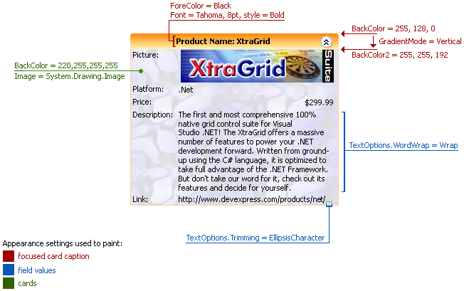
The image below illustrates these settings for a card in the XtraGrid control. A card consists of multiple visual elements (card caption, field caption, field value, etc.) and each can be customized via its own AppearanceObject object.
下面图片说明了XtraGrid 控件中一张卡片的设置。卡片包含多种可视元素(卡片标题,字段标题,字段值等),任何一种可视元素都可以通过它自身的AppearanceObject对象来定制。

The AppearanceObject class(译者注:应该是AppearanceOptions吧?) exposes the AppearanceObject.Options property, which provides access to the Boolean options that determine which appearance settings should be used to paint an element. The following table lists available appearance options.
| Option | Description |
|---|---|
| AppearanceOptions.UseBackColor | Gets or sets whether the AppearanceObject.BackColor property's value should be used. |
| AppearanceOptions.UseBorderColor | Gets or sets whether the AppearanceObject.BorderColor property's value should be used. |
| AppearanceOptions.UseFont | Gets or sets whether the AppearanceObject.Font property's value should be used. |
| AppearanceOptions.UseForeColor | Gets or sets whether the AppearanceObject.ForeColor property's value should be used. |
| AppearanceOptions.UseImage | Gets or sets whether the AppearanceObject.Image property's value should be used. |
If an option is disabled, its corresponding property isn't available. For example, if the AppearanceOptions.UseBackColor option is set to false, the AppearanceObject.BackColor property isn't used. In this case, the element's background color is specified by the control's look and feel settings. To obtain the appearance settings that are actually used to paint the control's elements, use the control's PaintAppearance property.
如果某选项被禁用,相应属性将失效。举例,如果AppearanceOptions.UseBackColor选项被设置为false,AppearanceObject.BackColor属性将不被使用。这种情形下,元素的背景色由控件的look and feel设置。为获取绘制控件元素实际使用的外观,使用控件的PaintAppearance属性。
Once a control has been dropped onto a form, its appearance properties are set to their default values and their corresponding appearance options are disabled. The control is painted based upon its look and feel and default appearance settings. After the appearance property's default value has been changed, its corresponding option is automatically enabled. Alternatively, setting the property to its default value disables the option.
一旦控件被拖放到窗体上,它的外观属性将被设置为默认值,相关的外观选项也将被禁用。控件根据look and feel和默认外观设置绘制。当外观属性的默认值更改好,对应选项自动被激活。与此对应,设置属性为默认值时将禁用选项。
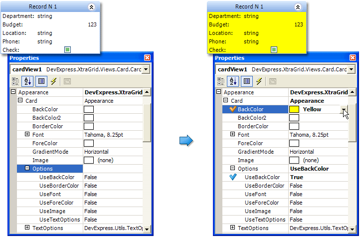
For example, by default, the BackColor property is set to the Color.Empty value. Its UseBackColor option is set to false. Once the BackColor property's value has been changed, the UseBackColor option is automatically set to true. Setting the BackColor property back to the Color.Empty value sets the option to false. This is illustrated below:

In some instances, some of the appearance settings (background color) used to paint such visual elements such as column headers, expand buttons, etc., are ignored regardless of the state of the corresponding options. This occurs when the control is painted in Office2003 or WindowsXP style.
Each control usually has multiple visual elements. Appearance objects for these elements are usually combined into a single object (the BaseAppearanceCollection descendant). For example, each view in XtraGrid has a BaseView.Appearance property that combines the Appearance objects for all the view's elements, such as column headers, buttons, cells, footers, etc. The image below shows the Properties window displaying Appearance objects for a grid view.
Appearance objects provided by the control specify how the control's elements should be painted, by default. These settings, however, can be overridden by individual elements, since they take priority over the control's elements.
For instance, by default, all the column headers in XtraGrid are painted using the appearance settings provided by the GridViewAppearances.HeaderPanel property. However, by using a column's GridColumn.AppearanceHeader property, it is possible to override these settings and provide a new appearance for the column's header, while the other column headers will be painted using default settings. So, the GridColumn.AppearanceHeader's settings take priority over the GridViewAppearances.HeaderPanel's settings.
The image below shows XtraGrid with the Contact Name column's header painted using the column's appearance settings, while the other column headers use the default appearance settings.
It is also possible to customize the column header's appearance settings via the GridView.CustomDrawColumnHeader event. The Appearance object supplied via this event will have the highest priority.
The appearance of a single element in a control can be specified using multiple appearance objects which have different priorities. The appearance settings of an object with a lower priority are used to paint an element only if the appearance settings of objects with a higher priority aren't used (their corresponding appearance options, e.g. UseBackColor, UseForeColor, disabled).
For instance, by default, the hierarchy of appearances used to paint a cell in the XtraTreeList is shown in the image below.
Specific appearance objects (AppearanceObjectEx instances) provide the AppearanceOptionsEx.HighPriority option, which allows a higher priority to be specified for their appearance settings. Currently, only the appearance settings provided by the columns (in XtraTreeList, XtraGrid, XtraVerticalGrid) and style conditions (in XtraGrid) are represented by AppearanceObjectEx objects.
The image below shows the hierarchy of appearances in XtraTreeList, which determine a node cell's look and feel when the HighPriority option is enabled for a column. As you can see from the image, the column's appearance settings used to paint its cells take priority over the appearances used to paint the focused node and focused cell.
DevExpress .NET controls such as XtraGrid and XtraTreeList support the printing functionality. These controls expose the AppearancePrint property, which provides the appearance settings that can be used to paint the control when it's printed. To use these settings, the option that determines whether or not the control can be painted using the print appearances used when printing must be enabled. For example, to use the print appearances to paint the grid view in XtraGrid when printing, set the GridOptionsPrint.UsePrintStyles property to true. Otherwise, if this property is set to false, the grid view will be printed as it is displayed on the form.
The appearance settings used to paint DevExpress .NET controls can be saved to the system registry, an XML file or written to a stream using the methods listed in the table below.
| Method | Description |
|---|---|
| BaseAppearanceCollection.SaveLayoutToRegistry | Saves the appearance settings to a system registry path. |
| BaseAppearanceCollection.SaveLayoutToStream | Saves the appearance settings to a specific stream. |
| BaseAppearanceCollection.SaveLayoutToXml | Saves the appearance settings to a specific XML file. |
Once saved, the appearance settings can be applied to any other control. This allows you to customize the control's appearance only once, and then apply the saved settings to other controls in other applications. The following table lists the methods used to restore the saved appearance settings:
| Method | Description |
|---|---|
| BaseAppearanceCollection.RestoreLayoutFromRegistry | Restores the appearance settings stored at the specified system registry path. |
| BaseAppearanceCollection.RestoreLayoutFromStream | Restores the appearance settings from the specified stream. |
| BaseAppearanceCollection.RestoreLayoutFromXml | Restores the appearance settings stored in the specified XML file. |
The following example code shows how to write and read the appearance settings used to paint XtraGrid elements to/from an XML file.
|
||||||
string fileName = "C:\\appearanceLayout.xml"; gridControl1.MainView.Appearance.SaveLayoutToXml(fileName); // ... gridControl1.MainView.Appearance.RestoreLayoutFromXml(fileName); |

