Android中layout_weight的基本使用
LinearLayout布局中的layout_weight,将会通过LinearLayout设置水平android:orientation="horizontal",或垂直android:orientation="vertical",对其中的子控件进行比例分配占有空间,以下用水平为例。
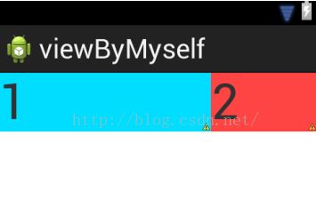
1.将子控件宽度设置为:android:layout_width="0dp"
    <LinearLayout
        android:layout_width="match_parent"
        android:layout_height="match_parent"
        android:orientation="horizontal" >

        <TextView
            android:id="@+id/contact_name1"
            android:layout_width="0dp"
            android:layout_height="wrap_content"
            android:layout_weight="1"
            android:background="@android:color/holo_blue_bright"
            android:text="1"
            android:textSize="50sp" />

        <TextView
            android:id="@+id/contact_name2"
            android:layout_width="0dp"
            android:layout_height="wrap_content"
            android:layout_weight="2"
            android:background="@android:color/holo_red_light"
            android:text="2"
            android:textSize="50sp"
            />

        <TextView
            android:id="@+id/contact_name3"
            android:layout_width="0dp"
            android:layout_height="wrap_content"
            android:layout_weight="3"
            android:background="@android:color/holo_green_dark"
            android:text="3"
            android:textSize="50sp" />
    </LinearLayout>
效果图如下:
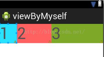
在android:layout_width="0dp"为情况下,直接根据android:layout_weight=""值的比例进行分配即可,及时内容超过控件大小也不影响它们之间占有的比例。
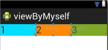
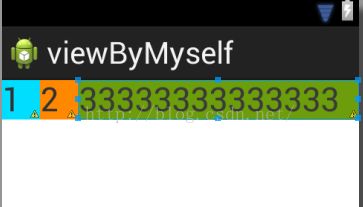
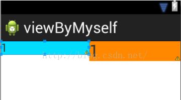
2. 将子控件宽度设置为: android:layout_width="wrap_content"
此时会有两种情况,一种是,内容不多,没超过控件大小,是按比例显示的,如图左所示效果,另一种,当内容超过控件大小时,会挤压其他相邻控件,实现不了我们要想的效果,但是你采用1中android:layout_width="0dp"就可以解决此类问题,如图右。
3.将子控件宽度设置为:android:layout_width="match_parent"
  <LinearLayout
        android:layout_width="match_parent"
        android:layout_height="match_parent"
        android:orientation="horizontal" >

        <TextView
            android:id="@+id/contact_name1"
            android:layout_width="match_parent"
            android:layout_height="wrap_content"
            android:layout_weight="1"
            android:background="@android:color/holo_blue_bright"
            android:text="1"
            android:textSize="50sp" />

        <TextView
            android:id="@+id/contact_name2"
            android:layout_width="match_parent"
            android:layout_height="wrap_content"
            android:layout_weight="2"
            android:background="@android:color/holo_red_light"
            android:text="2"
            android:textSize="50sp"
            />

        <TextView
            android:id="@+id/contact_name3"
            android:layout_width="match_parent"
            android:layout_height="wrap_content"
            android:layout_weight="2"
            android:background="@android:color/holo_green_dark"
            android:text="3"
            android:textSize="50sp" />
    </LinearLayout>
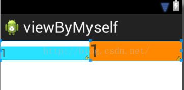
看效果
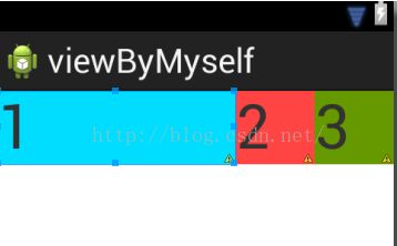
这是怎么计算的呢?以上权重layout_weight的值分别为1,2,2;设置它们的父控件match_parent和手机屏幕一样大。
1>假设手机屏幕宽度为480,它们三个子控件都为layout_width="match_parent",总共占用3×480;
2>父控件剩余的空间宽度w为手机屏幕480-子控件总占有宽度3×480,结果为w= -2×480(其值可以为负值);
3>然后获得每个子控件在剩余空间宽度,分别为w×1/5,w×2/5,w×2/5;
4>最后每个子控件占有的空间宽度为:480+w×1/5 :480+w×2/5 :480+w×2/5(w为负值);
计算结果为3:1:1
再改下:把权重layout_weight分别设置为1,2,3;
效果图如下:
计算同时1>,2>不变,只是改变了比例;
3>子控件分别占有剩余空间宽度为w×1/6,w×1/3,w×1/2。
4>480+w×1/6 :480+w×1/3 :480+w×1/2=2:1:0
所以显示效果,第三个子控件为0,没有空间占有,不显示,第一个和第二个子控件按比例2:1显示。
总结,其实就是 父控件宽度+父控件剩余宽度×子控件权重比例。
4.当你只有一个子控件时,显示占有父控件一半时,可以这样设置weightSum属性,来达到效果:
 <LinearLayout
        android:layout_width="match_parent"
        android:layout_height="match_parent"
        android:orientation="horizontal"
        android:weightSum="2">

        <TextView
            android:id="@+id/contact_name1"
            android:layout_width="0dp"
            android:layout_height="wrap_content"
            android:layout_weight="1"
            android:background="@android:color/holo_blue_bright"
            android:text="1"
            android:textSize="50sp" />

    </LinearLayout>
效果图如下:

总结:其实子控件显示的宽度与自己的父控件宽度的比例,是通过layout_weight/weightSum值来设置的,从而可以设置不同的比例,来进行显示不同的宽度。
5. android:baselineAligned的设置,baselineAligned默认设置为true,当设置为false时, 布局文件和它的内容的基准线不对齐,但可以看效果,此属性是干什么的:
当设置为false时:
设置为true或不设置时(默认为true)
看图差别,就知道它的效果。