【软件性能测试-LoadRunner实战技能 10】== LoadRunner Standard Graphs(标准资源图)
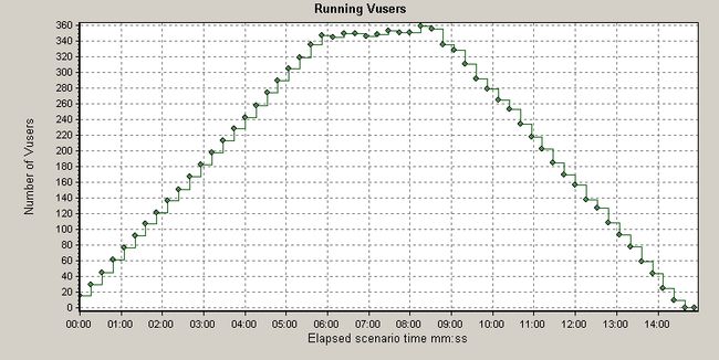
1:Vusers
This line graph shows the impact of Ramp-Up and Ramp-Down specified for run-time. This also shows the time when Errors begin to occur during the test run.
Note the time when the Number of Vusers peaks and when it begins to drop off. This is the "steady state" period of the run.
2:Transactions
Average Transaction Response Time
This line graph is used to determine whether performance is within acceptable minimum and maximum transaction performance time ranges expected of the system. It displays the average time taken to perform transactions during each second of the load test.<!-- http://svkbweb02.merc-int.com/asp/KBAview.asp?Conceptid=10458&Product=LR --> Unlike the Summary Report, only Transaction End Status of Passed are included (Failed transactions are filtered out by default).
Transactions per Second
This line graph helps you determine the actual load imposed by each transaction action at various spans of time throughout a run.
Each line displays the number of transactions performed — both passed(successful) and failed(unsuccessful) transactions.
Each point on a line is calculated from the number of transactions that ended within each span of time (the Granularity period automatically set to the lowest allowed relative to the scenario run). <!-- http://svkbweb02.merc-int.com/asp/KBAview.asp?conceptid=3333&Product=LR-->For example, an Average data point of 0.5 within the Granularity period of 16 Seconds means that 8 (0.5 x 16) transactions were completed within that 16 second period.
TPS (Transactions Per Second) Explained
TPS is the count of transactions processed each second. Like Miles Per Hour, it is a measurement of speed.
| One second | |||
|---|---|---|---|
| A | A | A | A |
| .25 | .25 | .25 | .25 |
| One second | |
|---|---|
| B | B |
| .5 | .5 |
In this illustration, when each action is performed on its own,
action A has a TPS of 4 per second.
Action B has a TPS of 2 per second.
Note that:
- Think time decreases TPS
- Errors increases TPS because failed transactions end sooner than good transactions which complete processing.
- Multiple actions performed in a linked sequence decreases TPS:
One second A B A .25 .5 .25 When actions are performed in sequence,
action A now individually has a TPS of 2 per second and
action B individually has a TPS of 1 per second.However, the combination of multiple actions average together to 3 per second.
Total Transactions per Second
This graph helps you determine the actual total transaction load on your system at any given moment in time. This line chart displays the total of all transaction actions performed during each second of a load test.
An additional line is used to display the total number of Failed (unsuccessful) transactions.
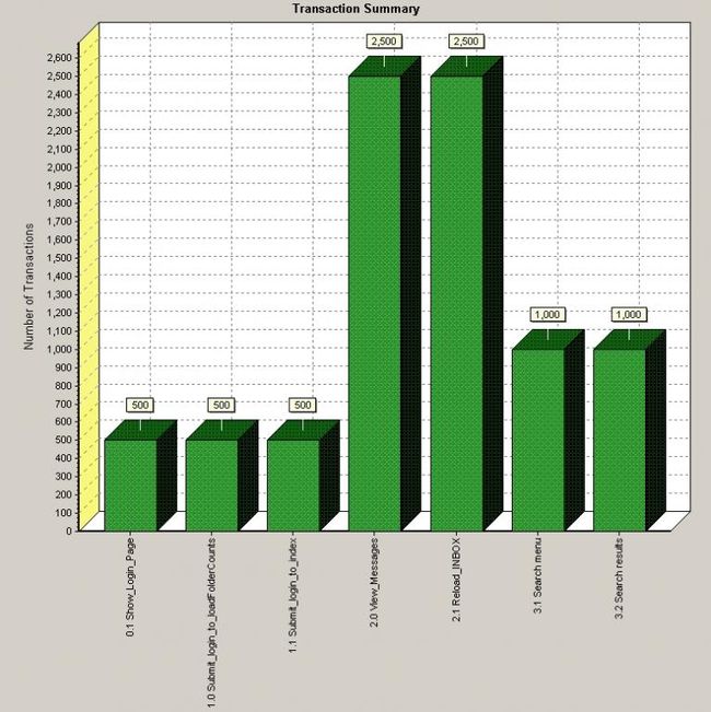
Transaction Summary
This bar graph displays, by transaction action, how many transactions passed, failed, stopped, or ended with errors.
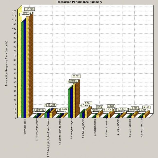
Transaction Performance Summary
This bar chart displays the minimum, average, and maximum response time for each transaction action in the load test.
This chart was manually scaled down to make actions easier to interpret. The tall column action on the left summarizes all other transaction actions by a user.
Transaction Response Time Under LoadThis XY graph illustrates how the Number of Vusers impacts Response Time. Typically, individual response times follow an exponential curve up as servers strain to process more Vusers. A flat horizontal line means that response time does not vary, usually because the system has enough (or too much) capacity.
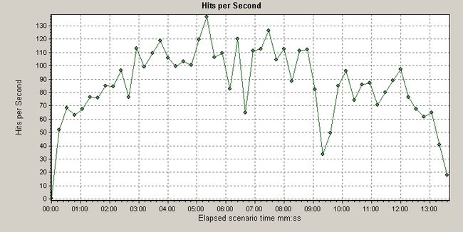
3:WebResources
Hits per SecondThe one line on this graph helps you evaluate the amount of load Vusers generate, in terms of the number of hits to all web servers. It displays the number of hits made on all Web servers by Vusers during each second of the load test.


