运用AdaptivePageLayout来做融合(convergence)设计以实现动态布局
在我先前的文章"如何得到屏幕和可用显示区域的大小尺寸及运用分辨率无关的编程",我已经阐述了如何运用units.gu来设计分辨率无关的应用.虽然如此,但是如果是对一些屏幕比较大的尺寸来说,我们还是希望可以改变它的一些布局以使得我们的内容显示更加饱满,更加生动.在Ubuntu手机平台中,我们可以使用AdaptivePageLayout来实现我们所需要的功能.通过这样的设计,我们可以使得我们的应用能够同时运行在平板及手机上并具有良好的用户体验.比如:

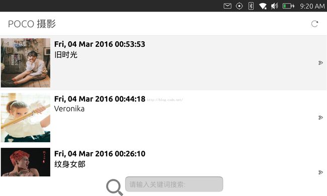
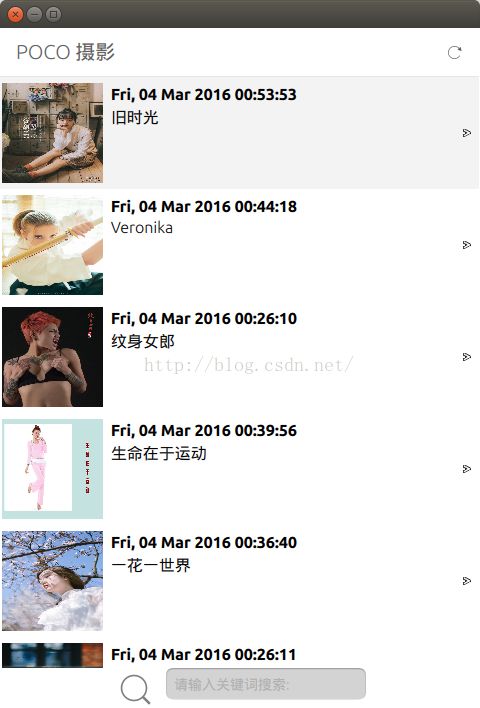
在上面的应用中,如果屏幕的宽度比较大,或在我们的设备中变为水平方向(landscape)时,我们希望可以充分利用屏幕右边的空间显示更多的内容,而不是需要按下一个"back"按钮回到上面的一个界面中.这种模式比较适用我们的平板上的landscape显示模式下的应用设计.上面显示的实际上是两个页面(左边是一个ListView,右边是一个message的detail页面).另外当我们的设备宽度比较窄(比如在portrait显示模式)的时候,我们希望有如下的界面:


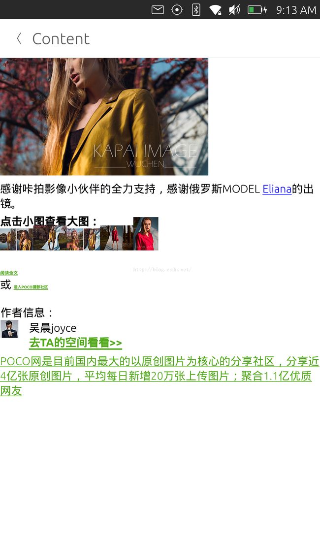
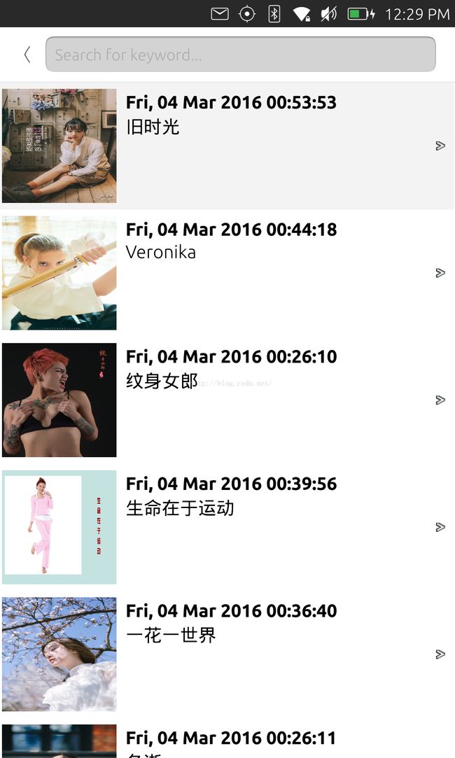
在屏幕变为portrait显示时,我们可以使用上面的显示模式.每当一个列表的内容被打开后,我们把我们的内容推入到我们的pagestack中.当返回后,只需按下左上角的"<"按钮即可.这样可以使得我们每页的内容显示的不要太拥挤.
在今天的练习中,我们将使用我们前面练习"从零开始创建一个Ubuntu应用 -- 一个小小的RSS阅读器 (1)"中的例子来开始.我们可以通过如下的命令来获取该例程的代码:
$ git clone git@github.com:liu-xiao-guo/rssreader_cache.git
在我们的练习中,我们将使用 AdaptivePageLayout来实现我们的功能.更多的API的细节可以在我们的开发者网站得到.在这里必须指出的是,AdaptivePageLayout只适用于:
import QtQuick 2.4
import Ubuntu.Components 1.3
也就是说 Ubuntu.Components 1.1/1.2都不支持.目前我们可以在Ubuntu Desktop 15.10上可以运行以下的代码.
1)修改ArticleListView.qml
为了得到在ArticleListView中的ListView的信息,我们添加如下的alias properties:
Item {
    id: root
    signal clicked(var instance)
    property alias currentIndex : listView.currentIndex
    property alias model: listView.model
    property alias listview: listView
    ...
}
这样我们就可以在外面应用我们的listView了.
2)修改Main.qml
在这个文件中,我们将抛弃我们之前所使用的PageStack.我们使用AdaptivePageLayout来实现我们的动态布局.修改后的代码为:
import QtQuick 2.4
import Ubuntu.Components 1.3
import "components"

MainView {
    // objectName for functional testing purposes (autopilot-qt5)
    objectName: "mainView"

    // Note! applicationName needs to match the "name" field of the click manifest
    applicationName: "rssreader.liu-xiao-guo"

    width: units.gu(60)
    height: units.gu(85)

    AdaptivePageLayout {
        id: layout
        anchors.fill: parent
        primaryPage: listPage

        layouts: PageColumnsLayout {
            when: width > units.gu(60)
            // column #0
            PageColumn {
                minimumWidth: units.gu(30)
                maximumWidth: units.gu(60)
                preferredWidth: units.gu(40)
            }
            // column #1
            PageColumn {
                fillWidth: true
            }
        }

        Page {
            id: listPage
            visible: false
            header: PageHeader {
                title: "POCO 摄影"
                trailingActionBar.actions: [
                    Action {
                        iconName: "reload"
                        text: "Reload"
                        onTriggered: articleList.reload()
                    }
                ]

                // flickable: articleList.listview
            }

            ArticleListView {
                id: articleList
                anchors {
                    left: parent.left
                    right: parent.right
                    bottom: parent.bottom
                    top: listPage.header.bottom
                }
                clip: true

                onClicked: {
                    articleContent.text = instance.content
                    layout.addPageToNextColumn(listPage, contentPage)
                }
            }
        }

        Page {
            id: contentPage
            header: PageHeader {
                title: "Content"
            }

            visible: false

            ArticleContent {
                id: articleContent
                objectName: "articleContent"
                anchors.fill: parent
            }
        }

        onColumnsChanged: {
            console.log("columns: " + columns );

            if ( columns == 2 ) {
                console.log("currentIndex: " + articleList.currentIndex )
                if ( articleList.currentIndex != undefined &&
                        articleList.currentIndex >= 0 ) {
                    var model = articleList.model
                    var index = articleList.currentIndex

                    articleContent.text = model.get(index).content
                    layout.addPageToNextColumn(listPage, contentPage)
                }

            }
        }
    }

    Action {
        id: reloadAction
        text: "Reload"
        iconName: "reload"
        onTriggered: articleList.reload()
    }
}
layout.addPageToNextColumn(listPage, contentPage)
        layouts: PageColumnsLayout {
            when: width > units.gu(60)
            // column #0
            PageColumn {
                minimumWidth: units.gu(30)
                maximumWidth: units.gu(60)
                preferredWidth: units.gu(40)
            }
            // column #1
            PageColumn {
                fillWidth: true
            }
        }
从上面的代码中可以看出来,如果屏幕的宽度大于units.gu(60)的话 (比如我们的MX4在屏幕水平放置时),就会出现左右的显示:
如果我们把我们的手机旋转到portrait显示时,显示的情况如下:
对于有些好奇的开发者来说,我们可以做如下的尝试:
        layouts: PageColumnsLayout {
            when: width > units.gu(200)
            // column #0
            PageColumn {
                minimumWidth: units.gu(30)
                maximumWidth: units.gu(60)
                preferredWidth: units.gu(40)
            }
            // column #1
            PageColumn {
                fillWidth: true
            }
        }
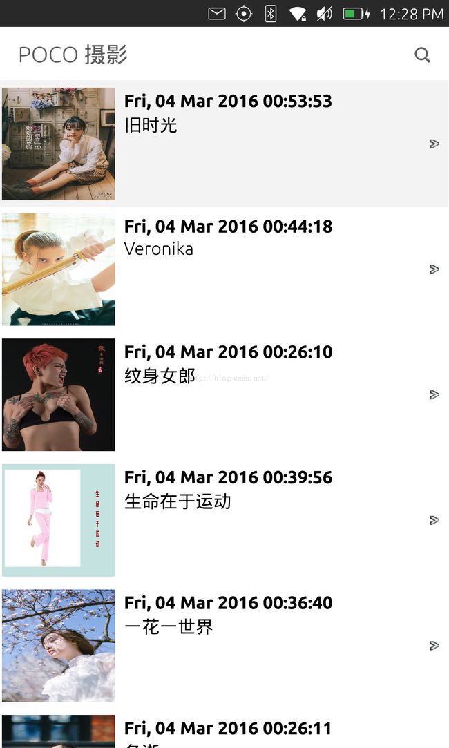
这里,我们把units.gu(60)改为units.gu(200).如果是这样的话,我的MX4手机将只有一页显示:

产生这样的原因是因为我们MX4的最大宽度是units.gu(80).我们用不可能达到units.gu(200)
对已没有手机的开发者来说,可以在"Ubuntu SDK Desktop Kit"下运行.可以通过改变应用的窗口大小来看到UI的变化.

可以看出来在屏幕的左上方有一个"
<"用于返回到primary page的按钮.更多关于 AdaptivePageLayout的介绍,也可以参照我的文章" 自适应页面布局使得应用适应不同屏幕的尺寸变得更加容易".
整个项目的源码在: https://github.com/liu-xiao-guo/rssreader_layout
更多练习:开发者可以参阅文章" PageHeader tutorial"来更一步把我们的搜索框集成到我们的header中.这个练习留给我的开发者自己去试.
我们的最终设计为:

我们的最终代码在: https://github.com/liu-xiao-guo/rssreader_header