Histograms and bar charts
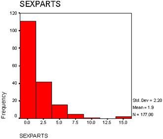
A histogram is a graphical way of presenting a frequency distribution. It is constructed by first selecting a number of "intervals" to be used. The choice is between reducing the information sufficiently while still providing enough variability to picture the shape of the distribution. Most computer programs that construct histograms will allow you to select the number of intervals, as well as their width. If you don�t tell the computer how many intervals to use, it will make the decision based on the data it has. In Figure 4.2 you will find a histogram produced by SPSS of the sexual behaviour data in Figure 4.1.
Figure 4.2 A histogram produced by SPSS for the "number of sex partners in the past year" variable.
First of all, notice that in this histogram, there are 7 intervals. The numbers on the X axis (also called the "abscissa") correspond to the midpoints of the interval. Halfway between adjacent intervals are the real limits of the interval, which determine where a particular data point gets "counted" in the histogram. For example, notice the third bar in this histogram. The midpoint is 5. The lower real limit is half way between 2.5 and 5, or 3.75. The upper real limit is between 5 and 7.5, or 6.25. So by convention, any score in the data set equal to or greater than 3.75 and LESS THAN 6.25 gets assigned to the "5" bar. The "Y" axis (also called the "ordinate") displays the frequency or number of times a particular piece of data in the data set falls into that interval. So, for example, you can see that 16 respondents in the data set reported having between 3.75 and 6.25 sexual partners last year (i.e., 4, 5, or 6). Now, this might seem somewhat silly given that number of sexual partners must be an integer (i.e., a discrete variable). For this reason, histograms are best used with data where nonintegers are actually possible. Regardless, this histogram does summarise the information in Figure 4.1 quite well. From the frequency distribution (Output 4.1) we know that most people reported having either no sexual partners or one sexual partner last year. The histogram does reflect this (the numbers 0 and 1 occurred 111 times). We also know from the frequency distribution that increasingly fewer people reported having many sexual partners. The histogram also reflects this.
Sometimes histograms are constructed with relative frequencies or percentages or proportions on the Y-axis. Because of the close relationship between counts or raw frequencies and relative frequencies and percentages, the interpretation of the frequency distribution remains the same.
Bar Charts. A graph very similar to a histogram is the bar chart. Bar charts are often used for qualitative or categorical data, although they can be used quite effectively with quantitative data if the number of unique scores in the data set is not large. A bar chart plots the number of times a particular value or category occurs in a data set, with the height of the bar representing the number of observations with that score or in that category. The Y-axis could represent any measurement unit: relative frequency, raw count, percent, or whatever else is appropriate for the situation. For example, the bar chart in Figure 4.3 plots the number of people, in millions, belonging in one of the four major ethnic categories in the United States in 1990.
Figure 4.3 Ethnic category is a qualitative or categorical variable. You can see that most of the U.S. population is "White."
Bar charts can be used quite effectively with quantitative data as well but some problems occur. Figure 4.4 shows a bar chart of the sex partners data.
Figure 4.4 A bar chart of the "number of sex partners last year" variable.
Most computer programs that generate bar charts will treat each quantitative score as a category. What this means is that the bar chart may not space out the scores appropriately on the X axis of the chart. As you can see in Figure 4.4, SPSS ignores the fact that there are no 9s and no observations with values between 11 and 13. As a result, it places "8" and "10" right next to each other, and then places "14" next to "10." It simply treats these scores with no observations as impossible. As a result, looking at a bar chart can give a misrepresentation as to the shape of the distribution. Second, if there are many unique scores in the data set, each of which occurs infrequently, a bar chart may provide no additional information than could be obtained from just looking at the data set. For example, imagine a bar chart of the following data: 4.3, 6.5, 1.2, 6.9, 4.1, 0.4, 6.1, 3.6, 1.6, 2.3. There is only one of every score. So a bar chart would provide little information because it would just display 10 bars equal in height (i.e., with a height of 1).

