Basic color schemes - Introduction to Color Theory
With colors you can set a mood, attract attention, or make a statement. You can use color to energize, or to cool down. By selecting the right color scheme, you can create an ambiance of elegance, warmth or tranquility, or you can convey an image of playful youthfulness. Color can be your most powerful design element if you learn to use it effectively.
Content |
|
| The Color Wheel | |
| Primary, Secondary and Tertiary Colors | |
| Warm and cool colors | |
| Tints, Shades, and Tones | |
|
Color Harmonies - basic techniques for creating color schemes
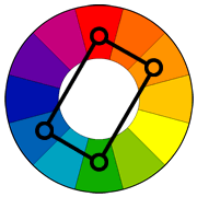
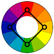
- Complementary - Analogous - Triadic - Split-Complementary - Rectangle (tetradic) - Square |
|
Colors affect us in numerous ways, both mentally and physically. A strong red color has been shown to raise the blood pressure, while a blue color has a calming effect.
Being able to use colors consciously and harmoniously can help you create spectacular results.
The Color Wheel
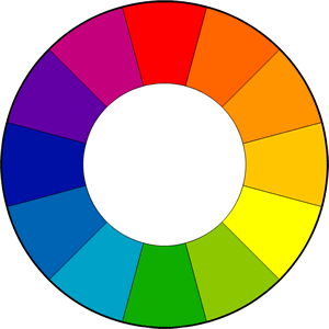
The color wheel or color circle is the basic tool for combining colors. The first circular color diagram was designed by Sir Isaac Newton in 1666.
The color wheel is designed so that virtually any colors you pick from it will look good together. Over the years, many variations of the basic design have been made, but the most common version is a wheel of 12 colors based on the RYB (or artistic) color model.
Traditionally, there are a number of color combinations that are considered especially pleasing. These are calledcolor harmonies or color chords and they consist of two or more colors with a fixed relation in the color wheel.
ColorImpact is designed to dynamically create a color wheel to match your base color.
Primary, Secondary and Tertiary Colors
In the RYB (or subtractive) color model, the primary colors are red, yellow and blue.
The three secondary colors (green, orange and purple) are created by mixing two primary colors.
Another six tertiary colors are created by mixing primary and secondary colors.
<object classid="clsid:D27CDB6E-AE6D-11cf-96B8-444553540000" codebase="http://download.macromedia.com/pub/shockwave/cabs/flash/swflash.cab#version=6,0,29,0" width="440" height="400"> <param name="movie" value="images/PrimaryColors.swf" /> <param name="quality" value="high" /> <embed src="images/PrimaryColors.swf" quality="high" pluginspage="http://www.macromedia.com/go/getflashplayer" type="application/x-shockwave-flash" width="440" height="400"></embed> </object>
The above illustration shows the color circle with the primary, secondary and tertiary colors.Click on the labels to turn the colors on / off.
 Warm and cool colors
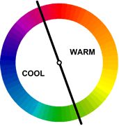
The color circle can be divided into warm and cool colors.
Warm colors are vivid and energetic, and tend to advance in space.
Cool colors give an impression of calm, and create a soothing impression.
White, black and gray are considered to be neutral.
Tints, Shades, and Tones
These terms are often used incorrectly, although they describe fairly simple color concepts. If a color is made lighter by adding white, the result is called atint. If black is added, the darker version is called a shade. And if gray is added, the result is a different tone.
| Tints - adding white to a pure hue: |
| Shades - adding black to a pure hue: |
| Tones - adding gray to a pure hue: |
Color Harmonies
- basic techniques for creating color schemes
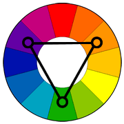
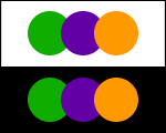
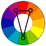
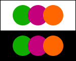
Below are shown the basic color chords based on the color wheel.
http://www.tigercolor.com/color-lab/color-theory/color-theory-intro.htm
http://www.tigercolor.com/color-lab/color-wheel/color-wheels.htm
http://www.handprint.com/HP/WCL/tech13.html
