七夕言情--慕课网
七夕言情是慕课网上的一个HTML5+JS+CSS3的动画类的项目;拖拖拉拉的小半个月才跟着课程一点点敲完了代码。回头来看整个项目。从自己的观点出发总结一下~
首先是页面布局:
这个动画一共分为三个背景分别为:
(背景一)(请忽略那只角落里的企鹅。。)

(背景二)

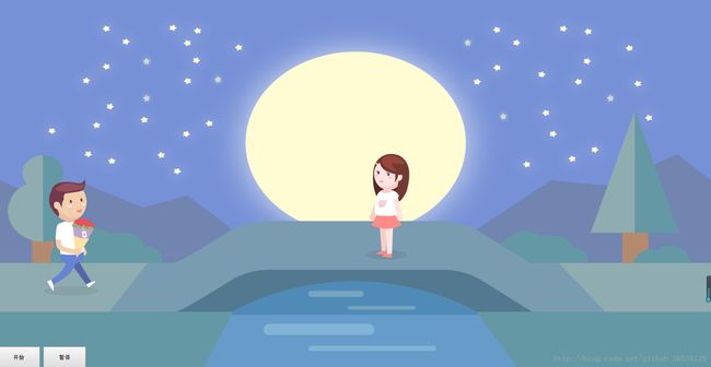
(背景三)

根据上面的设计图以及从慕课网上下载的资源包,可以做出如下的页面布局;
html:
pageA:
/*pageA*/
/*背景图*/
.a-background{
 	width:100%;
	height:100%;
	position: absolute;
}
.a_background_top{
	width:100%;
	height:71.6%;
	background-image:url('../media/images/background/a_background_top.png');
	background-size: 100% 100%;
}
.a_background_middle{
	width:100%;
	height:13.1%;
	background-image:url('../media/images/background/a_background_middle.png');
	background-size:100% 100%;
}
.a_background_botton{
	width:100%;
	height:15.3%;
	background-image:url('../media/images/background/a_background_botton.png');
	background-size:100% 100%;
}

/*太阳*/
#sun{
	background:url('../media/images/sun.png') no-repeat;
	position:absolute;
	z-index: 1;
	top:-30px;
	height:201px;
	width:201px;
	right:40%;
-webkit-animation-name: rotation;
-webkit-animation-duration: 30s;
-moz-animation-name:rotation;
-moz-animation-duration: 30s; -webkit-animation-name:smallCloud;
-webkit-animation-duration:30s;
-webkit-animation-iteration:infinite;
-moz-animation-name:smallCloud;
-moz-animation-duration:30s;
-moz-animation-iteration:infinite; -webkit-animation-name:largeCloud; -webkit-animation-duration:60s;
-webkit-animation-iteration:infinite;
-moz-animation-name:largeCloud;
-moz-animation-duration:60s;
-moz-animation-iteration:infinite; /*pageB*/
/*背景*/
.b_background {
width: 100%;
height: 100%;
background-image: url("../media/images/QixiB-dark.png");
background-size: 100% 100%;
position: absolute;
}
.b_background_preload {
background: url('../media/images/QixiB-bright.png') no-repeat -9999px -9999px;
}
.lamp-bright {
background-image: url("../media/images/QixiB-bright.png");
}
/*商店*/
.shop {
width: 39.5%;
height: 35.5%;
position: absolute;
left: 29%;
top: 36.5%;
}
.door {
position: absolute;
width: 32%;
height: 100%;
top: 32%;
height: 68%;
overflow: hidden;
left: 58.5%;
}
.door-left,.door-right {
width: 50%;
height: 100%;
position: absolute;
}
.door-left {
left: 0%;
background: url('../media/images/door-left.png');
background-size: 100% 100%;
}
.door-right {
left: 50%;
background: url('../media/images/door-right.png');
background-size: 100% 100%;
}
/*鸟*/
.bird{
min-width: 91px;
min-height: 71px;
top:10%;
position:absolute;
z-index:10;
right:-91px;
background:url('../media/images/bird.png') no-repeat -182px 0px;
}
.birdFly{
-webkit-animation-name: bird-slow;
-webkit-animation-duration: 400ms;
-webkit-animation-timing-function: step-start;
-webkit-animation-iteration-count: infinite;
-moz-animation-name: bird-slow;
-moz-animation-duration: 400ms;
-moz-animation-timing-function: step-start;
-moz-animation-iteration-count: infinite;
}
/*鸟慢飞*/
@-webkit-keyframes bird-slow {
0% {
background-position: -182px 0px;
}
50% {
background-position: 0px 0px;
}
75% {
background-position: -91px 0px;
}
100% {
background-position: -182px 0px;
}
}
@-moz-keyframes bird-slow {
0% {
background-position: -182px 0px;
}
50% {
background-position: 0px 0px;
}
75% {
background-position: -91px 0px;
}
100% {
background-position: -182px 0px;
}
}
pageC:
/*pageC*/
/* 背景图*/
.c_background{
	width:100%;
	height:100%;
	background-size:100% 100%;
	position:absolute;
}
.c_background_top{
	width:100%;
	height:71.6%;
	background-image:url('../media/images/background/c_background_top.png');
	background-size:100% 100%;
}
.c_background_middle{
	width:100%;
	height:13.1%;
	background-image:url('../media/images/background/c_background_middle.png');
	background-size:100% 100%;
}
.c_background_bottom{
	width:100%;
	height:15.3%;
	background-image:url('../media/images/background/c_background_botton.png');
	background-size:100% 100%;
}
/*小女孩*/
.girl{
	background:url('../media/images/girl.png') -755px -0px no-repeat;
	position:absolute;
	right:40%;
	top:37%;
	width:151px;
	height:291px;
}
.girl-rotate {
    -webkit-animation-name: girl-rotate;
    -webkit-animation-duration: 850ms;
    -webkit-animation-iteration-count: 1;
    -webkit-animation-timing-function: step-start;
    -webkit-animation-fill-mode: forwards;
    -moz-animation-name: girl-rotate;
    -moz-animation-duration: 850ms;
    -moz-animation-iteration-count: 1;
    -moz-animation-timing-function: step-start;
    -moz-animation-fill-mode: forwards;
}

@-webkit-keyframes girl-rotate {
    0% {
        background-position: -604px -0px;
    }
    16.7% {
        background-position: -151px -0px;
    }
    33.4% {
        background-position: -906px -0px;
    }
    50.1% {
        background-position: -0px -0px;
    }
    66.8% {
        background-position: -302px -0px;
    }
    83.5% {
        background-position: -453px -0px;
    }
    100% {
        background-position: -604px -0px;
    }
}

@-moz-keyframes girl-rotate {
    0% {
        background-position: -604px -0px;
    }
    16.7% {
        background-position: -151px -0px;
    }
    33.4% {
        background-position: -906px -0px;
    }
    50.1% {
        background-position: -0px -0px;
    }
    66.8% {
        background-position: -302px -0px;
    }
    83.5% {
        background-position: -453px -0px;
    }
    100% {
        background-position: -604px -0px;
    }
}
/*桥*/
.bridge-bottom{
	position:absolute;
	width:41%;
	height:24%;
	left:29.5%;
	top:76%;
	overflow:hidden;
}
/*水*/
.water{
	width:100%;
	height:100%;
}
.water_1,.water_2,.water_3,.water_4{
	width:100%;
	position:absolute;
	height:50%;
	-webkit-animation-name: shake;
        -webkit-animation-duration: 40s;
        -webkit-animation-direction: alternate;
        -webkit-anination-timing-function: linear;
        -webkit-animation-iteration-count: infinite;
        -moz-animation-name: shake;
        -moz-animation-duration: 40s;
        -moz-animation-direction: alternate;
        -moz-anination-timing-function: linear;
        -moz-animation-iteration-count: infinite;
}
.water_1{
	width:131px;
	height:15px;
	top:13%;
	left:35%;
	background:url('../media/images/water.png') -261px -0px no-repeat;
}
.water_2{
	width:161px;
	height:9px;
	top:30%;
	left:45%;
	background:url('../media/images/water.png') -693px -0px no-repeat;
    -webkit-animation-delay: 1s;
    -moz-animation-delay: 1s;
}
.water_3{
	width:261px;
	height:29px;
	top:50%;
	left:15%;
	background:url('../media/images/water.png') -0px -0px no-repeat;
    -webkit-animation-delay: 2s;
    -moz-animation-delay: 2s;
}

.water_4{
	width:301px;
	height:12px;
	top:75%;
	left:30%;
	background:url('../media/images/water.png') -392px -0px no-repeat;
    -webkit-animation-delay: 3s;
    -moz-animation-delay: 3s;
}

@-webkit-keyframes shake {
    0%, 100% {
        -webkit-transform: translate3d(0, 0, 0);
    }
    10%,
    30%,
    50%,
    70%,
    90% {
        -webkit-transform: translate3d(-30px, 0px, 0);
    }
    20%,
    40%,
    60%,
    80% {
        -webkit-transform: translate3d(30px, 0px, 0);
    }
}

@-moz-keyframes shake {
    0%, 100% {
        -moz-transform: translate3d(0, 0, 0);
    }
    10%,
    30%,
    50%,
    70%,
    90% {
        -moz-transform: translate3d(-30px, 0px, 0);
    }
    20%,
    40%,
    60%,
    80% {
        -moz-transform: translate3d(30px, 0px, 0);
    }
}
/*星星*/
.star{
	width:100%;
	height:100%;
	position:absolute;
}
.stars > li{
	position:absolute;
	width:30px;
	height:31px;
	background-image:url('../media/images/stars.png');
	-webkit-animation-name: flash;
        -webkit-animation-timing-function: ease-in-out;
        -webkit-animation-iteration-count: infinite;
        -webkit-animation-direction: alternate;
        -moz-animation-name: flash;
        -moz-animation-timing-function: ease-in-out;
        -moz-animation-iteration-count: infinite;
        -moz-animation-direction: alternate;
}
.stars1{
	top:20%;
	left:30%;
	-webkit-animation-duration: 5s;
	-moz-animation-duration: 5s;
}
.stars2{
	top:15%;
	left:20%;
	-webkit-animation-duration: 5s;
	-moz-animation-duration: 5s;
}
.stars3{
	top:25%;
	left:85%;
	-webkit-animation-duration: 5s;
	-moz-animation-duration: 5s;
}
.stars4{
	top:30%;
	left:70%;
	-webkit-animation-duration: 5s;
	-moz-animation-duration: 5s;
}
.stars5{
	top:25%;
	left:20%;
	-webkit-animation-duration: 5s;
	-moz-animation-duration: 5s;
}
.stars6{
	top:10%;
	left:65%;
	-webkit-animation-duration: 5s;
	-moz-animation-duration: 5s;
}

@-webkit-keyframes flash {
    0%, 50%, 100% {
        opacity: 1;
    }
    25%,
    75% {
        opacity: 0;
    }
}

@-moz-keyframes flash {
    0%, 50%, 100% {
        opacity: 1;
    }
    25%,
    75% {
        opacity: 0;
    }
}

/*文字效果*/

.logo {
    width: 185px;
    height: 81px;
    background-image: url('../media/images/logo.png');
    z-index: 999999;
    position: absolute;
    left: 50%;
    margin-left: -92.5px;
    top: 30px;
    display: none;
}

.logolightSpeedIn {
    display: block;
    -webkit-animation-name: lightSpeedIn;
    -webkit-animation-timing-function: ease-out;
    -webkit-animation-duration: 1s;
    -moz-animation-name: lightSpeedIn;
    -moz-animation-timing-function: ease-out;
    -moz-animation-duration: 1s;
}

@-webkit-keyframes lightSpeedIn {
    0% {
        -webkit-transform: translate3d(100%, 0, 0) skewX(-30deg);
        opacity: 0;
    }
    60% {
        -webkit-transform: skewX(20deg);
        opacity: 1;
    }
    80% {
        -webkit-transform: skewX(-5deg);
        opacity: 1;
    }
    100% {
        -webkit-transform: none;
        opacity: 1;
    }
}

@-moz-keyframes lightSpeedIn {
    0% {
        -moz-transform: translate3d(100%, 0, 0) skewX(-30deg);
        opacity: 0;
    }
    60% {
        -moz-transform: skewX(20deg);
        opacity: 1;
    }
    80% {
        -moz-transform: skewX(-5deg);
        opacity: 1;
    }
    100% {
        -moz-transform: none;
        opacity: 1;
    }
}

.logoshake {
    -webkit-animation-name: logoshake;
    -webkit-animation-duration: 0.5s;
    -moz-animation-name: logoshake;
    -moz-animation-duration: 0.5s;
}

@-webkit-keyframes logoshake {
    0%, 100% {
        -moz-transform: translate3d(0, 0, 0);
    }
    10%,
    30%,
    50%,
    70%,
    90% {
        -moz-transform: translate3d(-5px, 0, 0);
    }
    20%,
    40%,
    60%,
    80% {
        -moz-transform: translate3d(10px, 0, 0);
    }
}

@-moz-keyframes logoshake {
   0%, 100% {
        -moz-transform: translate3d(0, 0, 0);
    }
    10%,
    30%,
    50%,
    70%,
    90% {
        -moz-transform: translate3d(-5px, 0, 0);
    }
    20%,
    40%,
    60%,
    80% {
        -moz-transform: translate3d(10px, 0, 0);
    }
}
独立于分页面的部分:
/*主体部分*/
#content {
    width: 100%;
    height: 100%;
    /* top: 20%;*/
    overflow: hidden;
    position: absolute;
}

.content-wrap {
    position: relative;
}

.content-wrap > li {
    float: left;
    overflow: hidden;
    position: relative;
}
.charector{
	width: 151px;
	height:291px;
	background:url(../media/images/boy.png) -0px -291px no-repeat;
	position:absolute;
	left:6%;
	top:55%;
}
 /* 普通慢走*/
.slowWalk{
	-webkit-animation-name: person-slow;
	-webkit-animation-duration:950ms;
	-webkit-animation-iteration-count: infinite;
	-webkit-animation-timing-function:steps(1,start);
	-moz-animation-name: person-slow;
	-moz-animation-duration:950ms;
	-moz-animation-iteration-count: infinite;
	-moz-animation-timing-function:steps(1,start);
}
.slowFlowerWalk {
       -webkit-animation-name: person-flower-slow;
       -webkit-animation-duration: 950ms;
       -webkit-animation-iteration-count: infinite;
       -webkit-animation-timing-function: step-start;
       -moz-animation-name: person-flower-slow;
       -moz-animation-duration: 950ms;
       -moz-animation-iteration-count: infinite;
       -moz-animation-timing-function: step-start;
}
@-webkit-keyframes person-slow{
	0%{
		background-position:-0px -291px;
	}
	25%{
		background-position: -602px -0px;
	}
	50%{
		background-position: -302px -291px;
	}
	75%{
		background-position: -151px -291px;
	}
	100%{
		background-position: -0px -291px;
	}
}
@-moz-keyframes person-slow{
	0%{
		background-position:-0px -291px;
	}
	25%{
		background-position: -602px -0px;
	}
	50%{
		background-position: -302px -291px;
	}
	75%{
		background-position: -151px -291px;
	}
	100%{
		background-position: -0px -291px;
	}
}
/*带花*/

@-webkit-keyframes person-flower-slow {
   0% {
       background-position: -453px -0px;
   }
   25% {
       background-position: -904px -0px;
   }
   50% {
       background-position: -451px -0px;
   }
   75% {
       background-position: -753px -0px;
   }
   100% {
       background-position: -300px -0px;
   }
}

@-moz-keyframes person-flower-slow {
   0% {
       background-position: -453px -0px;
   }
   25% {
       background-position: -904px -0px;
   }
   50% {
       background-position: -451px -0px;
   }
   75% {
       background-position: -753px -0px;
   }
   100% {
       background-position: -300px -0px;
   }
}
/*人物暂停*/
.pauseWalk{
	-webkit-animation-play-state:paused;
	-moz-animation-play-state:paused;
}

.boyOriginal{
	background-position:-150px -0px;
}

.boy-rotate {
       -webkit-animation-name: boy-rotate;
       -webkit-animation-duration: 850ms;
       -webkit-animation-iteration-count: 1;
       -webkit-animation-timing-function: step-start;
       -webkit-animation-fill-mode: forwards;
       -moz-animation-name: boy-rotate;
       -moz-animation-duration: 850ms;
       -moz-animation-iteration-count: 1;
       -moz-animation-timing-function: step-start;
       -moz-animation-fill-mode: forwards;
   }

   @-webkit-keyframes boy-rotate {
       0% {
           background-position: -603px -291px;
       }
       16.7% {
           background-position: -150px -0px;
       }
       33.4% {
           background-position: -453px -291px;
       }
       50.1% {
           background-position: -0px -0px;
       }
       66.8% {
           background-position: -903px -291px;
       }
       83.5% {
           background-position: -753px -291px;
       }
       100% {
           background-position: -603px -291px;
       }
   }

   @-moz-keyframes boy-rotate {
       0% {
           /*background-position: -603px -291px;*/
       }
       16.7% {
           background-position: -150px -0px;
       }
       33.4% {
           background-position: -453px -291px;
       }
       50.1% {
           background-position: -0px -0px;
       }
       66.8% {
           background-position: -903px -291px;
       }
       83.5% {
           background-position: -753px -291px;
       }
       100% {
           background-position: -603px -291px;
       }
   }
js:
var Qixi = function() {
    var confi = {
        keepZoomRatio: false,
        layer: {
            "width": "100%",
            "height": "100%",
            "top": 0,
            "left": 0
        },
        audio: {
            enable: true,
            playURl: "http://www.imooc.com/upload/media/happy.wav",
            cycleURL: "http://www.imooc.com/upload/media/circulation.wav"
        },
        setTime: {
            walkToThird: 6000,
            walkToMiddle: 6500,
            walkToEnd: 6500,
            walkTobridge: 2000,
            bridgeWalk: 2000,
            walkToShop: 1500,
            walkOutShop: 1500,
            openDoorTime: 800,
            shutDoorTime: 500,
            waitRotate: 850,
            waitFlower: 800
        },
        snowflakeURl: ["http://img.mukewang.com/55adde120001d34e00410041.png", "http://img.mukewang.com/55adde2a0001a91d00410041.png", "http://img.mukewang.com/55adde5500013b2500400041.png", "http://img.mukewang.com/55adde62000161c100410041.png", "http://img.mukewang.com/55adde7f0001433000410041.png", "http://img.mukewang.com/55addee7000117b500400041.png"]
    };
    var debug = 0;
    if (debug) {
        $.each(confi.setTime,
        function(key, val) {
            confi.setTime[key] = 500
        })
    }
    if (confi.keepZoomRatio) {
        var proportionY = 900 / 1440;
        var screenHeight = $(document).height();
        var zooomHeight = screenHeight * proportionY;
        var zooomTop = (screenHeight - zooomHeight) / 2;
        confi.layer.height = zooomHeight;
        confi.layer.top = zooomTop
    }
    var instanceX;
    var container = $("#content");
    container.css(confi.layer);
    var visualWidth = container.width();
    var visualHeight = container.height();
    var getValue = function(className) {
        var $elem = $("" + className + "");
        return {
            height: $elem.height(),
            top: $elem.position().top
        }
    };
    var pathY = function() {
        var data = getValue(".a_background_middle");
        return data.top + data.height / 2
    } ();
    var bridgeY = function() {
        var data = getValue(".c_background_middle");
        return data.top
    } ();
    var animationEnd = (function() {
        var explorer = navigator.userAgent;
        if (~explorer.indexOf("WebKit")) {
            return "webkitAnimationEnd"
        }
        return "animationend"
    })();
    if (confi.audio.enable) {
        var audio1 = Hmlt5Audio(confi.audio.playURl);
        audio1.end(function() {
            Hmlt5Audio(confi.audio.cycleURL, true)
        })
    }
    var swipe = Swipe(container);
    function scrollTo(time, proportionX) {
        var distX = visualWidth * proportionX;
        swipe.scrollTo(distX, time)
    }
    var girl = {
        elem: $(".girl"),
        getHeight: function() {
            return this.elem.height()
        },
        rotate: function() {
            this.elem.addClass("girl-rotate")
        },
        setOffset: function() {
            this.elem.css({
                left: visualWidth / 2,
                top: bridgeY - this.getHeight()
            })
        },
        getOffset: function() {
            return this.elem.offset()
        },
        getWidth: function() {
            return this.elem.width()
        }
    };
    var bird = {
        elem: $(".bird"),
        fly: function() {
            this.elem.addClass("birdFly");
            this.elem.transition({
                right: visualWidth
            },
            15000, "linear")
        }
    };
    var logo = {
        elem: $(".logo"),
        run: function() {
            this.elem.addClass("logolightSpeedIn").on(animationEnd,
            function() {
                $(this).addClass("logoshake").off()
            })
        }
    };
    var boy = BoyWalk();
    boy.walkTo(confi.setTime.walkToThird, 0.6).then(function() {
        scrollTo(confi.setTime.walkToMiddle, 1);
        return boy.walkTo(confi.setTime.walkToMiddle, 0.5)
    }).then(function() {
        bird.fly()
    }).then(function() {
        boy.stopWalk();
        return BoyToShop(boy)
    }).then(function() {
        girl.setOffset();
        scrollTo(confi.setTime.walkToEnd, 2);
        return boy.walkTo(confi.setTime.walkToEnd, 0.15)
    }).then(function() {
        return boy.walkTo(confi.setTime.walkTobridge, 0.25, (bridgeY - girl.getHeight()) / visualHeight)
    }).then(function() {
        var proportionX = (girl.getOffset().left - boy.getWidth() - instanceX + girl.getWidth() / 5) / visualWidth;
        return boy.walkTo(confi.setTime.bridgeWalk, proportionX)
    }).then(function() {
        boy.resetOriginal();
        setTimeout(function() {
            girl.rotate();
            boy.rotate(function() {
                logo.run();
                snowflake()
            })
        },
        confi.setTime.waitRotate)
    });
    function BoyWalk() {
        var $boy = $("#boy");
        var boyWidth = $boy.width();
        var boyHeight = $boy.height();
        console.log(boyHeight);
        $boy.css({
            top: pathY - boyHeight + 25
        });
        function pauseWalk() {
            $boy.addClass("pauseWalk")
        }
        function restoreWalk() {
            $boy.removeClass("pauseWalk")
        }
        function slowWalk() {
            $boy.addClass("slowWalk")
        }
        function stratRun(options, runTime) {
            var dfdPlay = $.Deferred();
            restoreWalk();
            $boy.transition(options, runTime, "linear",
            function() {
                dfdPlay.resolve()
            });
            return dfdPlay
        }
        function walkRun(time, dist, disY) {
            time = time || 3000;
            slowWalk();
            var d1 = stratRun({
                "left": dist + "px",
                "top": disY ? disY: undefined
            },
            time);
            return d1
        }
        function walkToShop(doorObj, runTime) {
            var defer = $.Deferred();
            var doorObj = $(".door");
            var offsetDoor = doorObj.offset();
            var doorOffsetLeft = offsetDoor.left;
            var offsetBoy = $boy.offset();
            var boyOffetLeft = offsetBoy.left;
            instanceX = (doorOffsetLeft + doorObj.width() / 2) - (boyOffetLeft + $boy.width() / 2);
            var walkPlay = stratRun({
                transform: "translateX(" + instanceX + "px),scale(0.3,0.3)",
                opacity: 0.1
            },
            2000);
            walkPlay.done(function() {
                $boy.css({
                    opacity: 0
                });
                defer.resolve()
            });
            return defer
        }
        function walkOutShop(runTime) {
            var defer = $.Deferred();
            restoreWalk();
            var walkPlay = stratRun({
                transform: "translate(" + instanceX + "px,0px),scale(1,1)",
                opacity: 1
            },
            runTime);
            walkPlay.done(function() {
                defer.resolve()
            });
            return defer
        }
        function calculateDist(direction, proportion) {
            return (direction == "x" ? visualWidth: visualHeight) * proportion
        }
        return {
            walkTo: function(time, proportionX, proportionY) {
                var distX = calculateDist("x", proportionX);
                var distY = calculateDist("y", proportionY);
                return walkRun(time, distX, distY)
            },
            stopWalk: function() {
                pauseWalk()
            },
            resetOriginal: function() {
                this.stopWalk();
                $boy.removeClass("slowWalk slowFlolerWalk").addClass("boyOriginal")
            },
            toShop: function() {
                return walkToShop.apply(null, arguments)
            },
            outShop: function() {
                return walkOutShop.apply(null, arguments)
            },
            rotate: function(callback) {
                restoreWalk();
                $boy.addClass("boy-rotate");
                if (callback) {
                    $boy.on(animationEnd,
                    function() {
                        callback();
                        $(this).off()
                    })
                }
            },
            getWidth: function() {
                return $boy.width()
            },
            getDistance: function() {
                return $boy.offset().left
            },
            talkFlower: function() {
                $boy.addClass("slowFlolerWalk")
            }
        }
    }
    var BoyToShop = function(boyObj) {
        var defer = $.Deferred();
        var $door = $(".door");
        var doorLeft = $(".door-left");
        var doorRight = $(".door-right");
        function doorAction(left, right, time) {
            var defer = $.Deferred();
            var count = 2;
            var complete = function() {
                if (count == 1) {
                    defer.resolve();
                    return
                }
                count--
            };
            doorLeft.transition({
                "left": left
            },
            time, complete);
            doorRight.transition({
                "left": right
            },
            time, complete);
            return defer
        }
        function openDoor(time) {
            return doorAction("-50%", "100%", time)
        }
        function shutDoor(time) {
            return doorAction("0%", "50%", time)
        }
        function talkFlower() {
            var defer = $.Deferred();
            boyObj.talkFlower();
            setTimeout(function() {
                defer.resolve()
            },
            confi.setTime.waitFlower);
            return defer
        }
        var lamp = {
            elem: $(".b_background"),
            bright: function() {
                this.elem.addClass("lamp-bright")
            },
            dark: function() {
                this.elem.removeClass("lamp-bright")
            }
        };
        var waitOpen = openDoor(confi.setTime.openDoorTime);
        waitOpen.then(function() {
            lamp.bright();
            return boyObj.toShop($door, confi.setTime.walkToShop)
        }).then(function() {
            return talkFlower()
        }).then(function() {
            return boyObj.outShop(confi.setTime.walkOutShop)
        }).then(function() {
            shutDoor(confi.setTime.shutDoorTime);
            lamp.dark();
            defer.resolve()
        });
        return defer
    };
    function snowflake() {
        var $flakeContainer = $("#snowflake");
        function getImagesName() {
            return confi.snowflakeURl[[Math.floor(Math.random() * 6)]]
        }
        function createSnowBox() {
            var url = getImagesName();
            return $('').css({
                "width": 41,
                "height": 41,
                "position": "absolute",
                "backgroundSize": "cover",
                "zIndex": 100000,
                "top": "-41px",
                "backgroundImage": "url(" + url + ")"
            }).addClass("snowRoll")
        }
        setInterval(function() {
            var startPositionLeft = Math.random() * visualWidth - 100,
            startOpacity = 1;
            endPositionTop = visualHeight - 40,
            endPositionLeft = startPositionLeft - 100 + Math.random() * 500,
            duration = visualHeight * 10 + Math.random() * 5000;
            var randomStart = Math.random();
            randomStart = randomStart < 0.5 ? startOpacity: randomStart;
            var $flake = createSnowBox();
            $flake.css({
                left: startPositionLeft,
                opacity: randomStart
            });
            $flakeContainer.append($flake);
            $flake.transition({
                top: endPositionTop,
                left: endPositionLeft,
                opacity: 0.7
            },
            duration, "ease-out",
            function() {
                $(this).remove()
            })
        },
        200)
    }
    function Hmlt5Audio(url, loop) {
        var audio = new Audio(url);
        audio.autoplay = true;
        audio.loop = loop || false;
        audio.play();
        return {
            end: function(callback) {
                audio.addEventListener("ended",
                function() {
                    callback()
                },
                false)
            }
        }
    }
};
$(function() {
    Qixi()
});
function Swipe(container, options) {
    var element = container.find(":first");
    var swipe = {};
    var slides = element.find(">");
    var width = container.width();
    var height = container.height();
    element.css({
        width: (slides.length * width) + "px",
        height: height + "px"
    });
    $.each(slides,
    function(index) {
        var slide = slides.eq[index];
        slides.eq(index).css({
            width: width + "px",
            height: height + "px"
        })
    });
    var isComplete = false;
    var timer;
    var callbacks = {};
    container[0].addEventListener("transitionend",
    function() {
        isComplete = true
    },
    false);
    function monitorOffet(element) {
        timer = setTimeout(function() {
            if (isComplete) {
                clearInterval(timer);
                return
            }
            callbacks.move(element.offset().left);
            monitorOffet(element)
        },
        500)
    }
    swipe.watch = function(eventName, callback) {
        callbacks[eventName] = callback
    };
    swipe.scrollTo = function(x, speed) {
        element.css({
            "transition-timing-function": "linear",
            "transition-duration": speed + "ms",
            "transform": "translate3d(-" + x + "px,0px,0px)"
        });
        return this
    };
    return swipe
};其中运用css3 的关键帧运动实现了小男孩的走路以及鸟的飞行,星星的闪动,通过transform来实现了云,太阳,水流的运动;为了解决animation函数的回调嵌套使得代码的可读性减低的问题,通过$.deffer的方法将回调函数放在了.then(successFun,failFun)中,这样可以减少嵌套的层数,使代码更简洁。