Flutter之Appbar解析以及案例展示
Appbar(SliverAppBar which uses AppBar to provide a flexible app bar that can be used in a CustomScrollView.)可以看作就是我们所熟悉的Toolbar,其所拥有的属性有:
-
actions → List
一个 Widget 列表,代表 Toolbar 中所显示的菜单,对于常用的菜单,通常使用 IconButton 来表示;对于不常用的菜单通常使用PopupMenuButton 来显示为三个点,点击后弹出二级菜单。 -
automaticallyImplyLeading → bool
是否提供控件占位。 -
backgroundColor → Color
Appbar 的颜色,默认值为 ThemeData.primaryColor。该值通常和下面的三个属性一起使用:
brightness:App bar 的亮度,有白色和黑色两种主题,默认值为ThemeData.primaryColorBrightness
iconTheme:App bar 上图标的颜色、透明度、和尺寸信息。默认值为ThemeData.primaryIconTheme
textTheme:App bar 上的文字样式。默认值为ThemeData.primaryTextTheme -
bottom → PreferredSizeWidget
一个 AppBarBottomWidget 对象,通常是 TabBar。用来在 Toolbar 标题下面显示一个 Tab 导航栏 -
bottomOpacity → double
应用栏底部的不透明程度。值1.0完全不透明,值0.0完全透明。
通常,此值不会更改其默认值(1.0)。 当滚动应用栏时,SliverAppBar使用它来设置工具栏的不透明度动画。 -
centerTitle → bool
标题是否居中 -
elevation → double
放置此应用栏的z坐标。 这可以控制应用栏下方阴影的大小。
默认为4,应用栏的适当高程。 -
flexibleSpace → Widget
一个显示在 AppBar 下方的控件,高度和 AppBar 高度一样,可以实现一些特殊的效果,该属性通常在 SliverAppBar 中使用 -
leading → Widget
在标题前面显示的一个控件,在首页通常显示应用的 logo;在其他界面通常显示为返回按钮 -
preferredSize → Size
Scaffold对其高度设置 -
primary → bool
此应用栏是否显示在屏幕顶部。
如果为true,则appbar的工具栏元素和底部窗口小部件将在系统状态栏的高度上填充。 flexibleSpace的布局不受主要属性的影响。 -
title → Widget
当前界面的标题内容。 -
titleSpacing → double
标题间距,如果希望title占用所有可用空间,请将此值设置为0.0。
默认为NavigationToolbar.kMiddleSpacing。 -
toolbarOpacity → double
应用栏的工具栏部分透明度。
值1.0完全不透明,值0.0完全透明。
案例演示:
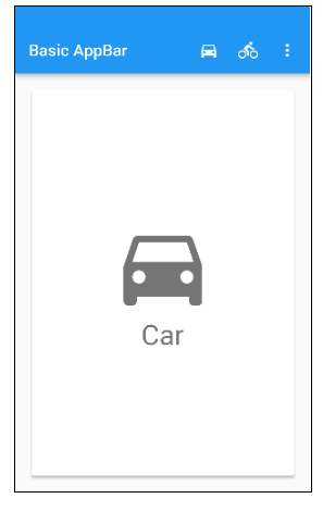
class _BasicAppBarSampleState extends State {
  Choice _selectedChoice = choices[0]; // The app's "state".

  void _select(Choice choice) {
    setState(() { // Causes the app to rebuild with the new _selectedChoice.
      _selectedChoice = choice;
    });
  }

  @override
  Widget build(BuildContext context) {
    return new MaterialApp(
      home: new Scaffold(
        appBar: new AppBar(
          title: const Text('Basic AppBar'),
          actions: [
            new IconButton( // action button
              icon: new Icon(choices[0].icon),
              onPressed: () { _select(choices[0]); },
            ),
            new IconButton( // action button
              icon: new Icon(choices[1].icon),
              onPressed: () { _select(choices[1]); },
            ),
            new PopupMenuButton( // overflow menu
              onSelected: _select,
              itemBuilder: (BuildContext context) {
                return choices.skip(2).map((Choice choice) {
                  return new PopupMenuItem(
                    value: choice,
                    child: new Text(choice.title),
                  );
                }).toList();
              },
            ),
          ],
        ),
        body: new Padding(
          padding: const EdgeInsets.all(16.0),
          child: new ChoiceCard(choice: _selectedChoice),
        ),
      ),
    );
  }
}

class Choice {
  const Choice({ this.title, this.icon });
  final String title;
  final IconData icon;
}

const List choices = const [
  const Choice(title: 'Car', icon: Icons.directions_car),
  const Choice(title: 'Bicycle', icon: Icons.directions_bike),
  const Choice(title: 'Boat', icon: Icons.directions_boat),
  const Choice(title: 'Bus', icon: Icons.directions_bus),
  const Choice(title: 'Train', icon: Icons.directions_railway),
  const Choice(title: 'Walk', icon: Icons.directions_walk),
];

class ChoiceCard extends StatelessWidget {
  const ChoiceCard({ Key key, this.choice }) : super(key: key);

  final Choice choice;

  @override
  Widget build(BuildContext context) {
    final TextStyle textStyle = Theme.of(context).textTheme.display1;
    return new Card(
      color: Colors.white,
      child: new Center(
        child: new Column(
          mainAxisSize: MainAxisSize.min,
          crossAxisAlignment: CrossAxisAlignment.center,
          children: [
            new Icon(choice.icon, size: 128.0, color: textStyle.color),
            new Text(choice.title, style: textStyle),
          ],
        ),
      ),
    );
  }
}

class TabbedAppBarSample extends StatelessWidget {
  @override
  Widget build(BuildContext context) {
    return new MaterialApp(
      home: new DefaultTabController(
        length: choices.length,
        child: new Scaffold(
          appBar: new AppBar(
            title: const Text('Tabbed AppBar'),
            bottom: new TabBar(
              isScrollable: true,
              tabs: choices.map((Choice choice) {
                return new Tab(
                  text: choice.title,
                  icon: new Icon(choice.icon),
                );
              }).toList(),
            ),
          ),
          body: new TabBarView(
            children: choices.map((Choice choice) {
              return new Padding(
                padding: const EdgeInsets.all(16.0),
                child: new ChoiceCard(choice: choice),
              );
            }).toList(),
          ),
        ),
      ),
    );
  }
}

class Choice {
  const Choice({ this.title, this.icon });
  final String title;
  final IconData icon;
}

const List choices = const [
  const Choice(title: 'CAR', icon: Icons.directions_car),
  const Choice(title: 'BICYCLE', icon: Icons.directions_bike),
  const Choice(title: 'BOAT', icon: Icons.directions_boat),
  const Choice(title: 'BUS', icon: Icons.directions_bus),
  const Choice(title: 'TRAIN', icon: Icons.directions_railway),
  const Choice(title: 'WALK', icon: Icons.directions_walk),
];

class ChoiceCard extends StatelessWidget {
  const ChoiceCard({ Key key, this.choice }) : super(key: key);

  final Choice choice;

  @override
  Widget build(BuildContext context) {
    final TextStyle textStyle = Theme.of(context).textTheme.display1;
    return new Card(
      color: Colors.white,
      child: new Center(
        child: new Column(
          mainAxisSize: MainAxisSize.min,
          crossAxisAlignment: CrossAxisAlignment.center,
          children: [
            new Icon(choice.icon, size: 128.0, color: textStyle.color),
            new Text(choice.title, style: textStyle),
          ],
        ),
      ),
    );
  }
}
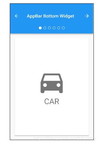
class _AppBarBottomSampleState extends State with SingleTickerProviderStateMixin {
  TabController _tabController;

  @override
  void initState() {
    super.initState();
    _tabController = new TabController(vsync: this, length: choices.length);
  }

  @override
  void dispose() {
    _tabController.dispose();
    super.dispose();
  }

  void _nextPage(int delta) {
    final int newIndex = _tabController.index + delta;
    if (newIndex < 0 || newIndex >= _tabController.length)
      return;
    _tabController.animateTo(newIndex);
  }

  @override
  Widget build(BuildContext context) {
    return new MaterialApp(
      home: new Scaffold(
        appBar: new AppBar(
          title: const Text('AppBar Bottom Widget'),
          leading: new IconButton(
            tooltip: 'Previous choice',
            icon: const Icon(Icons.arrow_back),
            onPressed: () { _nextPage(-1); },
          ),
          actions: [
            new IconButton(
              icon: const Icon(Icons.arrow_forward),
              tooltip: 'Next choice',
              onPressed: () { _nextPage(1); },
            ),
          ],
          bottom: new PreferredSize(
            preferredSize: const Size.fromHeight(48.0),
            child: new Theme(
              data: Theme.of(context).copyWith(accentColor: Colors.white),
              child: new Container(
                height: 48.0,
                alignment: Alignment.center,
                child: new TabPageSelector(controller: _tabController),
              ),
            ),
          ),
        ),
        body: new TabBarView(
          controller: _tabController,
          children: choices.map((Choice choice) {
            return new Padding(
              padding: const EdgeInsets.all(16.0),
              child: new ChoiceCard(choice: choice),
            );
          }).toList(),
        ),
      ),
    );
  }
}

class Choice {
  const Choice({ this.title, this.icon });
  final String title;
  final IconData icon;
}

const List choices = const [
  const Choice(title: 'CAR', icon: Icons.directions_car),
  const Choice(title: 'BICYCLE', icon: Icons.directions_bike),
  const Choice(title: 'BOAT', icon: Icons.directions_boat),
  const Choice(title: 'BUS', icon: Icons.directions_bus),
  const Choice(title: 'TRAIN', icon: Icons.directions_railway),
  const Choice(title: 'WALK', icon: Icons.directions_walk),
];

class ChoiceCard extends StatelessWidget {
  const ChoiceCard({ Key key, this.choice }) : super(key: key);

  final Choice choice;

  @override
  Widget build(BuildContext context) {
    final TextStyle textStyle = Theme.of(context).textTheme.display1;
    return new Card(
      color: Colors.white,
      child: new Center(
        child: new Column(
          mainAxisSize: MainAxisSize.min,
          crossAxisAlignment: CrossAxisAlignment.center,
          children: [
            new Icon(choice.icon, size: 128.0, color: textStyle.color),
            new Text(choice.title, style: textStyle),
          ],
        ),
      ),
    );
  }
}