频次直方图、数据区间划分和分布密度
%matplotlib inline
import numpy as np
import matplotlib.pyplot as plt
plt.style.use('seaborn-white')
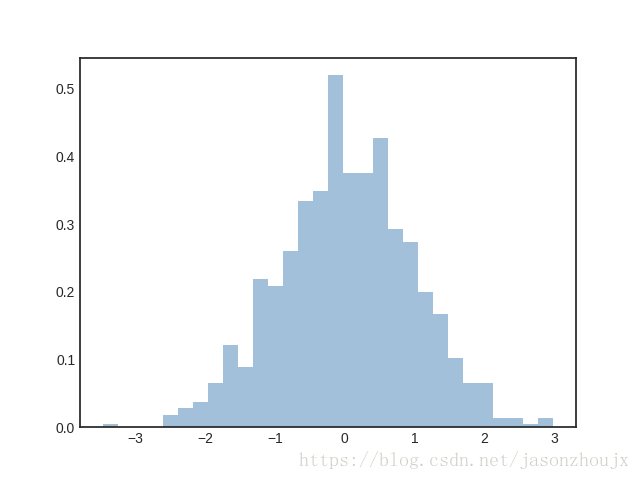
data = np.random.randn(1000)
plt.hist(data)

plt.hist(data, bins=30, normed=True, alpha=0.5, histtype='stepfilled',
color='steelblue', edgecolor='none'
x1 = np.random.normal(0, 0.8, 1000)
x2 = np.random.normal(-2, 1, 1000)
x3 = np.random.normal(3, 2, 1000)
kwargs = dict(histtype='stepfilled', alpha=0.3, normed=True, bins=40)
plt.hist(x1, **kwargs)
plt.hist(x2, **kwargs)
plt.hist(x3, **kwargs)

counts, bin_edges = np.histogram(data, bins=50)
print(counts)
[ 1 1 2 4 6 9 16 16 28 34 52 42 61 85 135 172 188 231
295 315 343 386 383 400 401 364 325 319 279 240 195 147 136 100 80 69
40 28 23 11 9 9 7 3 4 2 1 1 1 1]
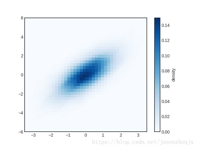
二维频次直方图与数据区间划分
plt.hist2d: 二维频次直方图
mean = [0, 0]
cov = [[1,1], [1,2]]
x, y = np.random.multivariate_normal(mean, cov, 10000).T
plt.hist2d(x, y, bins=30, cmap='Blues')
cb = plt.colorbar()
cb.set_label('counts in bin')
counts, xedges, yedges = np.histogram2d(x, y, bins=30)
plt.hexbin:六边形区间划分
plt.hexbin(x, y, gridsize=30, cmap='Blues')
cb = plt.colorbar(label='count in bin')
