第十五章 生成数据
matplotlib数学绘图库
pygal专注生成适合在数字设备上显示的图表
15.1 绘制折线图
import matplotlib.pyplot as plt #导入matplotlib中的pyplot模块并指定别名plt
squares = [1, 4, 9, 16, 25]
plt.plot(squares)
plt.show()
15.1.1 修改标题、坐标轴文字和线条粗细、校正图形
import matplotlib.pyplot as plt
values = [1, 2, 3, 4, 5] #横坐标轴
squares = [1, 4, 9, 16, 25] #纵坐标
plt.plot(values, squares, '-og', linewidth = 5, markerfacecolor = 'b') #-og表示实线、圆圈点、绿色
plt.title('Square Numbers', fontsize = 24)
plt.xlabel('Value', fontsize = 20)
plt.ylabel('Squares of Value', fontsize = 20)
plt.tick_params(axis = 'x', labelsize = 16) #如果要同时设置,可以axis = 'both'
plt.tick_params(axis = 'y', labelsize = 20)
plt.show()

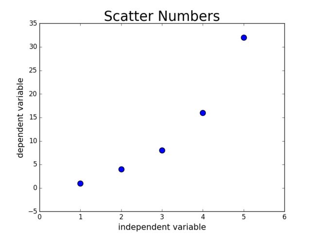
15.2.2 使用scatter()绘制散点图
在上例使用plt.plot()时,将'-og'换成'og'可以实现散点图
但是有时候我们需要设置各个数据点的样式,比如换颜色,设置大小
使用scatter(),并向它传递一对x,y坐标,并设置样式
import matplotlib.pyplot as plt
x_values = [1, 2, 3, 4, 5]
y_values = [1, 4, 8, 16, 32]
plt.scatter(x_values, y_values, s=100)
plt.title('Scatter Numbers', fontsize = 25)
plt.xlabel('independent variable', fontsize = 15)
plt.ylabel('dependent variable', fontsize = 15)
plt.tick_params(axis = 'both', which = 'both', labelsize = 12) #这里的which参数是主刻度(major)和副刻度(minor),默认是'both'
plt.show()
15.2.3 自动计算数据
利用Python遍历循环
import matplotlib.pyplot as plt
x_values = list(range(1,1001))
y_values = [x ** 2 for x in x_values]
plt.scatter(x_values, y_values, s = 20)
plt.title('Squares of Values', fontsize = 18)
plt.xlabel('Value', fontsize = 15)
plt.ylabel('Square of Values', fontsize = 15)
plt.tick_params(axis = 'both', labelsize = 10)
plt.axis([0, 1100, 0, 1100000]) #这里设置坐标轴的取值范围
plt.show()
调用scatter()时传递实参edgecolor='none'会消除默认的黑色轮廓,显示蓝色实心点(默认蓝色),传递实参c = 'red'显示红色

15.2.4 自定义颜色
上面提到的c = 'red'是一种办法
另外可以使用RGB颜色模式自定义颜色
传递参数c,设置为一个(元组),包含三个0~1的小数值,分别表示红、绿、蓝分量,值越接近1颜色越浅.
15.2.5 使用颜色映射
调用scatter()时,将参数c设置成y值列表,并使用参数cmap告诉pyplot使用哪个颜色映射
matplotlib.org的examples页面,找到color examples,点击colormaps_reference,了解更多的颜色映射
15.2.6 自动保存图表
plt.show()替换为plt.savefig()
plt.savafig('图片名.png', bbox_inches='tight'), 后面参数表示将图表多余的空白区域裁剪掉,省略这个实参会保留空白区域.
15.3 随机漫步
from random import choice
class Randomwalk(): #在random_walk.py中创建一个类
def __init__(self, num_points = 5000):
self.num_points = num_points
self.x_values = [0] #起始点
self.y_values = [0]
def fill_walk(self):
while len(self.x_values) < self.num_points:
x_direction = choice([-1, 1]) #确定方向
x_distance = choice([0, 1, 2, 3, 4]) #确定距离
x_step = x_direction * x_distance
y_direction = choice([-1, 1])
y_distance = choice([0, 1, 2, 3, 4])
y_step = y_direction * y_distance
if x_step == 0 and y_step == 0: #不能原地不动
continue
next_x = self.x_values[-1] + x_step
next_y = self.y_values[-1] + y_step
self.x_values.append(next_x)
self.y_values.append(next_y)
import matplotlib.pyplot as plt
from random_walk import Randomwalk
while True:
rw = Randomwalk()
rw.fill_walk()
point_numbers = list(range(rw.num_points))
plt.scatter(rw.x_values, rw.y_values, c=point_numbers,
cmap=plt.cm.Blues, edgecolor='none', s = 10) #设置样式
plt.show()
keep_running = input('would u like another walk?(y/n):')
if keep_running == 'n':
break

15.3.1 隐藏坐标轴
plt.axes().get_xaxis().set_visible(False)
plt.axes().get_yaxis().set_visible(False)
15.3.2 调整尺寸适合屏幕
plt.figure(figsize=(10,6)) #单位是英寸,需要先调整尺寸,再绘制图
15.4 使用pygal模拟掷骰子
15.4.1 创建Die类模拟一个骰子
from random import randint
class Die():
def __init__(self, num_sides=6): #骰子默认为6面
self.num_sides = num_sides
def roll(self):
return randint(1, self.num_sides) #randint()返回1到self.num_sides之间的随机数
15.4.2 掷骰子
die_visual.py
from die import Die
die = Die()
results = []
for roll_num in range(100): #表示掷骰子100次
result = die.roll()
results.append(result)
print(results)
15.4.3 分析结果
接上面代码
frequencies = []
for value in range(1, die.num_sides+1):
frequency = results.count(value)
frequencies.append(frequency)
print(frequencies)
15.4.4 绘制直方图
接上面代码
import pygal
hist = pygal.Bar() #先创建实例,再增加属性
hist.title = '掷骰子10000次的结果' #设置标题
hist.x_labels = ['1', '2', '3', '4', '5','6']
hist.x_title = '结果'
hist.y_title = '结果的频数'
hist.add('Damon的作品', frequencies) #这里'Damon的作品'表示图例
hist.render_to_file('die_visual.svg')

第十六章 下载数据
模块csv和json
16.1 CSV文件格式
在github上下载文件,利用Octo Mate插件
16.1.1 分析CSV文件头
province_distribution.py
import csv
filename = 'province distribution.csv' #这里我导出了我司二月份百度推广的地域数据
with open(filename) as f:
reader = csv.reader(f)
header_row = next(reader) #csv中的方法,它返回文件中下一行
print(header_row)
['日期', '账户', '省', '消费', '展现', '点击', '点击率', '平均点击价格', '网页转化', '商桥转化', '电话转化']
16.1.2 打印文件头及其位置
--snip--
with open(filename) as f:
reader = csv.reader(f)
header_row = next(reader)
for index, column_header in enumerate(header_row): #这里的enumerate()获取每个元素的索引及其值
print(index, column_header)
0 日期
1 账户
2 省
3 消费
4 展现
5 点击
6 点击率
7 平均点击价格
8 网页转化
9 商桥转化
10 电话转化
16.1.3 提取并读取数据
--snip--
with open(filename) as f:
reader = csv.reader(f)
header_row = next(reader)
province = []
for row in reader:
province.append(row[2]) #注意这里的索引用中括号
print(province)
['北京', '上海', '天津', '广东', '福建', '广西', '河北', '河南', '湖北', '湖南', '江苏', '江西', '山东', '浙江']