最近做数据分析时,入坑了R语言,画了一些感觉很有趣的交互图,现在把它分享出来,方便大家参考,毕竟独乐乐不如众乐乐。在此做个记录,也方便日后自己查找!
1.云图-----显示的是我本地数据库所有新闻共同提到的热点词汇
(注:需要数据分析与挖掘的部分知识,可以参考我之前写的文章)

R代码部分:
library(wordcloud2)
library(stringr)
library(plyr)
f<-readLines('D:/phpspider-master/OperationMySQL/worldcloud3/worldcloud.txt',encoding = "UTF-8")
words<-c(NULL)
for(i in 1:length(f))
{
words[i]<-f[i]
}
words<-gsub("[0-9a-zA-Z]+?","",words)
words<-str_trim(words)
tableWord<-count(words)
tableWord = tableWord[c(16:4000),]
letterCloud(tableWord,word="LCB",size = 10)
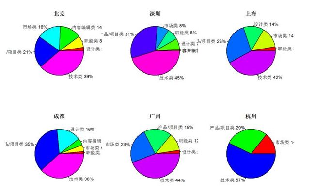
2.饼图----展示的是各大城市职位的组成
代码部分:
library(RODBC)
par(mfrow=c(2,3))
myconn=odbcConnect("MySQLODBC","root","")
works<-sqlQuery(myconn,"select catalog, count(recruitNumber) as recruits from newsanalysis_tencent where workLocation='北京' group by catalog order by recruits")
city<-works['catalog']
recruits<-works['recruits']
recruits<-as.matrix(recruits)
recruits<-as.numeric(recruits)
city<-works['catalog']
city<-as.character(unlist(city['catalog']))#将数据框类型转换为字符型
pct<-round(recruits/sum(recruits)*100)
lbls2<-paste(city," ",pct,"%",sep="")
pie(recruits,labels=lbls2,col=rainbow(length(lbls2)),radius=1,main = "北京")
works<-sqlQuery(myconn,"select catalog, count(recruitNumber) as recruits from newsanalysis_tencent where workLocation='深圳' group by catalog order by recruits asc")
city<-works['catalog']
recruits<-works['recruits']
recruits<-as.matrix(recruits)
recruits<-as.numeric(recruits)
city<-works['catalog']
city<-as.character(unlist(city['catalog']))#将数据框类型转换为字符型
pct<-round(recruits/sum(recruits)*100)
lbls2<-paste(city," ",pct,"%",sep="")
pie(recruits,labels=lbls2,col=rainbow(length(lbls2)),radius=1,main = "深圳")
works<-sqlQuery(myconn,"select catalog, count(recruitNumber) as recruits from newsanalysis_tencent where workLocation='上海' group by catalog order by recruits asc")
city<-works['catalog']
recruits<-works['recruits']
recruits<-as.matrix(recruits)
recruits<-as.numeric(recruits)
city<-works['catalog']
city<-as.character(unlist(city['catalog']))#将数据框类型转换为字符型
pct<-round(recruits/sum(recruits)*100)
lbls2<-paste(city," ",pct,"%",sep="")
pie(recruits,labels=lbls2,col=rainbow(length(lbls2)),radius=1,main = "上海")
works<-sqlQuery(myconn,"select catalog, count(recruitNumber) as recruits from newsanalysis_tencent where workLocation='成都' group by catalog order by recruits asc")
city<-works['catalog']
recruits<-works['recruits']
recruits<-as.matrix(recruits)
recruits<-as.numeric(recruits)
city<-works['catalog']
city<-as.character(unlist(city['catalog']))#将数据框类型转换为字符型
pct<-round(recruits/sum(recruits)*100)
lbls2<-paste(city," ",pct,"%",sep="")
pie(recruits,labels=lbls2,col=rainbow(length(lbls2)),radius=1,main = "成都")
works<-sqlQuery(myconn,"select catalog, count(recruitNumber) as recruits from newsanalysis_tencent where workLocation='广州' group by catalog order by recruits asc")
city<-works['catalog']
recruits<-works['recruits']
recruits<-as.matrix(recruits)
recruits<-as.numeric(recruits)
city<-works['catalog']
city<-as.character(unlist(city['catalog']))#将数据框类型转换为字符型
pct<-round(recruits/sum(recruits)*100)
lbls2<-paste(city," ",pct,"%",sep="")
pie(recruits,labels=lbls2,col=rainbow(length(lbls2)),radius=1,main = "广州")
works<-sqlQuery(myconn,"select catalog, count(recruitNumber) as recruits from newsanalysis_tencent where workLocation='杭州' group by catalog order by recruits asc")
odbcClose(myconn)
city<-works['catalog']
recruits<-works['recruits']
recruits<-as.matrix(recruits)
recruits<-as.numeric(recruits)
city<-works['catalog']
city<-as.character(unlist(city['catalog']))#将数据框类型转换为字符型
pct<-round(recruits/sum(recruits)*100)
lbls2<-paste(city," ",pct,"%",sep="")
pie(recruits,labels=lbls2,col=rainbow(length(lbls2)),radius=1,main = "杭州")
3.条形图----展示的是每个城市的所有招聘职位数

代码部分:
library(RODBC)
library(ggplot2)
library(plotly)
library(dplyr)
myconn=odbcConnect("MySQLODBC","root","")
city<-sqlQuery(myconn,"select distinct workLocation from newsanalysis_tencent order by workLocation")
count<-sqlQuery(myconn,"select count(recruitNumber) as count from newsanalysis_tencent group by workLocation order by workLocation")
city<-cbind(city,count)
city$workLocation <- reorder(city$workLocation,city$count,function(x){-mean(x)})
city <- arrange(city,desc(count))
#取前10名
City<-city$workLocation[1:10]
Works<-city$count[1:10]
p <- ggplot(data=city[1:10,],aes(City,Works)) + geom_bar(fill='red',stat = "identity") + labs(x="城市",y="职位数",title="各地方岗位数量")
p<-ggplotly(p,width = 672,height = 480)
p
4.分布地图----展示的IT类职位在地图各大版块的分布

代码部分:
library(RODBC)
library(leaflet)
myconn=odbcConnect("MySQLODBC","root","")
city1<-sqlQuery(myconn,"select * from cities")
city2<-sqlQuery(myconn,"select * from newsanalysis_tencent where catalog='技术类' ")
city3<-sqlQuery(myconn,"select workLocation,count(recruitNumber) as sum from newsanalysis_tencent where catalog='技术类'group by workLocation")
odbcClose(myconn)
city4<-merge(city1,city2,by="workLocation")
city5<-merge(city3,city4,by="workLocation")
m <- leaflet()
m <- addTiles(m)
addMarkers(m,city5$lon,lat=city5$lat,popup=paste('',"",city5$name,"",'',city5$catalog,":",city5$sum))
好了就分享这些了。