QQ官网项目(二)
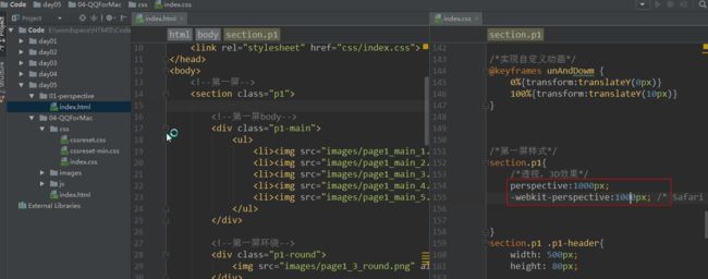
1.透视介绍
近大远小 : http://www.w3school.com.cn/cssref/pr_perspective.asp
一旦在父标签设计透视,子标签就会有透视效果

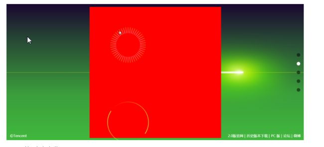
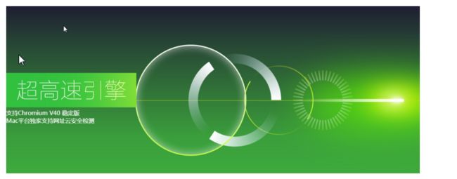
2.第一屏
1.第一屏添加透视效果
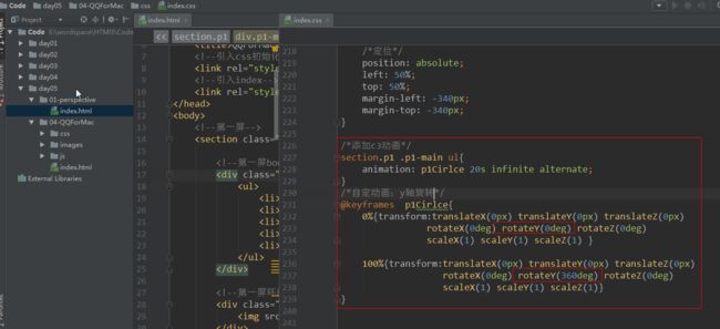
2.第一屏的舞台中ul旋转动画
按照y轴旋转
   section.p1 .p1-main ul{
            animation: p1Cirlce 20s infinite alternate;
   }

   @keyframes  p1Cirlce{
            0%{transform:translateX(0px) translateY(0px) translateZ(0px)
            rotateX(0deg) rotateY(0deg) rotateZ(0deg)
            scaleX(1) scaleY(1) scaleZ(1) }

            100%{transform:translateX(0px) translateY(0px) translateZ(0px)
            rotateX(0deg) rotateY(360deg) rotateZ(0deg)
            scaleX(1) scaleY(1) scaleZ(1)}
    }
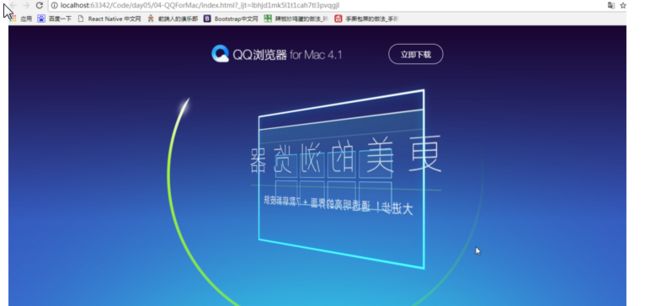
执行效果:
3.面向和背向效果
图片面向前,可见; 背向,不可见
backface-visibility
- 设计标签背向时是否可见 ;
- 如果在旋转元素不希望看到其背面时,该属性很有用。
- 在3D效果下能显现
backface-visibility: visible|hidden;
1.父标签添加3D效果
transform-style
- 属性规定如何在 3D 空间中呈现被嵌套的元素
- 该属性必须与 transform 属性一同使用
- 语法:
transform-style: flat|preserve-3d;

2.背向屏幕不显示

4后3张图片在y轴旋转180度
前面2张图片向前,后3张图片向后( 在y轴旋转180度 )
5在Z轴分层
父标签要添加3D效果

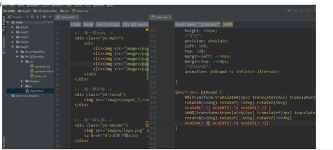
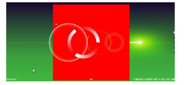
6.添加环绕动画
在Z轴添加环绕动画
/*环绕*/
section.p1 .p1-round{
    width: 680px;
    height: 680px;
    /*定位*/
    position: absolute;
    left: 50%;
    top: 50%;
    margin-left: -340px;
    margin-top: -340px;
    /*添加动画*/
    animation: p1Round 5s infinite linear;

}

7.环绕在X轴旋转60度
圆环倒下效果

8.环绕在Y轴旋转-10度
圆环切斜效果

9.环绕放大
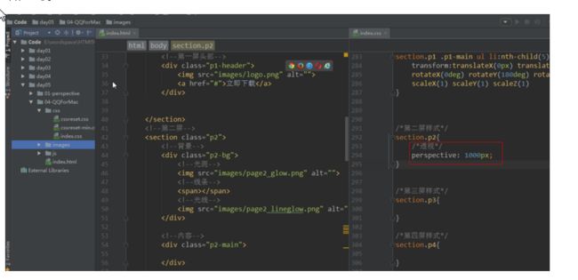
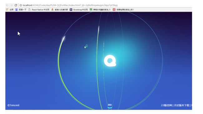
3第二屏
1.搭建布局
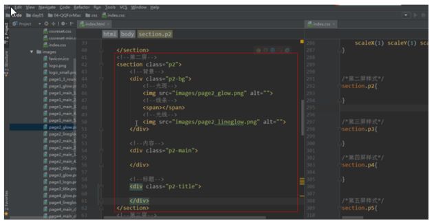
添加透视:
2.线条居中
/*线条*/
section.p2 .p2-bg span{
    height: 1px;
    width: 5000px;
    background-color: #c7e00e;
    /*定位*/
    position: absolute;
    top: 50%;
    left: 0;

    /*线条左边小右边大*/
    transform:translateX(0px) translateY(0px) translateZ(0px)
    rotateX(0deg) rotateY(-10deg) rotateZ(0deg)
    scaleX(1) scaleY(1) scaleZ(1);

    margin-left: -500px;
}

执行的效果:

3.光斑和光线
注意:nth-child( ) 选中的标签

执行效果:

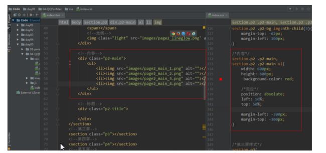
4.内容布局
1.内容布局
执行的效果:
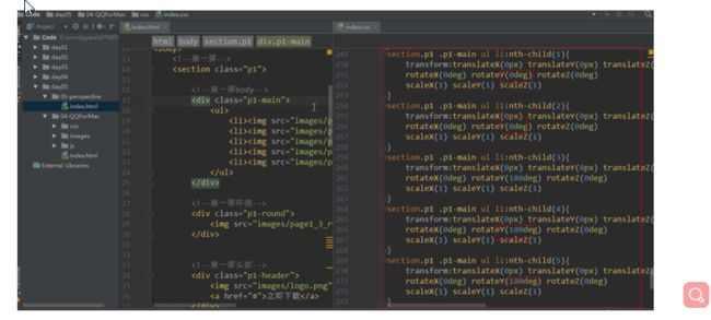
2.里面的li内容定位
!](http://upload-images.jianshu.io/upload_images/5793792-80dea0d8a6638f95.png?imageMogr2/auto-orient/strip%7CimageView2/2/w/1240)
5.平移图片
section.p2 .p2-main ul li:nth-child(1){
left: 80%;
}
section.p2 .p2-main ul li:nth-child(2){
left: 60%;
}
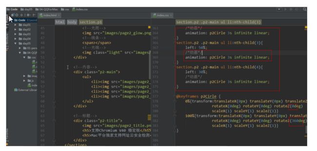
section.p2 .p2-main ul li:nth-child(3){
left: 50%;
}
section.p2 .p2-main ul li:nth-child(4){
left: 30%;
}
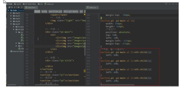
执行效果:
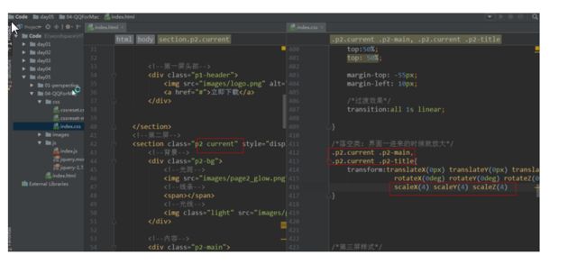
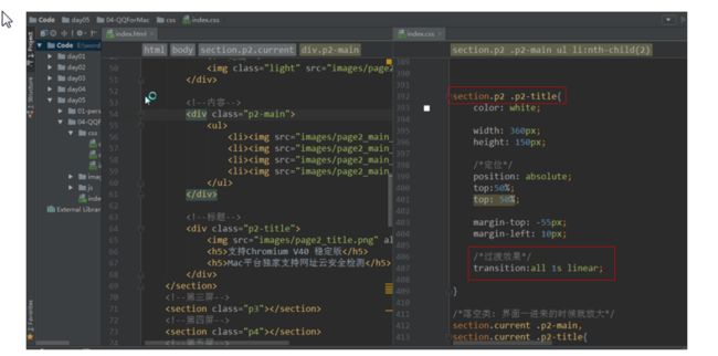
6.标题布局

执行效果:
7.旋转动画
针对每一个li标签执行动画
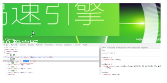
8.落空类
1.界面一进来默认放大
2.删除放大的样式(落空类)
1.手动删除落空类
2.添加过渡效果
//all    :  默认属性
//1s     :过渡时间
//linear :速度曲线
transition: all 1s linear;
3.js删除落空类

4第三屏
1.背景布局

section.p3 .p3-bg img{
    /*定位*/
    position: absolute;
    top: 50%;
    left: 50%;
}

section.p3 .p3-bg img:nth-child(1){
    margin-top: -555px;
    margin-left: -690px;

}
section.p3 .p3-bg img:nth-child(2){
    margin-top: -65px;
    margin-left: -65px;
}
执行效果:

2.内容布局800

执行的效果

3.分离内容中的li标签
在Y轴旋 + - 60 度

4.li添加轨道
section.p3 .p3-main ul li{
    ....

    /*轨道*/
    border: 1px solid #5ec0ff;
    border-radius: 50%;
}
效果:
5.li实现公转
每一个 li 标签都沿着 Y 轴旋转360 度
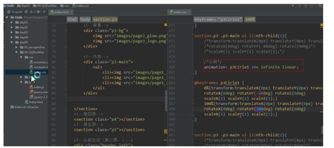
section.p3 .p3-main ul li:nth-child(1){
    /*transform:translateX(0px) translateY(0px) translateZ(0px)*/
    /*rotateX(0deg) rotateY(-80deg) rotateZ(0deg)*/
    /*scaleX(1) scaleY(1) scaleZ(1);*/

    /*公转*/
    animation: p3Cirle1 20s infinite linear;
}

@keyframes p3Cirle1 {
    0%{transform:translateX(0px) translateY(0px) translateZ(0px)
    rotateX(0deg) rotateY(-60deg) rotateZ(0deg)
    scaleX(1) scaleY(1) scaleZ(1);}
    100%{transform:translateX(0px) translateY(0px) translateZ(0px)
    rotateX(0deg) rotateY(300deg) rotateZ(0deg)
    scaleX(1) scaleY(1) scaleZ(1);}
}


section.p3 .p3-main ul li:nth-child(2){
    /*transform:translateX(0px) translateY(0px) translateZ(0px)*/
    /*rotateX(0deg) rotateY(0deg) rotateZ(0deg)*/
    /*scaleX(1) scaleY(1) scaleZ(1);*/
    /*公转*/
    animation: p3Cirle2 20s infinite linear;
}

@keyframes p3Cirle2 {
    0%{transform:translateX(0px) translateY(0px) translateZ(0px)
                rotateX(0deg) rotateY(0deg) rotateZ(0deg)
                scaleX(1) scaleY(1) scaleZ(1);}
    100%{transform:translateX(0px) translateY(0px) translateZ(0px)
                rotateX(0deg) rotateY(360deg) rotateZ(0deg)
                scaleX(1) scaleY(1) scaleZ(1);}
}


section.p3 .p3-main ul li:nth-child(3){
    /*transform:translateX(0px) translateY(0px) translateZ(0px)*/
    /*rotateX(0deg) rotateY(80deg) rotateZ(0deg)*/
    /*scaleX(1) scaleY(1) scaleZ(1);*/
    /*公转*/
    animation: p3Cirle3 20s infinite linear;
}

@keyframes p3Cirle3 {
    0%{transform:translateX(0px) translateY(0px) translateZ(0px)
    rotateX(0deg) rotateY(60deg) rotateZ(0deg)
    scaleX(1) scaleY(1) scaleZ(1);}
    100%{transform:translateX(0px) translateY(0px) translateZ(0px)
    rotateX(0deg) rotateY(420deg) rotateZ(0deg)
    scaleX(1) scaleY(1) scaleZ(1);}
}
6.li实现倾斜
每个li 标签 在 X 轴旋转 75 度

7.img实现自转
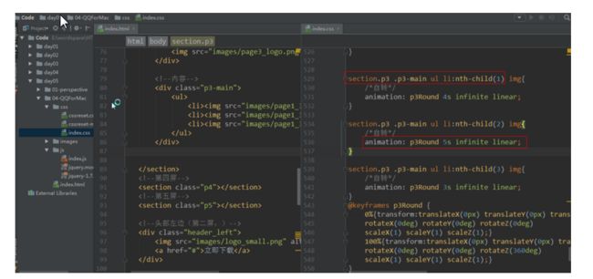
section.p3 .p3-main ul li:nth-child(1) img{
    /*自转*/
    animation: p3Round 4s infinite linear;
}

section.p3 .p3-main ul li:nth-child(2) img{
    /*自转*/
    animation: p3Round 5s infinite linear;
}

section.p3 .p3-main ul li:nth-child(3) img{
    /*自转*/
    animation: p3Round 3s infinite linear;
}
@keyframes p3Round {
    0%{transform:translateX(0px) translateY(0px) translateZ(0px)
    rotateX(0deg) rotateY(0deg) rotateZ(0deg)
    scaleX(1) scaleY(1) scaleZ(1);}
    100%{transform:translateX(0px) translateY(0px) translateZ(0px)
    rotateX(0deg) rotateY(0deg) rotateZ(360deg)
    scaleX(1) scaleY(1) scaleZ(1);}
}
8.实现标题
1.标题布局

效果:
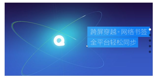
2.标题旋转
标题沿着 Y 轴旋转 -40 度 ; 沿着 X 轴旋转 10 度

9.落空类
1.默认放大-拉远
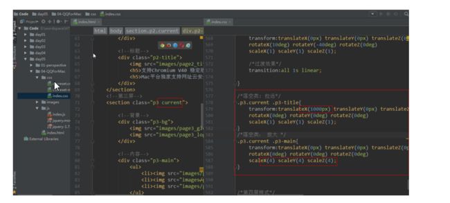
2.落空类添加过渡效果am

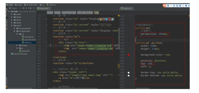
5第四屏
1.背景布局
1.背景定位
效果:

2.光线定位

效果:

3.光线动画

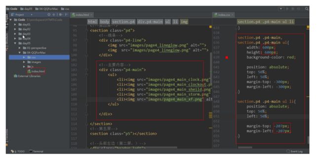
2中间内容
1.布局定位
执行效果:
2.X轴旋转45度
ul在X轴旋转45度

效果:

3.在Z轴分层
1.加3D特效
ul 添加3D特效
transform-style
- 属性规定如何在 3D 空间中呈现被嵌套的元素
- 该属性必须与 transform 属性一同使用
- 语法:
transform-style: preserve-3d
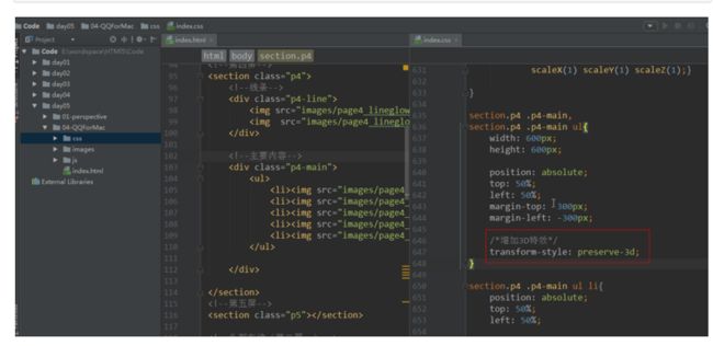
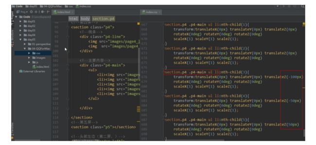
2.分层
li在Z轴分层 , 父标签要添加3D效果
效果:
4.图片旋转

3.标签

效果:

4.标题
在x轴旋转30度, 放大1.2倍

5.落空类
标签从左边进来 , 标题从右边进来, 中间内容落空

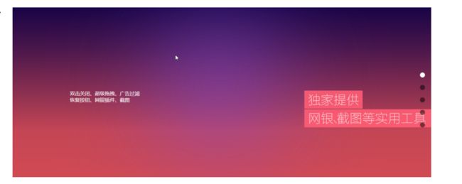
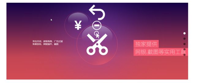
6第五屏
1.标签和标题布局
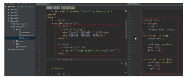
执行的效果:
2.中间内容
1.舞台ul布局
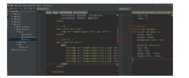
效果:

2.li 布局
效果:

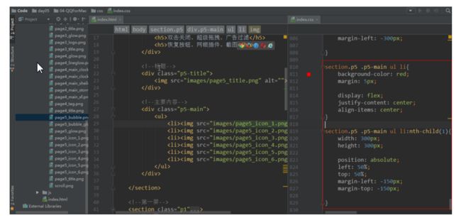
3.li 添加背景
1.第一张图的背景
section.p5 .p5-main ul li:nth-child(1){
    width: 305px;
    height: 305px;

    position: absolute;
    left: 50%;
    top: 50%;
    margin-left: -150px;
    margin-top: -150px;

    background: url("../images/page5_bubble_glow.png");
}

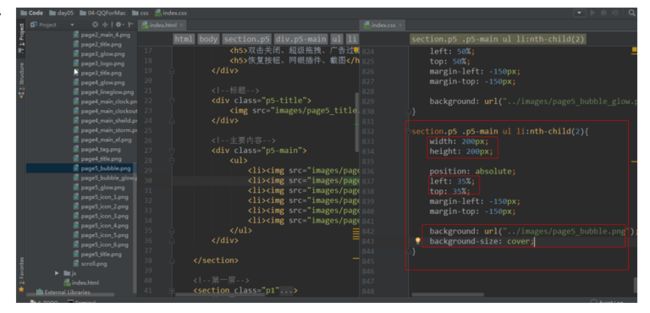
2.第二张图的背景
section.p5 .p5-main ul li:nth-child(2){
    width: 200px;
    height: 200px;

    position: absolute;
    left: 35%;
    top: 35%;
    margin-left: -150px;
    margin-top: -150px;

    background: url("../images/page5_bubble.png");
    background-size: cover;
}
执行效果:
3.第三张图的背景
section.p5 .p5-main ul li:nth-child(3){
    width: 250px;
    height: 250px;

    position: absolute;
    left: 25%;
    top: 90%;
    margin-left: -150px;
    margin-top: -150px;

    background: url("../images/page5_bubble.png");
    background-size: cover;
}

4.第四张图的背景
section.p5 .p5-main ul li:nth-child(4){
    width: 180px;
    height: 180px;

    position: absolute;
    left: 95%;
    top: 90%;
    margin-left: -150px;
    margin-top: -150px;

    background: url("../images/page5_bubble.png");
    background-size: cover;
}
5.第五张图的背景
section.p5 .p5-main ul li:nth-child(5){
    width: 120px;
    height: 120px;

    position: absolute;
    left: 75%;
    top: 45%;

    margin-top: -150px;

    background: url("../images/page5_bubble.png");
    background-size: cover;
}
6.第六张图的背景
section.p5 .p5-main ul li:nth-child(6){
    width: 90px;
    height: 90px;

    position: absolute;
    left: 90%;
    top: 55%;

    margin-top: -150px;

    background: url("../images/page5_bubble.png");
    background-size: cover;
}
执行的效果:

7.最后一张图片缩小

3.落空类
1.标签和标题落空
记住: 1. 要添加动画过渡类 ; 2. 标签和标题旋转坐标在右下角( 100% , 100% )
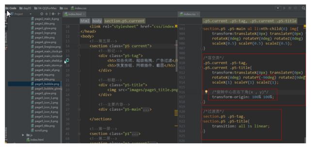
2.内容落空类
记住: 要给li标签添加动画过渡类
//x轴坐标(-1000,  0 )
.p5.current .p5-main ul li:nth-child(1){
    transform:translateX(-1000px) translateY(0px) translateZ(0px)
    rotateX(0deg) rotateY(0deg) rotateZ(0deg)
    scaleX(1) scaleY(1) scaleZ(1);
}

//x轴坐标(-1000,-1000)
.p5.current .p5-main ul li:nth-child(2){
    transform:translateX(-1000px) translateY(-1000px) translateZ(0px)
    rotateX(0deg) rotateY(0deg) rotateZ(0deg)
    scaleX(1) scaleY(1) scaleZ(1);
}

//x轴坐标(-1000,400)
.p5.current .p5-main ul li:nth-child(3){
    transform:translateX(-1000px) translateY(400px) translateZ(0px)
    rotateX(0deg) rotateY(0deg) rotateZ(0deg)
    scaleX(1) scaleY(1) scaleZ(1);
}

//x轴坐标(1000, 900)
.p5.current .p5-main ul li:nth-child(4){
    transform:translateX(1000px) translateY(900px) translateZ(0px)
    rotateX(0deg) rotateY(0deg) rotateZ(0deg)
    scaleX(1) scaleY(1) scaleZ(1);
}

//x轴坐标(1000, -1000)
.p5.current .p5-main ul li:nth-child(5){
    transform:translateX(1000px) translateY(-1000px) translateZ(0px)
    rotateX(0deg) rotateY(0deg) rotateZ(0deg)
    scaleX(1) scaleY(1) scaleZ(1);
}

//x轴坐标(10000,-300)
.p5.current .p5-main ul li:nth-child(6){
    transform:translateX(1000px) translateY(-300px) translateZ(0px)
    rotateX(0deg) rotateY(0deg) rotateZ(0deg)
    scaleX(1) scaleY(1) scaleZ(1);
}