此篇僅供個人新手學習使用,感謝各位作者大佬:
我熟知的三种三栏网页宽度自适应布局方法
双飞翼布局介绍-始于淘宝UED
CSS 布局十八般武艺都在这里了
CSS布局终极方案之--圣杯布局(兼容IE6+,现代浏览器)
查看测试
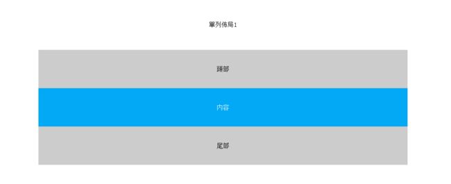
單列佈局1
- 頭部、内容、底部,寬度一致,不自適應;
HTML
頭部
内容
CSS
*{
    text-align: center;
    line-height: 100px;
}
body{
    margin: 0;
}
.header{
    height: 100px;
    background-color: #cccccc;
}
.content{
    min-height: 100px;
    color: #fff;
    background-color: #03A9F4;
}
.footer{
    height: 100px;
    background-color: #cccccc;
}
#layout1{
    /*   width: 960px; *//*设置width当浏览器窗口宽度小于960px时,单列布局不会自适应。*/
    max-width: 960px;
    margin: 0 auto;
}
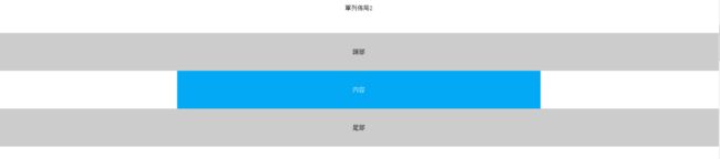
單列佈局2
- 頭部、底部寬度100%;
- 内容寬度固定;
HTML
頭部
内容
CSS
*{
    text-align: center;
    line-height: 100px;
}
body{
    margin: 0;
}
.header{
    height: 100px;
    background-color: #cccccc;
}
.content{
    min-height: 100px;
    color: #fff;
    background-color: #03A9F4;
}
.footer{
    height: 100px;
    background-color: #cccccc;
}
#layout2{
    /*   width: 960px; *//*设置width当浏览器窗口宽度小于960px时,单列布局不会自适应。*/
    max-width: 960px;
    margin: 0 auto;
}
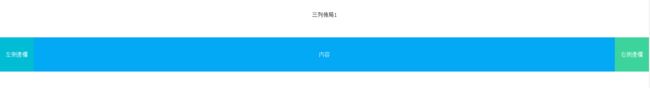
三列佈局1
- 左右側邊欄寬度固定,主内容欄寬度自適應;
- float+margin;
需要注意:
- 要先寫兩個側邊欄再寫内容,否則第二個側邊欄會被内容擠到下一行;
HTML
    左側邊欄
    右側邊欄
    内容
CSS
*{
    text-align: center;
    line-height: 100px;
}
body{
    margin: 0;
}
.content{
    min-height: 100px;
    color: #fff;
    background-color: #03A9F4;
}
.left{
    width: 100px;
    color: #fff;
    background-color: #00bcd4;
}
.right{
    width: 100px;
    color: #fff;
    background-color: #3CD49C;
}
#layout3 .left{
    float: left;
}
#layout3 .right{
    float: right;
}
#layout3 .content{
    margin-left: 100px;
    margin-right: 100px;
}
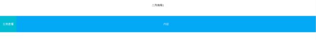
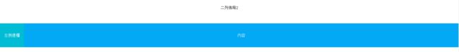
二列佈局1
- 左/右側邊欄寬度固定,主内容欄寬度自適應,與三列一致,衹是去掉了一個側邊欄,然後内容不設置左或右的margin;
- float+margin;
HTML
    左側邊欄
    内容
CSS
*{
    text-align: center;
    line-height: 100px;
}
body{
    margin: 0;
}
.content{
    min-height: 100px;
    color: #fff;
    background-color: #03A9F4;
}
.left{
    width: 100px;
    color: #fff;
    background-color: #00bcd4;
}
.right{
    width: 100px;
    color: #fff;
    background-color: #3CD49C;
}
#layout3 .left{
    float: left;
}
#layout3 .right{
    float: right;
}
#layout3 .content{
    margin-left: 100px;
    margin-right: 100px;
}
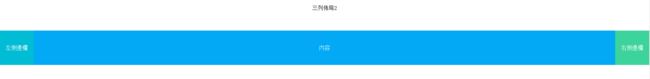
三列佈局2
- 左右側邊欄寬度固定 主内容欄寬度自適應;
- float+margin;
需要注意:
- 這裏div順序不是問題,打亂也不會改變佈局;
- IE5情況下,layout4要清除浮動;
HTML
    左側邊欄
    内容
    右側邊欄
CSS
*{
    text-align: center;
    line-height: 100px;
}
body{
    margin: 0;
}
.content{
    min-height: 100px;
    color: #fff;
    background-color: #03A9F4;
}
.left{
    width: 100px;
    color: #fff;
    background-color: #00bcd4;
}
.right{
    width: 100px;
    color: #fff;
    background-color: #3CD49C;
}
#layout4{
    position: relative;
    overflow: auto;
    zoom:1;
}
#layout4 .left{
    position:absolute;
    top:0;
    left: 0;
}
#layout4 .right{
    position:absolute;
    top:0;
    right: 0;
}
#layout4 .content{
    margin-left: 100px;
    margin-right: 100px;
    /*min-width: 600px;*//*當設置了最小寬度,或是内部元素含有一定的寬度,在瀏覽器窗口小到一定程度時將會與側邊欄重叠或是直接超出;*/
}
二列佈局2
- 左/右側邊欄寬度固定,主内容欄寬度自適應,與三列一致,衹是去掉了一個側邊欄,然後内容不設置左或右的margin;
- float+margin;
需要注意:
- 這裏div順序不是問題,打亂也不會改變佈局;
- IE5情況下,layout4要清除浮動;
HTML
    左側邊欄
    内容
CSS
*{
    text-align: center;
    line-height: 100px;
}
body{
    margin: 0;
}
.content{
    min-height: 100px;
    color: #fff;
    background-color: #03A9F4;
}
.left{
    width: 100px;
    color: #fff;
    background-color: #00bcd4;
}
.right{
    width: 100px;
    color: #fff;
    background-color: #3CD49C;
}
#layout4{
    position: relative;
    overflow: auto;
    zoom:1;
}
#layout4 .left{
    position:absolute;
    top:0;
    left: 0;
}
#layout4 .right{
    position:absolute;
    top:0;
    right: 0;
}
#layout4 .content{
    margin-left: 100px;
    margin-right: 100px;
    /*min-width: 600px;*//*當設置了最小寬度,或是内部元素含有一定的寬度,在瀏覽器窗口小到一定程度時將會與側邊欄重叠或是直接超出;*/
}
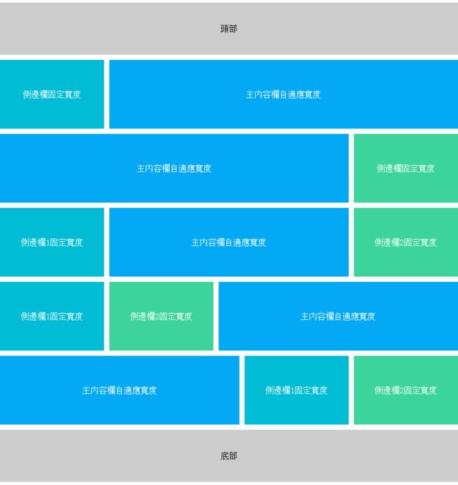
經典三列佈局,也叫做聖杯佈局【Holy Grail of Layouts】,是Kevin Cornell在2006年提出的一個佈局模型概念,在國内最早是由淘寶UED的工程師傳播開來,在中國也有叫法是雙飛翼佈局,它在佈局要求有幾點:
1、三列佈局,中間寬度自適應,兩邊定寬;
2、中間欄要在瀏覽器中優先展示渲染;
3、允許任意列的高度最高;
4、要求衹用一個額外的DIV標簽;
5、要求用最簡單的CSS、最少的HACK語句;
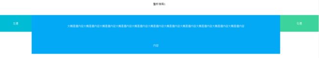
聖杯佈局1
需要注意:
- 順序不可亂,左右屬性其實是寫死的;
- 窗口過小時佈局會錯亂;
- 父級需要清除浮動;
HTML
        大概是個内容大概是個内容大概是個内容大概是個内容大概是個内容大概是個内容大概是個内容大概是個内容大概是個内容大概是個内容大概是個内容
        内容
    左邊
    右邊
CSS
*{
    text-align: center;
    line-height: 100px;
}
body{
    margin: 0;
}
.content{
    min-height: 100px;
    color: #fff;
    background-color: #03A9F4;
}
.left{
    width: 100px;
    color: #fff;
    background-color: #00bcd4;
}
.right{
    width: 100px;
    color: #fff;
    background-color: #3CD49C;
}
#layout5{
    padding: 0 230px 0 190px;
    overflow: auto;
    zoom:1;
}
#layout5 .content{
    float: left;
    width: 100%;
}
#layout5 .left{
    float: left;
    width: 190px;
    height: 100px;
    margin-left: -100%;
    position: relative;
    left: -190px;
}
#layout5 .right{
    float: left;
    width: 230px;
    height: 100px;
    margin-left: -230px;
    position: relative;
    right: -230px;
}
聖杯佈局2
- 該方法先將整個主體向左縮進210px,該空間就是側邊欄的寬度;
需要注意:
- 側邊欄内子集的寬度,超過側邊欄的寬度的話,將會拓展出來,不會影響佈局,但是影響美觀;
- 主體有個padding-left,所以當瀏覽器窗口縮小到一定程度時,主體寬度是100%+padding-left的數值,這時候頭部和底部就會出現空白距離,并且會出現滾動條;
- IE7模式下瀏覽器窗口縮小到635像素左右,有機氯將會排版錯亂,刷新后正常;
HTML
        大概是個内容大概是個内容大概是個内容大概是個内容大概是個内容大概是個内容大概是個内容大概是個内容大概是個内容大概是個内容大概是個内容
        内容
    左邊
    右邊
CSS
*{
    text-align: center;
    line-height: 100px;
}
body{
    margin: 0;
}
.header{
    height: 100px;
    background-color: #cccccc;
}
.content{
    min-height: 100px;
    color: #fff;
    background-color: #03A9F4;
}
.left{
    width: 100px;
    color: #fff;
    background-color: #00bcd4;
}
.right{
    width: 100px;
    color: #fff;
    background-color: #3CD49C;
}
.footer{
    height: 100px;
    background-color: #cccccc;
}
#layout6 .lc, #layout6 .cr, #layout6 .lcr, #layout6 .lrc , #layout6 .clr{
    margin: 10px 0;
    min-width: 400px;
}
#layout6 .content{
    float: left;
    width: 100%;
}
/* 左側邊欄固定寬度,内容自適應 */
#layout6 .lc{
    zoom: 1;
    overflow: hidden;
    padding-left: 210px;
}
#layout6 .lc .left{
    float: left;
    width: 200px;
    margin-left: -100%; /* = -100% */
    position: relative;
    left: -210px; /* 減去父級的padding-left */
}
/* 右側邊欄固定寬度,内容自適應 */
#layout6 .cr{
    zoom: 1;
    overflow: hidden;
    padding-right: 210px;
}
#layout6 .cr .right{
    float: left;
    width: 200px;
    margin-left: -200px; /* 數值為當前寬度 */
    position: relative;
    right: -210px; /* 減去父級的padding-right */
}
/* 左中右 内容自適應 */
#layout6 .lcr{
    zoom: 1;
    overflow: hidden;
    padding-left: 210px;
    padding-right: 210px;
}
#layout6 .lcr .left{
    float: left;
    width: 200px;
    margin-left: -100%;
    position: relative;
    left: -210px; /* 減去父級的padding-left */
}
#layout6 .lcr .right{
    float: left;
    width: 200px;
    margin-left: -200px;
    position: relative;
    right: -210px; /* 減去父級的padding-right */
}
/* 左右側邊欄固定寬度,都在左邊 内容自適應 */
#layout6 .lrc{
    zoom: 1;
    overflow: hidden;
    padding-left: 420px;
}
#layout6 .lrc .left{
    float: left;
    width: 200px;
    margin-left: -100%;
    position: relative;
    left: -420px; /* 減去父級的padding-left */
}
#layout6 .lrc .right{
    float: left;
    width: 200px;
    margin-left: -100%;
    position: relative;
    left: -210px; /* 減去父級的padding-left */
}
/* 左右側邊欄固定寬度,都在右邊 内容自適應 */
#layout6 .clr{
    zoom: 1;
    overflow: hidden;
    padding-right: 420px;
}
#layout6 .clr .left{
    float: left;
    width: 200px;
    margin-left: -200px;
    position: relative;
    right: -210px; /* 減去父級的padding-right */
}
#layout6 .clr .right{
    float: left;
    width: 200px;
    margin-left: -200px;
    position: relative;
    right: -420px; /* 減去父級的padding-right */
}
來自於淘寶UED,可以看做是聖杯佈局的改良版
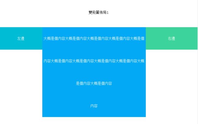
雙飛翼佈局1
- 這個佈局與聖杯佈局原理差不多,衹是雙飛翼不需要
position:relative這個屬性;
HTML
            大概是個内容大概是個内容大概是個内容大概是個内容大概是個内容大概是個内容大概是個内容大概是個内容大概是個内容大概是個内容大概是個内容
            内容


    左邊
    右邊
CSS
#layout7{
    overflow: auto;
    zoom:1;
}
#layout7 .left{
    float: left;
    width: 190px;
    margin-left: -100%;
}
#layout7 .right{
    float: left;
    width: 230px;
    margin-left: -230px;
}
#layout7 .content{
    margin: 0 230px 0 190px;/*在聖杯佈局中,這裏是padding*/
}
2017年4月1日 第一次整理