select {
/*Chrome和Firefox里面的边框是不一样的,所以复写了一下*/
border: solid 1px #A9A9A9;
/*很关键:将默认的select选择框样式清除*/
appearance:none;
-moz-appearance:none;
-webkit-appearance:none;
/*在选择框的最右侧中间显示小箭头图片*/
background:#fff url("../img/select_reset.png") no-repeat scroll right center;
/*为下拉小箭头留出一点位置,避免被文字覆盖*/
padding-left:7px;
padding-right: 17px;
}
/*清除ie的默认选择框样式清除,隐藏下拉箭头*/
select::-ms-expand { display: none; }
3、一句代码让你的彩色图片变灰
img.desaturate {
  filter: grayscale(100%);
  -webkit-filter: grayscale(100%);
  -moz-filter: grayscale(100%);
  -ms-filter: grayscale(100%);
  -o-filter: grayscale(100%);
}

4. 使用 :not() 在菜单上应用/取消应用边框
……可以直接使用 :not() 伪类来应用元素:
.nav li:not(:last-child) {
 border-right: 1px solid #666;
}
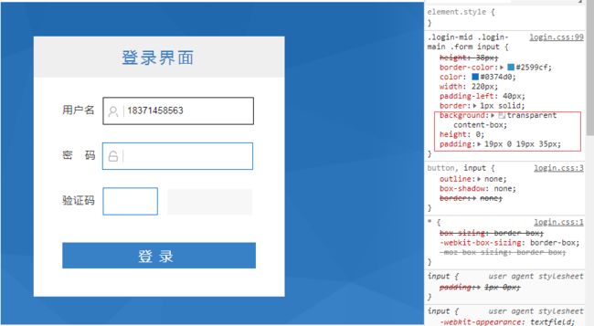
.form input{
height: 38px;
border-color: #2599cf;
color: #0374d0;
width: 220px;
padding-left: 40px;
border:1px solid;
background: transparent content-box;
height: 0;
padding: 19px 0 19px 35px;
}
li {
 display: none;
}
/* select items 1 through 3 and display them */
li:nth-child(-n+3) {
 display: block;
}
h2[data-text] {
position: relative;
}
h2[data-text]::after {
content: attr(data-text);
z-index: 10;
color: #e3e3e3;
position: absolute;
top: 0; left: 0;
-webkit-mask-image: -webkit-gradient(linear, left top, left bottom, from(rgba(0,0,0,0)), color-stop(50%, rgba(0,0,0,1)), to(rgba(0,0,0,0)));
}
还有另外一种:
background: linear-gradient(to right, red, blue);
-webkit-background-clip: text;
color: transparent;

9、文本模糊
color: transparent;
text-shadow: 0 0 5px rgba(0,0,0,0.5);

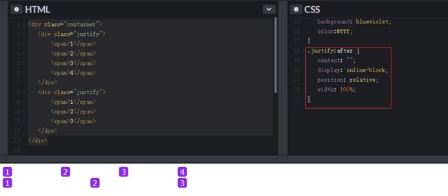
10、不使用flex,文本两端对齐
第一种,没有嵌套标签:
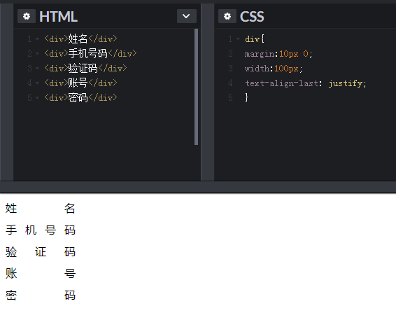
第二种,有嵌套标签:
html代码:
     1234


     123
样式:
.container{
  width:400px;
}
.justify{
  width:100%;
  height:24px;
  text-align: justify;
  position:relative;
}
span{
  display:inline-block;
  width: 20px;
  text-align: center;
  border-radius: 4px;
  background: blueviolet;
  color:#fff;
}
效果如下:

没有得到意料之中的结果,并没有实现所谓的两端对齐,原因是:
虽然 `text-align:justify` 属性是全兼容的,但是要使用它实现两端对齐,需要注意在模块之间添加**[空格/换行符/制表符]**才能起作用。
也就是说每一个 1 间隙,至少需要有一个空格或者换行或者制表符才行。
然后,我们更新一下 HTML 结构,采用同样的 CSS,结果是:
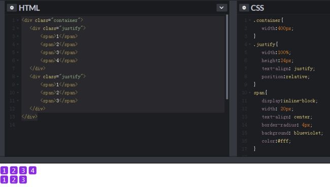
依然没有实现,原因在于 justify 只有在存在第二行(行块元素)的情况下,第一行才两端对齐,所以在这里,我们需要制造一个假的第二行,而 :after 伪元素正好再适合不过。
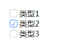
11、美化 默认的checkbox的样式
思路: 隐藏默认的checkbox , 通过label 标签for属性 锚定checkbox ,控制是否选中, 给label标签自定义样式
-
类型1
-
类型2
-
类型3
ul ,ol{
     list-style: none;display: inline-block;
 }

.list-body label{
    width: 14px;
    height: 14px;
 }

[id^="checkbox-"] + label {
    background-color: #FFF;
    border: 1px solid;
    border-color: #C1CACA;
    border-radius: 4px;
    float:left;
    position:relative;
    top: 3px;
    right: 4px;
}
[id^="checkbox-"]:checked + label {
    border-color: #38e;
    transition: all 0.5s linear 0s;
    transform-style: preserve-3d;
    transform-origin: 50% 50%;
}
[id^="checkbox-"]:checked + label:after {
    content: '\2713';
    position: relative;
    top: -5px;
    left: 2px;
    color: #38e;;
    text-align: center;
    font-size: 0.8rem;
 }
效果:
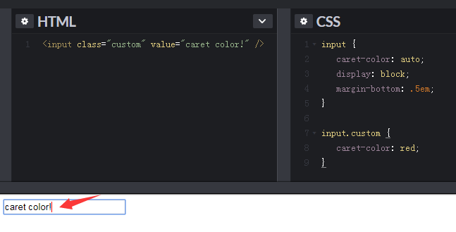
12、改变input 光标的颜色
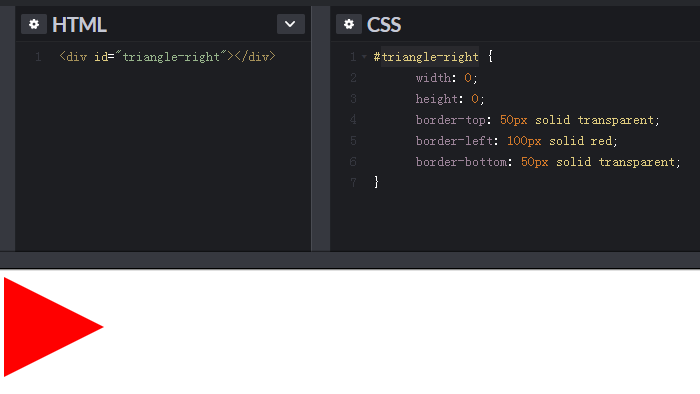
13、利用 transparent 属性实现各种三角形
14、实现文字的 波浪线 或虚线效果
相信大家对于 text-decoration 这个属性并不陌生,在重置 a 标签的默认样式时,我们经常要这样写:text-decoration: none; 可能对它了解的人也很少,实际上 text-decoration 是一个复合属性,由 line、style 和 color 组成。

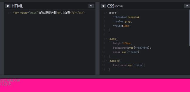
15、js可以获取修改css原生变量

16、元素可编辑
