4.数据挖掘——房价项目预测(四)matplotlib与Seaborn数据可视化学习
目录
Matplotlib
模块导入
subplot()
bar()
scatter()
imshow()
绘图颜色
Seaborn
模块导入
核密度估计图kdeplot()
观测值分布图displot()
变量间关系pairplot()
箱型图boxplot()
Matplotlib
Matplotlib 是一个 Python 的 2D绘图库,它以各种硬拷贝格式和跨平台的交互式环境生成出版质量级别的图形。通过 Matplotlib,开发者可以仅需要几行代码,便可以生成绘图,直方图,功率谱,条形图,错误图,散点图等。
目的是为Python构建一个Matlab式的绘图接口。
模块导入
import matplotlib.pyplot as plt
#忽略不必要的警告
import warnings
warnings.filterwarnings('ignore')
#令图像展示在jupyternotebook页面里
%matplotlib inline
figure:
Matplotlib的图像均位于figure对象中 创建figure:
fig = plt.figure(figsize=(12,16))
fig
相当于一个展示板,本质是一个函数,通过传递参数这个函数可以提供一块展示图像的区域。

subplot()
subplot() 函数允许你在同一图中绘制不同的东西。
fig.add_subplot(a, b, c)a,b 表示将fig分割成 a*b 的区域
c 表示当前选中要操作的区域
注意:从1开始编号(不是从0开始) plot 绘图的区域是最后一次指定subplot的位置
# 计算正弦和余弦曲线上的点的 x 和 y 坐标
x = np.arange(0,  3  * np.pi,  0.1)
y_sin = np.sin(x)
y_cos = np.cos(x)
# 建立 subplot 网格,高为 2,宽为 1
# 激活第一个 subplot
plt.subplot(2,  1,  1)
# 绘制第一个图像
plt.plot(x, y_sin)
plt.title('Sine')
# 将第二个 subplot 激活,并绘制第二个图像
plt.subplot(2,  1,  2)
plt.plot(x, y_cos)
plt.title('Cosine')
# 展示图像
plt.show()
bar()
pyplot 子模块提供 bar() 函数来生成条形图。
x =  [5,8,10]
y =  [12,16,6]
x2 =  [6,9,11]
y2 =  [6,15,7]
plt.bar(x, y, align =  'center')
plt.bar(x2, y2, color =  'g', align =  'center')
plt.title('Bar graph')
plt.ylabel('Y axis')
plt.xlabel('X axis')
plt.show()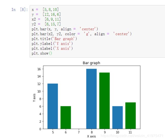
scatter()
使用scatter()来绘制散点图:
x = np.arange(50)
y = x**2+5
plt.scatter(x,y)
plt.show()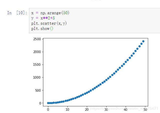
imshow()
plt.imshow()函数用作矩阵绘图 表示的是三个维度的关系,类比热力图.
m = np.random.randint(1,100,25).reshape(5,5)
print(m)
plt.imshow(m, interpolation='nearest', cmap=plt.cm.ocean)
plt.colorbar()
plt.show()

绘图颜色
| 字符 | 颜色 |
|---|---|
'b' |
蓝色 |
'g' |
绿色 |
'r' |
红色 |
'c' |
青色 |
'm' |
品红色 |
'y' |
黄色 |
'k' |
黑色 |
'w' |
白色 |
Seaborn
Seaborn其实是在matplotlib的基础上进行了更高级的API封装,从而使得作图更加容易,在大多数情况下使用seaborn就能做出很具有吸引力的图,而使用matplotlib就能制作具有更多特色的图。应该把Seaborn视为matplotlib的补充,而不是替代物。
Seaborn的特点:
- Python中的一个制图工具库,可以制作出吸引人的、信息量大的统计图
- 在Matplotlib上构建,支持numpy和pandas的数据结构可视化。
- 多个内置主题及颜色主题 可视化单一变量、二维变量用于比较数据集中各变量的分布情况
- 可视化线性回归模型中的独立变量及不独立变量
模块导入
import seaborn as sns核密度估计图kdeplot()
kdeplot是核密度估计图。具体用法如下:
seaborn.kdeplot(data, data2=None, shade=False, vertical=False, kernel='gau', bw='scott', gridsize=100, cut=3, clip=None, legend=True, cumulative=False, shade_lowest=True, cbar=False, cbar_ax=None, cbar_kws=None, ax=None, **kwargs)核密度估计(kernel density estimation)是在概率论中用来估计未知的密度函数,属于非参数检验方法之一。通过核密度估计图可以比较直观的看出数据样本本身的分布特征。
实例:绘制一个双变量分布
import numpy as np; np.random.seed(10)
import seaborn as sns; sns.set(color_codes=True)
mean, cov = [0, 2], [(1, .5), (.5, 1)]
x, y = np.random.multivariate_normal(mean, cov, size=50).T
ax = sns.kdeplot(x,y)
观测值分布图displot()
displot()集合了matplotlib的hist()与核函数估计kdeplot的功能,增加了rugplot分布观测条显示与利用scipy库fit拟合参数分布的新颖用途。
具体的用法如下:
seaborn.distplot(a, bins=None, hist=True, kde=True, rug=False, fit=None, hist_kws=None, kde_kws=None, rug_kws=None, fit_kws=None, color=None, vertical=False, norm_hist=False, axlabel=None, label=None, ax=None)实例:
x1 = np.random.normal(size=1000)
sns.distplot(x1)
变量间关系pairplot()
绘制数据集中变量间的成对关系,具体用法如下:
seaborn.pairplot(data, hue=None, hue_order=None, palette=None, vars=None, x_vars=None, y_vars=None, kind='scatter', diag_kind='auto', markers=None, height=2.5, aspect=1, dropna=True, plot_kws=None, diag_kws=None, grid_kws=None, size=None)实例:绘制联合关系地散点图和单变量分布的直方图
import seaborn as sns; sns.set(style="ticks", color_codes=True)
iris = sns.load_dataset("iris")
g = sns.pairplot(iris, hue="species")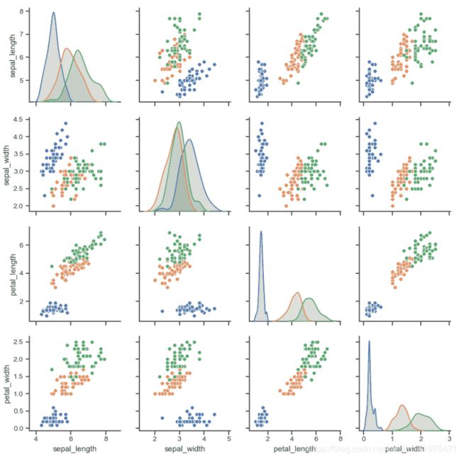
箱型图boxplot()
seaborn.boxplot 接口的作用是绘制箱形图以展现与类别相关的数据分布状况。箱形图(或盒须图)以一种利于变量之间比较或不同分类变量层次之间比较的方式来展示定量数据的分布。图中矩形框显示数据集的上下四分位数,而矩形框中延伸出的线段(触须)则用于显示其余数据的分布位置,剩下超过上下四分位间距的数据点则被视为“异常值”。
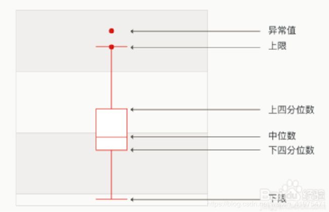
其用法为:
seaborn.boxplot(x=None, y=None, hue=None, data=None, order=None, hue_order=None, orient=None, color=None, palette=None, saturation=0.75, width=0.8, dodge=True, fliersize=5, linewidth=None, whis=1.5, notch=False, ax=None, **kwargs)实例:
dataset = sns.load_dataset("iris")#在线加载鸢尾花数据集
print(dataset.head())
sns.boxplot(x=dataset['species'], y='petal_length',data=dataset)
