display: flex以及flex-direction,justify-content,align-items
若给一个div设置display:flex;这个div就可以成为flex容器,在flex容器中用flex-direction,justify-content,align-items等属性对子div进行布局是十分方便的。
flex-direction
· flex-direction: row; (默认)
div是块级元素,默认一个div独占一行,可以通过在父级div(必须是flex容器)中设置flex-direction: row;让其在一行显示。
div1
div2

· flex-direction: column;
设置flex-direction: row;则可以让字div变为一列。
#box-container {
    height: 500px;
    display: flex;
    flex-direction: column;
}

· flex-direction: column;
flex-direction: column;让子元素反向一行显示:
#box-container {
    height: 500px;
    display: flex;
    flex-direction: row-reverse;
    border: 1px solid black;
}

· flex-direction: column;
让子元素反向一列显示
#box-container {
   height: 500px;
   display: flex;
   flex-direction: column-reverse;
   border: 1px solid black;
}

justify-content
justify-content的可选值包括:
- flex-start:从 flex 容器的前端开始排列项目。对行来说是把项目都靠左放,对于列是把项目都靠顶部放。
- flex-end:从 flex 容器的后端开始排列项目。对行来说是把项目都靠右放,对于列是把项目都靠底部放。
- center:可以让 flex 子元素排列在 flex 容器中间。
- space-between:项目间保留一定间距地在主轴排列。第一个和最后一个项目会被挤到容器边沿。例如,在行中第一个项目会紧贴着容器左侧,最后一个项目会紧贴着容器右侧,然后其他项目均匀排布。
- space-around:与space-between相似,但头尾两个项目不会紧贴容器边缘,空间会均匀分布在所有项目两边
· justify-content: center;
justify-content: center;可让子元素居中显示。
#box-container {
   height: 300px;
   display: flex;
   flex-direction: row;
   justify-content: center;
   border: 1px solid black;
}

若flex-direction:column;则为上下居中:
#box-container {
   height: 300px;
    display: flex;
    flex-direction: column;
    justify-content: center;
    border: 1px solid black;
}

· justify-content: flex-start; (默认)
默认值
#box-container {
    height: 300px;
    display: flex;
    flex-direction: row;
    justify-content: flex-start;
    border: 1px solid black;
}

· justify-content: flex-end;
从父元素尾部开始排列
#box-container {
    height: 300px;
    display: flex;
    flex-direction: row;
    justify-content: flex-end;
    border: 1px solid black;
}

flex-direction: column;时的效果类似只不过从横向排列改为纵向排列,后面就不演示了。
· justify-content: space-between;
子元素均匀排列,紧贴父元素头尾两端。
#box-container {
    height: 300px;
    display: flex;
    flex-direction: row;
    justify-content: space-between;
    border: 1px solid black;
}
加入一个颜色为green的div3(其余属性和div1,div2完全一样),效果更明显:
· justify-content: space-around;
子元素完全均匀排列,不紧贴父元素头尾两端。
#box-container {
    height: 300px;
    display: flex;
    flex-direction: row;
    justify-content: space-around;
    border: 1px solid black;
}

align-items
align-items的可选值包括:
- flex-start:从 flex 容器的前端开始排列项目。对行来说是把项目都靠顶部放,对于列是把项目都靠左放。
- flex-end:从 flex 容器的后端开始排列项目。对行来说是把项目都靠底部放,对于列是把项目都靠右放。
- center:把项目的位置调整到中间。对于行,垂直居中(项目上下方空间相等)。对于列,水平居中(项目左右方空间相等)。
- stretch:拉伸项目,填满 flex 容器。例如,排成行的项目从容器顶部拉伸到底部.
- baseline:基线对齐地排列。基线是字体相关的概念,可以认为字体坐落在基线上。
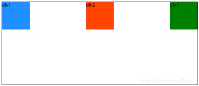
· align-items: flex-start;(默认)
#box-container {
    height: 300px;
    display: flex;
    flex-direction: row;
    align-items: flex-start;
    border: 1px solid black;
}

· align-items: flex-end;
#box-container {
    height: 300px;
    display: flex;
    flex-direction: row;
    align-items: flex-end;
    border: 1px solid black;
}

· align-items: center;
#box-container {
    height: 300px;
    display: flex;
    flex-direction: row;
    align-items: center;
    border: 1px solid black;
}

· align-items: stretch;
#box-container {
    height: 300px;
    display: flex;
    flex-direction: row;
    align-items: stretch;
    border: 1px solid black;
}
#box-1 {
    background-color: dodgerblue;
    /*width: 100px;*/
    /*height: 100px;*/
}
#box-2 {
    background-color: orangered;
    /*width: 100px;*/
    /*height: 100px;*/
}
#box-3 {
    background-color: green;
    width: 100px;
    height: 100px;
}
取消div1和div2的宽高设置,在没有设置大小的情况下,align-items: stretch;时子元素铺满父元素:

· align-items: baseline;
#box-container {
    height: 300px;
    display: flex;
    flex-direction: row;
    align-items: baseline;
    border: 1px solid black;
}

用以上属性可以很容易的对子级div进行布局,例如让子级div上下左右居中:
div1

虽然这个很好实现布局,但还是要根据实际情况运用。