Grammar of Graphic 图形语法
In brief, the grammar tells us that a statistical graphic is a mapping from data to aesthetic attributes (colour, shape, size) of geometric objects (points, lines, bars). The plot may also contain statistical transformations of the data and is drawn on a specific coordinate system
-from ggplot2 book
总的来说,图形语法就是在制作图形时把数据映射到几何图形的美学特征上,这些几何图形包括点,线,条形等,美学特征包括色彩,形状,尺寸等。统计图形中也包含统计数据在特定坐标系统上的转换信息。
The goal of the grammar is to “Shorten the distance from mind to page”.
plot =aesthetic + geoms
| Recall what you know about R's base plotting system. Which of the following
| does NOT apply to it?

1: Start with plot (or similar) function
2: Use annotation functions to add/modify (text, lines, points, axis)
3: Can easily go back once the plot has started (e.g., to adjust margins or correct a typo)
4: It is convenient and mirrors how we think of building plots and analyzing data

Selection: 3

| Recall what you know about R's lattice plotting system. Which of the
| following does NOT apply to it?

1: Plots are created with a single function call (xyplot, bwplot, etc.)
2: Margins and spacing are set automatically because entire plot is specified at once
3: Most useful for conditioning types of plots and putting many panels on one plot
4: Can always add to the plot once it is created

Selection: 4
总结: 以上两题说明R的基本绘图和lattice都有个缺点,就是在完成绘图后不能再添加元素。
ggplot的优点:
1: Automatically deals with spacings, text, titles but also allows you to annotate
2: Its default mode makes many choices for you (but you can customize!)
3: Like lattice it allows for multipanels but more easily and intuitively
实践 ggplot Hello World
mpg 数据说明
A data frame with 234 rows and 11 variables
     manufacturer
     model model name
     displ engine displacement, in litres 发动机排量
     year year of manufacture
     cyl number of cylinders 汽缸数量
     trans type of transmission 变速器类型
     drv f = front-wheel drive, r = rear wheel drive, 4 = 4wd 驱动类型,前驱,后驱,4驱
     cty city miles per gallon 市区油耗
     hwy highway miles per gallon 高速油耗 英里/加仑, 数值越大表示油耗低,即每加仑燃油行驶的英里数
     fl fuel type 燃油类型 汽油or柴油
     class "type" of car
查看mpg数据
>str(mpg)
Classes ‘tbl_df’, ‘tbl’ and 'data.frame':   234 obs. of  11 variables:
 $ manufacturer: chr  "audi" "audi" "audi" "audi" ...
 $ model       : chr  "a4" "a4" "a4" "a4" ...
 $ displ       : num  1.8 1.8 2 2 2.8 2.8 3.1 1.8 1.8 2 ...
 $ year        : int  1999 1999 2008 2008 1999 1999 2008 1999 1999 2008 ...
 $ cyl         : int  4 4 4 4 6 6 6 4 4 4 ...
 $ trans       : chr  "auto(l5)" "manual(m5)" "manual(m6)" "auto(av)" ...
 $ drv         : chr  "f" "f" "f" "f" ...
 $ cty         : int  18 21 20 21 16 18 18 18 16 20 ...
 $ hwy         : int  29 29 31 30 26 26 27 26 25 28 ...
 $ fl          : chr  "p" "p" "p" "p" ...
 $ class       : chr  "compact" "compact" "compact" "compact" ...
# 查看displ 和hwy的关系
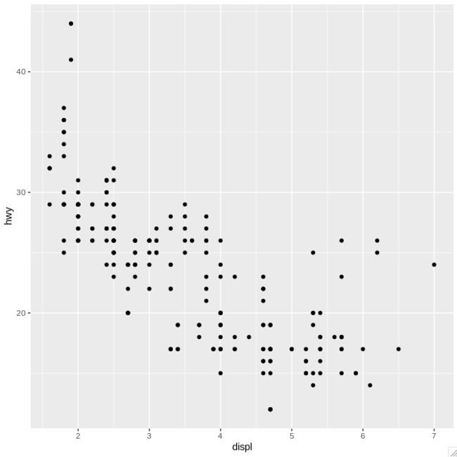
>qplot(displ,  hwy,  data = mpg)
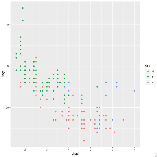
> qplot(displ, hwy, data = mpg, color = drv)
# 增加趋势线
>qplot(displ, hwy, data = mpg, color = drv, gem = c("point","smooth"))
使用散点图显示高速油耗相对驱动类型的对比和分布
> qplot(y=hwy,data = mpg, color = drv)
# 结论:
# hwy = 即每加仑燃油行驶的英里数, 数值越大越省油
# hwy 共有250个数值,所以x轴长度为250
# 前驱比较省油;4驱和后驱相对比较耗油;4驱和后驱差别不明显
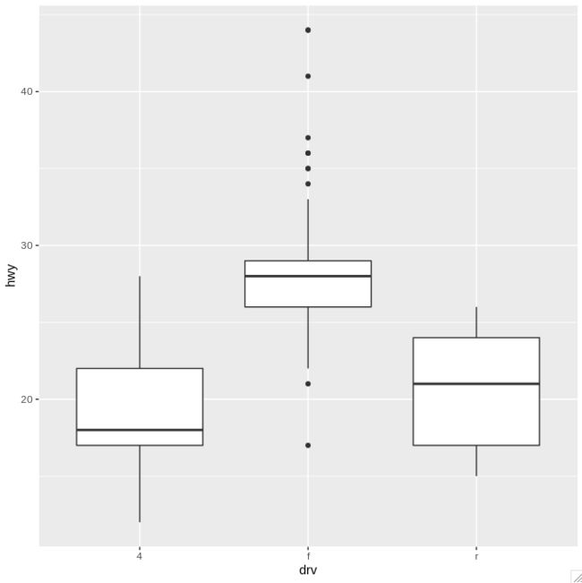
使用箱体图查看高速油耗和驱动类型的关系
# 参数1 是分组变量,参数2要检查的变量(连续变量),
qplot(drv, hwy, data = mpg, geom="boxplot")
继续添加对比变量:厂家
> qplot(drv, hwy, data = mpg, geom="boxplot", color=manufacturer)
# 备注:颜色对比不明显,相邻颜色不太容易辨认
#
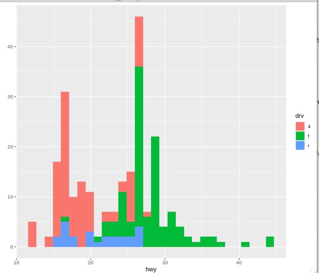
直方图
# x=要计算的变量,y=频数,第三个参数可选 fill=分组变量
qplot(hwy, data = mpg, fill = drv)
# 结论:四驱油耗小于30,根据红色柱形图很容易识别
facet 小面板
上面的堆叠直方图有人觉得不容易解读,可以用facets或者叫panel 实现
下面示例散点图facet
>qplot(displ, hwy, data = mpg, facets = . ~ drv)
直方图分组显示
>qplot(hwy, data = mpg, facets = drv ~ ., binwidth = 2)


