【Flutter】五、Flutter之表单输入框——TextField
【Flutter】五、Flutter之表单输入框——TextField
- TextField
- 1.1 TextField构造器
- 1.2 TextFiled属性说明
- 1.2.1 InputDecoration属性说明
- 1.2.2 TextInputAction
- 1.2.3 inputFormatters的使用
- 1.2.4 buildCounter的使用
Flutter中关于表单的相关控件有:TextField、CheckBox、Switch、Radio、Slider、CheckboxListTile、RadioListTile、SwitchListTile、Form。本文主要介绍TextField
TextField
用于构建输入框。
1.1 TextField构造器
const TextField({
    Key key,
    this.controller,
    this.focusNode,
    this.decoration = const InputDecoration(),
    TextInputType keyboardType,
    this.textInputAction,
    this.textCapitalization = TextCapitalization.none,
    this.style,
    this.strutStyle,
    this.textAlign = TextAlign.start,
    this.textAlignVertical,
    this.textDirection,
    this.readOnly = false,
    this.showCursor,
    this.autofocus = false,
    this.obscureText = false,
    this.autocorrect = true,
    this.maxLines = 1,
    this.minLines,
    this.expands = false,
    this.maxLength,
    this.maxLengthEnforced = true,
    this.onChanged,
    this.onEditingComplete,
    this.onSubmitted,
    this.inputFormatters,
    this.enabled,
    this.cursorWidth = 2.0,
    this.cursorRadius,
    this.cursorColor,
    this.keyboardAppearance,
    this.scrollPadding = const EdgeInsets.all(20.0),
    this.dragStartBehavior = DragStartBehavior.start,
    this.enableInteractiveSelection,
    this.onTap,
    this.buildCounter,
    this.scrollController,
    this.scrollPhysics,
  }) : assert(textAlign != null),
       assert(readOnly != null),
       assert(autofocus != null),
       assert(obscureText != null),
       assert(autocorrect != null),
       assert(maxLengthEnforced != null),
       assert(scrollPadding != null),
       assert(dragStartBehavior != null),
       assert(maxLines == null || maxLines > 0),
       assert(minLines == null || minLines > 0),
       assert(
         (maxLines == null) || (minLines == null) || (maxLines >= minLines),
         'minLines can\'t be greater than maxLines',
       ),
       assert(expands != null),
       assert(
         !expands || (maxLines == null && minLines == null),
         'minLines and maxLines must be null when expands is true.',
       ),
       assert(maxLength == null || maxLength == TextField.noMaxLength || maxLength > 0),
       keyboardType = keyboardType ?? (maxLines == 1 ? TextInputType.text : TextInputType.multiline),
       super(key: key);
1.2 TextFiled属性说明
| 属性 | 说明 |
|---|---|
| TextEditingController controller | 设置输入框默认显示的值 |
| FocusNode focusNode | |
| InputDecoration decoration | 文本字段周围的装饰,InputDecoration的属性参考1.2.1 InputDecoration属性说明 |
| TextInputType keyboardType | 设置键盘类型 TextInputType.text:文本输入键盘 TextInputType.multiline:多行文本,配合maxLines使用 TextInputType.number:数字键盘 TextInputType.phone:数字键盘,多出’*#‘键 TextInputType.datetime:数字键盘,多出’/:‘键 TextInputType.emailAddress:文本输入键盘,显示’@‘ TextInputType.url:文本输入键盘,显示’/‘ TextInputType.numberWithOptions(signed: true, decimal: true): 数字键盘,设置signed、decimal后模拟器中没看出区别 |
| TextInputAction textInputAction | 键盘回车按钮图标 TextInputAction是个枚举类,具体指参考1.2.2 TextInputAction |
| Capitalization textCapitalization | 文本风格。 TextCapitalization.none:默认一直使用小写 TextCapitalization.characters:默认一直使用大写 TextCapitalization.sentences:默认为每个句子的第一个字母使用大写键盘 TextCapitalization.word:默认为每个单词的第一个字母使用大写键盘 |
| TextStyle style | 设置输入框中文本样式 |
| StrutStyle strutStyle | |
| TextAlign textAlign | 文本对齐方式 |
| TextAlignVertical textAlignVertical | |
| TextDirection textDirection | 文本方向 |
| bool autofocus | 自动获取焦点 |
| bool obscureText | 密码模式显示 |
| bool autocorrect | 是否显示提示 |
| int maxLines | 最大行数 |
| int minLines | 最小行数 |
| bool expands | 是否放大 |
| bool readOnly | 是否只读 |
| bool showCursor | 是否显示光标 |
| int maxLength | 最大长度,右下角会显示输入限制 |
| bool maxLengthEnforced | 达到最大长度后,是否限制继续输入,为false可继续输入,为true不可继续输入 |
| ValueChanged |
内容改变回调,当达到最大长度后,继续输入也会触发。 |
| VoidCallback onEditingComplete | 点击回车回调 |
| ValueChanged |
提交(点击回车)回调 |
| List |
控制允许输入的格式,详细说明参考1.2.3 inputFormatters的使用 |
| bool enabled | |
| double cursorWidth | 光标宽度 |
| Radius cursorRadius | 光标圆角 |
| Color cursorColor | 光标颜色 |
| Brightness keyboardAppearance | 键盘外观 Brightness.light:高亮模式 Brightness.dark:暗黑模式 |
| EdgeInsets scrollPadding | |
| bool enableInteractiveSelection | |
| DragStartBehavior dragStartBehavior | |
| GestureTapCallback onTap | 点击输入框的回调 |
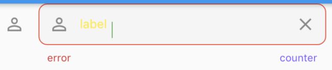
| InputCounterWidgetBuilder buildCounter | 自定义计数器(maxLength的显示),参考1.2.4 的使用 |
| ScrollPhysics scrollPhysics | |
| ScrollController scrollController |
1.2.1 InputDecoration属性说明
//InputDecoration构造器
const InputDecoration({
    this.icon,
    this.labelText,
    this.labelStyle,
    this.helperText,
    this.helperStyle,
    this.hintText,
    this.hintStyle,
    // hintText的最大行数
    this.hintMaxLines,
    this.errorText,
    this.errorStyle,
    // errorText最大行数
    this.errorMaxLines,
    // 是否显示最初的labelText
    this.hasFloatingPlaceholder = true,
    // 是否为密集形式(使用较少垂直空间),默认为false
    this.isDense,
    // 输入框内边距
    this.contentPadding,
    this.prefixIcon,
    this.prefix,
    this.prefixText,
    this.prefixStyle,
    this.suffixIcon,
    this.suffix,
    this.suffixText,
    this.suffixStyle,
    this.counter,
    this.counterText,
    this.counterStyle,
    // 输入框是否填充颜色,默认false
    this.filled,
    // 填充颜色
    this.fillColor,
    this.focusColor,
    this.hoverColor,
    // 没有焦点且有错误时要显示的border,参考下面的例子
    this.errorBorder,
    // 获取焦点并且没有errorText时要显示的border
    this.focusedBorder,
    // 有焦点而且有errorText时显示的border
    this.focusedErrorBorder,
    // 当enable为false且没有errorText时显示的border
    this.disabledBorder,
    // 当enable为true且没有errorText时显示的border
    this.enabledBorder,
    // 输入框border
    this.border,
    this.enabled = true,
    this.semanticCounterText,
    this.alignLabelWithHint,
  }) : assert(enabled != null),
       assert(!(prefix != null && prefixText != null), 'Declaring both prefix and prefixText is not supported.'),
       assert(!(suffix != null && suffixText != null), 'Declaring both suffix and suffixText is not supported.'),
       isCollapsed = false;

errorBorder示例:
// 1.下划线border
errorBorder: UnderlineInputBorder(
	borderSide: BorderSide(
		color: Colors.red
	)
)
// 2.圆角border
errorBorder:  OutlineInputBorder(
	borderSide: BorderSide(
		color: Colors.red
	),
	borderRadius: BorderRadius.all(Radius.circular(10.0))
)

1.2.2 TextInputAction
在iOS模拟器中以下值都会以字母显示。
| 枚举值 | 说明 |
|---|---|
| none |  |
| unspecified | |
| done |  |
| go |  |
| search |  |
| send |  |
| next |  |
| previous |  |
| continueAction | 安卓不支持 |
| join | 安卓不支持 |
| route | 安卓不支持 |
| emergencyCall | 安卓不支持 |
| newline |  |
1.2.3 inputFormatters的使用
Flutter提供了WhitelistingTextInputFormatter、BlacklistingTextInputFormatter、LengthLimitingTextInputFormatter可设置该属性。
1.WhitelistingTextInputFormatter:白名单校验,只允许输入符合规则的字符
// 只能输入A-Z
inputFormatters: [WhitelistingTextInputFormatter(RegExp('[A-Z]'))],

2.BlacklistingTextInputFormatter:黑名单校验,除了符合规定的值都可以输入
// 除了A-Z都能输入
inputFormatters: [BlacklistingTextInputFormatter(RegExp('[A-Z]'))],
3.LengthLimitingTextInputFormatter:长度限制,优先级要高于maxLength
inputFormatters: [LengthLimitingTextInputFormatter(5)]
1.2.4 buildCounter的使用
buildCounter: (
	BuildContext context,
   {
   	int currentLength,
   	int maxLength,
   	bool isFocused,
   }
) {
   return Text(
   	'$currentLength of $maxLength characters',
   	semanticsLabel: 'character count',
   );
},
