Datacamp 笔记&代码 Unsupervised Learning in Python 第二章 Visualization with hierarchical clustering &t-SNE
更多原始数据文档和JupyterNotebook
Github: https://github.com/JinnyR/Datacamp_DataScienceTrack_Python
Datacamp track: Data Scientist with Python - Course 23 (2)
Exercise
Hierarchical clustering of the grain data
In the video, you learned that the SciPy linkage()function performs hierarchical clustering on an array of samples. Use the linkage() function to obtain a hierarchical clustering of the grain samples, and use dendrogram() to visualize the result. A sample of the grain measurements is provided in the array samples, while the variety of each grain sample is given by the list varieties.
Instruction
- Import:
linkageanddendrogramfromscipy.cluster.hierarchy.matplotlib.pyplotasplt.
- Perform hierarchical clustering on
samplesusing thelinkage()function with themethod='complete'keyword argument. Assign the result tomergings. - Plot a dendrogram using the
dendrogram()function onmergings. Specify the keyword argumentslabels=varieties,leaf_rotation=90, andleaf_font_size=6.
import pandas as pd

df = pd.read_csv('https://s3.amazonaws.com/assets.datacamp.com/production/course_2234/datasets/seeds.csv', header=None)

sample_indices = [5 * i + 1 for i in range(42)]
df = df.iloc[sample_indices]
samples = df[list(range(7))].values
varieties = list(df[7].map({1: 'Kama wheat', 2: 'Rosa wheat', 3: 'Canadian wheat'}))
# Perform the necessary imports
from scipy.cluster.hierarchy import linkage, dendrogram
import matplotlib.pyplot as plt

# Calculate the linkage: mergings
mergings = linkage(samples, method='complete')

# Plot the dendrogram, using varieties as labels
dendrogram(mergings,
           labels=varieties,
           leaf_rotation=90,
           leaf_font_size=6,
)
plt.show()

Exercise
Hierarchies of stocks
In chapter 1, you used k-means clustering to cluster companies according to their stock price movements. Now, you’ll perform hierarchical clustering of the companies. You are given a NumPy array of price movements movements, where the rows correspond to companies, and a list of the company names companies. SciPy hierarchical clustering doesn’t fit into a sklearn pipeline, so you’ll need to use the normalize() function from sklearn.preprocessinginstead of Normalizer.
linkage and dendrogram have already been imported from scipy.cluster.hierarchy, and PyPlot has been imported as plt.
Instruction
- Import
normalizefromsklearn.preprocessing. - Rescale the price movements for each stock by using the
normalize()function onmovements. - Apply the
linkage()function tonormalized_movements, using'complete'linkage, to calculate the hierarchical clustering. Assign the result tomergings. - Plot a dendrogram of the hierarchical clustering, using the list
companiesof company names as thelabels. In addition, specify theleaf_rotation=90, andleaf_font_size=6keyword arguments as you did in the previous exercise.
import pandas as pd

df = pd.read_csv('https://s3.amazonaws.com/assets.datacamp.com/production/course_2072/datasets/company-stock-movements-2010-2015-incl.csv', index_col=0)
companies = list(df.index)
movements = df.values

from matplotlib import pyplot as plt
from scipy.cluster.hierarchy import linkage, dendrogram
# Import normalize
from sklearn.preprocessing import normalize

# Normalize the movements: normalized_movements
normalized_movements = normalize(movements)

# Calculate the linkage: mergings
mergings = linkage(normalized_movements, method='complete')

# Plot the dendrogram
dendrogram(mergings,
           labels=companies,
           leaf_rotation=90,
           leaf_font_size=6)
plt.show()

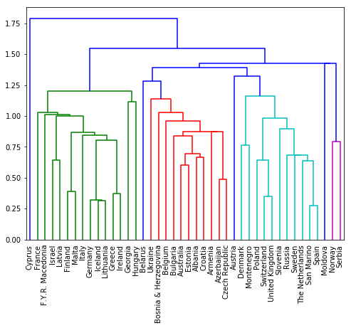
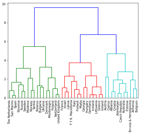
Exercise
Different linkage, different hierarchical clustering!
In the video, you saw a hierarchical clustering of the voting countries at the Eurovision song contest using 'complete'linkage. Now, perform a hierarchical clustering of the voting countries with 'single' linkage, and compare the resulting dendrogram with the one in the video. Different linkage, different hierarchical clustering!
You are given an array samples. Each row corresponds to a voting country, and each column corresponds to a performance that was voted for. The list country_names gives the name of each voting country. This dataset was obtained fromEurovision.
Instruction
- Import:
linkageanddendrogramfromscipy.cluster.hierarchy.matplotlib.pyplotasplt.
- Perform hierarchical clustering on
samplesusing thelinkage()function with themethod='single'keyword argument. Assign the result tomergings. - Plot a dendrogram of the hierarchical clustering, using the list
country_namesas thelabels. In addition, specify theleaf_rotation=90, andleaf_font_size=6keyword arguments as you have done earlier.
import pandas as pd

df = pd.read_csv('https://s3.amazonaws.com/assets.datacamp.com/production/course_2072/datasets/eurovision-2016.csv').fillna(0)

scores = pd.crosstab(index=df['From country'], columns=df['To country'], values=df['Televote Points'], aggfunc='first').fillna(12)
samples = scores.values
country_names = list(scores.index)
# Perform the necessary imports
import matplotlib.pyplot as plt
from scipy.cluster.hierarchy import linkage, dendrogram

# Calculate the linkage: mergings
mergings = linkage(samples, method='single')
fig = plt.figure(figsize=(8, 6))
# Plot the dendrogram
dendrogram(mergings,
           labels=country_names,
           leaf_rotation=90,
           leaf_font_size=10,
           )
plt.show()
# Modified by Jinny: compare different methods

# Calculate the linkage: mergings
mergings = linkage(samples, method='complete')
fig = plt.figure(figsize=(8, 6))
# Plot the dendrogram
dendrogram(mergings,
           labels=country_names,
           leaf_rotation=90,
           leaf_font_size=10,
           )

plt.show()
Exercise
Extracting the cluster labels
In the previous exercise, you saw that the intermediate clustering of the grain samples at height 6 has 3 clusters. Now, use the fcluster() function to extract the cluster labels for this intermediate clustering, and compare the labels with the grain varieties using a cross-tabulation.
The hierarchical clustering has already been performed and mergings is the result of the linkage() function. The list varieties gives the variety of each grain sample.
Instruction
- Import:
pandasaspd.fclusterfromscipy.cluster.hierarchy.
- Perform a flat hierarchical clustering by using the
fcluster()function onmergings. Specify a maximum height of6and the keyword argumentcriterion='distance'. - Create a DataFrame
dfwith two columns named'labels'and'varieties', usinglabelsandvarieties, respectively, for the column values. This has been done for you. - Create a cross-tabulation
ctbetweendf['labels']anddf['varieties']to count the number of times each grain variety coincides with each cluster label.
import pandas as pd

df = pd.read_csv('https://s3.amazonaws.com/assets.datacamp.com/production/course_2234/datasets/seeds.csv', header=None)

sample_indices = [5 * i + 1 for i in range(42)]
df = df.iloc[sample_indices]
samples = df[list(range(7))].values
varieties = list(df[7].map({1: 'Kama wheat', 2: 'Rosa wheat', 3: 'Canadian wheat'}))

from scipy.cluster.hierarchy import linkage

mergings = linkage(samples, method='complete')
# Perform the necessary imports
import pandas as pd
from scipy.cluster.hierarchy import fcluster

# Use fcluster to extract labels: labels
labels = fcluster(mergings, 6, criterion='distance')

# Create a DataFrame with labels and varieties as columns: df
df = pd.DataFrame({'labels': labels, 'varieties': varieties})

# Create crosstab: ct
ct = pd.crosstab(df['labels'], df['varieties'])

# Display ct
print(ct)
varieties  Canadian wheat  Kama wheat  Rosa wheat
labels
1                      14           3           0
2                       0           0          14
3                       0          11           0
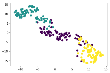
Exercise
t-SNE visualization of grain dataset
In the video, you saw t-SNE applied to the iris dataset. In this exercise, you’ll apply t-SNE to the grain samples data and inspect the resulting t-SNE features using a scatter plot. You are given an array samples of grain samples and a list variety_numbersgiving the variety number of each grain sample.
Instruction
- Import
TSNEfromsklearn.manifold. - Create a TSNE instance called
modelwithlearning_rate=200. - Apply the
.fit_transform()method ofmodeltosamples. Assign the result totsne_features. - Select the column
0oftsne_features. Assign the result toxs. - Select the column
1oftsne_features. Assign the result toys. - Make a scatter plot of the t-SNE features
xsandys. To color the points by the grain variety, specify the additional keyword argumentc=variety_numbers.
import pandas as pd

df = pd.read_csv('https://s3.amazonaws.com/assets.datacamp.com/production/course_2234/datasets/seeds.csv', header=None)

samples = df[list(range(7))].values
variety_numbers = list(df[7])

from matplotlib import pyplot as plt
# Import TSNE
from sklearn.manifold import TSNE

# Create a TSNE instance: model
model = TSNE(learning_rate=200)

# Apply fit_transform to samples: tsne_features
tsne_features = model.fit_transform(samples)

# Select the 0th feature: xs
xs = tsne_features[:,0]

# Select the 1st feature: ys
ys = tsne_features[:,1]

# Scatter plot, coloring by variety_numbers
plt.scatter(xs, ys, c=variety_numbers)
plt.show()
Exercise
A t-SNE map of the stock market
t-SNE provides great visualizations when the individual samples can be labeled. In this exercise, you’ll apply t-SNE to the company stock price data. A scatter plot of the resulting t-SNE features, labeled by the company names, gives you a map of the stock market! The stock price movements for each company are available as the array normalized_movements (these have already been normalized for you). The list companies gives the name of each company. PyPlot (plt) has been imported for you.
Instruction
- Import
TSNEfromsklearn.manifold. - Create a TSNE instance called
modelwithlearning_rate=50. - Apply the
.fit_transform()method ofmodeltonormalized_movements. Assign the result totsne_features. - Select column
0and column1oftsne_features. - Make a scatter plot of the t-SNE features
xsandys. Specify the additional keyword argumentalpha=0.5. - Code to label each point with its company name has been written for you using
plt.annotate(), so just hit ‘Submit Answer’ to see the visualization!
# Import TSNE
from sklearn.manifold import TSNE

# Create a TSNE instance: model
model = TSNE(learning_rate=50)

# Apply fit_transform to normalized_movements: tsne_features
tsne_features = model.fit_transform(normalized_movements)

# Select the 0th feature: xs
xs = tsne_features[:,0]

# Select the 1th feature: ys
ys = tsne_features[:,1]

# Scatter plot
plt.scatter(xs, ys, alpha=0.5)

# Annotate the points
for x, y, company in zip(xs, ys, companies):
    plt.annotate(company, (x, y), fontsize=5, alpha=0.75)
plt.show()
