慕课—R语言之数据可视化—学习笔记 3.6ggplot2绘图系统(下)
3.6ggplot2绘图系统(下)
很抱歉,这些天工作太忙了,没有来得及更新自己的笔记,不过慕课上的该课程我已经学习完毕,都是在下班后地铁上的时间学的,屌丝啊,还得挤地铁。同时,对于ggplot绘图系统我并没有按照慕课上的进行。不过那上面的还是超级棒的。
接上次的笔记,本次对ggplot2系统进行次实战练习。效果图如下
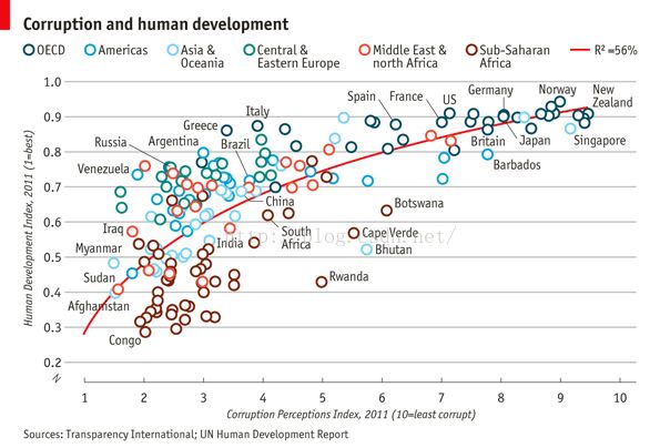
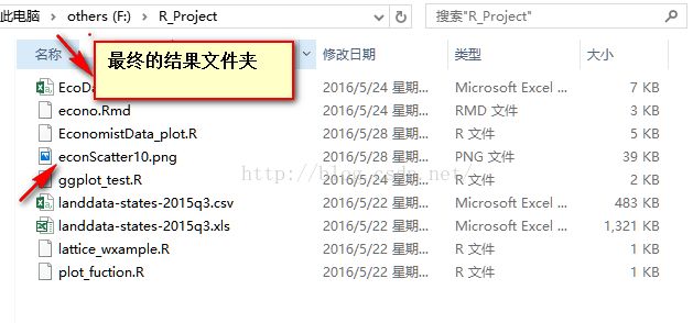
来源于经济学人(http://www.economist.com/node/21541178(貌似长城了,)。数据csv文件我会上传到百度云,
地址:http://pan.baidu.com/s/1jIyG28I 密码mqvr
下面开始我们的挑战Start
1导入数据
library(ggplot2)
dat<-read.csv("F:/R_Project/EcoData.csv")
2绘制
pc1=ggplot(dat,aes(x=CPI,y=HDI,color=Region))
pc1+geom_point()

3美学上的设置
3.1初步加工
(pc2 <- pc1 + geom_smooth(aes(group = 1),
method = "lm",
formula = y ~ log(x),
se = FALSE,
color = "red")) +
geom_point()
pc2 + geom_point(shape = 1, size = 4)
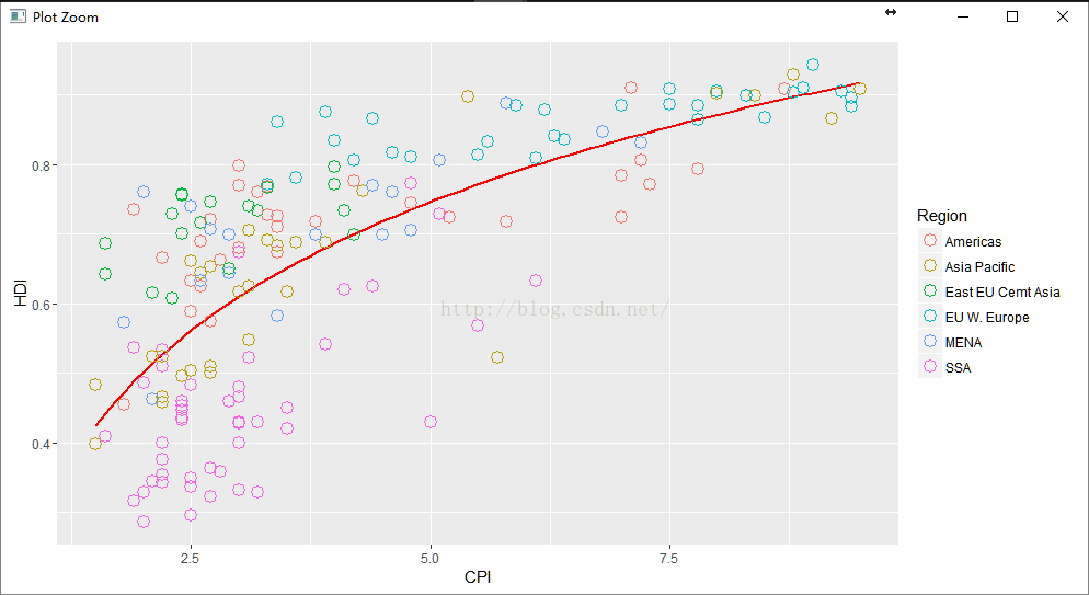
结果如下图:
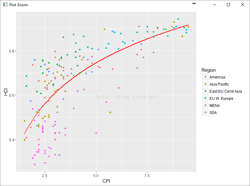
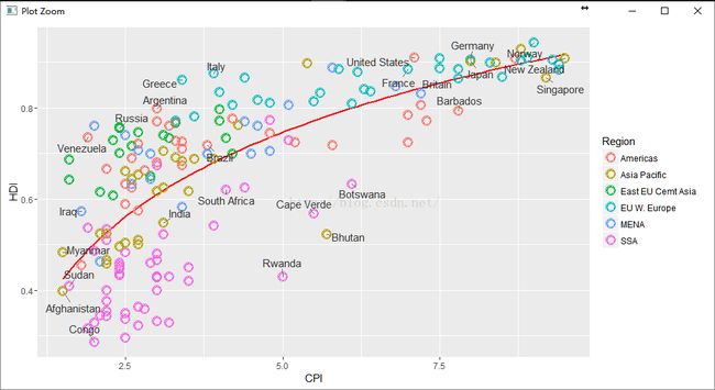
3.2 根据等级设置大小
pc3 <- pc2 +
geom_point(size = 4.5, shape = 1) +
geom_point(size = 4, shape = 1) +
geom_point(size = 3.5, shape = 1)
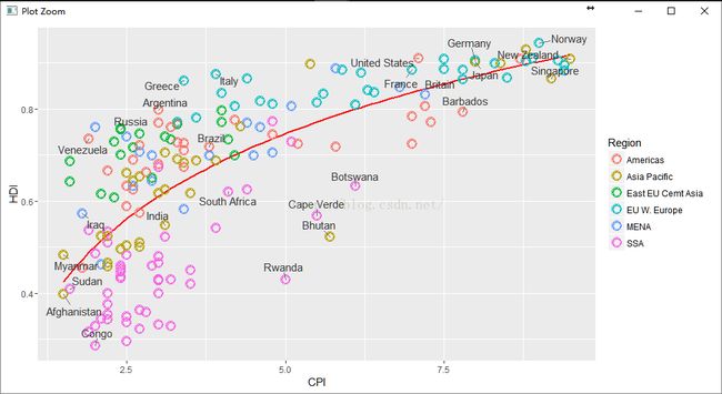
3.3添加文字
pointsToLabel <- c("Russia", "Venezuela", "Iraq", "Myanmar", "Sudan",
"Afghanistan", "Congo", "Greece", "Argentina", "Brazil",
"India", "Italy", "ireal", "South Africa", "Spane",
"Botswana", "Cape Verde", "Bhutan", "Rwanda", "France",
"United States", "Germany", "Britain", "Barbados", "Norway", "Japan",
"New Zealand", "Singapore")
(pc4 <- pc3 +
geom_text(aes(label = Country),
color = "gray20",
data = subset(dat, Country %in% pointsToLabel)))
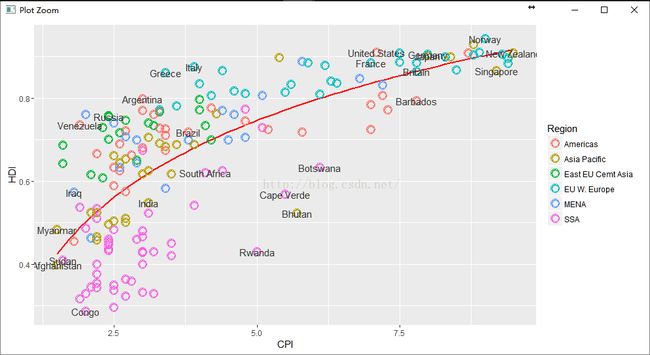
3.4添加文字注释
library("ggrepel")
pc3 + geom_text_repel(aes(label = Country),
color = "gray20",
data = subset(dat, Country %in% pointsToLabel),
force = 10)
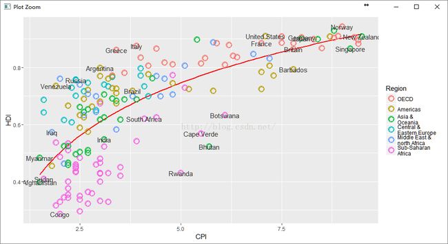
3.5调整区域标签以及顺序
调用factor函数
dat$Region <- factor(dat$Region,
levels = c("EU W. Europe",
"Americas",
"Asia Pacific",
"East EU Cemt Asia",
"MENA",
"SSA"),
labels = c("OECD",
"Americas",
"Asia &\nOceania",
"Central &\nEastern Europe",
"Middle East &\nnorth Africa",
"Sub-Saharan\nAfrica"))
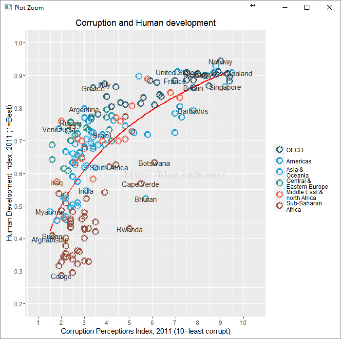
这张图满屏显示:
pc4$data <- dat
pc4
4添加grid
library(grid)
(pc5 <- pc4 +
scale_x_continuous(name = "Corruption Perceptions Index, 2011 (10=least corrupt)",
limits = c(.9, 10.5),
breaks = 1:10) +
scale_y_continuous(name = "Human Development Index, 2011 (1=Best)",
limits = c(0.2, 1.0),
breaks = seq(0.2, 1.0, by = 0.1)) +
scale_color_manual(name = "",
values = c("#24576D",
"#099DD7",
"#28AADC",
"#248E84",
"#F2583F",
"#96503F")) +
ggtitle("Corruption and Human development"))
继续 美观上的修改(刚想到这个词——美观,代替“美育”这一词了)
(pc6 <- pc5 +
theme_minimal() +
theme(text = element_text(color = "gray20"),
legend.position = c("top"), # position the legend in the upper left
legend.direction = "horizontal",
legend.justification = 0.1, # anchor point for legend.position.
legend.text = element_text(size = 11, color = "gray10"),
axis.text = element_text(face = "italic"),
axis.title.x = element_text(vjust = -1), # move title away from axis
axis.title.y = element_text(vjust = 2), # move away for axis
axis.ticks.y = element_blank(), # element_blank() is how we remove elements
axis.line = element_line(color = "gray40", size = 0.5),
axis.line.y = element_blank(),
panel.grid.major = element_line(color = "gray50", size = 0.5),
panel.grid.major.x = element_blank()
))
5计算一下方差
(mR2 <- summary(lm(HDI ~ log(CPI), data = dat))$r.squared)
结果:
> (mR2 <- summary(lm(HDI ~ log(CPI), data = dat))$r.squared)
[1] 0.5212859
6保存为图片
library(grid)
png(file = "F:/R_Project/econScatter10.png", width = 800, height = 600)
pc6
grid.text("Sources: Transparency International; UN Human Development Report",
x = .02, y = .03,
just = "left",
draw = TRUE)
grid.segments(x0 = 0.81, x1 = 0.825,
y0 = 0.90, y1 = 0.90,
gp = gpar(col = "red"),
draw = TRUE)
grid.text(paste0("R² = ",
as.integer(mR2*100),
"%"),
x = 0.835, y = 0.90,
gp = gpar(col = "gray20"),
draw = TRUE,
just = "left")
dev.off()
结果