Seaborn.countplot是什么
Seaborn是基于matplotlib的Python可视化库,可以视为matplotlib的补充。我在用BlackFriday数据集练手的时候,发现了countplot计数图,官网上的解释是:
seaborn.countplot(x =无,y =无,hue =无,数据=无,顺序=无,hue_order =无,orient =无,color =无,palette = None,饱和度= 0.75,dodge = True,ax = None,* * kwargs )
来个数据集体验一下。我用的是BlackFriday数据集:
import numpy as np
import pandas as pd
import matplotlib.pyplot as plt
%matplotlib notebook
import seaborn as sns
plt.rcParams['font.sans-serif'] = ['FangSong']
plt.rcParams['axes.unicode_minus'] = False
data = pd.read_csv('BlackFriday.csv')
data.head()

我们主要用到的是’Age’和’Gender’字段。
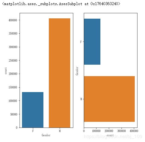
显示单个分类变量的值计数:
fig, ax = plt.subplots(1, 2, figsize=(7, 7))
sns.countplot(x=data['Gender'], ax=ax[0])
sns.countplot(y=data['Gender'], ax=ax[1])
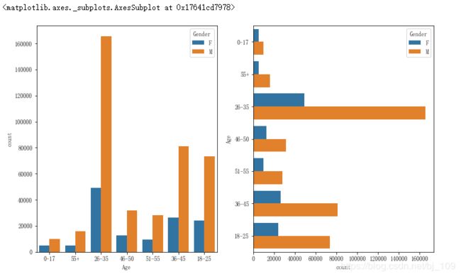
显示两个分类变量的值计数:
fig, ax = plt.subplots(1, 2, figsize=(12, 7))
sns.countplot(x=data['Gender'], hue=data['Age'], ax=ax[0])
sns.countplot(y=data['Gender'], hue=data['Age'], ax=ax[1])
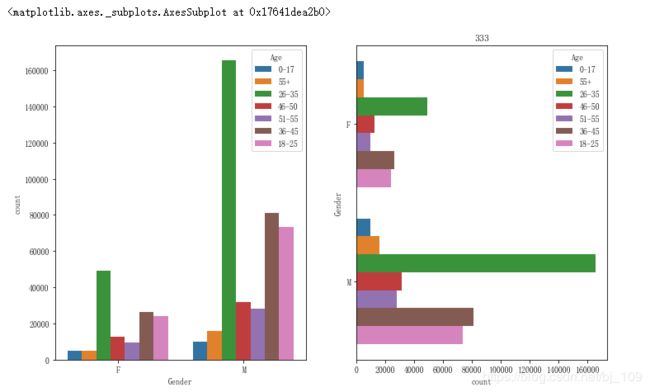
fig, ax = plt.subplots(1, 2, figsize=(12, 7))
sns.countplot(x=data['Age'], hue=data['Gender'], ax=ax[0])
sns.countplot(y=data['Age'], hue=data['Gender'], ax=ax[1])
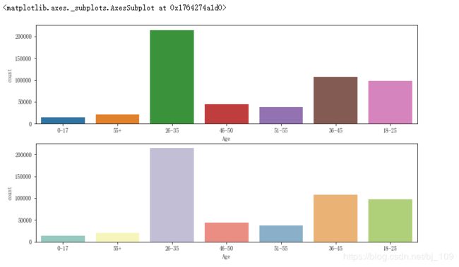
使用不同的调色板:
fig, ax = plt.subplots(2, 1, figsize=(12, 7))
sns.countplot(x=data['Age'], ax=ax[0])
sns.countplot(x=data['Age'], palette='Set3', ax=ax[1])