再来介绍一些有意思的 404 页面的设计案例:
1. Appealing Images
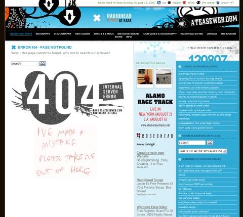
A really dirty, hand-made image with a comment – for despaired visitors only. The page also includes a search box.
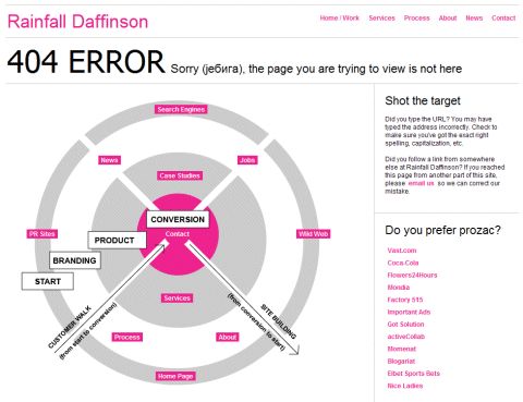
Rainfall Daffinson makes sure you don’t feel lost.
Even a 404-error page can look stylish.
A book with the page which couldn’t be found.
Jamie Huskisson communicates with “lost” visitors using imagery.
404 error as time on a clock.
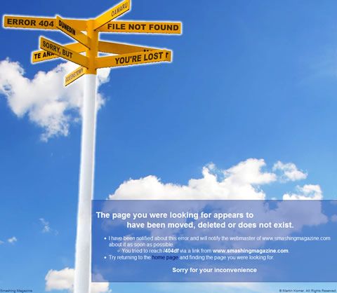
Sometimes you can feel or even smell that you’re definitely not on the page you wanted to visit.
2. Getting Poetic
404 error haiku. Informative, however a direct link to the start page would be quite useful.
Three more haikus by Lumino.us. Plus beer to keep you company.
And one more haiku by alt-web.com.
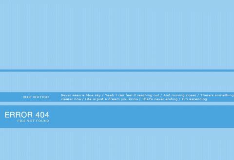
BlueVertigo offers a poem with horizontal scrolling.
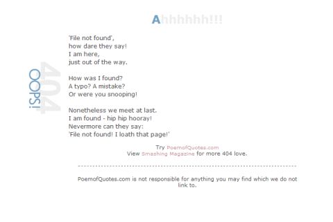
A small poem about the 404 error by Poemofquotes.com
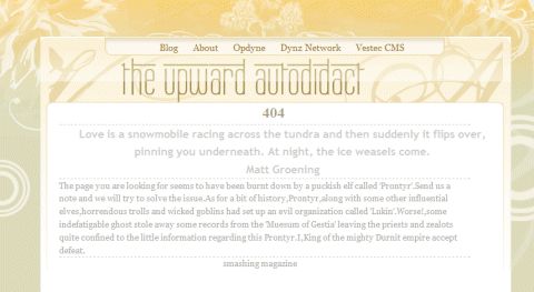
Jacob Thomas quotes Winston Churchill and informs lost visitors that the page they’ve been looking for seems to have been burnt down by a puckish elf called ‘Prontyr’.
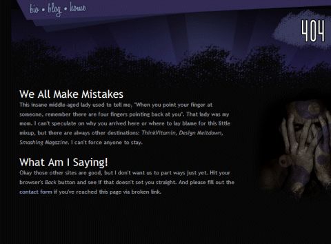
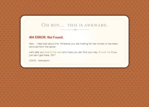
Darren Hoyt appeals to the humanity of mistakes and errors and communication with visitors directly.
3. Communicate Through Emotions
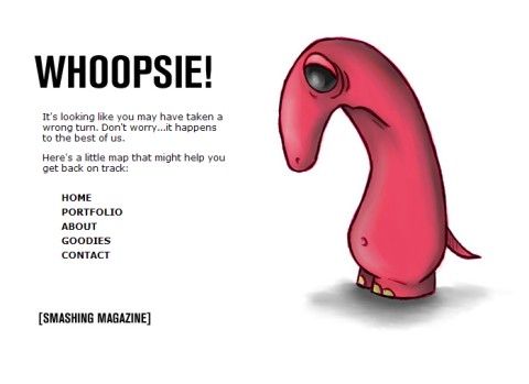
Isn’t he sad…
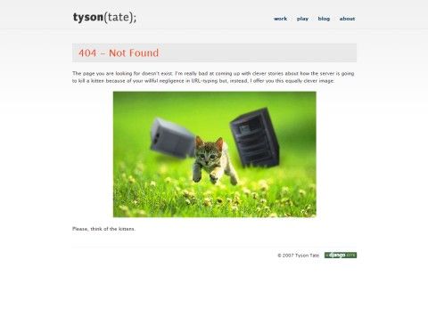
…however, Cat Content seems to be doing well…
…and Krystal gets no biscuit.
4. Communicate Through Irony
Maybe an idiot has passed you the wrong link or maybe a bigger idiot has linked in their site to a page that doesn’t exist. In both cases the big boss man has been sent an email informing him of this problem, so the person responsible can be tied to a tree and horsewhipped! Nice to know.
Martin Yelland has some good explanations about what happened: strange little Web Gremlins or fluctuations of the Earth’s Magnetic field might have caused the error – however, a team of highly trained monkeys has been dispatched to deal with this situation.
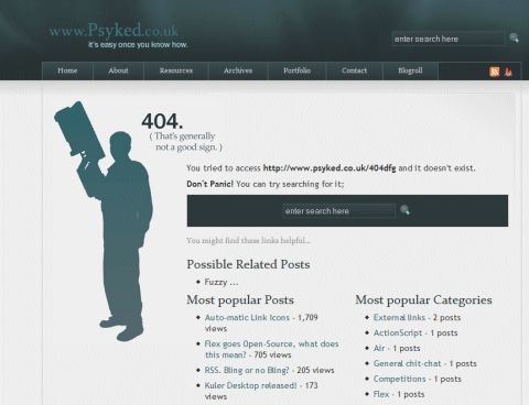
Even although you’re a douche bag, you can use a search box to get to the page you’ve been looking for.
Apparently, this is a test of the emergency broadcast systems. You should remain calm, these kinds of things happen all the time. The “four oh four error” by Poropoptrt.com.
5. While You Are Lost…
…you can read a comic…
…or more comics (the image is changing after every reload)…
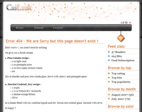
…get two cocktail recipes…
…die…
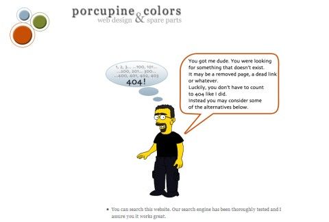
…don’t count to 404 (the site also provides a search box and a tag cloud)…
6. Explain What Happened
Explanation in a well-designed visualization of what happened.
Be aware when you’ve reached a buzzless page…
7. Explain What Can Be Done
Foobr offers a detailed explanation on what can be done and what the “lost” visitor might be looking for.
3amproductions.net suggests pages the visitor might be looking for.
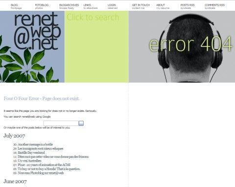
Renet-web.met offers recent posts and a search box.
8. Unusual Solutions
Shocking visitors with colors – interesting, but not quite appealing…
Blue Screen Of Death on the Web.
Sorabji.com lists what people were looking for when they got the 404 Page Error. Interesting approach, however not recommendable – think of spambots.
9. Be Sincere
Jeremy seems to be really sorry about the missing page…
…so is Rainer…
10. Do Whatever You Want To Do
This is not a working example, since the site isn’t using the page as a working 404 error page. Nevertheless it’s quite funny: the characters are talking, and as you might suggest, they are talking about 404 errors!
