animation动画全解
animation八大属性共用
代码
HTML
<html lang="en">
  <head>
    <meta charset="UTF-8" />
    <meta name="viewport" content="width=device-width, initial-scale=1.0" />
    <meta http-equiv="X-UA-Compatible" content="ie=edge" />
    <title>Static Templatetitle>
    <link rel="stylesheet" href="./index.css" />
  head>
  <body>
    <div class="box">div>
    <div class="box">div>
    <div class="box">div>
    <div class="box">div>
  body>
html>
CSS
.box {
  width: 100px;
  height: 100px;
  background-color: red;
  border-radius: 50%;
  margin-bottom: 20px;
}
.box:nth-child(2n + 1) {
  animation: move 2s linear infinite alternate;
}
.box:nth-child(2n) {
  animation: move 2s linear infinite alternate-reverse forwards 1s;
}

.box:hover {
  animation-play-state: paused;
}

@keyframes move {
  0% {
    transform: translate(0, 0);
  }
  100% {
    transform: translate(400px, 0);
  }
}
效果
控制台查看八大属性的全称和值
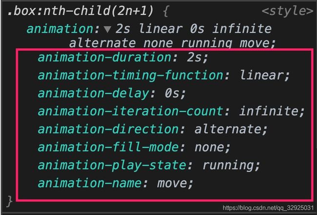
八大属性的意义与取值
animation-delay
作用:
定义动画于何时开始,即从动画应用在元素上到动画开始的这段时间的长度。
默认值:
0s,代表动画在应用到元素上后立即开始执行
取值:
正负值皆可。定义一个负值会让动画立即开始。但是动画会从它的动画序列中某位置开始。例如,如果设定值为-1s,动画会从它的动画序列的第1秒位置处立即开始。
animation-direction
作用:
指示动画是否反向播放
默认值:
normal,每个循环内动画向前循环,就是说每个动画循环结束,动画重置到起点重新开始
取值
alternate
动画交替反向运行。带时间功能的函数也反向,比如,ease-in 在反向时成为ease-out。计数取决于开始时是奇数迭代还是偶数迭代。小球的循环运动通常使用该值。
reverse
反向运行动画,每周期结束后,从动画结束的尾部到头反向运行。
alternate-reverse
反向交替运行动画。即动画第一次运行时是反向的,然后下一次是正向,后面依次循环。决定奇数次或偶数次的计数从1开始。
animation-duration
作用:
指定一个动画周期的时长。
默认值:
默认值为0s,表示无动画,直接到最后的状态
取值:
time,表达一个动画周期的时长,单位为秒(s)或者毫秒(ms),无单位值则无效。
animation-fill-mode
作用:
设置CSS动画在执行之前和之后如何将样式应用于其目标。
默认值:
none
当动画未执行时,动画将不会将任何样式应用于目标
取值(具体请看mdn):
mdn对此属性取值的解释
forwards
动画完成后,元素状态保持为最后一帧的状态。
backwards
动画将在应用于目标时立即应用第一个关键帧中定义的值,并在animation-delay期间保留此值。 第一个关键帧取决于animation-direction的值
both
动画将遵循forwards和backwards的规则,从而在两个方向上扩展动画属性
animation-iteration-count
作用:
定义动画在结束前运行的次数,可以是1次,也可以无限循环。如果指定了多个值,每次播放动画时,将使用列表中的下一个值,在使用最后一个值后循环回第一个值。
默认值:
默认值为1,表示只运行一次
取值:
infinite
无限循环播放动画.
动画播放的次数。可以用小数定义循环,来播放动画周期的一部分:例如,0.5 将播放到动画周期的一半。但不可设为负值。
animation-name
作用
属性指定应用的一系列动画,每个名称代表一个由@keyframes定义的动画序列
默认值
无默认值
取值
由@keyframes定义的动画序列名
animation-play-state
作用:
定义一个动画是否运行或者暂停。可以通过查询它来确定动画是否正在运行。另外,它的值可以被设置为暂停和恢复的动画的重放。
注意:
恢复一个已暂停的动画,将从它开始暂停的时候,而不是从动画序列的起点开始在动画。
默认值:
无默认值
取值
running
当前动画正在运行。
paused
当前动画已被停止。
animation-timing-function
作用:
定义CSS动画在每一动画周期中执行的节奏。
默认值
ease
取值
可能值为一或多个
调试贝塞尔曲线
代码
HTML
<html lang="en">
  <head>
    <meta charset="UTF-8" />
    <meta name="viewport" content="width=device-width, initial-scale=1.0" />
    <meta http-equiv="X-UA-Compatible" content="ie=edge" />
    <title>Static Templatetitle>
    <link rel="stylesheet" href="./index.css" />
  head>
  <body>
    <div id="box">div>
  body>
html>
CSS
#box {
  width: 100px;
  height: 100px;
  background-color: red;
  border-radius: 50%;
  animation: move 2s linear infinite alternate;
}

@keyframes move {
  0% {
    transform: translate(0, 0);
  }
  100% {
    transform: translate(300px, 0);
  }
}
调试
示例
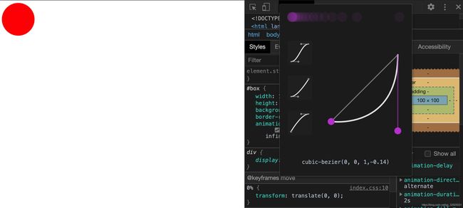
位置

看每帧动画
代码
HTML
<html lang="en">
  <head>
    <meta charset="UTF-8" />
    <meta name="viewport" content="width=device-width, initial-scale=1.0" />
    <meta http-equiv="X-UA-Compatible" content="ie=edge" />
    <title>Static Templatetitle>
    <link rel="stylesheet" href="./index.css" />
  head>
  <body>
    <div id="box">div>
  body>
html>
CSS
#box {
  width: 100px;
  height: 100px;
  background-color: red;
  border-radius: 50%;
  animation: move 2s steps(50) infinite alternate;
}

@keyframes move {
  0% {
    transform: translate(0, 0);
  }
  100% {
    transform: translate(300px, 0);
    border-radius: 0;
  }
}
效果

微调
如果将steps()的参数改为5
效果
看上去非常的“卡顿”

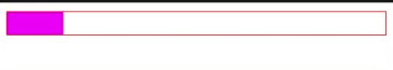
实现一个进度条特效
代码
HTML
linear-gradient函数的详细介绍
<html lang="en">
  <head>
    <meta charset="UTF-8" />
    <meta name="viewport" content="width=device-width, initial-scale=1.0" />
    <meta http-equiv="X-UA-Compatible" content="ie=edge" />
    <title>Static Templatetitle>
    <link rel="stylesheet" href="./index.css" />
  head>
  <body>
    <div id="box">div>
  body>
html>
CSS
#box {
  height: 20px;
  background: linear-gradient(#f0f, #f0f);
  background-repeat: no-repeat;
  border: 1px solid red;
  background-size: 0;
  animation: move 2s linear backwards infinite;
}

#box:hover {
  animation-play-state: paused;
}

@keyframes move {
  100% {
    background-size: 100%;
  }
}
效果
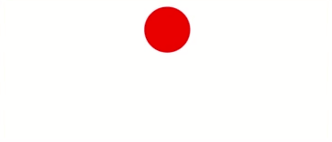
小球的移动(面试题)
初级版本
缺点
小球运动结束不能沿着原路径动画返回
HTML
<html lang="en">
  <head>
    <meta charset="UTF-8" />
    <meta name="viewport" content="width=device-width, initial-scale=1.0" />
    <meta http-equiv="X-UA-Compatible" content="ie=edge" />
    <title>Static Templatetitle>
    <link rel="stylesheet" href="./index.css" />
  head>
  <body>
    <div id="box">div>
  body>
html>
CSS
#box {
  width: 50px;
  height: 50px;
  background-color: red;
  border-radius: 50%;
  animation: move 2s linear;
}

@keyframes move {
  0% {
    transform: translate(0, 0);
  }
  100% {
    transform: translate(200px, 0);
  }
}
效果

优化一版
缺点
按照定义的运动时长运动结束以后还是突兀的从头开始
HTML
<html lang="en">
  <head>
    <meta charset="UTF-8" />
    <meta name="viewport" content="width=device-width, initial-scale=1.0" />
    <meta http-equiv="X-UA-Compatible" content="ie=edge" />
    <title>Static Templatetitle>
    <link rel="stylesheet" href="./index.css" />
  head>
  <body>
    <div id="box">div>
  body>
html>
CSS
#box {
  width: 50px;
  height: 50px;
  background-color: red;
  border-radius: 50%;
  animation: move 4s linear infinite;
}

@keyframes move {
  0%,
  66% {
    transform: translate(0, 0);
  }
  33%,
  100% {
    transform: translate(200px, 0);
  }
}
效果
优化二版
优点
丝滑
HTML
<html lang="en">
  <head>
    <meta charset="UTF-8" />
    <meta name="viewport" content="width=device-width, initial-scale=1.0" />
    <meta http-equiv="X-UA-Compatible" content="ie=edge" />
    <title>Static Templatetitle>
    <link rel="stylesheet" href="./index.css" />
  head>
  <body>
    <div id="box">div>
  body>
html>
CSS
#box {
  width: 50px;
  height: 50px;
  background-color: red;
  border-radius: 50%;
  animation: move 2s linear infinite alternate;
}

@keyframes move {
  0% {
    transform: translate(0, 0);
  }
  100% {
    transform: translate(200px, 0);
  }
}
效果

参考
https://developer.mozilla.org/zh-CN/docs/Web/CSS/animation
https://juejin.im/post/5cdd178ee51d456e811d279b