matlab的二维绘图
matlab绘制图形的步骤为:
- 数据准备:产生自变量采样向量,计算相应的函数值向量。
- 选定图形窗口及子图位置:在默认情况下,MATLAB系统绘制的图形为figure(1).figure(2),...
- 调用绘制函数绘制图形,例如plot函数
- 设置坐标轴的范围、刻度及坐标网格
- 利用对象属性值或图形窗口工具栏设置线型、标记类型及其大小等
- 添加图形注释,例如图名,坐标名称,图例,文字说明等
- 图形的导出与打印
二维绘图
1.基本二维绘图
- plot函数
- plot(Y):输入参数Y是Y轴的数据,一般是输入向量。若Y为复数,则等价于plot(real(Y),image(Y)).
- plot(X1,Y1,...,Xn,Yn):
- 若Xi,Yi均为实数向量,且为同维向量时,则plot先描出点(Xi,Yi)然后用直线依次相连
- 若Xi,Yi均为复数向量,则不考虑虚数部分
- 若Xi,Yi均为同型实数矩阵,则plot(Xi,Yi)依次画出矩阵的几条线段
- 若Xi,Yi一个为向量,另一个为矩阵,且向量的维数等于矩阵的行数或列数,则矩阵按向量的方向分解为几个向量,在与向量配对分别画出。
- plot(X1,Y1,LineSpec,...,Xn,Yn,LineSpec):LineSpec为选项字符串,用于设置颜色、线性、数据点等。
- plot(X1,Y1,LineSpec,'PropertyName',PropertyValue);PropertyName用于设置线的属性值,显得长度,宽度,标记点的颜色,大小等。
- h = plot(X1,Y1,LineSpec,'PropertyName',PropertyValue'):返回绘制函数的句柄值h
- 极坐标轴函数
- loglog函数用于绘制双对数极坐标轴图像
- semilogx函数用于绘制对数x轴上的图像
- semilogy函数用于绘制对数y轴上的图像
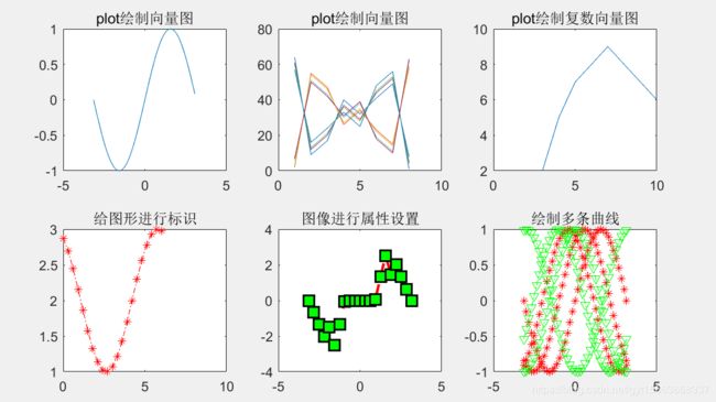
% 例2-1:利用plot绘制不同效果的图形
x1 = -pi:.1:pi;
y1 = sin(x1);
subplot(2,3,1);plot(x1,y1);
title('plot绘制向量图');

x2 = magic(8);
subplot(2,3,2);plot(x2);
title('plot绘制向量图');

x3 = [3+2i,4+5i,5+7i,6+8i,7+9i,10+6i];
subplot(2,3,3);plot(x3);
title('plot绘制复数向量图');

x4 = 0.01:0.3:2*pi;
y2 = cos(x4 + 0.5) + 2;
subplot(2,3,4);plot(x4,y2,'r-.*');
title('给图形进行标识');

x5 = -pi:pi/10:pi;
y3 = tan(sin(x5)) - sin(tan(x5));
subplot(2,3,5);plot(x5,y3,'--rs','LineWidth',2,...
                        'MarkerEdgeColor','k',...
                        'MarkerFaceColor','g',...
                        'MarkerSize',10);
title('图像进行属性设置');

x6 = -pi:pi/20:pi;
y4 = [sin(x6);sin(x6+1);sin(x6+2)];
z = [cos(x6);cos(x6+1);cos(x6+3)];
subplot(2,3,6);plot(x6,y4,'r:*',x6,z,'g-.v');
title('绘制多条曲线');
% 绘制对数坐标及半对数坐标图
clear all;
x1 = logspace(-1,2);
subplot(1,3,1);loglog(x1,exp(x1),'-s');
title('loglog函数绘图');
grid on;

x2 = 0:0.1:10;
subplot(1,3,2);semilogx(10.^x2,x2,'r-.*');
title('semilogx函数绘图');

subplot(1,3,3);semilogy(10.^x2,x2,'rd');
title('semilogy函数绘图'); 
2.格栅
当图像需要对具体数值更加清楚的展示时,为图形添加格栅是十分有效的。
- grid on:命令可以在当前图形的单位标记处添加格栅
- grid off:取消格栅的显示
- grid:单独的grid,则可以在on与off状态下交替转换。
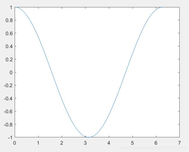
% 为图形添加格栅
clear all;
x = linspace(0,10);
y = sin(x);
ax1 = subplot(2,1,1);
plot(x,y);
grid on;

y2 = sin(3*x);
ax2 = subplot(2,1,2);
plot(x,y2)
grid on;grid; 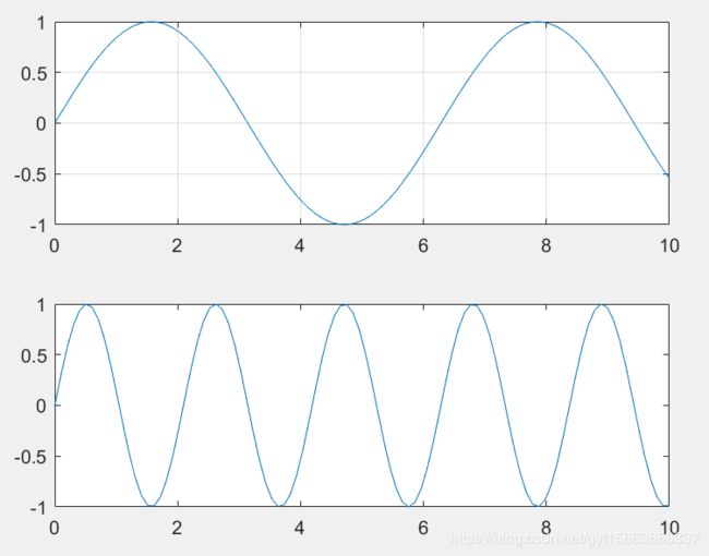
3.文字说明
- title('text'):在图像窗口的顶端的中间位置输出字符串text作为标题
- xlabel('text'):在x轴下的中间位置输出字符串text作为标注
- ylabel('text'):在y轴边上的中间位置输出字符串text作为标注
- zlabel('text'):咋z轴边上的中间位置输出字符串text作为标注
- text(x,y,'text'):在图形窗口(x,y)处写字符串text
- gtext('text'):通过使用鼠标或方向键,移动图形窗口中的十字光标,让用户将字符串text放置在图形窗口中。
- legend(str1,str2,...,pos):在当前图形上添加图例,并用说明性文字str1,str2等做标注。参数pos值位置参数。
- legend off:清除图例
clear all
x = (0:0.1:2*pi)';
y1 = 2 * exp(-0.5 * x) * [1,-1];
y2 = 2 * exp(-0.5 * x) .* sin(2 * pi * x);
x1 = (0:12)/2;
y3 = 2 * exp(-0.5 * x1) .* sin(2*pi*x1);
plot(x,y1,':',x,y2,'--',x1,y3)
title('曲线及其包络线');
xlabel('变量X');ylabel('变量Y');
text(3.2,0.5,'包络线');
text(0.5,0.5,'曲线y');
text(1.4,0.15,'离散数据点');
legend('包络线','曲线y','离散数据点') 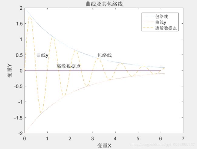
4.坐标轴设置
matlab提供了坐标轴控制函数axis。
- axis([xmin xmax ymin ymax zmin zmax]):设置当前坐标轴的x轴与y轴与z轴的范围。
- v = axis:返回一包含x轴,y轴与z轴对的刻度因子的行向量,v是一个四维或者六维的向量,取决于坐标是二维还是三维的。
- axis auto:自动计算当前轴的范围。auto x:自动计算x轴的范围。 auto y z:自动计算y轴与z轴的范围。
- axis manual:把坐标固定在当前的范围,如果保持状态hold on,后面的图形仍用相同的界限
- axis tight:把坐标轴的范围定为数据的范围,三个方向上的纵高比设为同一个值
- axis fill:用于将坐标轴的取值范围分别设置为绘制所用数据在相应方向上的最大、最小值
- axis ij:将二维图形的坐标原点设置在图形窗口的左上角,坐标轴i垂直向下,坐标轴j水平向右
- axis xy:使用笛卡儿坐标系
- axis equal:设置坐标轴的纵横比,使在每个方向的数据单位都相同
- axis square:设置当前图形为正方形,系统将调整x轴y轴和z轴,他们具有相同的长度。
- axis vis3d:将冻结坐标系此时的状态,以便进行旋转
- axis normal:自用调整纵横比,还用于填充图形区域的,显示与坐标轴上的数据单位的纵横比
- axis off:关闭所有坐标轴上的标记、格栅、和单位标记。保留由text和getext设置的对象
- axis on:显示坐标轴上的单位、标记和格栅
- [mode,visibility,direction] = axis('state'):返回表明当前坐标轴的设置属性的三个参数
clear all
t = 0.01:0.01:pi;
figure;
plot(sin(t),cos(t));
axis([-1 1 -2 2]) % 重新设置坐标轴

5.图像迭绘
在已经存在的图上绘制新的曲线,并保留原来的曲线。
hold on:是当前的轴及图形保留下来而不被刷新,并接受即将绘制的新的曲线
hold off:为不保留当前轴及图形,绘制新的区先后,原图被刷新
hold:为hold on语句和hold off语句的切换
% 利用hold函数绘制迭绘图形
clear all
x = -pi:pi/20:pi;
plot(sin(x),'r:>');
hold on
plot(cos(x),'b-<');
hold off 
6.子图绘制
matlab允许用户在同一个图形窗口中同时绘制多幅相互独立的子图,使用subplot函数。
- subplot(m,n,p):将当前图形窗口分成mxn个绘图区,即m行n列。函数选定第p个分区为当前的活动区。在每一个区允许使用不同的坐标系单独绘制图形。
- subplot(m,n,p,'replace'):如果定义的坐标轴已经存在,则删除已经有的,并创建一个新的坐标轴
- subplot(m,n,p,'align'):对齐坐标轴
- subplot(h):使句柄h对应的坐标轴为当前的,用于后面图形的输出展示
- subplot('Position',[left bottom widthheight]):在指定的位置上建立坐标轴
- subplot(...,prop1,value1,prop2,value2,...):设置坐标轴的属性及属性值
- h = subplot(...):返回坐标轴的句柄值h
% 利用subplot绘制子图
clear all
x = 0:0.01*pi:pi*16;
j = sqrt(-1);
subplot(2,2,1);plot(abs(sin(x)) .* (cos(x) + j * sin(x)),'LineWidth',3);
xlim([-1 1]);ylim([-1 1]);
subplot(2,2,2);plot(abs(sin(x/2)) .* (cos(x) + j * sin(x)),'LineWidth',3);
xlim([-1 1]);ylim([-1 1]);
subplot(2,2,3);plot(abs(sin(x/3)) .* (cos(x) + j * sin(x)),'LineWidth',3);
xlim([-1 1]);ylim([-1 1]);
subplot(2,2,4);plot(abs(sin(x/4)) .* (cos(x) + j * sin(x)),'LineWidth',3);
xlim([-1 1]);ylim([-1 1]);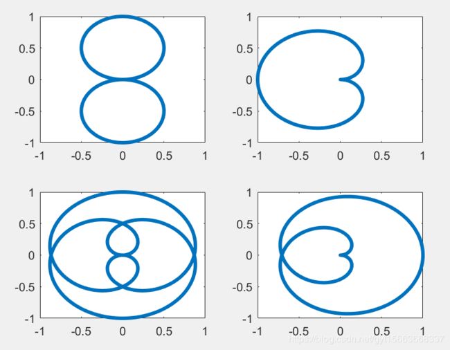
7.交互式绘图
matlab中设置了相应的鼠标操作的图形操作指令,分别是ginput、gtext和zoom函数。
- 除了ginput函数只能应用于二维图形外,其余两个函数对二维和三维图像均适用
- ginput函数和zoom函数配合使用,可以从图形中获得较为准确的数据
- 在逻辑顺序并不十分清晰的情况下,并不提倡这几个指令同时使用
ginput函数:
用于交互式从matlab绘制的图形中读取点的坐标。
- [x,y] = ginput(n):用于交互式的通过鼠标读取图形中的点,返回点的横纵坐标值。其中x为点的横坐标值,y为点的纵坐标值,输入参数n为选择点的个数,可以按Enter键提前结束读点操作
- [x,y] = ginput:可以无限地读取图形中点的坐标直到按下Enter键
- [x,y,button] = ginput(...):button值返回读点时的鼠标操作,其中1代表按下鼠标左键读点,2代表按下鼠标中键读点,3代表按下鼠标右键读点。
clear all
x1 = 0:pi./100:2*pi;
plot(x1,cos(x1));
n = 10;
[x,y] = ginput(n);
>> x

x =

    0.8548
    1.3602
    2.6075
    3.9194
    5.0269
    5.3710
    4.6075
    4.2419
    2.0806
    2.7258

>> y

y =

    0.6479
    0.1887
   -0.8735
   -0.7335
    0.2977
    0.5856
   -0.1381
   -0.5272
   -0.3755
    0.2821
gtext函数:
gtext用于为图形添加交互式标记。
gtext('str'):用鼠标把字符串或字符串元胞数组放置到图形中作为文字说明
clear all
x = -pi:.1:pi;
y = sin(x);
plot(x,y);
xlabel('x');ylabel('y');
gtext('y = sin(x)','fontsize',10) % 添加文本 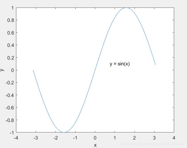
zoom函数:
zoom函数可以将局部图像进行放大。
- zoom on:打开交互式图形放大功能
- zoom off:关闭交互式图形放大功能
- zoom out:将系统返回非放大转态,并将图形恢复原状
- zoom reset:系统将记住当前图形的放大状态,作为放大状态的设置值,当使用zoom out或双击鼠标时,图形并不是返回到原状,而是返回reset时的放大状态
- zoom:用于切换放大系数,取值为on或off
- zoom xon:只对x轴进行放大
- zoom yon:只对y轴进行放大
- zoom(factor):用放大系数factor进行放大或缩小,而不影响交互式放大的转态。如果factor>1,则将系统图形放大factor倍;如果0
- zoom(fig,option):对窗口fig(不一定为当前窗口)中的二维图形进行放大,其中参数option为on、off、xon、yon、reset、factor等
clear all
t = 0.01:0.01:2*pi;
figure;
subplot(2,2,1);plot(t,sin(t));
axis([-5 10 -3 3]); % 设置坐标轴
title('放大前');
subplot(2,2,2);plot(t,sin(t));
axis([0 6 -1.5 1.5]);
zoom on; % 图像放大
title('放大后');
subplot(2,2,3);plot(t,sin(t));
axis([0 6 -3 3]);
zoom xon;
title('x轴方法');
subplot(2,2,4);plot(t,sin(t));
axis([-5 10 -1.5 1.5]);
zoom yon;
title('y轴放大');
8.双坐标轴绘制
在MATLAB中,提供了plotyy函数实现双坐标轴的绘制功能。
- plotyy(x1,y1,x2,y2):在一个图形窗口同时绘制两条曲线(x1,y1)和(x2,y2),曲线(x1,y1)用左侧的y轴,曲线(x2,y2)用右侧的y轴
- plotyy(x1,y1,x2,y2,fun):fun是字符串格式,用来指定绘图的函数名
- plotyy(x1,y1,x2,y2,fun1,fun2):用两种不同的函数分别绘制两种曲线。
clear all
x = 0:0.01:20;
y1 = 200 * exp(-0.05 * x) .* sin(x);
y2 = 0.8 * exp(-0.5 * x) .* sin(10 * x);
[AX,H1,H2] = plotyy(x,y1,x,y2,'plot');
xlabel('x');
set(get(AX(1),'Ylabel'),'String','慢衰减');
set(get(AX(2),'Ylabel'),'String','快衰减');
set(H1,'LineStyle','--')
set(H2,'LineStyle',':')
9.函数绘图
如果只知道函数的表达式,也可以绘制该函数的图形,函数fplot用于绘制一元函数的图形,函数explot用于 绘制二元函数的图形,函数ezploar用于绘制三元函数的图形。
fplot函数:
fplot函数根据函数的表达式自动调整自变量的范围,无须给函数赋值,直接生成或反映函数变化规律的图形,在函数变化快的区域,采用小的间隔,否则采用大的间隔。一般用在对横坐标取值间隔没有明确的要求,仅查看函数大致变化规律的情况下使用。
- fplot(fun,limits,tol,LineSpec):limit是指定的范围,一般limit=[a,b,c,d],a,b为横轴的上下限,c,d为纵轴的上下限。
- fplot(fun,limits,n):当n>=1时,至少画出n+1个点,最大步长不超过(xmax-xmin)/ n
- [X,Y] = fplot(fun,limits,...):返回横坐标与纵坐标的值给变量X和Y,此时fplot不画出图形。如需画出图形,即可使用plot(X,Y)语句
% 例2-12:利用fplot函数绘制f(x) = sin(tan(pi*x))
x = 0:0.01:1;
y = sin(tan(pi*x));
subplot(1,2,1);plot(x,y);
title('plot 函数绘图');
subplot(1,2,2);fplot('sin(tan(pi*x))',[0,1],1e-4);
title('fplot 函数绘图');
ezplot函数:
函数的表达式显示在图形的上方,同时对坐标轴可以不加任何限制作图。
- ezplot(fum):绘制fun函数图形
- ezplot(fun,[min,max]):绘制函数fun(x)在区间[min,max]的图形。
- ezplot(fun2):绘制隐函数fun2=fun(x,y)的图形,且fun(x,y)=0.
- explot(fun2,[xmin,xmax,ymin,ymax]):绘制隐函数fun(x,y)=0在区间[xmin,xmax]和[ymin,ymax]区间上的图形
- ezplot(funx,funy):绘制参数方程x=funx,y=funy的函数图形
subplot(2,1,1);
ezplot('cos(5 * t)','sin(3 * t)',[0,2 * pi])
grid on;
subplot(2,1,2);
ezplot('5 * x ^ 2 + 25 * y ^ 2 = 6',[-1.5,1.5,-1,1])
grid on; 
10.二维特殊图形
条形图:
条形图可以显示适量数据和矩阵数据,如果用户需要表示跨时间段的运算结果、不同数据的比较结果以及部分相对整体比较结果,常会用到条形图绘制离散数据。
- bar(Y)或barh(Y):绘制Y的条形图
- bar(x,Y)或barh(Y):在位置x上绘制Y的条形图
- bar(...,width)或barh(...,width):用width指定条形图的宽度,默认值为0.8,如果大于1,那么条与条之间将重合。
- bar(...,'style')或barh(...,'style'):指定条形图的绘制类型,style可以取值grouped或stacked.group为排列型,stacked为堆型条状图
- bar(...'bar_color')或barh(...,'bar_color'):指定条形图颜色
- bar(...,'PropertyName',PropertyValue',...):指定条形图的属性名及属性值。
- h = bar(...)或h=barh(...):返回条形图的句柄向量h
% 条形图
Y = [0.5 0.7 0.8;0.7 0.8 0.4;0.4 0.3 0.9;0.3 0.6 0.9;0.2 0.1 0.6];
subplot(2,2,1)
bar(Y,'grouped'),title 'Group';
xlabel('销售数据');ylabel('销售直方图')
subplot(2,2,2)
bar(Y,'stacked');title 'Stack'
xlabel('销售数据');ylabel('销售直方图')
subplot(2,2,3)
barh(Y,'stacked');title 'Stack'
xlabel('销售数据');ylabel('销售直方图')
subplot(2,2,4)
bar(Y,1.2);title 'Width = 1.2';
xlabel('销售数据');ylabel('销售直方图')
饼形图:
饼状图主要用于显示矩阵中每个元素在所有元素总和中所占的百分比及各部分之间的比例关系。
- pie(X):X是向量,根据X中个分量所占的百分比,绘制出相应比例,如果总和小于1,只会绘制部分圆
- pie(X,explode):可以把指定的部分从圆形中抽取出来,explode为一个与X长度相同的向量,其中不为0的数所对应的分量,将被抽取出来。
- pie(X,label):对每个分块添加标注,labels为单元数组,长度与X相同,只能是字符串
- pie(axes_handel,...):根据给定的句柄值绘制饼状图。
- h = pie(...):返回图形对象的句柄向量图h
% 饼形图
x = [0.15 0.2 0.25 0.35];
pie(x)
直方图:
条形直方图中的x轴反映了数据y中元素数值的范围,直方图的y轴显示出参数y中的元素落入该组的数目
- n = hist(Y):把Y按其中数据的大小分为10个长度相同的段,统计每段中的元素个数并返回给n,如果Y是矩阵,那么按列分段。
- n = hist(Y,x):输入参数x是向量,以x的值为中心生成直方图的各条。
- n = hist(Y,nbins):输入参数nbins是正整数,用来设置分段的个数
- [n,xout] = hist(...):不绘制数据Y的直方图,只返回反映每个条形图中元素的向量与反映每个条形图频率的向量
- hist(...):只绘制直方图,不输出参数
- hist(...):只绘制直方图,不输入参数
- hist(axes_handle,...):根据给定的句柄值axes_handle绘制直方图。
% 直方图
rand('state',1);
y = rand(100,1); % 生成待统计的数据
[n,x] = hist(y); % 返回统计频数n和区域中心位置x
s(1) = subplot(1,3,1);
hist(y); % 绘制统计直方图
xlabel('(a) hist(y)');
s(2) = subplot(1,3,2);
hist(y,7); % 绘制直方图并指定区域数目
xlabel('(b) hist(y,7)');
s(3) = subplot(1,3,3);
hist(y,0:.1:1); % 绘制直方图,并指定每个区域的中心位置
xlabel(' (x) hist(y,0:.1:1)');
axis(s,'square');
set(gcf,'Color','w');
散点图:
散点图将数据序列显示为一组点,在回归分析中较为常用,放映了因变量随自变量变化的趋势,便于观察两者关系。
- scatter(X,Y):绘制关于X和Y的散点图,由于没有设置散点图的其他属性,因此matlab采用默认的颜色和大小绘制数据点
- scatter(X,Y,S,C);根据指定颜色C绘制散点图
- scatter(...,markertype):使用专门的标记类型o绘制散点图。
- scatter(...,'filled'):对标记进行填充
- scatter(...,'PropertyName',propertyvalue):设置散点的属性名及属性值
- h = scater(...):返回散点图的句柄值。
% 散点图
x = linspace(0,3 * pi, 200);
y = cos(x) + rand(1,200);
c = linspace(1,10,length(x));
scatter(x,y,[],x)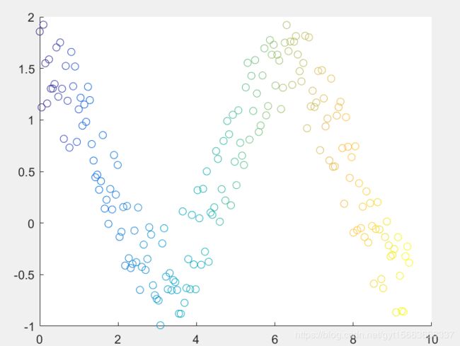
二维绘图的基本内容应该都在这里了,补充之间的绘图内容,接下来还会有三维绘图、四维绘图。