matplotlib折线图绘制案例
折线图应用场景
主要用于产品随时间走势
加载数据和设置中文显示
import numpy as np
import matplotlib.pyplot as plt

# 默认不支持中文,需要配置RC 参数
plt.rcParams['font.sans-serif']='SimHei'
# 设置字体之后不支持负号,需要去设置RC参数更改编码
plt.rcParams['axes.unicode_minus']=False

res = np.load(r'F:\数据分析\第一周\第三天-matplotlab\国民经济核算季度数据.npz')
columns = res['columns']  #获取csv 栏的内容
values = res['values']    #获取出去栏外的内容

print(columns)
print(values)
设置和显示画布
fig = plt.figure(figsize=(10,10))

#第一个图形
fig.add_subplot(2,1,1)

#第二个图形
fig.add_subplot(2,1,2)

#显示图形
plt.show()

画第一个折线图
部分代码如下:
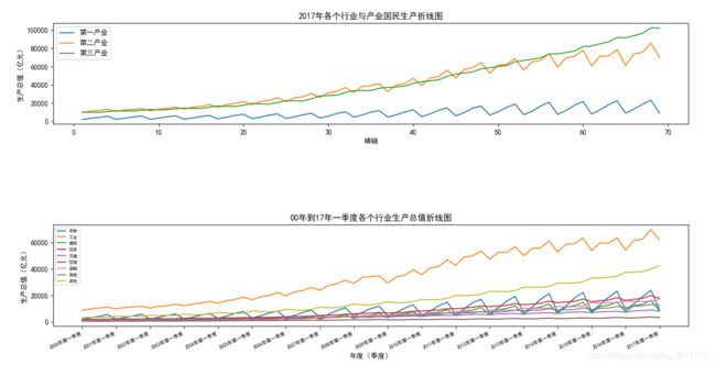
fig.add_subplot(2,1,1)
x = values[:,0]
y1 = values[:,3]
y2 = values[:,4]
y3 = values[:,5]

plt.plot(x,y1)
plt.plot(x,y2)
plt.plot(x,y3)

plt.title("2017年各个行业与产业国民生产折线图")
plt.xlabel('横轴')
plt.ylabel('生产总值(亿元)')
legend = [tmp[:4] for tmp in columns[3:6]]
plt.legend(legend,loc=2) #loc=2在左上角

画出第二个折线图
部分代码如下:
fig.add_subplot(2,1,2)
x = values[:,0]
y1 = values[:,6]
y2 = values[:,7]
y3 = values[:,8]
y4 = values[:,9]
y5 = values[:,10]
y6 = values[:,11]
y7 = values[:,12]
y8 = values[:,13]
y9 = values[:,14]

plt.plot(x,y1)
plt.plot(x,y2)
plt.plot(x,y3)
plt.plot(x,y4)
plt.plot(x,y5)
plt.plot(x,y6)
plt.plot(x,y7)
plt.plot(x,y8)
plt.plot(x,y9)

plt.title('00年到17年一季度各个行业生产总值折线图')
legend = [tmp[:2] for tmp in columns[6:15]]
plt.legend(legend,loc=2,fontsize=6)
plt.xlabel('年度(季度)')
plt.ylabel('生产总值(亿元)')

xticks = values[:,1]
plt.xticks(x[::4],xticks[::4],rotation='25',fontsize=7,horizontalalignment='right')

设置两个图之间的距离
设置图形上下左右之间的距离
plt.subplots_adjust(hspace=1,wspace=1)
完整代码如下
import numpy as np
import matplotlib.pyplot as plt

# 默认不支持中文,需要配置RC 参数
plt.rcParams['font.sans-serif']='SimHei'
# 设置字体之后不支持负号,需要去设置RC参数更改编码
plt.rcParams['axes.unicode_minus']=False

res = np.load(r'...........................\国民经济核算季度数据.npz')
columns = res['columns']  #获取csv 栏的内容
values = res['values']    #获取出去栏外的内容

print(columns)
print(values)

#创建画布
fig = plt.figure(figsize=(10,10))

#在画图对象里创建多个子图

#改变上下两个图的间距
plt.subplots_adjust(hspace=1,wspace=1)

#2行1列的第一个图和2行1列的第二个图
fig.add_subplot(2,1,1)
#+++++++++第一个子图的区域
#接下来绘图方式和之前一样
x = values[:,0]
y1 = values[:,3]
y2 = values[:,4]
y3 = values[:,5]

#绘图
plt.plot(x,y1)
plt.plot(x,y2)
plt.plot(x,y3)

# 增加标题
plt.title("2017年各个行业与产业国民生产折线图")

#x,y轴
plt.xlabel('横轴')
plt.ylabel('生产总值(亿元)')

#图例
legend = [tmp[:4] for tmp in columns[3:6]]
plt.legend(legend,loc=2)


#2行1列的第二个图
fig.add_subplot(2,1,2)
#++++++++++第二个子图的区域

x = values[::,0]
y1 = values[::,6]
y2 = values[::,7]
y3 = values[::,8]
y4 = values[::,9]
y5 = values[::,10]
y6 = values[::,11]
y7 = values[::,12]
y8 = values[::,13]
y9 = values[::,14]

plt.plot(x,y1)
plt.plot(x,y2)
plt.plot(x,y3)
plt.plot(x,y4)
plt.plot(x,y5)
plt.plot(x,y6)
plt.plot(x,y7)
plt.plot(x,y8)
plt.plot(x,y9)
# print(x,y)
plt.title('00年到17年一季度各个行业生产总值折线图')

#图例,图例大小,fontsize=6。
legend = [tmp[:2] for tmp in columns[6:15]]
plt.legend(legend,loc=2,fontsize=6)

#横轴名称
plt.xlabel('年份(季度)')
plt.ylabel('生产总值(亿元)')


xticks = values[:,1]
#需要更改的参数,更改后的参数,旋转的角度,对齐方式,字体大小,horizontalalignment='right'设置对齐方式
plt.xticks(x[::4],xticks[::4],rotation='25',horizontalalignment='right',fontsize=7)
# yticks = np.arange(0,60000)


#展示
plt.show()
#保存图片
# plt.savefig(r'F:\数据分析\第一周\第三天-matplotlab\国民生产总值.png')


#折线图,主要用于产品随时间走势