小程序ColorUI使用简易教程
本教程配合官方示例食用更佳!!!
目录
前言
快速上手
使用UniApp开发
开始
使用自定义导航栏
使用原生小程序开发
从现有项目开始
从新项目开始
使用自定义导航栏
组件
基础元素
layout布局
Background背景
Text文字
Icon图标
Button按钮
Tag标签
Avatar头像
Progress进度条
Border&Shadow边框阴影
Loading加载
交互组件
前言
ColorUI是一个css库!!!在你引入样式后可以根据class来调用组件
快速上手
使用UniApp开发
开始
下载源码解压获得/Colorui-UniApp文件夹,复制目录下的 /colorui 文件夹到你的项目根目录
App.vue 引入关键Css main.css icon.css
使用自定义导航栏
导航栏作为常用组件有做简单封装,当然你也可以直接复制代码结构自己修改,达到个性化目的。
App.vue 获得系统信息
onLaunch: function() {

uni.getSystemInfo({

success: function(e) {

// #ifndef MP

Vue.prototype.StatusBar = e.statusBarHeight;

if (e.platform == 'android') {

Vue.prototype.CustomBar = e.statusBarHeight + 50;

} else {

Vue.prototype.CustomBar = e.statusBarHeight + 45;

};

// #endif

// #ifdef MP-WEIXIN

Vue.prototype.StatusBar = e.statusBarHeight;

let custom = wx.getMenuButtonBoundingClientRect();

Vue.prototype.Custom = custom;

Vue.prototype.CustomBar = custom.bottom + custom.top - e.statusBarHeight;

// #endif

// #ifdef MP-ALIPAY

Vue.prototype.StatusBar = e.statusBarHeight;

Vue.prototype.CustomBar = e.statusBarHeight + e.titleBarHeight;

// #endif

}

})

},
pages.json 配置取消系统导航栏
"globalStyle": {

"navigationStyle": "custom"

},
复制代码结构可以直接使用,注意全局变量的获取。
使用封装,在main.js 引入 cu-custom 组件。
import cuCustom from './colorui/components/cu-custom.vue'

Vue.component('cu-custom',cuCustom)
page.vue 页面可以直接调用了
返回

导航栏
| 参数 | 作用 | 类型 | 默认值 |
|---|---|---|---|
| bgColor | 背景颜色类名 | String | '' |
| isBack | 是否开启返回 | Boolean | false |
| bgImage | 背景图片路径 | String | '' |
| slot块 | 作用 |
|---|---|
| backText | 返回时的文字 |
| content | 中间区域 |
| right | 右侧区域(小程序端可使用范围很窄!) |
使用原生小程序开发
从现有项目开始
下载源码解压获得/demo,复制目录下的 /colorui 文件夹到你的项目根目录
App.wxss 引入关键Css main.wxss icon.wxss
@import "colorui/main.wxss";

@import "colorui/icon.wxss";

@import "app.css"; /* 你的项目css */

....
从新项目开始
下载源码解压获得/template,复制/template并重命名为你的项目,导入到小程序开发工具既可以开始你的新项目了
使用自定义导航栏
导航栏作为常用组件有做简单封装,当然你也可以直接复制代码结构自己修改,达到个性化目的。
App.js 获得系统信息
onLaunch: function() {

    wx.getSystemInfo({

        success: e => {

            this.globalData.StatusBar = e.statusBarHeight;

            let custom = wx.getMenuButtonBoundingClientRect();

            this.globalData.Custom = custom;

            this.globalData.CustomBar = custom.bottom + custom.top - e.statusBarHeight;

        }

    })

},
App.json 配置取消系统导航栏,并全局引入组件
"window": {

"navigationStyle": "custom"

},

"usingComponents": {

"cu-custom":"/colorui/components/cu-custom"

}
page.wxml 页面可以直接调用了
返回

导航栏
| 参数 | 作用 | 类型 | 默认值 |
|---|---|---|---|
| bgColor | 背景颜色类名 | String | '' |
| isBack | 是否开启返回 | Boolean | false |
| isCustom | 是否开启左侧胶囊 | Boolean | false |
| bgImage | 背景图片路径 | String | '' |
| slot块 | 作用 |
|---|---|
| backText | 返回时的文字 |
| content | 中间区域 |
| right | 右侧区域(小程序端可使用范围很窄!) |
组件
基础元素
layout布局
Flex布局
父级添加class名flex
- 固定尺寸
通过添加class名basic-{ {options}}来设置分栏大小,options可以取五个值,分别为xs、sm、df、lg、xl
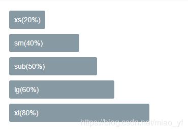
xs(20%)


sm(40%)


df(50%)

lg(60%)

xl(80%)
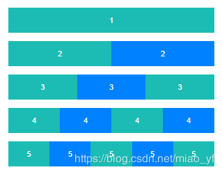
- 比例布局
通过添加class名flex-{ {options}}来设置分栏大小,options可以取值sub、twice、treble,分别代表占比1,2,3
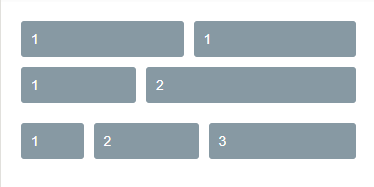
1

1


1

2


1

2

3
- 水平对齐(justify)
通过添加class名justify-{ {options}}来设置盒子水平对齐方式,options可以取值start、end、center、between、around,效果可以参考flex布局布局中的容器属性justify-content(Flex布局教程)
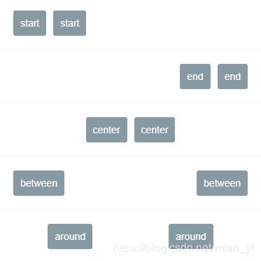
start

start


end

end


center

center


between

between


around

around
- 垂直对齐(align)
通过添加class名align-{ {options}}来设置盒子垂直对齐方式,options可以取值start、end、center,效果可以参考flex布局布局中的容器属性align-item(Flex布局教程)
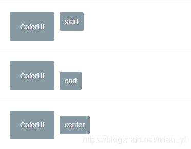
ColorUi

start


ColorUi

end


ColorUi

center
Grid布局
父级添加class名grid
- 等分列
通过添加class名col-{ {options}}来实现栅格布局,options可以取值1、2、3、4、5
{
    {index+1}}
- 等高
通过添加class名grid-square设置盒子内容等高,添加col-{ {options}}来设置分栏个数,options可以取值1、2、3、4、5,将盒子等分
----------------------------------------------------------------------------------------
data() {
return {
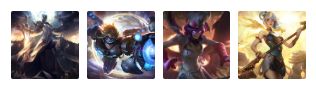
avatar: ['https://ossweb-img.qq.com/images/lol/web201310/skin/big10001.jpg',
'https://ossweb-img.qq.com/images/lol/web201310/skin/big81005.jpg',
'https://ossweb-img.qq.com/images/lol/web201310/skin/big25002.jpg',
'https://ossweb-img.qq.com/images/lol/web201310/skin/big99008.jpg'
],
}
},布局相关class
| class | 说明 | 可选值 |
|---|---|---|
| flex | flex布局必选值 | —— |
| basic-{ {options}} | 设置分栏大小 | xs/sm/df/lg/xl |
| flex-{ {options}} | 以比例设置分栏大小 | sub/twice/treble |
| justify-{ {options}} | 水平对齐方式 | start/end/center/between/around |
| align-{ {options}} | 垂直对齐方式 | start/end/center |
| grid | grid布局必选值 | —— |
| col-{ {options}} | 栅格布局 | 1/2/3/4/5 |
| grid-square | 等高 | —— |
| fl | 左浮 | —— |
| fr | 右浮 | —— |
| margin-{ {options}} | 外边距 | xs/sm/df/lg/xl |
| padding-{ {options}} | 内边距 | xs/sm/df/lg/xl |
| margin-lr-{ {options}} | 水平方向外边距 | xs/sm/df/lg/xl |
| padding-lr-{ {options}} | 水平方向内边距 | xs/sm/df/lg/xl |
| margin-tb-{ {options}} | 垂直方向外边距 | xs/sm/df/lg/xl |
| padding-tb-{ {options}} | 垂直方向内边距 | xs/sm/df/lg/xl |
| margin-top-{ {options}} | 上外边距 | xs/sm/df/lg/xl |
| padding-top-{ {options}} | 上内边距 | xs/sm/df/lg/xl |
| margin-right-{ {options}} | 右外边距 | xs/sm/df/lg/xl |
| padding-right-{ {options}} | 右内边距 | xs/sm/df/lg/xl |
| margin-bottom-{ {options}} | 下外边距 | xs/sm/df/lg/xl |
| padding-bottom-{ {options}} | 下内边距 | xs/sm/df/lg/xl |
| margin-left-{ {options}} | 左外边距 | xs/sm/df/lg/xl |
| padding-left-{ {options}} | 左内边距 | xs/sm/df/lg/xl |
注:lr,left-right;tb,top-bottom;
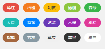
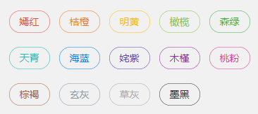
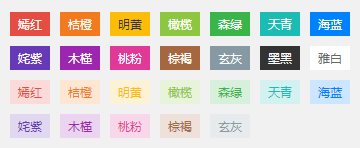
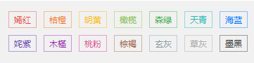
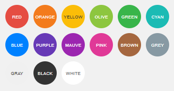
Background背景
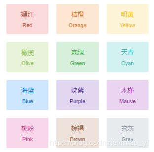
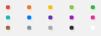
颜色背景
- 深色
通过添加class名bg-{ {options}}设置背景
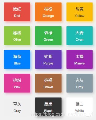
{
    {item.title}}

{
    {item.name}}
- 浅色
通过添加class名bg-{ {options}}设置背景颜色,添加class名light表示相应的浅色
{
    {item.title}}

{
    {item.name}}
- 渐变
通过添加class名bg-gradual-{ {options}}设置渐变背景颜色
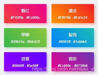
魅红

#f43f3b - #ec008c


鎏金

#ff9700 - #ed1c24


翠柳

#39b54a - #8dc63f


靛青

#0081ff - #1cbbb4


惑紫

#9000ff - #5e00ff


霞彩

#ec008c - #6739b6
图片背景
- 透明背景(文字层)
通过bg-img设置图片背景,bg-mask设置透明遮罩层
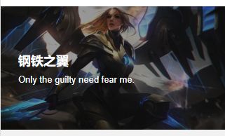
钢铁之翼


Only the guilty need fear me.
通过bg-shadeTop设置遮罩层上阴影,bg-shadeBottom设置遮罩层下阴影
上面开始


下面开始
背景相关class
| class | 说明 | 可选值 |
|---|---|---|
| bg-{ {options}} | 设置背景色 | red/orange/yellow/olive/green/cyan/blue/purple/mauve/pink/ brown/grey/gray/black/white |
| light | 浅色背景,配合bg-{ {options}}使用,取值前12个 | —— |
| bg-gradual-{ {options}} | 渐变色背景 | red/orange/green/blue/purple/pink |
| bg-img | 图片背景 | —— |
| bg-mask | 遮罩层 | —— |
| bg-shadeTop | 遮罩层上阴影 | —— |
| bg-shadeBottom | 遮罩层下阴影 | —— |
| shadow-blur | 外阴影 | —— |
Text文字
文字大小
通过添加class名text-{ {size}}设置文字大小,size取值xs、sm、df、lg、xl、xxl、sl、xsl

文字颜色
通过添加class名text-{ {color}}设置文字颜色,color取值red、orange、yellow、olive、green、cyan、blue、purple、mauve、brown、grey、gray、black、white
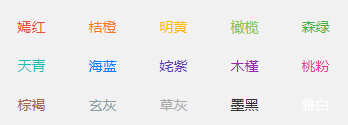
{
    {item.title}}
文字阴影
通过添加class名text-shadow设置文字阴影
文字截断
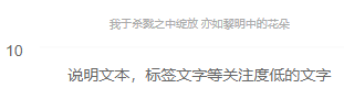
通过添加class名text-cut设置文字长度溢出显示省略号
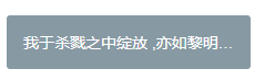
我于杀戮之中绽放 ,亦如黎明中的花朵
文字对齐
通过添加class名text-{ {position}}设置文字长度溢出显示省略号,position取值left、center、right
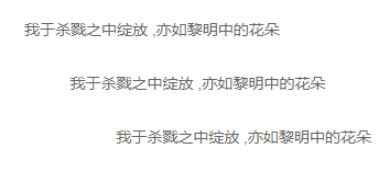
我于杀戮之中绽放 ,亦如黎明中的花朵

我于杀戮之中绽放 ,亦如黎明中的花朵

我于杀戮之中绽放 ,亦如黎明中的花朵
特殊文字
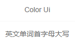
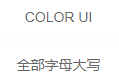
通过添加class名text-price表示价格,会显示¥符号,text-Abc设置英文首字母大写,text-ABC设置英文大写,text-abc设置英文小写
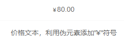
80.00
价格文本,利用伪元素添加"¥"符号
color Ui
英文单词首字母大写
color Ui
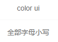
全部字母大写
color Ui
全部字母小写
文字相关class
| class | 说明 | 可选值 |
|---|---|---|
| text-{ {size}} | 文字大小 | xs(20upx)/sm(24upx)/df(28upx)/lg(32upx)/xl(36upx)/xxl(44upx)/sl(80upx)/xsl(120upx) |
| text-{ {color}} | 文字颜色 | red/orange/yellow/olive/green/cyan/blue/purple/mauve/brown/grey/gray/black/white |
| text-shadow | 文字阴影 | —— |
| text-cut | 文字截断 | —— |
| text-bold | 文字加粗 | —— |
| text-{ {position}} | 文字对齐 | left/center/right |
| text-price | 带¥符号 | —— |
| text-Abc | 首字母大写 | —— |
| text-ABC | 全部大写 | —— |
| text-abc | 全部小写 | —— |
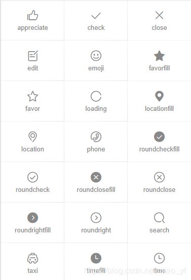
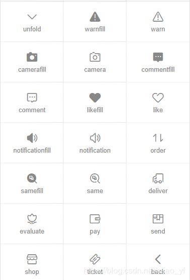
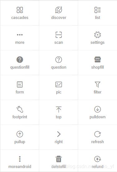
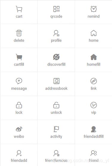
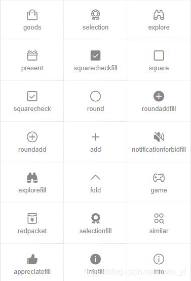
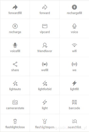
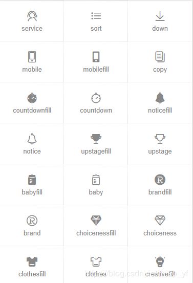
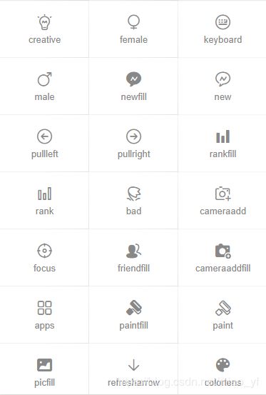
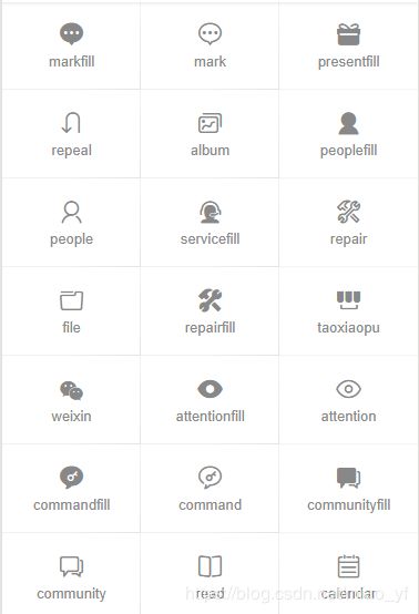
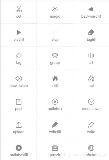
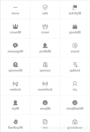
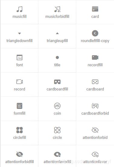
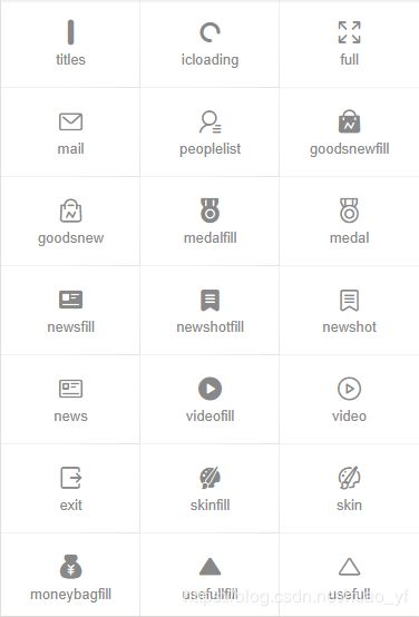
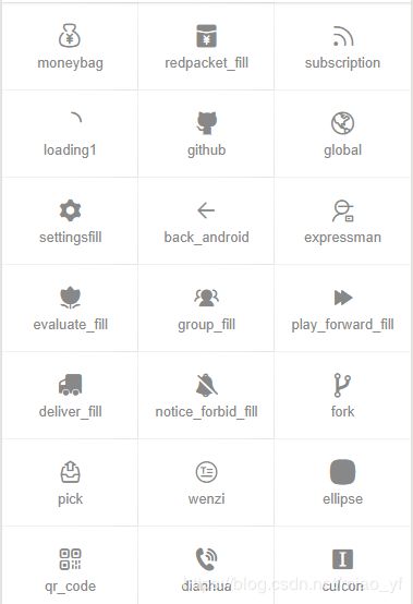
Icon图标
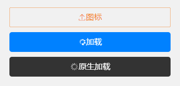
通过添加class名cuIcon-{ {iconName}},直接设置图标
Button按钮
按钮必选class cu-btn
按钮形状
通过添加class名设置按钮不同形状,默认只需要添加cu-btn,round为圆角,cuIcon为圆形用来包裹图标
按钮尺寸
sm小尺寸,lg大尺寸
按钮颜色
添加背景class名就可以,用法参考背景组件的介绍
幽灵按钮
通过line-{ {color}}或者lines-{ {color}}设置镂空的幽灵按钮
禁用按钮
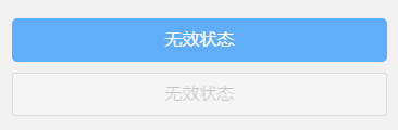
添加disabled禁用按钮
自定义图标按钮
可以直接在button标签class内添加图标名,或者在text等其他标签内添加class,其他标签要包裹在button标签内
按钮相关class
| class | 说明 | 可选值 |
|---|---|---|
| cu-btn | 按钮必选值 | —— |
| round | 圆角按钮 | —— |
| cuIcon | 圆形 | —— |
| sm | 小尺寸按钮 | —— |
| lg | 大尺寸按钮 | —— |
| line-{ {color}} | 幽灵按钮,细边框 | 参考背景色 |
| lines-{ {color}} | 幽灵按钮,粗边框 | 参考背景色 |
| disabled | 禁用 | —— |
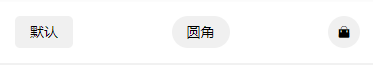
Tag标签
标签必选class cu-tag
标签形状
通过添加class名设置标签不同形状,默认只需要添加cu-tag,round为椭圆,radius为圆角
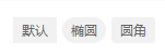
默认
椭圆
圆角
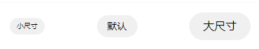
标签尺寸
sm小尺寸
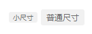
小尺寸
普通尺寸
标签颜色
添加背景class名就可以,用法参考背景组件的介绍
{
    {item.title}}
{
    {item.title}}
幽灵标签
通过line-{ {color}}设置镂空的幽灵按钮
{
    {item.title}}
胶囊样式
通过cu-capsule设置为胶囊样式,内部设置自己想要的样式
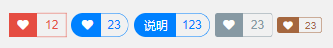
12


23


说明

123


23


23
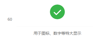
数字标签
通过badge设置角标
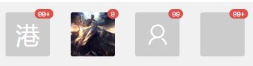
港99+


9


99


99+
标签相关class
| class | 说明 | 可选值 |
|---|---|---|
| cu-tag | 标签必选值 | —— |
| round | 椭圆 | —— |
| radius | 圆角 | —— |
| sm | 小尺寸标签 | —— |
| line-{ {color}} | 幽灵标签 | 参考背景色 |
| cu-capsule | 胶囊标签 | —— |
| badge | 数字角标 | —— |
Avatar头像
头像必选class cu-avatar
头像形状
通过round和radius设置头像形状

头像尺寸
通过sm 、lg、xl设置不同大小的头像
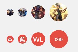
 蔚

蓝

wl


网络
内嵌文字
头像内部不仅仅是图片,也可以是自定义文字和图标等
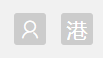
港
头像颜色
设置背景色即可
{
    {item.name}}
头像组
设置了cu-avatar外部的盒子添加cu-avatar-group的class

头像标签
在头像标签内部添加数字标签的角标即可

头像相关class
| class | 说明 | 可选值 |
|---|---|---|
| cu-avatar | 头像必选值 | —— |
| cu-avatar-group | 头像组,包裹cu-avatar | —— |
| round | 圆形 | —— |
| radius | 圆角 | —— |
| sm | 小尺寸头像 | —— |
| lg | 大尺寸头像 | —— |
| xl | 超大尺寸头像 | —— |
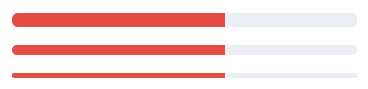
Progress进度条
进度条必须值为cu-progress
进度条形状
进度条默认为方形,radius为圆角,round为圆形;代码中loading只是一个变量,初始值为false,页面初始化时赋值为true,即给进度条赋值,使进度条有一个动画效果。
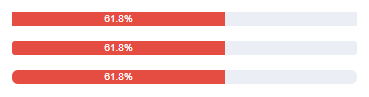
61.8%


61.8%


61.8%
进度条尺寸
sm为小尺寸,xs为超小尺寸
进度条颜色
添加背景色即可

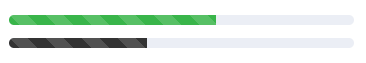
进度条条纹
添加striped设置条纹样式,active设置条纹动态效果
进度条比例
在给定class为cu-progress的标签内按需放置元素并进行分段设计即可

30%

45%

25%
进度条布局
结合布局、图标等内容,可根据个人所需可以设置不同进度显示的样式
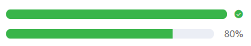
80%
进度条相关class
| class | 说明 | 可选值 |
|---|---|---|
| cu-progress | 进度条必选值 | —— |
| radius | 圆角 | —— |
| round | 圆形 | —— |
| sm | 小尺寸 | —— |
| xs | 超小尺寸 | —— |
| striped | 条纹 | —— |
| active | 结合striped使用,设置动态条纹效果 | —— |
Border&Shadow边框阴影
默认shadow是根据背景色设置的阴影,shadow-lg为长阴影,但是我肉眼没看出来二者的区别,真是在下愚钝,shadow-warp为翘边阴影(在下愚钝,它翘一点???),shadow-blur根据背景图片设置的阴影,有点意思,挺好。关于边框border没什么好展开的,直接看下面表格class说明就好。
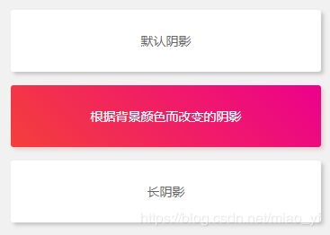
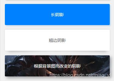
默认阴影

根据背景颜色而改变的阴影

长阴影

长阴影

翘边阴影


根据背景图而改变的阴影
边框阴影相关class
| class | 说明 | 可选值 |
|---|---|---|
| solid/solids | 实线四周边框,solid为细边框 ,solids为粗边框 | —— |
| solid/solids-{ {options}} | 不同方向的边框(上下左右) | top/right/bottom/left |
| shadow | 默认阴影(根据背景色变化) | —— |
| shadow-lg | 长阴影 | —— |
| shadow-wrap | 翘边阴影 | —— |
| shadow-blur | 根据背景图片变化的阴影 |
Loading加载
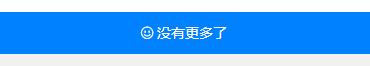
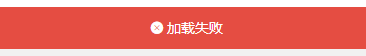
加载必选值cu-load
加载状态
loading正在加载中,over加载完成,erro加载失败
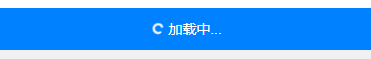
弹框加载
设置按钮,弹出弹框,显示加载状态,弹框模板设置load-modal
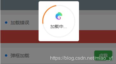
加载中...
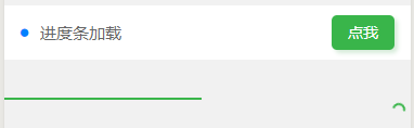
进度条加载
设置进度条加载时需要添加load-progress,变量loadProgress为加载进度条的进度,load-progress-bar代表加载中进度条样式,load-progress-spinner代表加载中旋转的圆圈样式
加载相关class
| class | 说明 | 可选值 |
|---|---|---|
| cu-load | 加载必选值(除了进度条加载) | —— |
| loading | 加载中 | —— |
| over | 加载完成 | —— |
| erro | 加载失败 | —— |
| load-modal | 弹框加载 | —— |
| load-progress | 设置进度条加载 | —— |
| load-progress-bar | 进度条加载样式 | —— |
| load-progress-spinner | 旋转加载样式 | —— |
| hide | 隐藏 | —— |
| show | 显示 | —— |
交互组件
这篇博客太长了,交互组件的介绍就另写一篇吧,ColorUI组件库简易教程之交互组件
这只是个人的理解写的,有什么不足,望大佬指教,及时更正!