学习python可视化,matplotlib库学习,基本操作
一般用到matplotlib库或者子库会写成(as)plt,方便后面使用,也基本是一种共识。
基础操作
在画图前需要先plt.figure()生产一个图像
x = np.linspace(-3,3,50)
y1 = 2*x + 1
y2 = x**2
以上面的数据进行学习
关于图像
`plt.plot(x,y1)  # 可以设置具体参数,color、linestyle、lineswith、lable(这条线的名字)等等
plt.hlines(1,-1,2)  #  一条x∈(-1,2)y=1的直线   竖直线是 vlines(2,-1,3)   y∈(-1,3)x=2的直线
关于坐标轴
new_ticks = np.linspace(-1,2,5)   # -1~2中间平均出来5个数
plt.xticks(new_ticks)  # x轴变成 上面那5个数
plt.yticks([-2,-1,-0.5,1,2],[r"$really bad$",r"$bad$",r"$nomal$",r"$good$",r"$very good$"])
# 上面这条  y轴在对应位置变成后面的标记
plt.xlim(-1,2)  # 现在x轴范围  y轴  ylim

ax = plt.gca()  # gca 获取当前坐标内容,spines要修改的那条边,   right\left\top\bottom
ax.spines['right'].set_color("none")
ax.spines['top'].set_color("none")
ax.spines['bottom'].set_position(('data', 0))
ax.spines["left"].set_position(("data",1))

ax.xaxis.set_ticks_position("bottom")   # 将x轴的位置设置在底部
ax.spines["bottom"].set_position(("data",0))   # 底部位置在 “y=0”

plt.xticks(())  # 取消x轴
图片添加内容
添加图例 legend
# legend
# 在plot时输入参数label="sth" 为这个线条添加图例
# loc="upper right" 表示图例将添加在图中的右上角.
#  'best' : 0,
#  'upper right'  : 1,
#  'upper left'   : 2,
#  'lower left'   : 3,
#  'lower right'  : 4,
#  'right'        : 5,
#  'center left'  : 6,
#  'center right' : 7,
#  'lower center' : 8,
#  'upper center' : 9,
#  'center'       : 10,
plt.legend(loc = 5)
plt.legend(loc = “upper right”)
添加内容 text
# x、y分别是在图中x、y的起点(还可以有z),fontdict设置插入内容格式
plt.text(x, y, r"$this is the txet",
			fontdict{"size" : 16, "color" : "r"})

#  %.2f保留两位小数,横向居中对齐ha='center',纵向底部(顶部)对齐va='bottom'
# 比如柱状图加数据表示
plt.text(x, y+0.3, "%.2f", ha="center", va="bottom")
散点图 scatter
plt.scatter(x, y) # 没什么说的,和plot类似,可以设置一些参数颜色 大小 之类的
柱状图 bar
plt.bar(x, y)
Imager图像
import matplotlib.pyplot as plt
import numpy as np

a = np.array([0.1,0.2,0.3,
          0.4,0.5,0.6,
          0.7,0.8,0.9]).reshape(3,3)
# array 数组  reshape 将上面的列表生成3行3列的数组

plt.imshow(a, cmap="Blues", interpolation="nearest", origin="upper")
# cmap参数 设置图片组颜色 Blues挺好看
# interploation 所用的差值方法(高斯、样条什么的)没特殊要求设置nearest
# origin  图表排列顺序,upper(从小到大)和lower

plt.colorbar(shrink=.92)
# 图片旁边出现参考数据图    shrink 调整比例大小

plt.show()
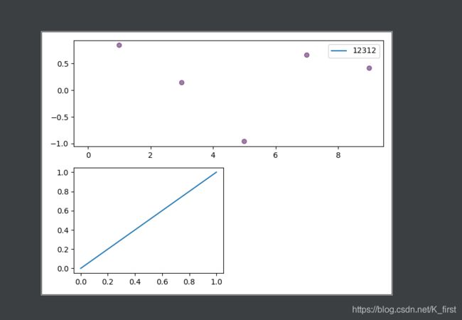
多个表在一个图
plt.subplot(2,2,1)
a = plt.plot(x, y)
# 将图像分成两行两列, a 在第一个位置

# 每一个新的图都需要在图前面声明位置,plt.subplot(*,*,*)

# 对于设置不同大小的图,比如 第一个图想占第一行,第二行生产3个小图  可以通过下面的方法来
plt.subplot(2,1,1)
plt(x1, y1)
plt.subplot(2,2,3)   # 注意这个时候小图应该是在3这个位置
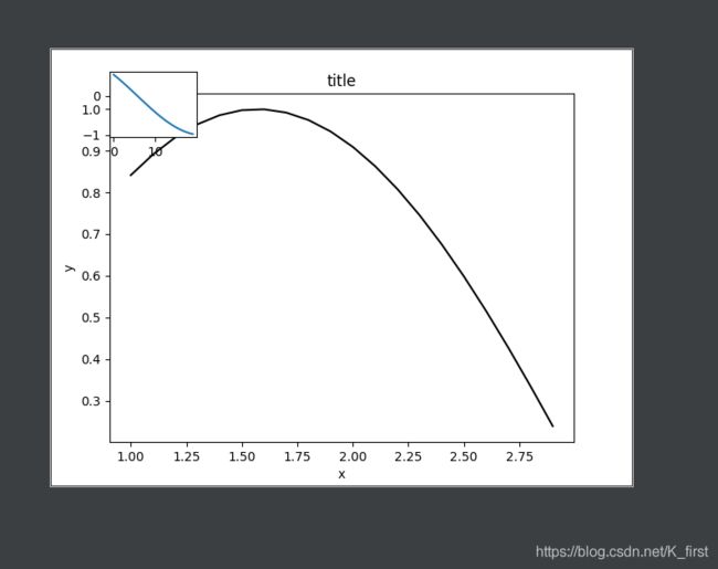
画中画
原理是向图像增加坐标系,使不同坐标系做同一个图中显示出来 (我理解的以上)
import matplotlib.pyplot as plt
import numpy as np
fig = plt.figure()

x = np.arange(1, 3, 0.1)
y = np.sin(x)

left, bottom, width, height = 0.1, 0.1, 0.8, 0.8
# 上面这个就是要加进图像的坐标系,其中 left=0.1  表示添加的坐标轴在图形中从左向右1/10的位置  bottom是高度
width 插入图形的长度大小  height 插入图形高度大小
ax1 = fig.add_axes([left, bottom, width, height])
ax1.plot(x, y, 'r', c="black")
ax1.set_xlabel('x')
ax1.set_ylabel('y')
ax1.set_title('title')

# 对于图像的细节操作  在  ax1.plot()中进行 其他和常规图一样

left, bottom, width, height = 0.1, 0.8, 0.15, 0.15
ax2 = fig.add_axes([left, bottom, width, height])
y2 = np.cos(x)
ax2.plot(y2)
突然不知道了方向,那就在一条路上埋头走一走再说
2020.11.16