1
2
3

网页新手,如有纰漏,欢迎各路神仙指出。
一天半哪,全文共6364 words。
先发后补,要不然一天没有个奋斗目标,不写点东西感觉一天好像虚度了一样。
有时候文字的冲击力没有图片强,图片的冲击力没有视频强,视频的冲击力没有游戏(可交互)强。
所以做笔记的时候尽量也将目标变成图片,不要是单纯的那种文字,否则会很容易放弃掉你的目标的。
明确目标和做事的动机比没有方向蛮干更加重要。
不拖延,今日事,今日毕。


2020.8.4

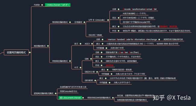

准备Less 代码。
Less其实就是Css的扩展,可以有像javascript那样的变量、函数、嵌套等特性。
Less.js 中文文档 - Less 中文网less.bootcss.com


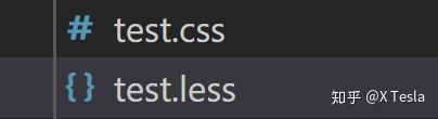
新建 test.less,然后什么都不写,只需要保存一下,就会在同级文件夹中生成一个叫做test.css 的文件。
index.less: 需要在前面加个小星号,要不然会报错。
* {
    margin:0;
    padding:0;
    box-sizing:border-box;
}
html href 链接引入 同级文件夹css下的index.css文件(less保存会自动编译成css)
通过这三个在线实例,我们可以很清晰地了解对比三者Border、Margin、Padding的作用。
菜鸟教程——Border边框www.runoob.com 菜鸟教程——Margin外边距www.runoob.com 菜鸟教程——Padding填充www.runoob.com

引入js 文件夹下的flexible.js文件。
123
flexible.js文件
var rem =docEl.clientWidth/ 24,24将页面等分成24个片区。
(function flexible(window, document) {

  var docEl = document.documentElement;
  var dpr = window.devicePixelRatio || 1;

  // adjust body font size
  function setBodyFontSize() {

    if (document.body) {

      document.body.style.fontSize = 12 * dpr + "px";
    } else {

      document.addEventListener("DOMContentLoaded", setBodyFontSize);
    }
  }
  setBodyFontSize();

  // set 1rem = viewWidth / 10
  function setRemUnit() {

    var rem = docEl.clientWidth / 24;
    docEl.style.fontSize = rem + "px";
  }

  setRemUnit();

  // reset rem unit on page resize
  window.addEventListener("resize", setRemUnit);
  window.addEventListener("pageshow", function(e) {

    if (e.persisted) {

      setRemUnit();
    }
  });

  // detect 0.5px supports
  if (dpr >= 2) {

    var fakeBody = document.createElement("body");
    var testElement = document.createElement("div");
    testElement.style.border = ".5px solid transparent";
    fakeBody.appendChild(testElement);
    docEl.appendChild(fakeBody);
    if (testElement.offsetHeight === 1) {

      docEl.classList.add("hairlines");
    }
    docEl.removeChild(fakeBody);
  }
})(window, document);

知乎首页上的Event Listener。

知乎好调皮呀。

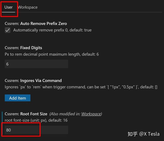
Extensions中安装“cssrem" 插件。可以将px 像素转换为 rem。
找到插件设置,然后需要restart一下,要不然没有显示的。

更改Rem值,然后可能需要再次重启一下。
.n (n是名字,名字随便取),enter即可创建一个class为n的分区,然后我们在css中修改n的属性。
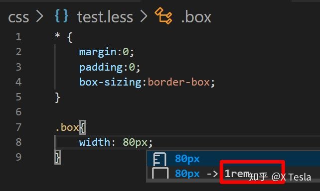
插件安装后 键入 80px 就可以自动转换为1rem了。
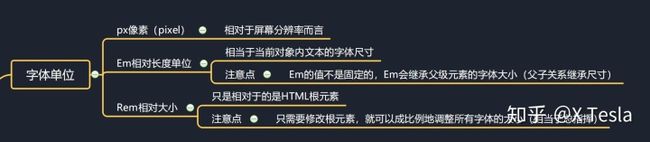
1 rem 其实跟游戏当中的向量归一化差不多,比较直观方便。
而直接用px的话,它是不会缩放的,因为flexible.js里面写的时候单位是rem,所以我们只有使用rem 单位屏幕才能自适应。
* {

  margin: 0;
  padding: 0;
  box-sizing: border-box;
}
.box {

  width: 1rem;
  height: 1rem;
  background-color: rgb(193, 192, 255);
}
最终适配结果。


2020.8.5

把之前 index.less中测试用的.box 删掉。
../ 访问上级文件夹。如 images和css 是同级文件夹,css文件夹下的index.css文件中的bg-image要访问image文件夹中的图片的话,需要 ../
* {
    margin:0;
    padding:0;
    box-sizing:border-box;
}

body{
    background:url(../images/bg.jpg)
     no-repeat top center;
     background-size:cover;
  }
【1】top center 居上居中,跟UE4 h/v alignment一样。
【2】backgroud-size 跟 UE4 Size一样,自动填充。


【3】还有no-repeat 不重复,指如果有一个37*37px 的图片,而显示器分辨率是3840 * 2160 px,默认是会自动把这张小图片重复填满整个网页的。no-repeat 则将这张小图片设置为不自动重复平铺。

用header标签。
再次强调一下,px 单位不能自动适应,rem才可以。
把颜色换成图片。
html文件。
less文件。
* {
 margin:0;
 padding:0;
 box-sizing:border-box;
}

body{
 background:url(../images/bg.jpg)
 no-repeat top center;
 background-size:cover;
  }

header {
 height:1.25rem;
 background:url(..//images/head_bg.png)
 no-repeat;
 background-size: 100% 100%;
 // 水平垂直缩放100%,原大小


}
然后header标题空间我们就配置好了。
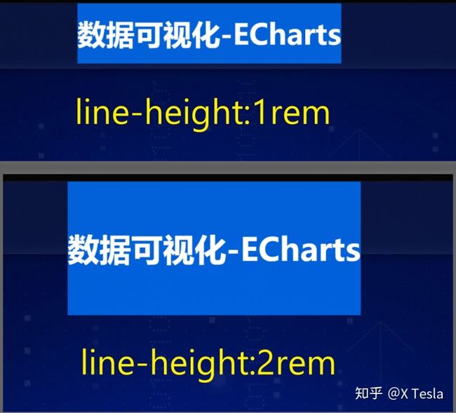
html文件header标签中添加 h1 一号大标题,中间夹着 “数据可视化-Echarts”字样。
css文件中font-size要注意转化为rem,这样文字大小也能跟着屏幕自适应变化。
* {
    margin:0;
    padding:0;
    box-sizing:border-box;
}

body{
    background:url(../images/bg.jpg)
     no-repeat top center;
     background-size:cover;
  }

header {
    height:1.25rem;
    background:url(..//images/head_bg.png)
    no-repeat;
    background-size: 100% 100%;
    // 水平垂直缩放100%,原大小
    h1{
        font-size: .475rem;
        color: white;
        text-align: center;
        line-height: 1rem;

    }

}
文字大小跟随屏幕自适应就弄好了。
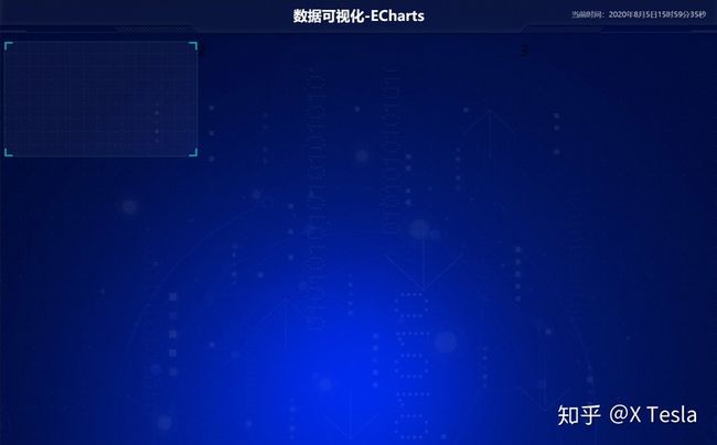
.showTime 定义division分区showTime。
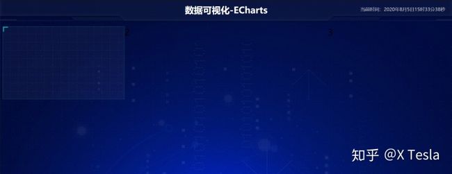
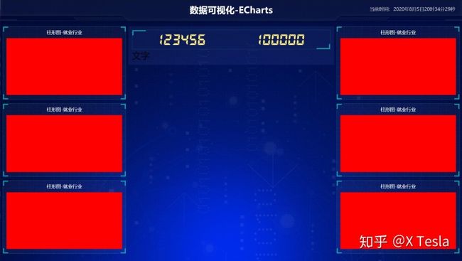
 数据可视化-ECharts
 12152
子绝父相,父类header relative相对,子类.showTime absolute绝对,让子类位置相对于父类位置。
注意top 位置为0,否则文字位置在header的下面。

// 格式: 当前时间:2020年8月5日11时48分14秒
这个道理都是相通的,用蓝图来写也非常简单。
X Tesla:【UE4】 如何用蓝图获取本地时间zhuanlan.zhihu.comqueryselector用于查询 分区showTime,然后innerHTML脚本向分区内写字。
数据可视化-ECharts
// 格式: 当前时间:2020年8月5日11时48分14秒

2020.8.5

UE4当中可以用Grid Panel来做,但是比较麻烦。用Spacer和H/V Box就可以了。
header下面新增section mainbox。
.column*3可以创建三行column class。
            1
            2
            3
css中
.column: nth-child(n)来定位column元素并更改其相关flex 布局。 .mainbox{
display:flex;
min-width: 1024px;
max-width: 1920px;
margin: auto;
background-color: green;
padding: 0.125rem 0.125rem 0;
.column{
flex:3;
}
.column:nth-child(2) {
flex:5;
}
}
2020.8.5
就跟UE Vertical Box Horizontal Box 一样的啦。
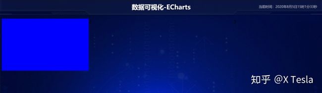
我们需要在 column 1 第一列下添加 panel 1,其实就是第一个Vertical Box里面放了三个Horizontal Box。
 2
 3
.mainbox{
    display:flex;
    min-width: 1024px;
    max-width: 1920px;
    margin:  0 auto;
    padding: 0.125rem 0.125rem 0;
    .column{
        flex:3;
    }
    .column:nth-child(2) {
        flex:5;
    }
    .panel{
        height: 3.875rem;
        background-color: blue;

    }
}
【1】添加边框、添加背景图片。
.panel{
        height: 3.875rem;
        border:1px solid rgba(25,186,139,0.17);
        background-image: url(../images/line(1).png);

    }
【2】给panel 内 左右下 一个padding,上面的padding可以用文字代替。
.panel{
        height: 3.875rem;
        padding: 0  .1875rem .5rem;
        border:1px solid rgba(25,186,139,0.17);
        background-image: url(../images/line(1).png);

    }
【3】制作vertical box 中的第一个horizontal box 和第二个 horizonal box 之间的边距,用margin,margin定义外边距。顺便加个白色,透明度第一点就好了。
  .panel{
        height: 3.875rem;
        padding: 0 .1875rem .5rem;
        border:1px solid rgba(25,186,139,0.17);
        background-image: url(../images/line(1).png) ;
        background-color: rgba(255, 255, 255, .04);
        margin-bottom: .1875rem;

    }
通过border 和before after定位来 制作Panel的四个边角。
【1】&::before 制作左上角的边角
.panel{
        position: relative;
        height: 3.875rem;
        padding: 0 .1875rem .5rem;
        border:1px solid rgba(25,186,139,0.17);
        background-image: url(../images/line(1).png) ;
        background-color: rgba(255, 255, 255, .04);
        margin-bottom: .1875rem;
        &::before{
            position: absolute;
            top: 0;
            left: 0;
            width: 10px;
            height: 10px;
            border-left: 2px solid #02a6b5;
            border-top:  2px solid #02a6b5;
            content: '';
        }
    }
【2】&::after 制作右上角的边角
 .panel{
        position: relative;
        height: 3.875rem;
        padding: 0 .1875rem .5rem;
        border:1px solid rgba(25,186,139,0.17);
        background-image: url(../images/line(1).png) ;
        background-color: rgba(255, 255, 255, .04);
        margin-bottom: .1875rem;
        &::before{
            position: absolute;
            top: 0;
            left: 0;
            width: 10px;
            height: 10px;
            border-left: 2px solid #02a6b5;
            border-top:  2px solid #02a6b5;
            content: '';
        }

        &::after{
            position: absolute;
            top: 0;
            right: 0;
            width: 10px;
            height: 10px;
            border-right: 2px solid #02a6b5;
            border-top:  2px solid #02a6b5;
            content: '';
        }
    }
【03】】下面两个边角的话需要在panel 分区中再添加一个panel-footer
 2
 3
把上面的代码复制一套,注意还是在panel内,跟html中div分区保持一致。
   // panel
    .panel{
        position: relative;
        height: 3.875rem;
        padding: 0 .1875rem .5rem;
        border:1px solid rgba(25,186,139,0.17);
        background-image: url(../images/line(1).png) ;
        background-color: rgba(255, 255, 255, .04);
        margin-bottom: .1875rem;

        &::before{
            position: absolute;
            top: 0;
            left: 0;
            width: 10px;
            height: 10px;
            border-left: 2px solid #02a6b5;
            border-top:  2px solid #02a6b5;
            content: '';
        }

        &::after{
            position: absolute;
            top: 0;
            right: 0;
            width: 10px;
            height: 10px;
            border-right: 2px solid #02a6b5;
            border-top:  2px solid #02a6b5;
            content: '';
        }

        //panel -footer
    .panel-footer{
        position: absolute;
        bottom: 0;
        left: 0;
        width: 100%;


        &::before{
            position: absolute;
            bottom: 0;
            left: 0;
            width: 10px;
            height: 10px;
            border-left: 2px solid #02a6b5;
            border-bottom:  2px solid #02a6b5;
            content: '';
        }

        &::after{
            position: absolute;
            bottom: 0;
            right: 0;
            width: 10px;
            height: 10px;
            border-right: 2px solid #02a6b5;
            border-bottom:  2px solid #02a6b5;
            content: '';
        }


    }

    }

html中。
2
3

 h2{
        height:.6rem;
        color: white;
        line-height: .6rem;
        text-align: center;
        font-size: .25rem;
        font-weight: 400;

    }
 h2{
        height:.6rem;
        color: white;
        line-height: .6rem;
        text-align: center;
        font-size: .25rem;
        font-weight: 400;

    }

    .chart{
        height: 3rem;
        background-color: red;
}不断复制就好了。
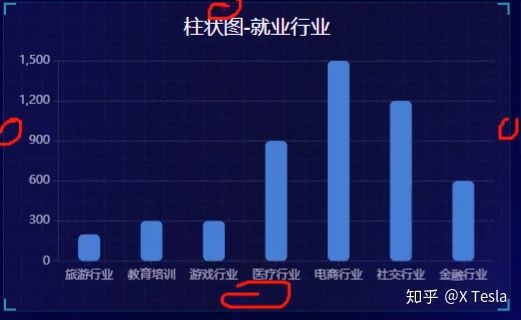
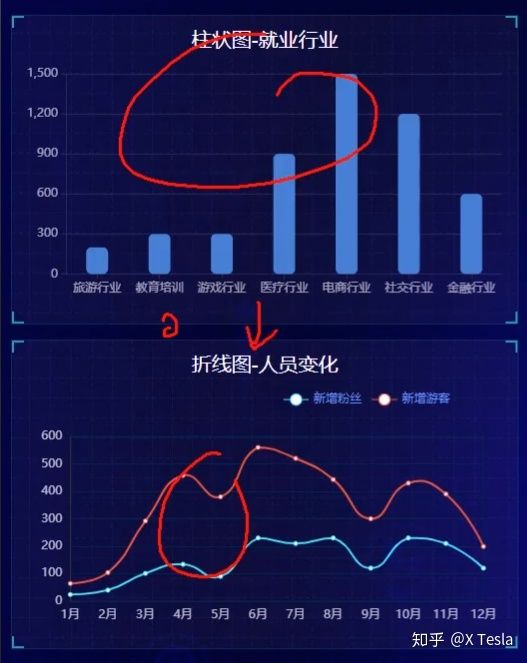
柱形图-就业行业
柱形图-就业行业
当前的LESS文件:
* {
    margin:0;
    padding:0;
    box-sizing:border-box;
}

body{
    background:url(../images/bg.jpg)
     no-repeat top center;
     background-size:cover;
  }

header {
    position: relative;
    height:1.25rem;
    background:url(..//images/head_bg.png)
    no-repeat;
    background-size: 100% 100%;
    // 水平垂直缩放100%,原大小
    h1{
        font-size: .475rem;
        color: white;
        text-align: center;
        line-height: 1rem;
    }
    .showTime{
        position: absolute;
        font-size: .25rem;
        right: .375rem;
        // 代替text-align,指定具体的偏移对齐位置
        top:0;
        line-height: .9375rem;
        color: rgba(255, 255, 255, .7);

    }
}

.mainbox{
    display:flex;
    min-width: 1024px;
    max-width: 1920px;
    margin:  0 auto;
    padding:  0.125rem 0.125rem 0;
    .column{
        flex:3;
    }
    .column:nth-child(2) {
        flex:5;
    }

    // panel
    .panel{
        position: relative;
        height: 3.875rem;
        padding: 0 .1875rem .5rem;
        border:1px solid rgba(25,186,139,0.17);
        background-image: url(../images/line(1).png) ;
        background-color: rgba(255, 255, 255, .04);
        margin-bottom: .1875rem;

        &::before{
            position: absolute;
            top: 0;
            left: 0;
            width: 10px;
            height: 10px;
            border-left: 2px solid #02a6b5;
            border-top:  2px solid #02a6b5;
            content: '';
        }

        &::after{
            position: absolute;
            top: 0;
            right: 0;
            width: 10px;
            height: 10px;
            border-right: 2px solid #02a6b5;
            border-top:  2px solid #02a6b5;
            content: '';
        }

        //panel -footer
    .panel-footer{
        position: absolute;
        bottom: 0;
        left: 0;
        width: 100%;


        &::before{
            position: absolute;
            bottom: 0;
            left: 0;
            width: 10px;
            height: 10px;
            border-left: 2px solid #02a6b5;
            border-bottom:  2px solid #02a6b5;
            content: '';
        }

        &::after{
            position: absolute;
            bottom: 0;
            right: 0;
            width: 10px;
            height: 10px;
            border-right: 2px solid #02a6b5;
            border-bottom:  2px solid #02a6b5;
            content: '';
        }


    }
    h2{
        height:.6rem;
        color: white;
        line-height: .6rem;
        text-align: center;
        font-size: .25rem;
        font-weight: 400;

    }

    .chart{
        height: 3rem;
        background-color: red;
    }
    }

}

2020.8.5

上方放number,下面放文字。第六节制作这个no模块。
上部数字
 .no{
        background: rgba(101, 132, 226, .1);
        padding: .1875rem;

    }
需要在第二列中添加一个边距值,要不然是跟左右两列紧挨着的。
.column:nth-child(2) {
        flex:5;
margin: 0 .125rem .1875rem;将no 模块划分为上面的hd(head)存放数字,下面的bd(body)存放文字说明。
                    数字
                    文字
先给数字no-hd个边框。
.no{
        background: rgba(101, 132, 226, .1);

        padding: .1875rem;
        .no-hd{
            border: 1px solid rgba(25, 186, 139, .17);
        }

    }
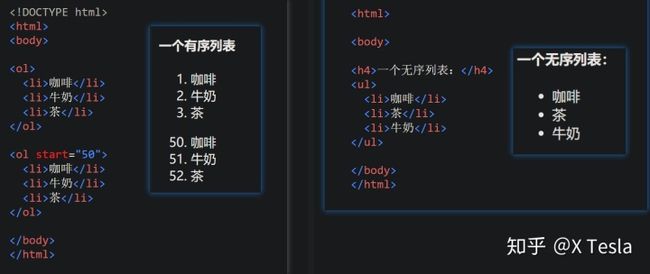
有序列表,无序列表很常用的。
- 123456
- 100000
文字
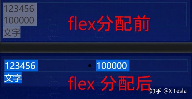
还是用flex 来均匀分配。
.no{
background: rgba(101, 132, 226, .1);
padding: .1875rem;
.no-hd{
border: 1px solid rgba(25, 186, 139, .17);
}
ul{
display: flex;
li{
flex:1;
}
}
}
【6.5】设置数字特性
.no{
background: rgba(101, 132, 226, .1);
padding: .1875rem;
.no-hd{
border: 1px solid rgba(25, 186, 139, .17);
}
ul{
display: flex;
li{
flex:1;
line-height: 1rem;
font: size .875rem;
color:#ffeb7b;
text-align:center;
}
}
}
然后li 初始化(跟body 一样都放在外层)的时候设置list-style为none这样那个小圆点就没了。
li{
list-style: none;
}

【6.6】优化文字字体
ttf格式的字体样式已经在资源包中了。
我们需要跟那个li 初始化一样来定义我们的字体。
@font-face{
font-family:electronicFont;
src:url(../font/DS-DIGIT.TTF)
}
然后对应文字名字。
.no{
background: rgba(101, 132, 226, .1);
padding: .1875rem;
.no-hd{
border: 1px solid rgba(25, 186, 139, .17);
}
ul{
display: flex;
li{
flex:1;
line-height: 1rem;
font-size: .875rem;
color:#ffeb7b;
text-align:center;
font-family: "electronicFont";
}
}
}

【6.7】制作边角
还是用&::before,&::after。注意如果出不来的话,父绝子相哈。
因为要定在数字边框处,所以relative要在 no-bd下,也就是no-bd要当爹。
.no{
background: rgba(101, 132, 226, .1);
padding: .1875rem;
.no-hd{
border: 1px solid rgba(25, 186, 139, .17);
position: relative;
&::before{
position:absolute;
top:0;
left:0;
content:"";
width: 30px;
height: 10px;
border-top: 2px solid #02a6b5;
border-left:2px solid #02a6b5;
}
&::after{
position:absolute;
bottom:0;
right:0;
content:"";
width: 30px;
height: 10px;
border-bottom: 2px solid #02a6b5;
border-right:2px solid #02a6b5;
}
}
ul{
display: flex;
li{
flex:1;
line-height: 1rem;
font-size: .875rem;
color:#ffeb7b;
text-align:center;
font-family: "electronicFont";
}
}
}
}
【6.8】制作中间的小竖线
还是用伪元素来做。
ul{
display: flex;
li{
position: relative;
flex:1;
line-height: 1rem;
font-size: .875rem;
color:#ffeb7b;
text-align:center;
font-family: "electronicFont";
&::after{
content: "";
position: absolute;
top:25%;
right:0;
height: 50%;
width: 1px;
background-color: rgba(255, 255, 255, .2);
}
}

【6.9】制作数字下的文字
ul>li*2可快速制作无序列表
.no-bd{
ul{
display:flex;
li{
flex:1;
color:rgba(255, 255, 255, .7);
font-size:0.225rem;
height:.5rem;
line-height: .5rem;
padding-top: .125rem;
}
}
}
- 123456
- 100000
- 虚幻引擎需求人数
- 虚幻引擎供应人数

七、制作map模块
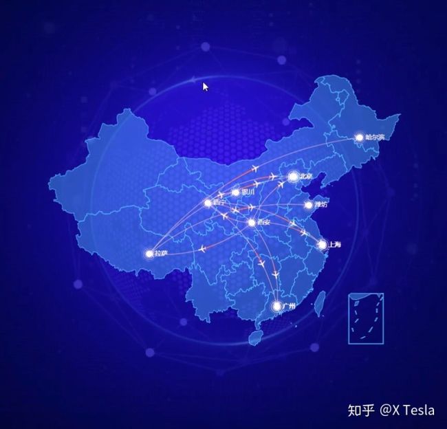
可以看到map模块分为四个元素:
- 中国 地图模块
- 后面六边形地球图片
- 箭头旋转图片
- 点状不规则形状图片
【7.1】配置map基础空间
div map 分区。
- 123456
- 100000
- 虚幻引擎需求人数
- 虚幻引擎供应人数
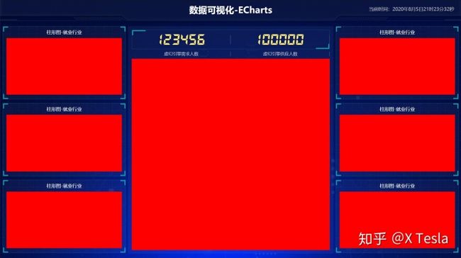
加高度和颜色测试。
.map{
height:10.125rem;
background-color: red;
}
【7.2】放置球体图片
居中。

.map{
position: relative;
height:10.125rem;
.map1{
width: 6.475rem;
height:6.475rem;
position: absolute;
top:50%;
left:50%;
// 水平居中 垂直居中
transform:translate(-50%,-50%);
background: url(../images/map.png);
//让图片也能跟着缩放
background-size: 100% 100%;
opacity: 0.3;
}
}
【7.3】旋转不规则图片

- 123456
- 100000
- 虚幻引擎需求人数
- 虚幻引擎供应人数
调用keyframes 动画,跟ue差不多,多少秒内转多少度。
.map2{
position: absolute;
top: 50%;
left: 50%;
transform:translate(-50%,-50%);
width:8.0375rem ;
height:8.0375rem;
background: url(../images/lbx.png);
background-size: 100% 100%;
animation: rotate1 15s linear infinite;
}
@keyframes rotate1 {
from{
transform: translate(-50%,-50%) rotate(0deg);
}
to{
transform: translate(-50%,-50%) rotate(360deg);
}
【7.4】逆时针旋转箭头

可以 opacity改图片不透明度。
    .map{
        position: relative;
        height:10.125rem;

       .map1{
           width: 6.475rem;
           height:6.475rem;
           position: absolute;
           top:50%;
           left:50%;
        //    水平居中 垂直居中
           transform:translate(-50%,-50%);
           background: url(../images/map.png);

           //让图片也能跟着缩放
           background-size: 100% 100%;
           opacity: 0.3;

       }

       .map2{
           position: absolute;
           top: 50%;
           left: 50%;
           transform:translate(-50%,-50%);
           width:8.0375rem ;
           height:8.0375rem;
           background: url(../images/lbx.png);
           background-size: 100% 100%;
           opacity: 0.6;

           animation: rotate1 15s linear infinite;

       }

       .map3{
        position: absolute;
        top: 50%;
        left: 50%;
        transform:translate(-50%,-50%);
        width: 7.075rem ;
        height:7.075rem;
        background: url(../images/jt.png);
        background-size: 100% 100%;
        opacity: 0.6;

        animation: rotate2 10s linear infinite;

    }

       @keyframes rotate1 {
           from{
               transform: translate(-50%,-50%) rotate(0deg);
           }

           to{
            transform: translate(-50%,-50%) rotate(360deg);
           }
            }

        @keyframes rotate2 {
            from{
                transform: translate(-50%,-50%) rotate(0deg);
            }

            to{
             transform: translate(-50%,-50%) rotate(-360deg);
            }
地图模块
可以先将bgcolor ctrl+/ 注释掉,后面直接放地图就好了。
  .chart{
        position: absolute;
        top: 0;
        left: 0;
        background-color: red;
        width:10.125rem ;
        height:10.125rem ;

    }
数据可视化-ECharts
柱形图-就业行业
柱形图-就业行业
布局整个LESS 文件
* {
    margin:0;
    padding:0;
    box-sizing:border-box;
}

li{
    list-style: none;
}

@font-face{
    font-family:electronicFont;
    src:url(../font/DS-DIGIT.TTF)
}

body{
    background:url(../images/bg.jpg)
     no-repeat top center;
     background-size:cover;
  }

header {
    position: relative;
    height:1.25rem;
    background:url(..//images/head_bg.png)
    no-repeat;
    background-size: 100% 100%;
    // 水平垂直缩放100%,原大小
    h1{
        font-size: .475rem;
        color: white;
        text-align: center;
        line-height: 1rem;
    }
    .showTime{
        position: absolute;
        font-size: .25rem;
        right: .375rem;
        // 代替text-align,指定具体的偏移对齐位置
        top:0;
        line-height: .9375rem;
        color: rgba(255, 255, 255, .7);

    }
}

.mainbox{
    display:flex;
    min-width: 1024px;
    max-width: 1920px;
    margin:  0 auto;
    padding:  0.125rem 0.125rem 0;
    .column{
        flex:3;
    }
    .column:nth-child(2) {
        flex:5;
        margin: 0 .125rem .1875rem;
    }

    // panel
    .panel{
        position: relative;
        height: 3.875rem;
        padding: 0 .1875rem .5rem;
        border:1px solid rgba(25,186,139,0.17);
        background-image: url(../images/line(1).png) ;
        background-color: rgba(255, 255, 255, .04);
        margin-bottom: .1875rem;

        &::before{
            position: absolute;
            top: 0;
            left: 0;
            width: 10px;
            height: 10px;
            border-left: 2px solid #02a6b5;
            border-top:  2px solid #02a6b5;
            content: '';
        }

        &::after{
            position: absolute;
            top: 0;
            right: 0;
            width: 10px;
            height: 10px;
            border-right: 2px solid #02a6b5;
            border-top:  2px solid #02a6b5;
            content: '';
        }

        //panel -footer
    .panel-footer{
        position: absolute;
        bottom: 0;
        left: 0;
        width: 100%;


        &::before{
            position: absolute;
            bottom: 0;
            left: 0;
            width: 10px;
            height: 10px;
            border-left: 2px solid #02a6b5;
            border-bottom:  2px solid #02a6b5;
            content: '';
        }

        &::after{
            position: absolute;
            bottom: 0;
            right: 0;
            width: 10px;
            height: 10px;
            border-right: 2px solid #02a6b5;
            border-bottom:  2px solid #02a6b5;
            content: '';
        }


    }
    h2{
        height:.6rem;
        color: white;
        line-height: .6rem;
        text-align: center;
        font-size: .25rem;
        font-weight: 400;

    }

    .chart{
        height: 3rem;
        background-color: red;
    }
    }

    .no{

        background: rgba(101, 132, 226, .1);

        padding: .1875rem;
        .no-hd{
            border: 1px solid rgba(25, 186, 139, .17);
            position: relative;


        &::before{
            position:absolute;
            top:0;
            left:0;
            content:"";
            width: 30px;
            height: 10px;
            border-top: 2px solid #02a6b5;
            border-left:2px solid #02a6b5;
        }

        &::after{
            position:absolute;
            bottom:0;
            right:0;
            content:"";
            width: 30px;
            height: 10px;
            border-bottom: 2px solid #02a6b5;
            border-right:2px solid #02a6b5;
        }
    }

    .no-bd{
        ul{
            display:flex;
            li{
                flex:1;
                color:rgba(255, 255, 255, .7);
                font-size:0.225rem;
                height:.5rem;
                line-height: .5rem;

            }
        }
    }
        ul{
            display: flex;
            li{
                position: relative;
                flex:1;
                line-height: 1rem;
                font-size: .875rem;
                color:#ffeb7b;
                text-align:center;
                font-family: "electronicFont";
                &::after{
                    content: "";
                    position: absolute;
                    top:25%;
                    right:0;
                    height: 50%;
                    width: 1px;
                    background-color: rgba(255, 255, 255, .2);
                }
            }
        }
    }

    .map{
        position: relative;
        height:10.125rem;

       .map1{
           width: 6.475rem;
           height:6.475rem;
           position: absolute;
           top:50%;
           left:50%;
        //    水平居中 垂直居中
           transform:translate(-50%,-50%);
           background: url(../images/map.png);

           //让图片也能跟着缩放
           background-size: 100% 100%;
           opacity: 0.3;

       }

       .map2{
           position: absolute;
           top: 50%;
           left: 50%;
           transform:translate(-50%,-50%);
           width:8.0375rem ;
           height:8.0375rem;
           background: url(../images/lbx.png);
           background-size: 100% 100%;
           opacity: 0.6;

           animation: rotate1 15s linear infinite;

       }

       .map3{
        position: absolute;
        top: 50%;
        left: 50%;
        transform:translate(-50%,-50%);
        width: 7.075rem ;
        height:7.075rem;
        background: url(../images/jt.png);
        background-size: 100% 100%;
        opacity: 0.6;

        animation: rotate2 10s linear infinite;

    }

    .chart{
        position: absolute;
        top: 0;
        left: 0;
        // background-color: red;
        width:10.125rem ;
        height:10.125rem ;

    }

       @keyframes rotate1 {
           from{
               transform: translate(-50%,-50%) rotate(0deg);
           }

           to{
            transform: translate(-50%,-50%) rotate(360deg);
           }
            }

        @keyframes rotate2 {
            from{
                transform: translate(-50%,-50%) rotate(0deg);
            }

            to{
             transform: translate(-50%,-50%) rotate(-360deg);
            }


       }

    }
}