Echarts图表柱状图,饼状图以及同时显示折线图和柱状图的设置
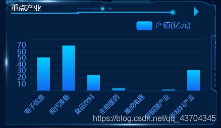
柱状图
这里柱状图是渐变色
//基于准备好的dom,初始化echarts实例
  var myChart = echarts.init(document.getElementById('land'));
  //指定图表的配置项和数据
  option = {

    tooltip: {
     },
    legend: {

      data: ['产值(亿元)'],
      textStyle: {

        color: "#4c9bfd"
      },
      right: "10%"
    },
    grid: {

      top: "20%",
      left: "3%",
      right: "4%",
      bottom: "1%",
      show: true, // 显示边框
      borderColor: "#012f4a", // 边框颜色
      containLabel: true // 包含刻度文字在内
    },
    xAxis: {

      axisTick: {

        show: false // 去除刻度线
      },
      axisLabel: {

        interval: 0,    //强制文字产生间隔
        rotate: 45,     //文字逆时针旋转45°
        textStyle: {
         //文字样式
          color: "#4c9bfd",
          fontSize: 10,
          fontFamily: 'Microsoft YaHei'
        }
      },
      axisLine: {

        show: false // 去除轴线
      },
      data: ["电子信息", "现代准备", "食品饮料", "生物医药", "集成电路", "新能源产业", "新材料产业"]
    },
    yAxis: {

      axisTick: {

        show: false // 去除刻度线
      },
      axisLabel: {

        color: "#4c9bfd" // 文本颜色
      },
      axisLine: {

        show: false // 去除轴线
      },
      splitLine: {

        lineStyle: {

          color: "#012f4a" // 分割线颜色
        }
      }
    },
    series: [{

      name: '产值(亿元)',
      type: 'bar',
      //设置柱状图大小
      barWidth: 20,
      //设置柱状图渐变颜色
      itemStyle: {

        normal: {

          color: new echarts.graphic.LinearGradient(0, 1, 0, 0, [{

            offset: 0,
            color: "#1268f3" // 0% 处的颜色
          }, {

            offset: 0.6,
            color: "#08a4fa" // 60% 处的颜色
          }, {

            offset: 1,
            color: "#01ccfe" // 100% 处的颜色
          }], false)
        }
      },
      data: data
    }]
  }
  // 使用刚指定的配置项和数据显示图表。
  myChart.setOption(option);
  // 4.让图表随屏幕自适应
  window.addEventListener('resize', function () {

    myChart.resize();
  })
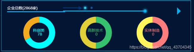
饼状图
之前文本是引导线显示的,发现引导线位置会随着数据变化,我就把文中间显示了,关于引导线代码里有注释
// 基于准备好的dom,初始化echarts实例
  var myChart = echarts.init(document.getElementById('industry'));
  var data1 = [{

    name: '科创类',
    value: params.techinnovat,
    itemStyle: {
      color: '#00FFFF' }
  }, {

    name: '非科创类',
    value: params.notechinnovat,
    itemStyle: {
      color: '#F4AA1E' },
    label: {

      normal: {

        position: 'inner',
        show: false
      }
    }
  }];
  var data2 = [{

    name: '高新技术',
    value: params.hightech,
    itemStyle: {
      color: '#36C16E' }
  }, {

    name: '非高新技术',
    value: params.nohightech,
    itemStyle: {
      color: '#E1CF37' },
    label: {

      normal: {

        position: 'inner',
        show: false
      }
    }
  }];
  var data3 = [{

    name: '实体制造',
    value: params.physical,
    itemStyle: {
      color: '#FF7C7C' }
  }, {

    name: '非实体制造',
    value: params.nophysical,
    itemStyle: {
      color: '#FFF45C' },
    label: {

      normal: {

        position: 'inner',
        show: false
      }
    }
  }];
  option = {

    tooltip: {

      trigger: 'item',
      // formatter: "{a}
{b}: {c} ({d}%)"
    },
    series: [{

      type: 'pie',
      radius: ['80%', '50%'],
      center: ['17%', '43%'],
      // startAngle: 260, //是引导线时起始角度
      data: data1,
      animation: true,
      label: {

        position: 'outer',
        alignTo: 'none',
        bleedMargin: 100,
        normal: {

          formatter: '{b} \n {c}',//多值的嵌套
          position: 'center'
        }
      },
      // labelLine: {

      //   show: false, // 让环形引导线不展示
      //   length: 28, //引导线第一段长度
      //   length2: 20, //引导线第二段长度
      // },
      left: 0,
      right: '66.6667%',
      top: 0,
      bottom: 0
    }, {

      type: 'pie',
      radius: ['80%', '50%'],
      center: ['47%', '43%'],
      data: data2,
      animation: true,
      label: {

        position: 'outer',
        alignTo: 'labelLine',
        bleedMargin: 5,
        normal: {

          formatter: '{b} \n {c}',//多值的嵌套
          position: 'center'
        }
      },
      left: '33.3333%',
      right: '33.3333%',
      top: 0,
      bottom: 0
    }, {

      type: 'pie',
      radius: ['80%', '50%'],
      center: ['77%', '43%'],
      data: data3,
      animation: true,
      label: {

        position: 'outer',
        alignTo: 'edge',
        margin: 50,
        normal: {

          formatter: '{b} \n {c}',//多值的嵌套
          position: 'center'
        }
      },
      left: '66.6667%',
      right: 0,
      top: 0,
      bottom: 0
    }]
  };
  // 使用刚指定的配置项和数据显示图表。
  myChart.setOption(option);
  // 4.让图表随屏幕自适应
  window.addEventListener('resize', function () {

    myChart.resize();
  })
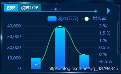
折线图和柱状图组合
// 1. 实例化对象
  var myChart = echarts.init(document.getElementById('line1'));
  // 2.指定配置
  var option = {

    // 通过这个color修改两条线的颜色
    color: ["#ed3f35"],
    tooltip: {

      trigger: "axis"
    },
    legend: {

      // 如果series 对象有name 值,则 legend可以不用写data
      // 修改图例组件 文字颜色
      textStyle: {

        color: "#4c9bfd"
      },
      // 这个10% 必须加引号
      right: "10%"
    },
    grid: {

      top: "20%",
      left: "3%",
      right: "6%",
      bottom: "3%",
      show: true, // 显示边框
      borderColor: "#012f4a", // 边框颜色
      containLabel: true // 包含刻度文字在内
    },
    xAxis: {

      data: date,
      axisTick: {

        show: false // 去除刻度线
      },
      axisLabel: {

        color: "#4c9bfd", // 文本颜色
      },
      axisLine: {

        show: true, // 去除轴线
        onZero: false //y轴是负数时也能显示
      }
    },
    yAxis: [{

      type: "value",
      show:true,
      axisTick: {

        show: false // 去除刻度线
      },
      axisLabel: {

        color: "#4c9bfd" // 文本颜色
      },
      axisLine: {

        show: false // 去除轴线
      },
      splitLine: {

        lineStyle: {

          color: "#012f4a" // 分割线颜色
        }
      }
    },{

      type: 'value',
      axisLabel: {

        formatter: '{value} %',
        color: "#4c9bfd" // 文本颜色
      },
      axisLine: {

        show: false // 去除轴线
      },
      axisTick: {

        show: false // 去除刻度线
      },
      splitLine: {

        lineStyle: {

          color: "#012f4a" // 分割线颜色
        }
      }
    }],
    series: [
      {

        name: '产值(亿元)',
        type: 'bar',
        //设置柱状图大小
        barWidth: '40%',
        //设置柱状图渐变颜色
        itemStyle: {

          normal: {

            color: new echarts.graphic.LinearGradient(0, 1, 0, 0, [{

              offset: 0,
              color: "#1268f3" // 0% 处的颜色
            }, {

              offset: 0.6,
              color: "#08a4fa" // 60% 处的颜色
            }, {

              offset: 1,
              color: "#01ccfe" // 100% 处的颜色
            }], false)
          }
        },
        data: data
      },
      {

        name: "增长率",
        type: "line",
        yAxisIndex: 1, //默认0时按左边y轴显示,1是按右边增长率显示
        // true 可以让我们的折线显示带有弧度
        smooth: true,
        data: rate
      }
    ]
  };
  // 3. 把配置给实例对象
  myChart.setOption(option);
  // 4. 让图表跟随屏幕自动的去适应
  window.addEventListener("resize", function () {

    myChart.resize();
  });