【R语言系列02】plot ggplot作图,标注虚线,标注文本,添加阴影误差带
【R语言系列02】R作图中的标注虚线,文本,阴影误差带
【以往专题】
【R语言系列01】拼贴操作 paste 与 paste0
本期将从几个模拟实例当中提供一些常用作图技巧的分享。
需要的包:
reshape2进行长宽表转换ggplot2ggplot作图ggthemes设置主题
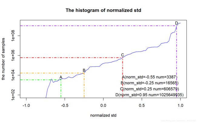
Example 1 The histogram of normalized std
效果
代码
set.seed(824)
std_list = seq(-0.75, 1.00, 0.025)
number_list = sort(rnorm(71, 5, 2))
adjust_list = 10^number_list + rexp(71, 0.001


ShowPoint = function(x, col_, labels_, lx, ly){

  index = (x + 0.75) / 0.025 + 1
  segments(x, 10, x, adjust_list[index], col = col_, lty = 4, lwd = 2)
  segments(-1.25, adjust_list[index], x, adjust_list[index], col = col_, lty = 4, lwd = 2)
  text(x, adjust_list[index]*2, labels = labels_)
  text(lx, ly, paste0(labels_,"(norm_std=",as.character(x)," num=",as.character(as.integer(adjust_list[index])),")"))
}

plot(std_list, adjust_list, col = 'blue', type = 'l', xlim = c(-1,1), ylim = c(100, max(adjust_list)), log='y', xlab = 'normalized std', ylab = 'the number of samples', main = 'The histogram of normalized std')

ShowPoint(-0.55, "green", "A", 0.6, 6400)
ShowPoint(-0.25, "orange", "B", 0.6, 1600)
ShowPoint(0.25, "red", "C", 0.6, 400)
ShowPoint(0.95, "purple", "D", 0.6, 100)
Example 2 2D histogram of normalized std and loss
效果

代码
library(ggplot2)
library(ggthemes)

y = runif(10^6,0,2)
x = rep(0, 10^6)
for(i in 1:10^6)
  x[i] = rnorm(1, 1 - cos(0 - y[i]) * 1.5, sqrt(y[i]/3))


data <- data.frame(x, y)

loc = data.frame(tp = c(-2, 0, 1.8), tr = c(1, 1.4, 1.2))

ggplot(data, aes(x = x, y = y)) +
  geom_bin2d(binwidth = 0.01) +
  scale_fill_gradient2(low="blue", high = "darkgreen") +
  geom_segment(aes(x = tp, y = rep(0,3), xend = tp, yend = tr),
               data= loc,
               lty = 2,
               lwd = 1,
               colour = c("tan2","blueviolet","chartreuse")) +
  geom_segment(aes(x = rep(-3, 3), y = tr, xend = tp, yend = tr),
               data= loc,
               lty = 2,
               lwd = 1,
               colour = c("tan2","blueviolet","chartreuse")) +
  geom_text(aes(x = tp, y = tr),
            data = loc,
            label = c("A(-2,1) num:0","B(0,1.4) num:132","C(1.8,1.2) num:51"),
            size = 5,
            hjust = 0, nudge_x = 0.05) +
  labs(x = 'normalized std', y = 'loss') +
  theme_grey()
Example 3
效果
代码
library(ggplot2)
library(ggthemes)

real_age = seq(0, 100, 2)
perceived_age_asian =
  c(25, 21, 20, 21, 22, 20, 19, 22, 23, 20, 25, 27, 25, 23, 29, 31, 32, 28, 34, 40, 38, 36, 39, 37, 43, 39, 42, 45, 46, 48, 53, 49, 50, 52, 54, 48, 49, 52, 53, 47, 56, 57, 59, 54, 61, 55, 56, 58, 62, 60, 57)
perceived_age_caucasian =
  c(25, 27, 26, 24, 23, 25, 26, 25, 27, 25, 27, 25, 28, 24, 27, 30, 28, 31, 32, 35, 38, 36, 39, 37, 41, 40, 43, 46, 44, 45, 47, 47, 52, 53, 51, 49, 48, 54, 56, 48, 52, 59, 61, 57, 62, 56, 50, 59, 63, 61, 59)
perceived_age_afro =
  c(25, 26, 24, 20, 22, 21, 19, 21, 20, 22, 23, 25, 24, 26, 22, 30, 33, 27, 35, 36, 34, 32, 33, 35, 40, 39, 41, 42, 39, 41, 44, 46, 48, 54, 56, 46, 43, 50, 49, 47, 56, 57, 59, 54, 61, 44, 58, 57, 63, 58, 55)
ground_truth = seq(0, 100, 2)

noise1 = data.frame(real_age, "value" = perceived_age_asian, "noise" = rnorm(length(perceived_age_asian), 5.0, 2.7))
noise2 = data.frame(real_age, "value" = perceived_age_caucasian, "noise" = rnorm(length(perceived_age_caucasian), 5.3, 2.6))
noise3 = data.frame(real_age, "value" = perceived_age_afro, "noise" = rnorm(length(perceived_age_afro), 5.2, 2.8))

mws = data.frame(real_age, "Asian" = perceived_age_asian, "Caucasian" = perceived_age_caucasian, "Afro-American" = perceived_age_afro)

library(reshape2)
mws = melt(mws, id.vars="real_age")

ggplot(mws, aes(x = real_age, y = value, colour = variable)) +
  geom_abline(slope = 1, intercept = 0, lty = 2, lwd = 2) +
  geom_line(lty = 1, lwd = 1, type = 'l') +
  geom_ribbon(aes(ymax = value + noise,
                  ymin = value - noise),
                  data = noise2,
                  alpha = 0.3,
                  fill = "lightgreen",
                  colour = NA ) +
  geom_ribbon(aes(ymax = value + noise,
                  ymin = value - noise),
                  data = noise3,
                  alpha = 0.3,
                  fill = "lightblue",
                  colour = NA ) +
  geom_ribbon(aes(ymax = value + noise,
                  ymin = value - noise),
                  data = noise1,
                  alpha = 0.3,
                  fill = "#FFC408",
                  colour = NA ) +
  scale_x_continuous(limits = c(0,100)) +
  scale_y_continuous(limits = c(0,100)) +
  labs(x = "Real Age", y = "Perceived Age") +
  theme_foundation()