r语言 绘制直方图_如何在R中绘制直方图
r语言 绘制直方图
In this tutorial, we’ll go over the steps to plot a histogram in R. A histogram is a graphical representation of the values along with its range. It is similar to a bar plot and each bar present in a histogram will represent the range and height of the specified value.
在本教程中,我们将介绍在R中绘制直方图的步骤。 直方图是值及其范围的图形表示。 它类似于条形图,直方图中的每个条形都将表示指定值的范围和高度。
R offers standard function hist() to plot the histogram in Rstudio. It also offers function geom_density() to plot histogram using ggplot2.
R提供标准函数hist()来绘制Rstudio中的直方图。 它还提供了函数geom_density()来使用ggplot2绘制直方图。
直方图的优点 (Advantages of Histograms)
- A histogram provides the distribution of the data, frequency of the data along with its range. 直方图提供数据的分布,数据的频率及其范围。
- It is an easier way to visualize large data sets. 这是一种可视化大型数据集的简便方法。
- The histogram also shows the skewness of the data. 直方图还显示了数据的偏度 。
R中直方图的类型 (Types of Histogram plots in R)
Based on the distribution of the data, a histogram exhibits many different shapes. In this section, we will try to understand the different types of histogram shapes and their meaning.
根据数据的分布,直方图显示许多不同的形状。 在本节中,我们将尝试了解直方图形状的不同类型及其含义。
The major types of histogram distributions are,
直方图分布的主要类型是
- Normal distribution. 正态分布。
- Right skewed distribution. 右偏分布。
- Left skewed distribution. 左偏分布。
- Bimodal distribution 双峰分布
R中的基本直方图 (Basic Histogram in R)
In this section, we will plot a simple histogram using the ‘airquality’ data set.
在本节中,我们将使用“空气质量”数据集绘制一个简单的直方图。
Execute the below code to plot this simple histogram.
执行以下代码以绘制此简单直方图。
#this code imports the dataset from the R(built-in data sets)
datasets::airquality

#creates the simple histogram
hist(airquality$Temp, xlab = 'Temparature', ylab='Frequency', main='Simple histogram plot', col = 'yellow', border = 'black')
正态分布 (Normal distribution)
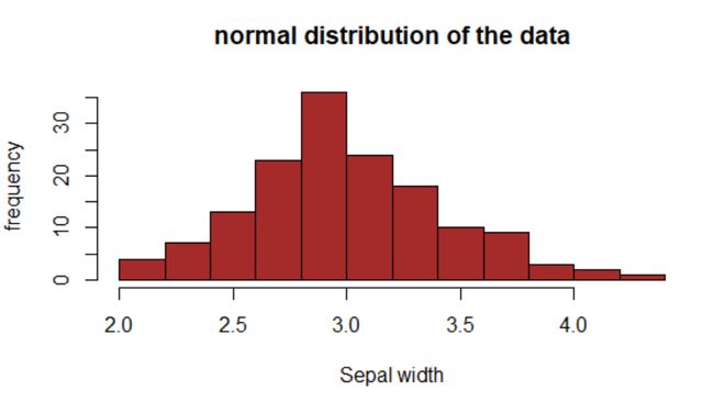
A normal distribution in the histogram is the ideal bell-shaped plot, which contains less or no random data.
在直方图正态分布是钟形的理想曲线图,它包含较少或不随机数据。
This distribution shows that the majority of the values are concentrated at the center range.
此分布表明大多数值集中在中心范围。
However, the remaining data points will end up as a tail in both sides as you can see in the below plot.
但是,剩余的数据点将在两侧都变成尾巴,如下图所示。
Execute the below code to create the histogram which shows the normal distribution.
执行以下代码以创建显示正态分布的直方图。
#imports the default dataset which is present in R
data("iris")


#reads the data
head(iris, 5)
 Sepal.Length Sepal.Width Petal.Length Petal.Width Species
1          5.1         3.5          1.4         0.2  setosa
2          4.9         3.0          1.4         0.2  setosa
3          4.7         3.2          1.3         0.2  setosa
4          4.6         3.1          1.5         0.2  setosa
5          5.0         3.6          1.4         0.2  setosa


#creates the histogram bins based on 'sepal length'
hist(iris$Sepal.Width, xlab = 'Sepal width', ylab = 'frequency', main='normal distribution of the data', col = 'brown')
R中的左或负偏直方图 (Left or Negatively Skewed Histogram in R)
In this section, we will plot the left or negetive skewed histogram.
在本节中,我们将绘制左或消极的偏斜直方图。
Negative skewed: If the histogram distribution shows the values which are concentrated on the right side and the tail will be on the left side or on the negative value side, then it is called as negatively of left-skewed distribution.
负偏斜 :如果直方图分布显示的值集中在右侧,而尾巴将在左侧或负值侧 ,则称为负偏斜分布。
Execute the below code to create a negetive skewed histogram in Rstudio.
执行以下代码,以在Rstudio中创建一个具有偏差的直方图。
Dataset: google play store dataset by kaggle
数据集: Google Play商店数据集by kaggle
#imports the csv file
df<- read.csv("googleplaystore.csv")
#reads the data
df
#plots the histogram which is negetively or left skewed
hist(df$Rating, xlab = 'Ratings', ylab = 'Frequency', main = 'Negetive or left skewed distribution', col='brown')
直方图或正偏图 (Right or Positively skewed Histogram )
In this section, we will plot the right or positively skewed histogram.
在本节中,我们将绘制右或正偏直方图。
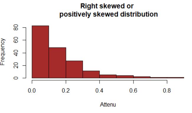
Positive skewed: If the histogram’s distribution shows that the values are concentrated on the left side and tail is on the right side of the plot, then such distribution is called positively or right-skewed histogram distribution.
正偏斜:如果直方图的分布显示值集中在图的左侧,而尾部位于图的右侧 ,则这种分布称为正偏斜或右偏直方图分布。
Execute the below code to plot the right or positively skewed histogram.
执行以下代码以绘制右或正偏直方图。
#imports the data from the R's default dataset named 'attenu'.
datasets::attenu

#plots the right or posiively skewed distribution
hist(attenu$accel, xlab = 'attenu', ylab = 'Frequency', main = 'Right or positively skewed distribution', col = 'brown')
使用直方图绘制的数据的双峰分布 (Bimodal Distribution of the data plotted using Histogram)
In this section, we will plot a bimodal distribution of the data.
在本节中,我们将绘制数据的双峰分布。
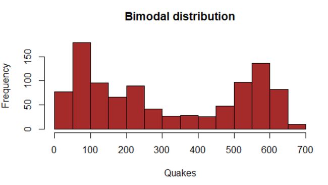
Bimodal distribution: Bimodal distribution is a type of histogram distribution, where you can witness two data peaks.
双峰分布:双峰分布是直方图分布的一种,您可以在其中看到两个数据峰 。
In the below graph, the x value ‘quakes’ represent the quakes data distribution.
在下图中, x值“ quakes”表示地震数据分布。
Execute the below code to plot the bimodal distribution.
执行以下代码以绘制双峰分布。
#imports the data from the R's default dataset named 'quakes'
datasets::quakes

#plots the bimodal histogram distribution
hist(quakes$depth, xlab = 'Quakes', ylab = 'Frequency', main = 'Bimodal distribution', col = 'brown')
在R中使用ggplot2绘制直方图。 (Plotting a Histogram using ggplot2 in R.)
As you know ggplot2 is the most used visualization package in R.ggplot2 offers great themes and functions to create visually appealing graphs.
如您所知ggplot2是R.中最常用的可视化软件包。ggplot2提供了出色的主题和功能来创建吸引人的图形 。
In this section, we will plot the histogram of the values present in the ‘diamonds’ data set, which is present in R by default.
在本节中,我们将绘制“钻石”数据集中存在的值的直方图,该数据默认情况下在R中存在。
Execute the below code to plot the histogram using ggplot2.
执行以下代码,使用ggplot2绘制直方图。
#install the required packages
install.packages('ggplot2')
install.packages('dplyr')
install.packages('ggthemes')

#import the required libraries
library(ggplot2)
library(dplyr)
library(ggthemes)

#shows the data
head(diamonds)
#plots the histogram
ggplot(diamonds, aes(carat))+geom_histogram()
#changes the bin width
ggplot(diamonds, aes(carat))+geom_histogram(binwidth = 0.01)
#adds the fill element and x,y and main labels of the graph
ggplot(diamonds, aes(carat, fill=cut))+geom_histogram()+labs(x='carats', y=' Frequency of carats')+ggtitle("Distribution of diamonds's carat by cut values")
#chnages the theme for attractive graph
ggplot(diamonds, aes(carat, fill=cut))+geom_histogram()+labs(x='carats', y=' Frequency of carats')+ggtitle("Distribution of diamonds's carat by cut values")+theme_classic()
结论 (Conclusion)
The histogram is similar to a bar plot, which represents the distribution of data along with their range.
直方图类似于条形图 ,它表示数据分布及其范围。
R offers built-in functions such as hist() to plot the graph in basic R and geom_histogram() to plot the graph using ggplot2 in R.
R提供了内置函数,例如hist()以在基本R中绘制图形, geom_histogram()以在R中使用ggplot2绘制图形。
The histogram has many types. The major ones are normal distribution, positively skewed, negatively skewed, and bimodal distribution.
直方图有很多类型。 主要分布是正态分布,正偏,负偏和双峰分布 。
In this tutorial all these plot types are explained and plotting using ggplot2 is also illustrated in the end.
在本教程中,将解释所有这些绘图类型,并在最后说明使用ggplot2进行绘图。
I hope, you have understood the histogram plotting and usage of different types of histograms.
希望您已经了解了直方图的绘制方式和不同类型直方图的用法。
Try practicing with different datasets. For any queries, just post it in the comments section. keep going!!!
尝试对不同的数据集进行练习。 对于任何查询,只需将其发布在评论部分。 继续!!!
翻译自: https://www.journaldev.com/39129/histogram-in-r
r语言 绘制直方图


