1. Geographic Data
From scientific fields like meteorology and climatology, through to the software on our smartphones like Google Maps and Facebook check-ins, geographic data is always present in our everyday lives. Raw geographic data like latitudes and longitudes are difficult to understand using the data charts and plots we've discussed so far. To explore this kind of data, you'll need to learn how to visualize the data on maps.
In this mission, we'll explore the fundamentals of geographic coordinate systems and how to work with the basemap library to plot geographic data points on maps. We'll be working with flight data from the openflights website. Here's a breakdown of the files we'll be working with and the most pertinent columns from each dataset:
airlines.csv - data on each airline.
- country - where the airline is headquartered.
- active - if the airline is still active.
airports.csv - data on each airport.
- name - name of the airport.
- city - city the airport is located.
- country - country the airport is located.
- code - unique airport code.
- latitude - latitude value.
- longitude - longitude value.
routes.csv - data on each flight route.
- airline - airline for the route.
- source - starting city for the route.
- dest - destination city for the route.
We can explore a range of interesting questions and ideas using these datasets:
- For each airport, which destination airport is the most common?
- Which cities are the most important hubs for airports and airlines?
Read in the 3 CSV files into 3 separate dataframe objects - airlines, airports, and routes.
Use the DataFrame.iloc[] method to return the first row in each dataframe as a neat table.
Display the first rows for all dataframes using the print() function. Try to answer the following questions:
- What's the best way to link the data from these 3 different datasets together?- What are the formats of the latitude and longitude values?
import pandas as pd
airlines = pd.read_csv('airlines.csv')
airports = pd.read_csv('airports.csv')
routes   = pd.read_csv('routes.csv')

print(airlines.iloc[0])
print(airports.iloc[0])
print(routes.iloc[0])
id 1
name Private flight
alias \N
iata -
icao NaN
callsign NaN
country NaN
active Y
Name: 0, dtype: object
id 1
name Goroka
city Goroka
country Papua New Guinea
code GKA
icao AYGA
latitude -6.08169
longitude 145.392
altitude 5282
offset 10
dst U
timezone Pacific/Port_Moresby
Name: 0, dtype: object
airline 2B
airline_id 410
source AER
source_id 2965
dest KZN
dest_id 2990
codeshare NaN
stops 0
equipment CR2
Name: 0, dtype: object
2. Geographic Coordinate Systems
A geographic coordinate system allows us to locate any point on Earth using latitude and longitude coordinates.
Here are the coordinates of 2 well known points of interest:
White House Washington DC 38.898166 -77.036441 Alcatraz Island San Francisco CA 37.827122 -122.422934
In most cases, we want to visualize latitude and longitude points on two-dimensional maps. Two-dimensional maps are faster to render, easier to view on a computer and distribute, and are more familiar to the experience of popular mapping software like Google Maps. Latitude and longitude values describe points on a sphere, which is three-dimensional. To plot the values on a two-dimensional plane, we need to convert the coordinates to the Cartesian coordinate system using a map projection.
A map projection transforms points on a sphere to a two-dimensional plane. When projecting down to the two-dimensional plane, some properties are distorted. Each map projection makes trade-offs in what properties to preserve and you can read about the different trade-offs here. We'll use the Mercator projection, because it is commonly used by popular mapping software.
3. Installing Basemap
Before we convert our flight data to Cartesian coordinates and plot it, let's learn more about the basemap toolkit. Basemap is an extension to Matplotlib that makes it easier to work with geographic data. The documentation for basemap provides a good high-level overview of what the library does:
The matplotlib basemap toolkit is a library for plotting 2D data on maps in Python. Basemap does not do any plotting on it’s own, but provides the facilities to transform coordinates to one of 25 different map projections. Basemap makes it easy to convert from the spherical coordinate system (latitudes & longitudes) to the Mercator projection. While basemap uses Matplotlib to actually draw and control the map, the library provides many methods that enable us to work with maps quickly. Before we dive into how basemap works, let's get familiar with how to install it.
The easiest way to install basemap is through Anaconda. If you're new to Anaconda, we recommend checking out our Python and Pandas installation project:
conda install basemap
The Basemap library has some external dependencies that Anaconda handles the installation for. To test the installation, run the following import code:
from mpl_toolkits.basemap import Basemap
If an error is returned, we recommend searching for similar errors on StackOverflow to help debug the issue. Because basemap uses matplotlib, you'll want to import matplotlib.pyplot into your environment when you use Basemap.
from mpl_toolkits.basemap import Basemap
4. Workflow With Basemap
Here's what the general workflow will look like when working with two-dimensional maps:
- Create a new basemap instance with the specific map projection we want to use and how much of the map we want included.
- Convert spherical coordinates to Cartesian coordinates using the basemap instance.
- Use the matplotlib and basemap methods to customize the map.
- Display the map.
Let's focus on the first step and create a new basemap instance. To create a new instance of the basemap class, we call the basemap constructor and pass in values for the required parameters:
- projection: the map projection.
- llcrnrlat: latitude of lower left hand corner of the desired map domain
- urcrnrlat: latitude of upper right hand corner of the desired map domain
- llcrnrlon: longitude of lower left hand corner of the desired map domain
- urcrnrlon: longitude of upper right hand corner of the desired map domain
Create a new basemap instance with the following parameters:
- projection: "merc"
- llcrnrlat: -80 degrees
- urcrnrlat: 80 degrees
- llcrnrlon: -180 degrees
- urcrnrlon: 180 degrees
Assign the instance to the new variable m.
import matplotlib.pyplot as plt
from mpl_toolkits.basemap import Basemap
m = Basemap(projection = 'merc',
            llcrnrlat = -80,
           urcrnrlat = 80,
           llcrnrlon = -180,
           urcrnrlon = 180)
5. Converting From Spherical to Cartesian Coordinates
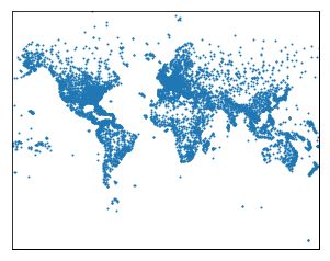
As we mentioned before, we need to convert latitude and longitude values to Cartesian coordinates to display them on a two-dimensional map. We can pass in a list of latitude and longitude values into the basemap instance and it will return back converted lists of longitude and latitude values using the projection we specified earlier. The constructor only accepts list values, so we'll need to use Series.tolist() to convert the longitude and latitude columns from the airports dataframe to lists. Then, we pass them to the basemap instance with the longitude values first then the latitude values:
x, y = m(longitudes, latitudes)
The basemap object will return 2 list objects, which we assign to x and y. Finally, we display the first 5 elements of the original longitude values, original latitude values, the converted longitude values, and the converted latitude values.
Convert the longitude values from spherical to Cartesian and assign the resulting list to x.
Convert the latitude values from spherical to Cartesian and assign the resulting list to y.
m = Basemap(projection='merc', llcrnrlat=-80, urcrnrlat=80, llcrnrlon=-180, urcrnrlon=180)

x, y = m(longitudes, latitudes)

m = Basemap(projection='merc', llcrnrlat=-80, urcrnrlat=80, llcrnrlon=-180, urcrnrlon=180)

longitudes = airports["longitude"].tolist()
latitudes = airports["latitude"].tolist()

x, y = m(longitudes, latitudes)

m.scatter(x, y, s=1)

plt.show()
7. Customizing The Plot Using Basemap
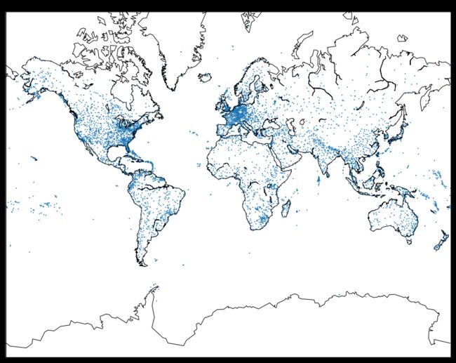
You'll notice that the outlines of the coasts for each continent are missing from the map above. We can display the coast lines using the basemap.drawcoastlines() method.
Use basemap.drawcoastlines() to enable the coast lines to be displayed.
Display the plot using plt.show().
m = Basemap(projection='merc', llcrnrlat=-80, urcrnrlat=80, llcrnrlon=-180, urcrnrlon=180)
longitudes = airports["longitude"].tolist()
latitudes = airports["latitude"].tolist()
x, y = m(longitudes, latitudes)
m.scatter(x, y, s=1)
m = Basemap(projection='merc', llcrnrlat=-80, urcrnrlat=80, llcrnrlon=-180, urcrnrlon=180)
longitudes = airports["longitude"].tolist()
latitudes = airports["latitude"].tolist()
x, y = m(longitudes, latitudes)
m.scatter(x, y, s=1)
m.drawcoastlines()
plt.show()
8. Customizing The Plot Using Matplotlib
Because basemap uses matplotlib under the hood, we can interact with the matplotlib classes that basemap uses directly to customize the appearance of the map.
We can add code that:
- uses pyplot.subplots() to specify the figsize parameter
- returns the Figure and Axes object for a single subplot and assigns to fig and ax respectively
- use the Axes.set_title() method to set the map title
Before creating the basemap instance and generating the scatter plot, add code that:
- creates a figure with a height of 15 inches and a width of 20 inches
- sets the title of the scatter plot to "Scaled Up Earth With Coastlines"
# Add code here, before creating the Basemap instance.
m = Basemap(projection='merc', llcrnrlat=-80, urcrnrlat=80, llcrnrlon=-180, urcrnrlon=180)
longitudes = airports["longitude"].tolist()
latitudes = airports["latitude"].tolist()
x, y = m(longitudes, latitudes)
m.scatter(x, y, s=1)
m.drawcoastlines()
plt.show()
fig, ax = plt.subplots(figsize=(15,20))
plt.title("Scaled Up Earth With Coastlines")
m = Basemap(projection='merc', llcrnrlat=-80, urcrnrlat=80, llcrnrlon=-180, urcrnrlon=180)
longitudes = airports["longitude"].tolist()
latitudes = airports["latitude"].tolist()
x, y = m(longitudes, latitudes)
m.scatter(x, y, s=1)
m.drawcoastlines()
plt.show()

9. Introduction to Great Circles
To better understand the flight routes, we can draw great circles to connect starting and ending locations on a map. A great circle is the shortest circle connecting 2 points on a sphere.
Great Circles(pic)
On a two-dimensional map, the great circle is demonstrated as a line because it is projected from three-dimensional down to two-dimensional using the map projection. We can use these to visualize the flight routes from the routes dataframe. To plot great circles, we need the source longitude, source latitude, destination longitude, and the destination latitude for each route. While the routes dataframe contains the source and destination airports for each route, the latitude and longitude values for each airport are in a separate dataframe (airports).
To make things easier, we've created a new CSV file called geo_routes.csv that contains the latitude and longitude values corresponding to the source and destination airports for each route. We've also removed some columns we won't be working with.
Read geo_routes.csv into a dataframe named geo_routes.
Use the DataFrame.info() method to look for columns containing any null values.
Display the first five rows in geo_routes.
geo_routes = pd.read_csv("geo_routes.csv")
print(geo_routes.info())
print(geo_routes.head(5))
RangeIndex: 67428 entries, 0 to 67427
Data columns (total 8 columns):
airline 67428 non-null object
source 67428 non-null object
dest 67428 non-null object
equipment 67410 non-null object
start_lon 67428 non-null float64
end_lon 67428 non-null float64
start_lat 67428 non-null float64
end_lat 67428 non-null float64
dtypes: float64(4), object(4)
memory usage: 4.1+ MB
None
airline source dest equipment start_lon end_lon start_lat end_lat
0 2B AER KZN CR2 39.956589 49.278728 43.449928 55.606186
1 2B ASF KZN CR2 48.006278 49.278728 46.283333 55.606186
2 2B ASF MRV CR2 48.006278 43.081889 46.283333 44.225072
3 2B CEK KZN CR2 61.503333 49.278728 55.305836 55.606186
4 2B CEK OVB CR2 61.503333 82.650656 55.305836 55.012622
10. Displaying Great Circles
We use the basemap.drawgreatcircle() method to display a great circle between 2 points. The basemap.drawgreatcircle() method requires four parameters in the following order:
- lon1 - longitude of the starting point.
- lat1 - latitude of the starting point.
- lon2 - longitude of the ending point.
- lat2 - latitude of the ending point.
The following code generates a great circle for the first three routes in the dataframe:
m.drawgreatcircle(39.956589, 43.449928, 49.278728, 55.606186)
m.drawgreatcircle(48.006278, 46.283333, 49.278728, 55.606186)
m.drawgreatcircle(39.956589, 43.449928, 43.081889 , 44.225072)
Unfortunately, basemap struggles to create great circles for routes that have an absolute difference of larger than 180 degrees for either the latitude or longitude values. This is because the basemap.drawgreatcircle() method isn't able to create great circles properly when they go outside of the map boundaries. This is mentioned briefly in the documentation for the method:
Note: Cannot handle situations in which the great circle intersects the edge of the map projection domain, and then re-enters the domain.
Write a function, named create_great_circles() that draws a great circle for each route that has an absolute difference in the latitude and longitude values less than 180. This function should:
- Accept a dataframe as the sole parameter
- Iterate over the rows in the dataframe using DataFrame.iterrows()
- For each row:
- Draw a great circle using the four geographic coordinates only if:
- The absolute difference between the latitude values (end_lat and start_lat) is less than 180.
- If the absolute difference between the longitude values (end_lon and start_lon) is less than 180. Create a filtered dataframe containing just the routes that start at the DFW airport.
- Draw a great circle using the four geographic coordinates only if:
- Select only the rows in geo_routes where the value for the source column equals "DFW".
- Assign the resulting dataframe to dfw.
Pass dfw into create_great_circles() and display the plot using the pyplot.show() function.
fig, ax = plt.subplots(figsize=(15,20))
m = Basemap(projection='merc', llcrnrlat=-80, urcrnrlat=80, llcrnrlon=-180, urcrnrlon=180)
m.drawcoastlines()
fig, ax = plt.subplots(figsize=(15,20))
m = Basemap(projection='merc', llcrnrlat=-80, urcrnrlat=80, llcrnrlon=-180, urcrnrlon=180)
m.drawcoastlines()

def create_great_circles(df):
    for index, row in df.iterrows():
        end_lat, start_lat = row['end_lat'], row['start_lat']
        end_lon, start_lon = row['end_lon'], row['start_lon']

        if abs(end_lat - start_lat) < 180:
            if abs(end_lon - start_lon) < 180:
                m.drawgreatcircle(start_lon, start_lat, end_lon, end_lat)

dfw = geo_routes[geo_routes['source'] == "DFW"]
create_great_circles(dfw)
plt.show()

In this mission, we learned how to visualize geographic data using basemap. This is the last mission in the Storytelling Through Data Visualization course. You should now have a solid foundation in data visualization for exploring data and communicating insights. We encourage you to keep exploring data visualization on your own. Here are some suggestions for what to do next:
Plotting tools: Creating 3D plots using Plotly Creating interactive visualizations using bokeh Creating interactive map visualizations using folium The art and science of data visualization: Visual Display of Quantitative Information Visual Explanations: Images and Quantities, Evidence and Narrative