Python数据可视化--matplotlib基础用法
matplotlib是Python的一个优秀的数据可视化库,能够绘制常用的数据分析图表,还能够绘制三维图像。
安装:在cmd窗口中输入
pip install matplotlib官方文档:https://matplotlib.org/tutorisals/index.html
基础用法:
1-通过plt.plot快速绘图
import matplotlib.pyplot as plt
import numpy as np

# 准备绘图数据
x = np.arange(0, 1, 0.05)
print(x)

# y=sin(2*pi*x)
y = np.sin(2 * np.pi * x)
print(y)

# # 开始绘图
plt.plot(x, y)
plt.show()

# 改变线条颜色(b代表blue)
plt.plot(x, y, 'b')
plt.show()

# 将线条改为--虚线
plt.plot(x, y, 'b--')
plt.show()

# 将数据点用*号标出来
plt.plot(x, y, 'b--*')

# 设置图的标题
plt.title('My First Plot')

# 设置X坐标的名称
plt.xlabel('x lable')
plt.ylabel('y lable')

# 添加图例
# 1-设置label参数
plt.plot(x, y, 'b--*', label='sin')
# 2-设置图例的位置
plt.legend(loc='best')

# 显示图形
plt.show()

2-Figure和Subplot
# ---绘制多个图表---
# 创建figure对象
fig = plt.figure()
# 创建subplot---(221:前两个2表示2*2,两行两列,最后一个1表示创建第几个)
ax1 = fig.add_subplot(221)
ax2 = fig.add_subplot(222)
ax3 = fig.add_subplot(223)
ax4 = fig.add_subplot(224)

# --创建多个图标的简写--
fig,ax = plt.subplots(2,2)
ax[0,1].plot(x,y)
plt.show()
3.颜色·线型和标记
# 创建figure对象fig
fig = plt.figure()
# 创建subplot
ax = fig.add_subplot(111)
# 设置颜色·线型和标记
ax.plot(x, y, color='red', linestyle='--', marker='*')  # 可以也简写为 'r--*'
plt.show()
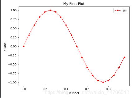
4.标题·标签·图例
# 准备绘图数据
x = np.arange(0, 1, 0.05)
# y=sin(2*pi*x)
y = np.sin(2 * np.pi * x)

# -----标题·标签·图例-----
fig = plt.figure()
fig, ax = plt.subplots()
# 设置颜色·线型·标记
ax.plot(x, y, 'r--*', label='sin')
# 设置标题·标签
ax.set(title='My First Plot', xlabel='X label', ylabel='Y label')
# # 设置图例 (先在plot()中添加lable参数)
# 设置位置
ax.legend(loc='best')
# 显示图像
plt.show()
# 设置标题、标签时,可以分开写(fontsize设置字体大小)
ax.set_title('My First Plot',fontsize=18)
ax.set_xlabel('X label',fontsize=18)
ax.set_ylabel('Y label',fontsize=18)
# 添加网格线
ax.grid()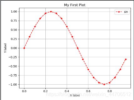
# 设置图例位置
ax.legend(loc='best')          # 在最合适的位置,不定

ax.legend(loc='upper right')   # 在右上方
ax.legend(loc='upper left')    # 在左上方

ax.legend(loc='lower right')   # 在右下方
ax.legend(loc='lower left')    # 在左下方

ax.legend(loc='upper center')  # 在中上方
ax.legend(loc='lower center')  # 在中下方
# 设置标签字体大小
ax.set_xlabel('X label',fontsize=18)# 指定默认字体(防止label里中文出现乱码)
from pylab import mpl
mpl.rcParams['font.sans-serif'] = ['FangSong']  # 指定‘仿宋’字体
# 在一张图中绘制多个图形
import matplotlib.pyplot as plt
import numpy as np

# 准备绘图数据
x = np.arange(0, 1, 0.05)
# y=sin(2*pi*x)
y = np.sin(2 * np.pi * x)
# y2=cos(2*pi*x)
y2 = np.cos(2 * np.pi * x)

fig, ax = plt.subplots()
# 设置颜色·线型·标记·标签
ax.plot(x, y, 'b--o', label='sinx')
ax.plot(x, y2, 'r-*', label='cosx')
# 设置标题·标签
ax.set(title='sinx&cosx', xlabel='X label', ylabel='Y label')
# 设置图例位置
ax.legend(loc='best')
# 显示图形
plt.show() 
5.将图表保存到本地(存在当前目录下)
fig.savefig('myfig.png') # 名称+后缀