折线图
x = [1,2,3,4,5]
y = [1,2,3,4,5]
plt.plot(x,y,
c='b',
linestyle=':',
linewidth=3,
marker='o',
markerfacecolor='r',
markersize=10,
alpha=0.7,
label="x=y"
)
plt.legend()
plt.show()

y1 = np.random.random(6)
y2 = np.random.random(6)
x = np.arange(6)
plt.plot(x, y1, label='成都')
plt.plot(x, y2, label='武汉')
plt.legend(loc='best')
plt.title('各城市房价(单位:万)', fontsize=20)
index_name = ['1月', '2月', '3月', '4月', '5月', '6月']
plt.xticks(x,index_name)
plt.show()

data_frame = pd.DataFrame({
'Python基础': np.random.randint(10, 100, 5),
'Python爬虫': np.random.randint(10, 100, 5),
'Python Web': np.random.randint(10, 100, 5),
})
plt.plot(data_frame, marker='o')
plt.legend(data_frame, loc=2)
plt.xticks([0, 1, 2, 3, 4], ['1月', '2月', '3月', '4月', '5月'])
plt.title('2022年课程购买人数')
plt.xlabel('月份')
plt.ylabel('购买人数')
plt.grid()
plt.show()

柱状图
x = [1,2,3,4,5]
index_name = ['星期一','星期二','星期三','星期四','星期五']
height = [2.5,3.5,4.6,5.7,6.8]
plt.bar(x,height,color='r')
plt.xticks(x,index_name)
plt.title('销售量(单位:万元)')
for x,height in zip(x,height):
plt.text(x,height,height,ha='center',va='bottom')
plt.show()

叠加柱状图
plt.figure(figsize=(4,4),dpi=100)
x = [1,2,3,4,5]
index_name = ['星期一','星期二','星期三','星期四','星期五']
height1 = [2.5,3.5,4.6,5.7,6.8]
height2 = [2,3,4,5,6]
plt.bar(x,height1,color='r',label='python销量')
plt.bar(x,height2,bottom=height1,color='b',label='c语言销量')
plt.xticks(x,index_name)
plt.title('销售量(单位:万元)')
plt.legend()
plt.show()

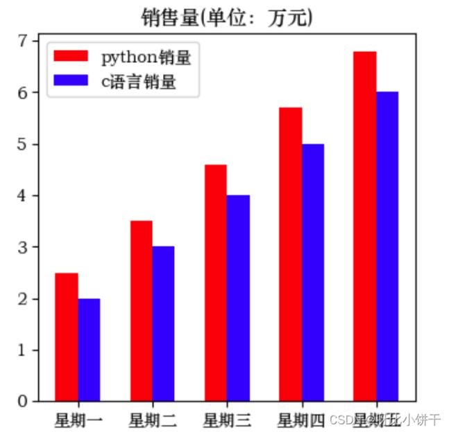
并列柱状图
plt.figure(figsize=(4,4),dpi=100)
x = np.arange(5)
index_name = ['星期一','星期二','星期三','星期四','星期五']
height1 = [2.5,3.5,4.6,5.7,6.8]
height2 = [2,3,4,5,6]
bar_width = 0.3
plt.bar(x,height1, bar_width,color='r',label='python销量')
plt.bar(x + bar_width,height2, bar_width, color='b',label='c语言销量')
plt.xticks(x+bar_width/2,index_name)
plt.title('销售量(单位:万元)')
plt.legend()
plt.show()
水平柱状图(条形图)
plt.figure(figsize=(4,4),dpi=100)
y=[1,2,3,4,5]
index_name = ['python','c语言','c++','java','php']
plt.yticks(y,index_name)
width = [2.5,3.6,4.7,5.8,6.0]
plt.barh(y,width)
for y,width in zip(y,width):
plt.text(width,y,width)
plt.show()

饼状图
plt.figure(figsize=(4,4),dpi=100)
labels = ['A','B','C','D','E']
x = [10,20,30.5,40.6,50.7]
explode = [0,0.1,0,0,0.1]
plt.pie(x,labels=labels,autopct='%.0f%%',explode=explode)
plt.show()

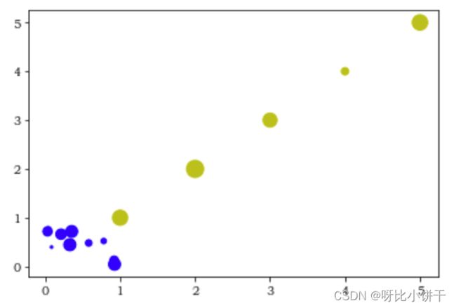
散点图
x = [1,2,3,4,5]
y = [1,2,3,4,5]
a = np.random.rand(10)
b = np.random.rand(10)
size1 = np.random.rand(5)*200
size2 = np.random.rand(10)*100
plt.scatter(x,y,color='y',s=size1)
plt.scatter(a,b,color='b',s=size2)
plt.show()
直方图
x = [1,2,3,4,5,1.1,1.2,1.3]
plt.hist(x)
plt.show()

data = np.random.normal(0,1,100000)
plt.hist(data,bins=200)
plt.show()
