Flex Spark皮肤定制
Flex3到Flex4,增加了Spark组件,这是Flex的一次重要升级,基本上组件全部重写了一套,为了保持向下兼容,出现了同一组件两套实现并存的现象,虽然说Spark组件中也可嵌入MX组件,但实际使用常会遇到些小麻烦,例如mx:Tree滚动条异常,透明背景无法监听鼠标事件等等,如果你使用定制的组件,写法稍有不规范,就会出现Spark下显示异常,比如之前定制的TWaver圆角文本输入框就是如此,不得不在Spark下重新实现。
Spark与MX组件的区别
Spark最大的目的或许是方便Adobe兜售它的Flash Catalyst,当然这是个玩笑,Spark组件更加轻量,更易扩展。所有的Flex组件都从UIComponent继承,Spark组件也是如此,只不过它多了一层包装,从SkinnableComponent继承。MX中每个组件对应一个类,在Spark体系中,每个组件对应两个类,一个Component类,一个Skin类,例如按钮组件对应:spark.components.Button和spark.skins.spark.ButtonSkin,这种设计实现了组件行为逻辑与视图呈现的分离,就像将程序员和美工的工作分开一样,这也是MVC思想的产物。
Flex 3与Flex4的区别详见:
Differences between Flex 3 and Flex 4
what is difference in halo and spark in Flex3 and Flex4
Spark组件外观定制
前面提到Flash Catalyst,这就是Adobe提供的组件外观可视化编辑工具,这个工具主要针对美工、设计师,对于习惯于写代码的程序员们也可以使用Flash Builder 4+来定制组件。
回到实际问题,之前我定制的圆角文本输入框在Spark框架下出现了问题,我决定将其改造,使用定制组件Skin的方式实现圆角文本输入框。
定制圆角文本输入框
需求与分析
我的需求很简单,文本框带圆角,其内放个图标,如同mac osx的搜索框。实现思路也很清晰,给矩形增加圆角,再多放个icon,定好位置,做好布局……
定义组件类
开始动手,按Spark组件定制的步骤,先定义组件类,再定义外观类。
组件类描述组件的行为和属性,这里我们定义一个CustomTextInput.as,继承于spark.components.TextInput,组件行为不需要特别定义,这里只是增加两个样式:icon和radius,分别表示图标和圆角半径,而具体的呈现将在Skin类中实现。
package component{

	import skin.CustomTextInputSkin;

	import spark.components.TextInput;


	[Style(name="icon", inherit="no", type="Object")]

	[Style(name="radius", inherit="true", type="Number")]


	public class CustomTextInput extends TextInput{

		[Embed(source="/images/search.png")]

		private const defaultIcon:Class;


		public function CustomTextInput(){

			super();

			this.setStyle('icon', defaultIcon);

			this.setStyle('radius', 10);

			this.setStyle("skinClass", CustomTextInputSkin);

		}

	}

}
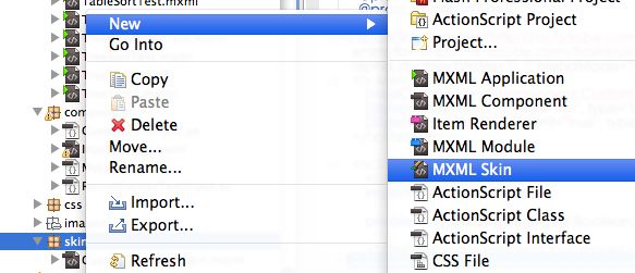
定义外观类外观类描述组件的呈现,这里我们按Flash Builder提示创建MXML Skin,选择名称为CustomTextInputSkin,设置Host component为component.CustomTextInput, 完成向导,自动生成文件CustomTextInputSkin.mxml

生成的文件实际上是默认TextInputSkin的复本,找到下面的片段:
<!-- border -->

 <!--- @private -->

 <s:Rect left="0" right="0" top="0" bottom="0" id="border">

     <s:stroke>

         <!--- @private -->

         <s:SolidColorStroke id="borderStroke" weight="1" />

     </s:stroke>

 </s:Rect>


 <!-- fill -->

 <!--- Defines the appearance of the TextInput component's background. -->

 <s:Rect id="background" left="1" right="1" top="1" bottom="1">

     <s:fill>

         <!--- @private Defines the background fill color. -->

         <s:SolidColor id="bgFill" color="0xFFFFFF" />

     </s:fill>

 </s:Rect>


 <!-- shadow -->

 <!--- @private -->

 <s:Rect left="1" top="1" right="1" height="1" id="shadow">

     <s:fill>

         <s:SolidColor color="0x000000" alpha="0.12" />

     </s:fill>

 </s:Rect>


 <!-- text -->

 <!--- @copy spark.components.supportClasses.SkinnableTextBase#textDisplay -->

 <s:RichEditableText id="textDisplay"

           verticalAlign="middle"

           widthInChars="10"

           left="1" right="1" top="1" bottom="1" />
其中边框,填充,阴影,文本框都有对应的块,分别对边框、填充、阴影添加圆角,并在文本块增加了图片组件,修改如下:
  <!-- border -->

   <!--- @private -->

   <s:Rect left="0" right="0" top="0" bottom="0" id="border" radiusX="{hostComponent.getStyle('radius')}" radiusY="{hostComponent.getStyle('radius')}" >

       <s:stroke>

           <!--- @private -->

           <s:SolidColorStroke id="borderStroke" weight="1" />

       </s:stroke>

   </s:Rect>


   <!-- fill -->

   <!--- Defines the appearance of the TextInput component's background. -->

   <s:Rect id="background" left="1" right="1" top="1" bottom="1" radiusX="{hostComponent.getStyle('radius')}" radiusY="{hostComponent.getStyle('radius')}" >

       <s:fill>

           <!--- @private Defines the background fill color. -->

           <s:SolidColor id="bgFill" color="0xFFFFFF" />

       </s:fill>

   </s:Rect>


   <!-- shadow -->

   <!--- @private -->

   <s:Rect left="1" top="1" right="1" height="1" id="shadow" radiusX="{hostComponent.getStyle('radius')}" radiusY="{hostComponent.getStyle('radius')}" >

       <s:fill>

           <s:SolidColor color="0x000000" alpha="0.12" />

       </s:fill>

   </s:Rect>

   <s:HGroup id="textGroup" gap="0" height="100%" paddingLeft="4" paddingRight="4">

	<!-- icon -->

	<s:Image id="icon" includeIn="normal" x="0" y="0" source="{hostComponent.getStyle('icon')}" verticalAlign="middle" height="100%"/>

	<!-- text -->

	<!--- @copy spark.components.supportClasses.SkinnableTextBase#textDisplay -->

	<s:RichEditableText id="textDisplay"

						verticalAlign="middle"

						widthInChars="10"

						left="1" right="1" top="1" bottom="1"  height="100%"/>

</s:HGroup>
使用运行测试定制的组件,代码如下:
<?xml version="1.0" encoding="utf-8"?>

<s:Application xmlns:fx="http://ns.adobe.com/mxml/2009"

			   xmlns:s="library://ns.adobe.com/flex/spark"

			   xmlns:mx="library://ns.adobe.com/flex/mx"

			   xmlns:component="component.*"  >

	<s:VGroup paddingLeft="20" paddingTop="20">

		<s:TextInput />

		<component:CustomTextInput  />

		<component:CustomTextInput  radius="12" icon="images/device.png" text="ABC Test ... hohoho" editable="false" />

	</s:VGroup>

</s:Application>
运行界面

代码下载
注意
此代码使用的Flex SDK 4.5编译,需要在Flash Player 10.2+运行,当然你也可以稍微改造一下代码,使其兼容Flex SDK 4.0,如图标改s:Image为mx:Image:
<!-- icon -->

<mx:Image id="icon" x="0" y="0" source="{hostComponent.getStyle('icon')}" verticalAlign="middle" height="100%"/>
参考文档
http://www.unitedmindset.com/jonbcampos/2010/03/21/new-spark-skinning-workflow/
http://www.slideshare.net/danorlando/creating-custom-spark-components-in-flex-4
http://www.adobe.com/devnet/flex/videotraining/exercises/ex5_06.html