Design a Web 2.0 tab with Photoshop
The follow guide below attempts to give you an idea how to design a nice sleek tab menu in Photoshop, Web 2.0 style.

Step 1
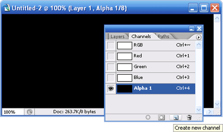
Create a new canvas with white[#ffffff] background at any size you like, preferably rectangular; they are more suitable to draw tabs. Then switch to Channels Tab (Windows -> Channels), click Create new channel on bottom right.
Step 2
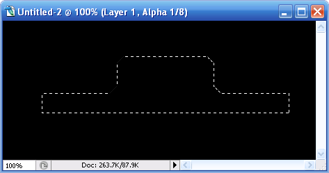
On the channel layer selected, draw similar shape with Polygonal Lasso tool. Fill it up with white color[#ffffff]; unselect the Polygonal region (select any Marquee tool and hit the screen one); give the shape Gaussian Blur with radius 6.0px.
Step 3
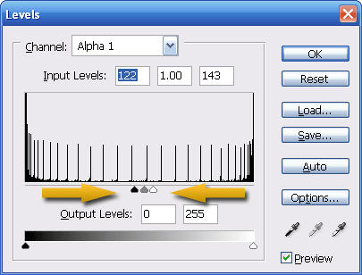
CTRL-L to call up the Level Dialog and push the left and right arrow to meet the center arrow, like the image above. This will “smooth” your blur-ed shape up and give you a nice rounded corner shape.
Step 4
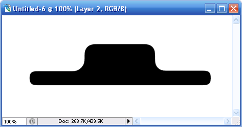
In Channels Tab, Hold CTRL, click on Channel Thumbnail of layer Alpha 1. The new shape will now be selected, switch back to Layers Tab, Create New Layer and fill the selected area with black [#000000].
Step 5
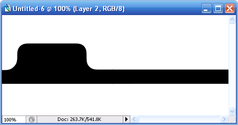
Remove rounded corners for bot bottom left and bottom right, move it towards the left and position it as illustrated above. Next we will focus on the black color Tab.
 |
Hold CTRL, click on tab’s Layer Thumbnail to get the entire tab image highlighted. |
 |
With the tab image still highlighted, select Rectangular Marquee Tool, hold ALT and draw a rectangular of region we want to remove. |
 |
You should only see the top part selected. Select -> Modify -> Contract, Contract by 2px and you should get something like the image on the left. |
 |
Create a new layer, fill the highlighted region with white[#ffffff]. Right click, choose Blending Options then Gradiant Overlay. Replace the white[#ffffff] color stop with gray[#616161]. Your tab should look like the image on the left. |
Step 6
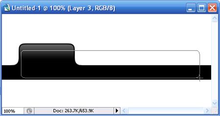
Create a new layer; Select Rounded rectangular Tool (Radius 8px), draw a rectangular and put this layer behind the black tab layer. Right click and select Blending Options and insert the following settings.
Drop Shadow
- Opacity: 31%
- Distance: 0px
- Spread: 0%
- Size: 2px
Bevel and Emboss
- Depth: 100%
- Size: 0px
- Soften: 0px
Gradiant Overlay
- Here are the Color stops settings.
- Color: #aaaaaa, Location: 0%
- Color: #ffffff, Location 100%
Step 7
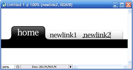
Put in some text to see the overall web 2.0 look. I’m using font Lucida Fax, font-size 32pt and 25pt. And your tab is done! Feel free to play around with the Tab’s colors combination.