React Native 使用 Flexbox 布局
Flexbox 可以在不同屏幕尺寸上提供一致的布局结构。
- 一般来说,使用flexDirection、alignItems和 justifyContent三个样式属性就已经能满足大多数布局需求。
React Native 中的 Flexbox 的工作原理和 web 上的 CSS 基本一致,当然也存在少许差异。首先是默认值不同:flexDirection的默认值为column(而不是row),alignContent默认值为 flex-start(而不是 stretch), flexShrink 默认值为0 (而不是1), 而flex只能指定一个数字值。
一、Flex
flex属性决定元素在主轴上如何填满可用区域。整个区域会根据每个元素设置的 flex 属性值被分割成多个部分。
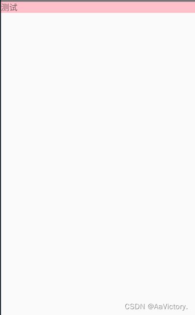
- 如下例:
import React, { Component } from 'react'
import { View,Text,StyleSheet } from 'react-native'


export default class App5 extends Component {
    render() {
      return (
        <View style={{backgroundColor:"pink"}}><Text>测试</Text></View>
      )
    }
  }
- 效果图
- 加上flex后 :会填满可用区域
import React, { Component } from 'react'
import { View,Text,StyleSheet } from 'react-native'


export default class App5 extends Component {
    render() {
      return (
        <View style={{flex:1,backgroundColor:"pink"}}><Text>测试</Text></View>
      )
    }
  }
- 效果图

二、display
设置此组件显示的类型,它的值支支持‘
flex’和‘none’,flex是默认值
三、Flex Direction
在组件的style中指定flexDirection可以决定布局的主轴。子元素是应该沿着水平轴(row)方向排列,还是沿着竖直轴(column)方向排列呢?默认值是竖直轴(column)方向。
flexDirection 有四个值
- column: 竖向(主轴是竖向)
默认值是column - column-reverse: 竖向的反方向,反数据
- row: 横向(主轴是横向)
- row-reverse :横向的反方向,反数据
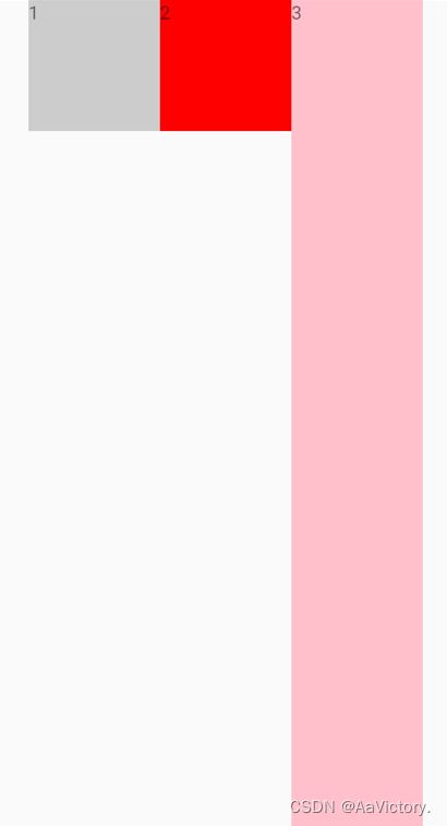
- 下面是 flexDirection:row(横向是主轴)
import React, { Component } from 'react'
import { View,Text,StyleSheet } from 'react-native'

export default class App5 extends Component {
  render() {
    return (
      <View style={styles.container}>
      <View style={styles.box1}><Text>1</Text></View>
      <View style={styles.box2}><Text>2</Text></View>
      <View style={styles.box3}><Text>3</Text></View>
      </View>
    )
  }
}
const styles=StyleSheet.create({
    container:{
        //flex:1 占满布局
        flex:1,
        //flexDirection有四个值   row (横向排),row-reverse , column (竖向排), column-reverse
        flexDirection:"row",
    },
    box1:{
        width:100,
        height:100,
        backgroundColor:"#ccc"
    },
    box2:{
        width:100,
        height:100,
        backgroundColor:"red"
    },
    box3:{
        width:100,
        height:100,
        backgroundColor:"pink"
    }
})
-
运行横向效果图如下

-
默认效果图(竖向是主轴)

四、JustifyContent
在组件的 style 中指定justifyContent可以决定其子元素沿着
主轴的排列方式
justifyContent是控制主轴方向的对齐方式
- flex-start(默认值):主轴的起点对齐
- flex-end:与主轴的末端对齐
- center :整体居中(仅两边留白)
- space-between:仅中间留白
- space-around:中间个两边都留白
- space-evenly:中间个两边间距一样

import React, { Component } from 'react'
import { View,Text,StyleSheet } from 'react-native'

export default class App5 extends Component {
  render() {
    return (
      <View style={styles.container}>
      <View style={styles.box1}><Text>1</Text></View>
      <View style={styles.box2}><Text>2</Text></View>
      <View style={styles.box3}><Text>3</Text></View>
      </View>
    )
  }
}
const styles=StyleSheet.create({
    container:{
        //flex:1 占满布局
        flex:1,
        //flexDirection有四个值   row (横向排),row-reverse , column (竖向排), column-reverse
        flexDirection:"row",
        //flex-start(默认值), flex-end,center ,space-between,space-around,space-evenly
        //justifyContent是控制主轴方向的对齐方式
        //center 整体居中(仅两边留白)
        //space-between 仅中间留白
        //space-around中间个两边都留白
        justifyContent:"center"
    },
    box1:{
        width:100,
        height:100,
        backgroundColor:"#ccc"
    },
    box2:{
        width:100,
        height:100,
        backgroundColor:"red"
    },
    box3:{
        width:100,
        height:100,
        backgroundColor:"pink"
    }
})
- 运行后如下图

- 如果修改为–> justifyContent:“space-between” 运行后如下:

- 自己多换几个,尝试一下
Align Items
在组件的 style 中指定alignItems可以决定其子元素沿着
次轴(与主轴垂直的轴,比如若主轴方向为row,则次轴方向为column)的排列方式。子元素是应该靠近次轴的起始端还是末尾段分布呢?亦或应该均匀分布?可用的选项有:
- stretch (默认值)
- flex-start
- flex-end
- center
- baseline
注意:要使stretch选项生效的话,子元素在次轴方向上不能有固定的尺寸。以下面的代码为例:只有将子元素样式中的width: 50去掉之后,alignItems: 'stretch’才能生效。
import React, { Component } from 'react'
import { View,Text,StyleSheet } from 'react-native'

export default class App5 extends Component {
  render() {
    return (
      <View style={styles.container}>
      <View style={styles.box1}><Text>1</Text></View>
      <View style={styles.box2}><Text>2</Text></View>
      <View style={styles.box3}><Text>3</Text></View>
      </View>
    )
  }
}
const styles=StyleSheet.create({
    container:{
        //flex:1 占满布局
        flex:1,
        //flexDirection有四个值   row (横向排),row-reverse , column (竖向排), column-reverse
        flexDirection:"row",
        //flex-start(默认值), flex-end,center ,space-between,space-around,space-evenly
        //justifyContent是控制主轴方向的对齐方式
        //center 整体居中(仅两边留白)
        //space-between 仅中间留白
        //space-around中间个两边都留白
        justifyContent:"center",
        //alignItems:stretch 设置侧轴方向的拉伸,不能设置高度
        //alignItems:baseline 设置基线对齐,设置咦文字底部来对齐
        alignItems:"center"
    },
    box1:{
        width:100,
        height:100,
        backgroundColor:"#ccc"
    },
    box2:{
        width:100,
        height:100,
        backgroundColor:"red"
    },
    box3:{
        width:100,
        height:100,
        backgroundColor:"pink"
    }
})
-
效果图如下

-
如果修改为–> alignItems:“stretch” (要把box3 style属性的高度去掉)运行后如下:
-
自己多换几个,尝试一下,以上是常用的flex布局