r语言绘制雷达图
I’ve tried several different types of NBA analytical articles within my readership who are a group of true fans of basketball. I found that the most popular articles are not those with state-of-the-art machine learning technologies, but those with straightforward and meaningful graphs.
我在读者群中尝试了几种不同类型的NBA分析文章,这些文章是一群真正的篮球迷。 我发现最受欢迎的文章不是那些具有最新的机器学习技术的文章,而是那些具有简单明了的图表的文章。
At a certain stage of my career as a data scientist, I realized that delivering the information is more important than showing the fancy models. Perhaps that’s why linear regression is still one of the most popular models in the finance world.
在我作为数据科学家的职业生涯的某个阶段,我意识到提供信息比展示精美的模型更为重要。 也许这就是为什么线性回归仍然是金融界最受欢迎的模型之一的原因。
In this post, I am going to talk about a simple topic. It is how to draw the spider plot, or the radar plot, which is one of the most essential graphs in a comparative analysis. I am implementing the code in R.
在这篇文章中,我将讨论一个简单的话题。 这是绘制蜘蛛图或雷达图的方法 ,它是比较分析中最重要的图之一。 我正在R中实现代码。
数据 (Data)
NBA players’ basic statistics and advanced statistics per game in 2019–2020 NBA playoffs. (from basketball reference)
在2019–2020 NBA季后赛中,NBA球员的每场比赛的基本统计数据和高级统计数据。 ( 参考篮球 )
码 (Code)
Let’s first visualize James Harden’s stats in a spider plot. We only focus on five stats: PTS (points), TRB (total rebounds), AST (assists), STL (steals), and BLK (blocks).
让我们首先在蜘蛛图中形象化詹姆斯·哈登的统计数据。 我们仅关注五项统计数据:PTS(得分),TRB(总篮板),AST(助攻),STL(抢断)和BLK(盖帽)。
df = read.csv("playoff_stats.csv")
maxxx = apply(df[,c("PTS.","TRB","AST","STL","BLK")],2,max)
minnn = apply(df[,c("PTS.","TRB","AST","STL","BLK")],2,min)
In the code of this block, the data was read to a data frame, “df”. And the maximum and minimum values of each column were calculated because these values are useful to define the boundary of the data in the spider plot.
在该块的代码中,数据被读取到数据帧“ df”。 并计算每列的最大值和最小值,因为这些值可用于定义蜘蛛图中数据的边界。
For example, I extracted the stats of James Harden and LeBron James for our analysis.
例如,我提取了James Harden和LeBron James的统计数据进行分析。
df_sel = df[c(3,10),c("PTS.","TRB","AST","STL","BLK")]
rownames(df_sel) = c("Harden","Lebron")
To define the function of the spider plot, we need to load the fmsb package.
要定义蜘蛛图的功能,我们需要加载fmsb包。
comp_plot = function(data,maxxx,minnn){
    library(fmsb)
    data = rbind(maxxx, minnn, data)
    colors_border=c( rgb(0.2,0.5,0.5,0.9), rgb(0.8,0.2,0.5,0.9) , rgb(0.7,0.5,0.1,0.9) )
    colors_in=c( rgb(0.2,0.5,0.5,0.4), rgb(0.8,0.2,0.5,0.4) , rgb(0.7,0.5,0.1,0.4) )
    radarchart( data, axistype=1 , pcol=colors_border , pfcol=colors_in , plwd=4 , plty=1, cglcol="grey", cglty=1, axislabcol="grey", caxislabels=rep("",5), cglwd=0.8, vlcex=0.8)
    legend(x=0.5, y=1.2, legend = rownames(data[-c(1,2),]), bty = "n", pch=20 , col=colors_in , text.col = "black", cex=1, pt.cex=3)
}
In the function, “radarchart” is to draw the spider plot, some arguments of which is explained below.
在函数中,“ radarchart”用于绘制蜘蛛图,下面将解释其中的一些参数。
pcol and pfcol define the color of lines and the color to fill, respectively. plwd and plty give the line width and type of the spider plot, respectively. The grid line (or the web) has the color and type defined by cglcol and cglty. I don’t want to put any label in the center of the spider plot, so the caxislabels is given null strings (rep(“”,5)).
pcol和pfcol分别定义线条的颜色和要填充的颜色。 plwd和plty分别给出了蜘蛛图的线宽和类型。 网格线(或网络)的颜色和类型由cglcol和cglty定义。 我不想在蜘蛛图的中心放置任何标签,因此caxislabels给出了空字符串(rep(“”,5))。
Let’s see how Harden’s stats look.
让我们看看哈登的统计数据如何。
comp_plot(df_sel[1,],maxxx,minnn)From the plot above, we can see that Harden is not only an excellent scorer (high points) but also a playmaker (high assists). These interpretations are perfectly consistent with the James Harden we know.
从上图可以看出,哈登不仅是出色的得分手(高分),而且是组织者(高助攻)。 这些解释与我们所知的詹姆斯·哈登完全吻合。
To compare the stats between James Harden and LeBron James, let’s input both players’ stats to the function.
为了比较詹姆斯·哈登和勒布朗·詹姆斯之间的数据,我们将两个球员的数据输入到该函数中。
comp_plot(df_sel,maxxx,minnn)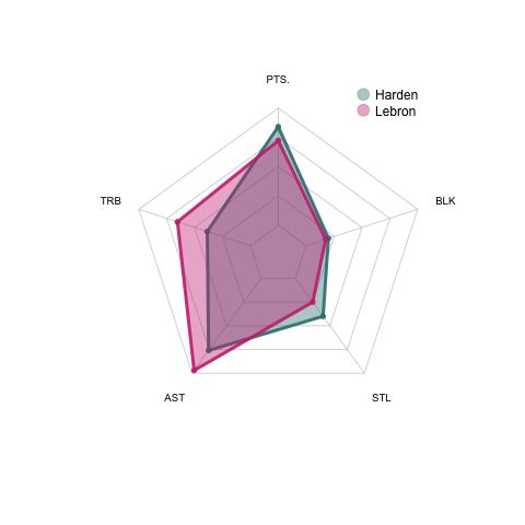
We can see that LeBron has got better rebound and assist numbers in the stats comparing to Harden even though his scoring is not as good as Harden.
我们可以看到,勒布朗的得分和助攻数据都比哈登更好,尽管他的得分不如哈登。
Pretty straight forward, right?
很简单吧?
Let’s do a similar comparison between Giannis Antetokounmpo and Kawhi Leonard in their advanced statistics, which include offense box plus/minus (OBPM), defense box plus/minus (DBPM), offense win share (OWS), defense win share (DWS), and true shooting percentage (TS).
让我们在Giannis Antetokounmpo和Kawhi Leonard的高级统计数据中进行类似的比较,其中包括进攻框正负(OBPM),防守框正负(DBPM),进攻赢率(OWS),防守赢率(DWS),和真实拍摄百分比(TS)。
df = read.csv("playoff_stats_adv.csv")
maxxx = apply(df[,c("OBPM","DBPM","OWS","DWS","TS.")],2,max)
minnn = apply(df[,c("OBPM","DBPM","OWS","DWS","TS.")],2,min)
df_sel = df[c(1,3),c("OBPM","DBPM","OWS","DWS","TS.")]
rownames(df_sel) = c("Giannis","Kawhi")
Let’s see Giannis’s stats first.
首先让我们看看吉安尼斯的统计数据。
comp_plot(df_sel[1,],maxxx,minnn)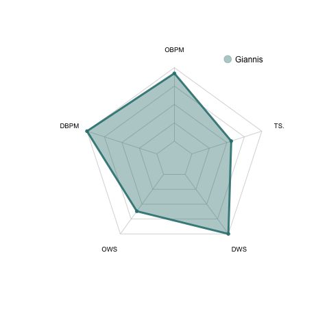
We can find that Giannis is an all-round star because he has good stats in almost every aspect. No wonder he won his second MVP for the 2019–2020 regular season.
我们可以发现吉安尼斯是全能明星,因为他几乎在各个方面都有出色的数据。 难怪他赢得了2019–2020常规赛第二次MVP。
Next, let’s compare Giannis with Kawhi Leonard in their advanced statistics.
接下来,让我们将Giannis和Kawhi Leonard的高级统计数据进行比较。
comp_plot(df_sel,maxxx,minnn)We can see that Giannis outperformed Kawhi in all aspects of the advanced stats.
我们可以看到,吉安尼斯在所有高级统计数据方面都胜过了Kawhi。
You can compare any number of players with this simple function, however, I don’t recommend to use a spider plot for the comparison of more than 3 individuals.
您可以使用此简单功能比较任意数量的玩家,但是,我不建议使用蜘蛛图来比较3个以上的玩家。
If you do need to compare a large group of objects, a heatmap could be a better choice for visualization. Here is one of my previous posts of the best heatmap function in R.
如果确实需要比较大量对象,则热图可能是可视化的更好选择。 这是我以前有关R中最佳热图函数的文章之一。
I hope this short article could contribute to your toolkit as a data scientist!
我希望这篇简短的文章可以对您作为数据科学家的工具包有所帮助!
翻译自: https://towardsdatascience.com/draw-a-radar-spider-plot-with-r-4af9693c3237
r语言绘制雷达图