使用Echars实现水滴状、环形图、分割图、堆叠、组织架构图、地图轮廓等图表
百度Echarts
- 水滴状图表
- 横向柱形图
- 分割块柱形图
- 曲线面积图
- 横向堆叠柱形图
- 环形进度图
- 饼状图
- 饼状图多个标题
- 组织架构图
- 省市轮廓地图
- 新疆省地图
- 全国地图
- 折线图阴影效果
- 柱形折线混合图带日期轴
- 图表大小自动适配
相信大家对百度Echarts一点也不陌生,几乎每个项目中都会用到Echarts图表,作为数据统计展示或者其他业务展示。当初刚接触Echarts的时候,看了几遍文档,在示例中找到适合自己需求的代码直接修改。但是效果很丑或者说是太简单了,虽然功能实现了,但是在视觉和用户体验上就会差点意思(产品:你看看人家这个挺好的)。
今年使用的Echarts次数很多,简单的图表满足不了需求,自己只好多看看Echarts文档,接下来就把在项目中遇到的图表总结记录下。
水滴状图表
效果图如下:

代码如下:
	<div id="main" style="width:100%; height:100%;"></div>
	<script src="https://cdn.jsdelivr.net/npm/jquery@3/dist/jquery.min.js"></script>
	<script src="https://cdn.jsdelivr.net/npm/echarts@^4.9.0/dist/echarts.min.js"></script>
	<script type="text/javascript" src="https://echarts.baidu.com/resource/echarts-liquidfill-latest/dist/echarts-liquidfill.min.js"></script>
	<script type="text/javascript">
		var Dom = document.getElementById('main');
		var myChart = echarts.init(Dom);
		var app = {};
		var option;
		var data = 0.8;
		option = {
			//backgroundColor: '#000',//背景
			title: [{
				text: (data * 100).toFixed(0) + '%',
				left: '50%',
				top: '40%',
				textAlign: 'center',
				textStyle: {
					fontSize: '30',
					color: '#5acef2',
					textAlign: 'center',
				},
			}, ],
			polar: {
				radius: ['43%', '40%'], //极坐标系的半径
				center: ['50%', '50%'], //极坐标系的中心(圆心)坐标,数组的第一项是横坐标相对于容器宽度,第二项是纵坐标相对于容器高度
			},
			angleAxis: {
				max: 100, //最大值
				clockwise: false, //进度按逆时针方向
				axisLine: {
					show: false,
				},
				axisTick: {
					show: false,
				},
				axisLabel: {
					show: false,
				},
				splitLine: {
					show: false,
				},
			},
			radiusAxis: {
				type: 'category',
				axisLine: {
					show: false,
				},
			},
			series: [{
					type: 'liquidFill',
					radius: '40%',
					z: 1, //组件的所有图形的z值。控制图形的前后顺序。z值小的图形会被z值大的图形覆盖。
					center: ['50%', '50%'],
					amplitude: 20, //圆形内 水滴角度
					color: {
						type: 'linear',
						x: 0,
						y: 0,
						x2: 1,
						y2: 1,
						colorStops: [{
								offset: 0,
								color: '#e744ff',
							},
							{
								offset: 1,
								color: '#33c8ff',
							},
						],
						globalCoord: false,
					},
					data: [
						//0.5,
						{
							value: 0.44,
							direction: 'left',
						},
					],
					backgroundStyle: {
						//borderWidth: 1,
						color: 'transparent',
					},
					label: {
						normal: {
							formatter: '',
						},
					},
					outline: { // 轮廓设置
						show: true,
						itemStyle: {
							borderWidth: 0,//轮廓大小
						},
						borderDistance: 0, // 轮廓间距
					},
				},
				{//外层环形
					name: '',
					type: 'bar',
					roundCap: true, //是否在环形柱条两侧使用圆弧效果
					z: 2,
					showBackground: true,
					backgroundStyle: {//环形底色
						color: '#cecece',
					},
					data: [75],//环形进度数据
					coordinateSystem: 'polar',
					itemStyle: {
						normal: {
							color: new echarts.graphic.LinearGradient(0, 0, 0.5, 1, [{
									offset: 0,
									color: '#5acef2',
								},
								{
									offset: 0.7,
									color: '#5073fb',
								},
								{
									offset: 1,
									color: '#6ae8d8',
								},
							]),
						},
					},
				},
			],
		};

		window.onresize = function() {
			myChart.resize();
		};
		if (option && typeof option === "object") {
			myChart.setOption(option, true);
		}
	</script>
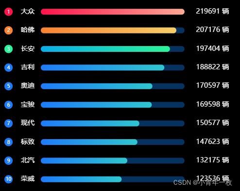
横向柱形图
效果图如下:
代码如下:
<div id="indexBar" style="width:500px; height:400px;"></div>
	<script src="https://cdn.jsdelivr.net/npm/jquery@3/dist/jquery.min.js"></script>
	<script src="js/echarts.min.js"></script>
	<script type="text/javascript">
		var dom = document.getElementById("indexBar");
		var myChart = echarts.init(dom);
		var app = {};
		var option;
		var data = [{
				"stock": "大众",
				"fundPost": "219691"
			},
			{
				"stock": "哈佛",
				"fundPost": "207176"
			},
			{
				"stock": "长安",
				"fundPost": "197404"
			},
			{
				"stock": "吉利",
				"fundPost": "188822"
			},
			{
				"stock": "奥迪",
				"fundPost": "170597"
			},
			{
				"stock": "宝骏",
				"fundPost": "169598"
			},
			{
				"stock": "现代",
				"fundPost": "150577"
			},
			{
				"stock": "标致",
				"fundPost": "147623"
			},
			{
				"stock": "北汽",
				"fundPost": "132175"
			},
			{
				"stock": "荣威",
				"fundPost": "123536"
			}
		]

		function contains(arr, dst) {
			var i = arr.length;
			while ((i -= 1)) {
				if (arr[i] == dst) {
					return i;
				}
			}
			return false;
		}
		var attackSourcesColor = [
			new echarts.graphic.LinearGradient(0, 1, 1, 1, [{
					offset: 0,
					color: "#ff134a"
				},
				{
					offset: 1,
					color: "#ffa995"
				}
			]),
			new echarts.graphic.LinearGradient(0, 1, 1, 1, [{
					offset: 0,
					color: "#FA8231"
				},
				{
					offset: 1,
					color: "#F7CE68"
				}
			]),
			new echarts.graphic.LinearGradient(0, 1, 1, 1, [{
					offset: 0,
					color: "#08AEEA"
				},
				{
					offset: 1,
					color: "#2AF598"
				}
			]),
			new echarts.graphic.LinearGradient(0, 1, 1, 1, [{
					offset: 0,
					color: "#1d7bfa"
				},
				{
					offset: 1,
					color: "#2EC7CF"
				}
			])
		];
		var attackSourcesColor1 = [
			"#ff134a",
			"#FA8231",
			"#2AF598",
			"#1d7bfa",
		];
		var attaData = [];
		var attaName = [];
		data.forEach((it, index) => {
			//attaData[index] = parseFloat(it.fundPost).toFixed(2);//保留两位小数
			attaData[index] = it.fundPost;
			attaName[index] = it.stock;
		});
		var salvProMax = []; //背景按最大值
		for (let i = 0; i < attaData.length; i++) {
			salvProMax.push(attaData[0]);
		};

		function attackSourcesDataFmt(sData) {
			var rank = [];
			sData.forEach(function(item, i) {
				let itemStyle = {
					color: i > 3 ? attackSourcesColor[3] : attackSourcesColor[i]
				};
				rank.push({
					value: item,
					itemStyle: itemStyle
				});
			});
			return rank;
		};
		var option = {
			backgroundColor: "#000",
			grid: {
				left: "0%",
				right: "0%",
				bottom: "2%",
				top: "2%",
				containLabel: true
			},
			xAxis: {
				type: "value",
				//boundaryGap: [0, 0.01],
				splitLine: "none",
				axisTick: "none",
				axisLine: "none",
				axisLabel: "none",
			},
			yAxis: [{
					type: "category",
					inverse: true, //坐标数据正序显示, false时为倒序
					offset: 20,
					axisTick: "none",
					axisLine: "none",
					axisLabel: "none",
					data: attaName,
					axisLabel: {
						padding: [0, 30, 0, 0], //排名与柱形间距
						rich: {
							nt1: {
								color: "#fff",
								backgroundColor: attackSourcesColor1[0],
								width: 15,
								height: 15,
								fontSize: 10,
								align: "center",
								borderRadius: 100,
								padding: [0, 1, 2, 1]
							},
							nt2: {
								color: "#fff",
								backgroundColor: attackSourcesColor1[1],
								width: 15,
								height: 15,
								fontSize: 10,
								align: "center",
								borderRadius: 100,
								padding: [0, 1, 2, 1]
							},
							nt3: {
								color: "#fff",
								backgroundColor: attackSourcesColor1[2],
								width: 15,
								height: 15,
								fontSize: 10,
								align: "center",
								borderRadius: 100,
								padding: [0, 1, 2, 1]
							},
							nt: {
								color: "#fff",
								backgroundColor: attackSourcesColor1[3],
								width: 15,
								height: 15,
								fontSize: 10,
								align: "center",
								borderRadius: 100,
								padding: [0, 1, 2, 1],
							}
						},
						formatter: function(value, index) {
							index = contains(attaName, value) + 1;
							if (index - 1 < 3) {
								return ["{nt" + index + "|" + index + "}"].join("\n");
							} else {
								return ["{nt|" + index + "}"].join("\n");
							}
						}
					}
				},
				{ //右侧y轴 数据
					type: "category",
					inverse: true,
					offset: -25, //位置偏移
					axisTick: "none",
					axisLine: "none",
					axisLabel: "none",
					show: true,
					axisLabel: {
						formatter: '{value} 辆',
						textStyle: {
							color: "#fafafa",
							fontSize: "14"
						}
					},
					data: attaData,
				},
				{ //左侧y轴 名称
					type: 'category',
					offset: 5, //位置偏移
					inverse: true,
					position: "left",
					axisTick: "none",
					axisLine: "none",
					axisLabel: "none",
					axisLabel: {
						inverse: true,
						textStyle: {
							color: "#fff",
							fontSize: "14"
						}
					},
					data: attaName
				},
			],
			series: [{ //横向柱形实际数据块
					zlevel: 2,
					name: "",
					type: "bar",
					barWidth: 12,
					barGap: "100%",
					animationDuration: 1500,
					data: attackSourcesDataFmt(attaData),
					align: "center",
					itemStyle: {
						normal: {
							barBorderRadius: 10
						}
					},
				},
				{ //横向柱形底色块
					name: "",
					type: "bar",
					barWidth: 12,
					barGap: "-100%",
					data: salvProMax,
					itemStyle: {
						normal: {
							color: "#05325F",
							barBorderRadius: 30
						},
					}
				}
			]
		};

		if (option && typeof option === 'object') {
			myChart.setOption(option);
		};
		window.onresize = function() {
			myChart.resize();
		}
分割块柱形图
效果图如下:

代码如下:
<div id="main" style="width:100%; height:100%;"></div>
	<script src="https://cdn.jsdelivr.net/npm/jquery@3/dist/jquery.min.js"></script>
	<script src="js/echarts.min.js"></script>
	<script type="text/javascript">
		var Dom = document.getElementById('main');
		var myChart = echarts.init(Dom);
		var app = {};
		var option;
		var xLabel = ['大众', '哈佛', '长安', '吉利', '奥迪', '宝骏', '现代', '标致', '北汽', '荣威'];
		var data1 = [20, 80, 100, 40, 34, 90, 60, 50, 80, 100, 40, 34, 90, 60];
		option = {
			tooltip: {
				trigger: 'axis',
				formatter: function (params) {
					var relVal = '';
					for (var i = 0, l = params.length; i < l; i++) {
						relVal +=   params[i].marker + params[i].name + ' : ' + params[i].value + '人'
					}
					return relVal;
				}
			},

			backgroundColor: '#0f375f',
			xAxis: {
				data: xLabel,
				axisLine: {
					show: true, //隐藏X轴轴线
					lineStyle: {
						color: 'rgba(8,174,234,0.2)'
					}
				},
				axisTick: {
					show: false //隐藏X轴刻度
				},
				axisLabel: {
					show: true,
					fontSize: 14,
					textStyle: {
						color: "#cecece" //X轴文字颜色
					}
				},

			},
			yAxis: [{
				type: "value",
				splitLine: {
					show: true,
					lineStyle: {
						color: 'rgba(8,174,234,0.2)',
						width: 1
					},
				},
				axisTick: {
					show: false
				},
				axisLine: {
					show: true,
					lineStyle: {
						color: 'rgba(8,174,234,0.2)'
					}
				},
				axisLabel: {
					show: true,
					fontSize: 14,
					textStyle: {
						color: "#cecece" //X轴文字颜色
					}
				},
			}, ],
			series: [{
					name: "主营业务",
					type: "bar",
					barWidth: 20,
					itemStyle: {
						normal: {
							color: new echarts.graphic.LinearGradient(0, 0, 0, 1, [{
									offset: 0,
									color: 'rgba(42,245,152,1)' // 0% 处的颜色
								},
								{
									offset: 1,
									color: 'rgba(8,174,234,1)' // 100% 处的颜色
								}
							])
						}
					},
					data: data1,
					z: 10, //控制图形的前后顺序,z值小的图形会被z值大的图形覆盖  类似于z-index
					zlevel: 0, //zlevel 大的 Canvas 会放在 zlevel 小的 Canvas 的上面。
					label: {
						show: true,
						position: "top",
						distance: 10,
						fontSize: 16,
						color: "#01fff4"
					}
				},
				{
					// 柱形分隔线
					type: "pictorialBar",
					itemStyle: {
						normal: {
							color: "#0F375F" //分割线颜色
						}
					},
					symbolRepeat: "fixed", //分割线固定
					symbolMargin: 6, //分层块的高度
					symbol: "round", //类型
					symbolClip: true,
					symbolSize: [20, 2], //分割线的宽高
					symbolPosition: "start",
					symbolOffset: [0, -1], //位置偏移
					data: data1,
					z: 0,
					zlevel: 1,
				},
			]
		};

		if (option && typeof option === "object") {
			myChart.setOption(option, true);
		}
曲线面积图
效果图如下:

代码如下:
<div id="indexArea" style="width:100%; height:100%;"></div>
	<script src="https://cdn.jsdelivr.net/npm/jquery@3/dist/jquery.min.js"></script>
	<script src="js/echarts.min.js"></script>
	<script type="text/javascript">
		var dom = document.getElementById("indexArea");
		var myChart = echarts.init(dom);
		var app = {};
		var option;
		option = {
			grid: {
				top: '13%',
				right: '1.5%',
				bottom: '8%',
				left: '3%'
			},
			xAxis: {
				type: 'category',
				boundaryGap: false, //设置x轴两边的留白
				axisTick: { //x轴刻度尺
					show: false,
					alignWithLabel: true
				},
				axisLine: { //x轴线条颜色
					show: true,
					lineStyle: {
						color: '#dadada',
						width: 0.5
					}
				},
				axisLabel: { //x轴文字倾斜
					show: true,
					textStyle: {
						color: '#333', //更改坐标轴文字颜色
						fontSize: 14, //更改坐标轴文字大小
					},
					interval: 0,
				},
				data: ['大众', '哈佛', '长安', '吉利', '奥迪', '宝骏', '现代', '标致', '北汽', '荣威']
			},
			yAxis: {
				type: 'value',
				name: '',
				nameTextStyle: {
					padding: [0, 90, 5, 0], // y轴name位置
					color: '#333', //更改坐标轴文字颜色
					fontSize: 14 //更改坐标轴文字大小
				},
				splitLine: {
					show: true, //关闭网格线
					lineStyle: {
						color: '#dadada',
						width: 0.5
					}
				},
				axisLine: { //y轴线条颜色
					show: false,
				},
				axisTick: {
					show: false
				},
				axisLabel: { //y轴文字倾斜
					textStyle: {
						color: '#333', //更改坐标轴文字颜色
						fontSize: 14 //更改坐标轴文字大小
					}
				},
			},
			series: [{
					name: '',
					data: [106, 129, 144, 176, 135, 148, 144, 176, 135, 148],
					type: 'line',
					stack: 'Total',
					symbolSize: 8, //设定实心点的大小
					smooth: true, //面积图改成弧形状
					lineStyle: {
						width: 1, //外边线宽度
						color: '#ff7145' //外边线颜色
					},
					itemStyle: {
						normal: { //节点颜色
							color: '#ff7145',
						}
					},
					label: { //显示当前柱形数值
						show: true,
						position: 'top',
						textStyle: {
							color: '#000', //更改坐标轴文字颜色
							fontSize: 14 //更改坐标轴文字大小
						}
					},
					showSymbol: true, //去除面积图节点圆
					areaStyle: { //区域填充渐变颜色
						color: {
							type: 'linear',
							x: 0,
							y: 0,
							x2: 0,
							y2: 1,
							colorStops: [{
								offset: 0,
								color: 'rgba(255,113,69, 0.6)' // 0% 处的颜色
							}, {
								offset: 1,
								color: 'rgba(255,255,255, 1)' // 100% 处的颜色
							}],
							global: false // 缺省为 false
						}
					}
				},
				{
					name: '',
					data: [131, 206, 229, 244, 276, 235, 248, 276, 235, 248, ],
					type: 'line',
					stack: 'Total',
					symbolSize: 8, //设定实心点的大小
					smooth: true, //面积图改成弧形状
					lineStyle: {
						width: 1, //外边线宽度
						color: '#6c92ff' //外边线颜色
					},
					itemStyle: {
						normal: { //节点颜色
							color: '#6c92ff',
						}
					},
					label: { //显示当前柱形数值
						show: true,
						position: 'top',
						textStyle: {
							color: '#000', //更改坐标轴文字颜色
							fontSize: 14 //更改坐标轴文字大小
						}
					},
					showSymbol: true, //去除面积图节点圆
					areaStyle: { //区域填充渐变颜色
						color: {
							type: 'linear',
							x: 0,
							y: 0,
							x2: 0,
							y2: 1,
							colorStops: [{
								offset: 0,
								color: 'rgba(117,153,255, 0.6)' // 0% 处的颜色
							}, {
								offset: 1,
								color: 'rgba(255,255,255, 1)' // 100% 处的颜色
							}],
							global: false // 缺省为 false
						}
					}
				}
			]
		};

		if (option && typeof option === 'object') {
			myChart.setOption(option);
		};
		window.onresize = function() {
			myChart.resize();
		}
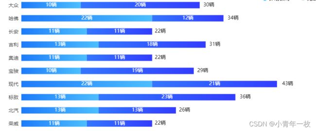
横向堆叠柱形图
效果图如下:
代码如下:
var dom = document.getElementById("indexColumnar");
var myChart = echarts.init(dom);
var app = {};
var option;
var data1 = [10, 22, 11, 13, 11, 10, 22, 13, 13, 11];
var data2 = [20, 12, 11, 18, 11, 19, 21, 23, 13, 11];
var total_data = function() {
	var datas = [];
	for (var i = 0; i < data1.length; i++) {
		datas.push(data1[i] + data2[i]);
	}
	return datas;
}();
option = {
	grid: {
		left: '3%',
		right: '3%',
		bottom: '2%',
		top: '3%',
		containLabel: true
	},
	xAxis: [{
		type: 'value',
		name: '',
		axisLine: { //x轴线条颜色
			show: false,
		},
		axisLabel: {
			show: false,
		},
		splitLine: { //网格线
			show: false,
		},
	}],
	yAxis: [{
		type: 'category',
		inverse: true, //坐标数据正序显示, false时为倒序
		axisTick: {
			show: false
		},
		axisLine: { //x轴线条颜色
			show: false,
		},
		axisLabel: {
			show: true,
			textStyle: {
				color: '#333', //更改坐标轴文字颜色
				fontSize: 14 //更改坐标轴文字大小
			}
		},
		data: ['大众', '哈佛', '长安', '吉利', '奥迪', '宝骏', '现代', '标致', '北汽', '荣威']
	}],
	animationDuration: 3000,
	series: [{
			name: '',
			type: 'bar',
			stack: 'total',
			barWidth: 18, //柱形宽度
			label: {
				normal: {
					show: true,
					position: 'inside',
					formatter: '{c}辆',
					textStyle: {
						color: '#fff', //更改坐标轴文字颜色
						fontSize: 14 //更改坐标轴文字大小
					},
				}
			},
			itemStyle: { //柱形色
				normal: {
					color: new echarts.graphic.LinearGradient(
						1, 0, 0, 0,
						[{
								offset: 0,
								color: '#4cbeff'
							},
							{
								offset: 1,
								color: '#1d7bfa'
							}
						]
					),
				},
			},
			data: data1,
		},
		{
			name: '',
			type: 'bar',
			stack: 'total',
			barWidth: 18, //柱形宽度
			label: {
				normal: {
					show: true,
					position: 'inside',
					formatter: '{c}辆',
					textStyle: {
						color: '#fff', //更改坐标轴文字颜色
						fontSize: 14 //更改坐标轴文字大小
					},
				}
			},
			itemStyle: { //柱形色
				normal: {
					color: new echarts.graphic.LinearGradient(
						1, 0, 0, 0,
						[{
								offset: 0,
								color: '#333dff'
							},
							{
								offset: 1,
								color: '#3376ff'
							}
						]
					),
				},
			},
			data: data2,
		},
		{
			name: '总计',
			type: 'bar',
			stack: '总计',
			label: {
				normal: {
					show: true,
					position: ['102%', '-20'],
					formatter: '{c}辆',
					textStyle: {
						color: '#000', //更改坐标轴文字颜色
						fontSize: 14 //更改坐标轴文字大小
					},

				}
			},
			data: total_data
		}
	]
};
if (option && typeof option === 'object') {
	myChart.setOption(option);
};
window.onresize = function() {
	myChart.resize();
}
环形进度图
效果如下:

代码如下:
<div id="main" style="width:700px; height:400px;"></div>
	<script src="https://cdn.jsdelivr.net/npm/jquery@3/dist/jquery.min.js"></script>
	<script src="js/echarts.min.js"></script>
	<script type="text/javascript">
		var Dom = document.getElementById('main');
		var myChart = echarts.init(Dom);
		var app = {};
		var option;
		var data = [{
			name: '销量占比',
			value: 84
		}, {
			name: '预售占比',
			value: 40
		}]

		var seriesArr = [];
		colors = [
			['#389af4', '#dfeaff'],
			['#ff8c37', '#ffdcc3']
		]
		data.forEach(function(item, index) {
			seriesArr.push({
				name: item.name,
				type: 'pie',
				clockWise: false,
				radius: [60, 70],
				itemStyle: {
					normal: {
						color: colors[index][0],
						shadowColor: colors[index][0],
						shadowBlur: 0,
						label: {
							show: false
						},
						labelLine: {
							show: false
						},
					}
				},
				hoverAnimation: false,
				center: [index * 40 + 30 + '%', '50%'],
				data: [{
					value: item.value,
					label: {
						normal: {
							formatter: function(params) {
								return item.name + "\n\n" + params.value + "%";
							},
							position: 'center',
							show: true,
							textStyle: {
								fontSize: '16',
								color: colors[index][0]
							}
						}
					},
				}, {
					value: 100 - item.value,
					name: 'invisible',
					itemStyle: {
						normal: {
							color: colors[index][1]
						},
						emphasis: {
							color: colors[index][1]
						}
					}
				}]
			})
		});


		option = {
				backgroundColor: "#000",
				series: seriesArr
		},
		window.onresize = function() {
			myChart.resize();
		};
		if (option && typeof option === "object") {
			myChart.setOption(option, true);
		}
	</script>
饼状图
效果如下:

代码如下:
	<div id="indexArea" style="width:100%; height:100%;"></div>
	<script src="https://cdn.jsdelivr.net/npm/jquery@3/dist/jquery.min.js"></script>
	<script src="js/echarts.min.js"></script>
	<script type="text/javascript">
		var dom = document.getElementById("indexArea");
		var myChart = echarts.init(dom);
		var app = {};
		var option;
		let bgColor = '#fff';
		let title = '总计销售:';
		let color = ['#168eff', '#ff734e', ' #feb11c', '#33c8ff', '#e52929', '#e744ff', '#78d639'];
		let echartData = [{
				name: "大众",
				value: "3720"
			},
			{
				name: "哈佛",
				value: "2920"
			},
			{
				name: "长安",
				value: "2200"
			},
			{
				name: "吉利",
				value: "1420"
			},
			{
				name: "宝骏",
				value: "2920"
			},
			{
				name: "现代",
				value: "2200"
			},
			{
				name: "北汽",
				value: "420"
			}
		];
		let formatNumber = function(num) {
			let reg = /(?=(\B)(\d{3})+$)/g;
			return num.toString().replace(reg, ',');
		}
		let total = echartData.reduce((a, b) => {
			return a + b.value * 1
		}, 0);

		option = {
			backgroundColor: bgColor,
			color: color,
			title: [{ //饼状图内标题与总数的样式
				text: '{name|' + title + '}\n{val|' + formatNumber(total) + '辆}',
				top: 'center',
				left: 'center',
				textStyle: {
					rich: {
						name: { //状图内标题
							fontSize: 20,
							color: '#666666',
							padding: [10, 0]
						},
						val: { //状图内总数
							fontSize: 32,
							fontWeight: 'bold',
							color: '#333333',
						}
					}
				}
			}],
			series: [{
				type: 'pie',
				radius: ['45%', '60%'],
				center: ['50%', '50%'],
				data: echartData,
				hoverAnimation: false, //去除鼠标移入放大
				itemStyle: {
					normal: {
						borderColor: bgColor,
						borderWidth: 2 //列 间距
					}
				},
				labelLine: { //坐标线样式
					normal: {
						length: 20, //坐标直线宽度
						length2: 120, //坐标横线宽度
						lineStyle: {
							color: '#e6e6e6'
						}
					}
				},
				label: {
					normal: {
						formatter: params => { //显示圆点 + 标题 + 数据
							return (
								'{icon|●}{name|' + params.name + '}{value|' +
								formatNumber(params.value) + '辆}'
							);
						},
						// padding: [0 , -100, 25, -100],//列标题位置偏移到横线位置上方
						rich: {
							icon: {
								fontSize: 20 //标题 圆点大小
							},
							name: { //标题样式
								fontSize: 14,
								padding: [0, 10, 0, 4],
								color: '#666666'
							},
							value: { //标题后数值样式
								fontSize: 18,
								fontWeight: 'bold',
								color: '#333333'
							}
						}
					}
				},
			}]
		};
		if (option && typeof option === 'object') {
			myChart.setOption(option);
		};
		window.onresize = function() {
			myChart.resize();
		}
	</script>
饼状图多个标题
效果如下:

代码如下:
var dom = document.getElementById("genderColumn");
var myChart = echarts.init(dom);
var app = {};
var option;

var colorList = ['#53d08d', '#ff9416', '#5398ff']

option = {
    title: [
		{
		    text: '性别分布',
		   x: 'center',
		   y: '3%',
		   textStyle: {
		   	color: '#555',
		   	fontSize: 15,
		   },
		},
		     {
		        text: '女性',
		        textStyle:{
		            fontSize:18,
		            color: '#555',
		        },
		        textAlign:"center",
		        x: '25.5%',
		        y: '56%',
		    },
			{
			    text: '男性',
			    textStyle:{
			        fontSize:18,
			       	color: '#555',
			    },
			    textAlign:"center",
			    x: '71.5%',
			    y: '56%',
			}
	],
	legend: {
		orient: 'horizontal',
		y: '12%', //图例距离标题距离
		itemWidth: 12, //图例宽
		itemHeight: 12, //图例高
		itemGap: 30, //图例之间间距
		textStyle: {
			color: '#555', //更改坐标轴文字颜色
			fontSize: 14 //更改坐标轴文字大小
		},
		data: [{
				name: '体彩',
				icon: 'roundRect',
			},
			{
				name: '福彩',
				icon: 'roundRect',
			},
			{
				name: '彩民',
				icon: 'roundRect',
			}
		]
	},
    tooltip: {
        trigger: 'item'
    },
    series: [{
        type: 'pie',
        center: ['26%', '60%'],
        radius: ['26%', '50%'],
        clockwise: false,
        hoverAnimation: true, //去除鼠标移入放大
       hoverOffset: 10,
        itemStyle: {
            normal: {
                color: function(params) {
                    return colorList[params.dataIndex]
                }
            }
        },
        label: {
            show: true,
            position: 'outside',
           // formatter: '{b}:{d}%',
		   formatter: '{d}%',
		   fontSize: 14,
        },
        labelLine: {
            normal: {
                //length: 10,
                lineStyle: {
                    width: 1
                }
            }
        },
        data: [{
            'name': '体彩',
            'value': 45
        }, {
            'name': '福彩',
            'value': 93
        }, {
            'name': '彩民',
            'value': 35
        }
        ],
    },
	{
	    type: 'pie',
	    center: ['72%', '60%'],
	    radius: ['26%', '50%'],
	    clockwise: false,
	    hoverAnimation: true, //去除鼠标移入放大
	    hoverOffset: 10,
	    itemStyle: {
	        normal: {
	            color: function(params) {
	                return colorList[params.dataIndex]
	            }
	        }
	    },
	    label: {
	        show: true,
	        position: 'outside',
	       // formatter: '{b}:{d}%',
		   formatter: '{d}%',
		   fontSize: 14,
	    },
	    labelLine: {
	        normal: {
	            //length: 10,
	            lineStyle: {
	                width: 1
	            }
	        }
	    },
	    data: [{
	        'name': '体彩',
	        'value': 15
	    }, {
	        'name': '福彩',
	        'value': 29
	    }, {
	        'name': '彩民',
	        'value': 31
	    }
	    ],
	}
	]
};
if (option && typeof option === 'object') {
	myChart.setOption(option);
};
组织架构图
效果如下:

代码如下:
	<script src="http://www.jq22.com/jquery/jquery-1.10.2.js"></script>
	<script type="text/javascript" src="../js/echartThree.js"></script>
	<script type="text/javascript">
		var dom = document.getElementById("container");
		var myChart = echarts.init(dom);
		var app = {};
		var option;
		const data = {
			name: '销售部',
			itemStyle: {
				color: "#4c91ee"
			},
			children: [{
					name: '销售一部',
					itemStyle: {
						color: "#4c91ee"
					},
					children: [{
							name: '任务名称1',
							value: 1,
							itemStyle: {
								color: "#3dcee3"
							},
						},
						{
							name: '任务名称2',
							itemStyle: {
								color: "#4c91ee"
							},
						},
						{
							name: '任务名称2',
							itemStyle: {
								color: "#4c91ee"
							},
						},
						{
							name: '任务名称3',
							itemStyle: {
								color: "#51cd47"
							},
						},
						{
							name: '任务名称4',
							itemStyle: {
								color: "#dadada"
							},
						},
						{
							name: '任务名称5',
							itemStyle: {
								color: "#f67e3f"
							},
						},
						{
							name: '任务名称6',
							itemStyle: {
								color: "#ea4f4d"
							},
						},
						{
							name: '任务名称7',
							itemStyle: {
								color: "#4c91ee"
							},
						},
						{
							name: '任务名称8',
							itemStyle: {
								color: "#4c91ee"
							},
						}
					]
				},
				{
					name: '销售二部',
					itemStyle: {
						color: "#51cd47"
					},
				},
				{
					name: '销售三部',
					itemStyle: {
						color: "#4c91ee"
					},
					children: [{
							name: '任务3-1',
							itemStyle: {
								color: "#4c91ee"
							},
						},
						{
							name: '任务3-2',
							itemStyle: {
								color: "#4c91ee"
							},
						}
					]
				},
				{
					name: '销售四部',
					itemStyle: {
						color: "#4c91ee"
					},
					children: [{
							name: '任务4-1',
							itemStyle: {
								color: "#4c91ee"
							},
						},
						{
							name: '任务4-2',
							itemStyle: {
								color: "#4c91ee"
							},
						}
					]
				}
			]
		};
		option = {
			/* tooltip: {
				trigger: 'item',//类型
				triggerOn: 'mousemove',//鼠标移入显示提示框
			}, */
			series: [{
				type: 'tree',
				id: 0,
				name: 'tree1',
				data: [data],
				top: '10%',
				left: '10%',
				bottom: '20%',
				right: '10%',
				avoidLabelOverlap: true, //防止标签重叠
				roam: true, //移动+缩放  'scale' 或 'zoom':只能够缩放。 'move' 或 'pan':只能够平移。
				scaleLimit: { //缩放比例
					min: 0.7, //最小的缩放值
					max: 4, //最大的缩放值
				},
				layout: 'orthogonal', //树图布局,orthogonal水平垂直方向,radial径向布局 是指以根节点为圆心,每一层节点为环,一层层向外
				orient: 'TB', //树形方向  TB为上下结构  LR为左右结构
				// nodePadding: 100,//结点间距 (发现没用)
				//layerPadding: 30,//连接线长度 (发现没用)
				symbol: 'circle', //图形形状  rect方形  roundRect圆角 emptyCircle圆形 circle实心圆
				symbolSize: 14, //状态大小
				edgeShape: 'polyline', //线条类型  curve曲线
				initialTreeDepth: 1, //初始展开的层级
				expandAndCollapse: true, //子树折叠和展开的交互,默认打开
				lineStyle: { //结构线条样式
					width: 0.7,
					color: '#dadada',
					type: 'broken'
				},
				label: { //节点文本样式
					normal: {
						backgroundColor: '#2c97f9',
						position: 'bottom',
						verticalAlign: 'middle', //文字垂直对齐方式
						align: 'center',
						borderColor: '#dadada',
						color: '#fff',
						borderWidth: 1,
						borderRadius: 5,
						padding: 5,
						height: 40,
						width: 100,
						offset: [0, 30], //节点文字与圆圈之间的距离
						fontSize: 15,
						// 节点文本阴影
						shadowBlur: 10,
						shadowColor: 'rgba(0,0,0,0.25)',
						shadowOffsetX: 0,
						shadowOffsetY: 2,
					}
				},
				leaves: { //叶子节点文本样式

					label: {
						backgroundColor: '#fff',
						color: '#333',
						position: 'bottom',
						rotate: 0, //标签旋转。
						verticalAlign: 'middle',
						align: 'center',
						overflow: 'truncate', //break为文字折行,  truncate为文字超出部分省略号显示
						lineOverflow: 'truncate', //文字超出高度后 直接截取
					}
				},
				// 子节点选中状态。
				selectedMode: 'single',//single表示单选    multiple表示多选
				select: {
					label: {
						backgroundColor: '#2c97f9',
						color:'#fff'
					}
				},
				expandAndCollapse: true, //默认展开树形结构
				animationDuration: 550,
				animationDurationUpdate: 750
			}]
		};
		window.onresize = function() {
			myChart.resize();
		}
		if (option && typeof option === "object") {
			myChart.setOption(option, true);
			//节点切换显示
			myChart.on('mousedown', (e) => {
				const name = e.data.name;
				const curNode = myChart._chartsViews[0]._data.tree._nodes.find(item => {
					return item.name === name;
				});
				const depth = curNode.depth;
				const curIsExpand = curNode.isExpand;
				myChart._chartsViews[0]._data.tree._nodes.forEach((item, index) => {
					if (item.depth === depth && item.name !== name && !curIsExpand) {
						item.isExpand = false;
					}
				});
			})
		}
	</script>
省市轮廓地图
效果如下:

代码如下:
<div id="main" style="width:100%; height:100%;"></div>
	<script src="https://cdn.jsdelivr.net/npm/jquery@3/dist/jquery.min.js"></script>
	<script src="js/echarts.min.js"></script>
	<script src="js/shandong.js"></script>
	<script type="text/javascript">
		echarts.registerMap('shandong', shandongJson); //这里用的那个省市的就写那个省市的名字
		var chart = echarts.init(document.getElementById('main'));
		chart.setOption({
			title: { //这里是标题
				text: '轮廓地图',
				top: '3%',
				left: 'center', //标题居中显示
				textStyle: { //标题的样式
					fontSize: 20,
					fontWeight: 600,
					color: '#222'
				}
			},
			geo: {
				map: 'shandong',
				aspectScale: 0.75, //长宽比
				zoom: 1.1,
				roam: false,
				itemStyle: {
					normal: {
						borderWidth: 8, //设置外层边框
						borderColor:'#ff9416',
						shadowColor: '#a3d3ff', //底色阴影
						shadowOffsetX: 0,
						shadowOffsetY: 10
					},
					emphasis: {
						show: false,
					}
				}
			},
			series: [{
				type: 'map',
				map: 'shandong',
				zoom: 1.1,
				label: {
					normal: {
						show: true, //显示省份标签
						textStyle: {
							color: "#fff"
						} //省份标签字体颜色
					},
					emphasis: { //对应的鼠标悬浮效果
						show: true,
						textStyle: {
							color: "#fff"
						}
					}
				},
				itemStyle: {
					normal: {
						borderWidth: .95, //区域边框宽度
						borderColor: '#ce7e2b', //区域边框颜色
						areaColor: "#0065b5", //区域颜色

					},

					emphasis: {
						borderWidth: 1.5, //鼠标滑过区域,区域边框宽度
						borderColor: '#cdaf38', //鼠标滑过区域,区域边框颜色
						areaColor: "#2AB8FF", //鼠标滑过区域背景色
					}
				},
				data: [ //这里是数据

				]
			}],
		});
	</script>
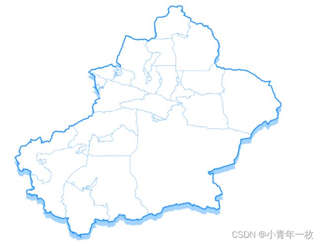
新疆省地图
效果如下:
代码如下:
echarts.registerMap('xinjiang', xinjiangJson); //这里用的那个省市的就写那个省市的名字
var chart = echarts.init(document.getElementById('map'));

chart.setOption({
	tooltip: {
		show: true,
		formatter: function(params) {
			return '  ' + params.name + '   ' + params.value[2] + '人  ';
		},

	},
	geo: {
		map: 'xinjiang',
		aspectScale: 0.75, //长宽比
		zoom: 1.2,
		roam: false,
		itemStyle: {
			normal: {
				borderWidth: 4, //设置外层边框
				borderColor:'#168eff',
				shadowColor: '#a3d3ff', //底色阴影
				shadowOffsetX: 0,
				shadowOffsetY: 10
			},
			emphasis: {
				show: false,
			}
		}
	},
	series: [{
			type: 'map',
			map: 'xinjiang',
			zoom: 1.2,
			label: {
				normal: {
					show: false, //显示省份标签
					textStyle: {
						color: "#fff"
					} //省份标签字体颜色
				},
				emphasis: { //对应的鼠标悬浮效果
					show: true,
					textStyle: {
						color: "#fff"
					}
				}
			},
			itemStyle: {
				normal: {
					borderWidth: .25, //区域边框宽度
					borderColor: '#168eff', //区域边框颜色
					areaColor: "#fff", //区域颜色
				},
				emphasis: {
					borderWidth: 1.5, //鼠标滑过区域,区域边框宽度
					//borderColor: '#b3daff', //鼠标滑过区域,区域边框颜色
					areaColor: "#168eff", //鼠标滑过区域背景色
					borderWidth: 1, //鼠标划过区域 区域边框
					/* shadowColor: 'rgba(0, 255, 255, 0.9)',
					shadowBlur: 10, //鼠标划过区域 区域外发光
					shadowOffsetX: 0,
					shadowOffsetY: 1, */
					shadowColor: 'rgba(163, 211, 255,0.9)',
					shadowOffsetX: 0,
					shadowOffsetY: 15,
					opacity: 1,
					shadowBlur: 15
				}
			},
			data: [ //这里是数据

			],
		},
	],
});
全国地图
效果如下:

代码如下:
echarts.registerMap('china', chinaJson);
var chart = echarts.init(document.getElementById('chinaMap'));
chart.setOption({
	tooltip: {
		trigger: 'item',
		padding: [10, 15],
		backgroundColor: '#fff',
		borderWidth: .25, //区域边框宽度
		borderColor: '#2882f5', //区域边框颜色
		textStyle: {
			color: '#000',
			fontSize:16,
			fontWeight: 'bolder'
		},
		formatter: function(val) {
			return val.data.name + '' +
				'' +
				'' + val.data.lable1 + ':' + '' +
				'' + val.data.value + '次' + '' +
				'' +
				'' +
				'' + val.data.lable2 + ':' + '' +
				'' + val.data.numbar + '次' + '' +
				'' +
				''
		}
	},
	geo: {
		map: 'china',
		//aspectScale: 0.75, //长宽比
		zoom: 1.2,
		roam: false,
		itemStyle: {
			normal: {
				borderWidth: 2, //设置外层边框
				borderColor: '#168eff',
				shadowColor: '#a3d3ff', //底色阴影
				shadowOffsetX: 0,
				shadowOffsetY: 10
			},
			emphasis: {
				//show: false,
			}
		}
	},
	series: [{
		type: 'map',
		map: 'china',
		zoom: 1.2,
		selectedMode: false,
		//roam: true, //是否开启鼠标缩放和平移漫游
		//geoIndex: 0, // 不可缺少,否则无tooltip 指示效果
		label: {
			normal: {
				show: true, //显示省份标签
				textStyle: {
					color: "#000"
				} //省份标签字体颜色
			},
			emphasis: { //对应的鼠标悬浮效果
				show: true,
				textStyle: {
					color: "#fff"
				}
			}
		},
		itemStyle: {
			normal: {
				borderWidth: .25, //区域边框宽度
				borderColor: '#168eff', //区域边框颜色
				areaColor: "#f4faff", //区域颜色

			},
			emphasis: {
				borderWidth: .5, //鼠标滑过区域,区域边框宽度
				areaColor: "#168eff", //鼠标滑过区域背景色
				borderWidth: 1, //鼠标划过区域 区域边框
			}
		},
		data: [{
				name: '北京',
				lable1: '异常次数',
				value: '200',
				lable2: '异常终端',
				numbar: '100'
			},
			{
				name: '上海',
				lable1: '异常次数',
				value: '200',
				lable2: '异常终端',
				numbar: '100'
			},
			{
				name: '天津',
				lable1: '异常次数',
				value: '200',
				lable2: '异常终端',
				numbar: '100'
			},
			{
				name: '重庆',
				lable1: '异常次数',
				value: '200',
				lable2: '异常终端',
				numbar: '100'
			},
			{
				name: '河北',
				lable1: '异常次数',
				value: '10',
				lable2: '异常终端',
				numbar: '10'
			},
			{
				name: '山东',
				lable1: '异常次数',
				value: '2',
				lable2: '异常终端',
				numbar: '8'
			},
			{
				name: '陕西',
				lable1: '异常次数',
				value: '200',
				lable2: '异常终端',
				numbar: '100'
			},
			{
				name: '山西',
				lable1: '异常次数',
				value: '200',
				lable2: '异常终端',
				numbar: '100'
			},
			{
				name: '辽宁',
				lable1: '异常次数',
				value: '2000',
				lable2: '异常终端',
				numbar: '1000'
			},
			{
				name: '吉林',
				lable1: '异常次数',
				value: '20',
				lable2: '异常终端',
				numbar: '10'
			},
			{
				name: '黑龙江',
				lable1: '异常次数',
				value: '20',
				lable2: '异常终端',
				numbar: '10'
			},
			{
				name: '宁夏',
				lable1: '异常次数',
				value: '20',
				lable2: '异常终端',
				numbar: '10'
			},
			{
				name: '江苏',
				lable1: '异常次数',
				value: '0',
				lable2: '异常终端',
				numbar: '0'
			},
			{
				name: '河南',
				lable1: '异常次数',
				value: '0',
				lable2: '异常终端',
				numbar: '0'
			},
			{
				name: '安徽',
				lable1: '异常次数',
				value: '20',
				lable2: '异常终端',
				numbar: '10'
			},
			{
				name: '浙江',
				lable1: '异常次数',
				value: '20',
				lable2: '异常终端',
				numbar: '10'
			},
			{
				name: '湖南',
				lable1: '异常次数',
				value: '0',
				lable2: '异常终端',
				numbar: '0'
			},
			{
				name: '湖北',
				lable1: '异常次数',
				value: '20',
				lable2: '异常终端',
				numbar: '10'
			},
			{
				name: '甘肃',
				lable1: '异常次数',
				value: '20',
				lable2: '异常终端',
				numbar: '10'
			},
			{
				name: '青海',
				lable1: '异常次数',
				value: '20',
				lable2: '异常终端',
				numbar: '10'
			},
			{
				name: '西藏',
				lable1: '异常次数',
				value: '20',
				lable2: '异常终端',
				numbar: '10'
			},
			{
				name: '新疆',
				lable1: '异常次数',
				value: '2000',
				lable2: '异常终端',
				numbar: '1000'
			},
			{
				name: '内蒙古',
				lable1: '异常次数',
				value: '20',
				lable2: '异常终端',
				numbar: '10'
			},
			{
				name: '贵州',
				lable1: '异常次数',
				value: '20',
				lable2: '异常终端',
				numbar: '10'
			},
			{
				name: '四川',
				lable1: '异常次数',
				value: '20',
				lable2: '异常终端',
				numbar: '10'
			},
			{
				name: '江西',
				lable1: '异常次数',
				value: '20',
				lable2: '异常终端',
				numbar: '10'
			},
			{
				name: '福建',
				lable1: '异常次数',
				value: '20',
				lable2: '异常终端',
				numbar: '10'
			},
			{
				name: '广东',
				lable1: '异常次数',
				value: '20',
				lable2: '异常终端',
				numbar: '10'
			},
			{
				name: '广西',
				lable1: '异常次数',
				value: '0',
				lable2: '异常终端',
				numbar: '0'
			},
			{
				name: '云南',
				lable1: '异常次数',
				value: '0',
				lable2: '异常终端',
				numbar: '0',
			},
			{
				name: '海南',
				lable1: '异常次数',
				value: '0',
				lable2: '异常终端',
				numbar: '0'
			},
			{
				name: '香港',
				lable1: '异常次数',
				value: '0',
				lable2: '异常终端',
				numbar: '0'
			},
			{
				name: '澳门',
				lable1: '异常次数',
				value: '0',
				lable2: '异常终端',
				numbar: '0'
			},
			{
				name: '台湾',
				lable1: '异常次数',
				value: '0',
				lable2: '异常终端',
				numbar: '0'
			}
		]
	}],
});
window.addEventListener("resize", function() {
	echarts.init(document.getElementById('chinaMap')).resize();
});
折线图阴影效果
效果如下:

代码如下:
var dom = document.getElementById("personnel");
var myChart = echarts.init(dom);
var app = {};
var option;
option = {
	tooltip: {
		trigger: 'axis',
		formatter: function(params) {
			var relVal = params[0].name;
			for (var i = 0, l = params.length; i < l; i++) {
				relVal += '
' + params[i].marker + params[i].seriesName + ' : ' + params[i].value + '人'
			}
			return relVal;
		}
	},
	grid: {
		left: '3%',
		right: '1%',
		bottom: '8%',
		top: '20%',
	},
	legend: {
		orient: 'horizontal',
		x: '20px',
		y: '10px',
		itemGap: 50, //图例之间间距
		itemWidth: 12, //图例宽
		itemHeight: 12, //图例高
		icon: "circle",
		textStyle: {
			fontSize: 14 //更改坐标轴文字大小
		},
	},
	xAxis: {
		type: 'category',
		axisTick: { //x轴刻度尺
			show: false,
			alignWithLabel: true
		},
		axisLine: { //x轴线条颜色
			show: true,
			lineStyle: {
				color: '#dadada',
				width: 0.5
			}
		},
		axisLabel: { //x轴文字倾斜
			show: true,
			textStyle: {
				color: '#333', //更改坐标轴文字颜色
				fontSize: 14, //更改坐标轴文字大小
			},
		},
		data: ['1月', '2月', '3月', '4月', '5月', '6月', '7月', '8月', '9月', '10月', '11月', '12月']
	},
	yAxis: {
		type: 'value',
		name: '',
		nameTextStyle: {
			padding: [0, 30, 5, 0], // y轴name位置
			color: '#333', //更改坐标轴文字颜色
			fontSize: 14 //更改坐标轴文字大小
		},
		splitLine: {
			show: true, //关闭网格线
			lineStyle: {
				color: '#dadada',
				width: 0.5
			}
		},
		axisLine: { //y轴线条颜色
			show: false,
		},
		axisTick: { //x轴刻度
			show: false
		},
		axisLabel: { //y轴文字倾斜
			textStyle: {
				color: '#333', //更改坐标轴文字颜色
				fontSize: 14 //更改坐标轴文字大小
			}
		},
	},
	series: [{
			name: '入职人数',
			type: 'line',
			stack: 'Total',
			symbolSize: 8, //设定实心点的大小
			smooth: true, //面积图改成弧形状
			lineStyle: {
				normal: {
					color: '#168eff', //外边线颜色
					width: 3, //外边线宽度
					shadowColor: "#168eff", //线阴影颜色
					shadowOffsetY: 10, //阴影大小
					shadowBlur: 15
				}
			},
			itemStyle: {
				normal: { //节点颜色
					color: '#168eff',
				}
			},
			showSymbol: true, //去除面积图节点圆
			data: [148, 108, 96, 95, 84, 69, 123, 160, 190, 123, 251,220],
		},
		{
			name: '离职人数',
			type: 'line',
			stack: 'Total',
			symbolSize: 8, //设定实心点的大小
			smooth: true, //面积图改成弧形状
			lineStyle: {
				normal: {
					color: '#fa6666', //外边线颜色
					width: 3, //外边线宽度
					shadowColor: "#fa6666", //线阴影颜色
					shadowOffsetY: 10, //阴影大小
					shadowBlur: 15
				}
			},
			itemStyle: {
				normal: { //节点颜色
					color: '#fa6666',
				}
			},
			showSymbol: true, //去除面积图节点圆
			data: [49, 71, 106, 129, 144, 176, 135, 148, 144, 176, 135, 148],
		}

	]
};

if (option && typeof option === 'object') {
	myChart.setOption(option);
};
window.onresize = function() {
	myChart.resize();
}
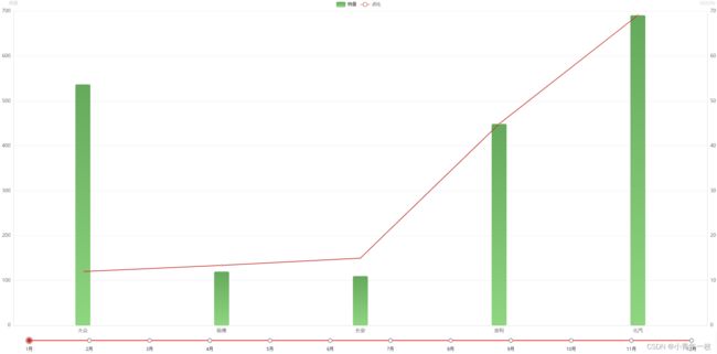
柱形折线混合图带日期轴
效果如下:
代码如下:
 var dom = document.getElementById("area");
	        var myChart = echarts.init(dom);
	        var app = {};
	        var option;
			//数据
			var all = {
			    "data": [
			        [537, 120, 110, 449, 691,],
			        [145, 130, 917, 142, 665,],
			        [225,175, 235,155, 741],
			        [341, 413, 282, 741, 300,],
			        [249, 154, 390, 349, 154],
			        [310, 249, 354, 230, 390],
			       [537, 120, 110, 449, 691,],
			       [145, 130, 917, 142, 665,],
			       [225,175, 235,155, 741],
			       [341, 413, 282, 741, 300,],
			       [249, 154, 390, 349, 154],
			       [310, 249, 354, 230, 390]
			    ],
			    "rote": [
			        [12.0, 13.4, 15.0, 44.9, 69.1, ],
			        [175,155,100,20,80],
			        [91.7,20,99,34,88],
			        [34.1, 41.3, 28.2, 74.1, 30.0],
			        [175,89,34,20, 66.5],
			        [91.7, 12, 66.5,30, 120],
			        [34.1, 41.3, 28.2, 74.1, 30.0],
			        [14.5, 13.0, 91.7, 12, 66.5],
			        [91.7, 12, 66.5,30, 120],
			        [14.5, 13.0, 91.7, 12, 66.5],
			        [91.7, 12, 66.5,30, 120],
			        [34.1, 41.3, 28.2, 74.1, 30.0],
			        [34.1, 41.3, 28.2, 74.1, 30.0],
			        [44.1, 51.3, 67.2, 44.1, 50.0]
			    ],
			    "provinces": ["大众", "哈佛", "长安", "吉利", "北汽"],
			    "months": [ "1月", "2月", "3月", "4月", "5月", "6月", "7月", "8月", "9月", "10月", "11月", "12月"]
			};

			//series样式
			var itemStyle = {
			    normal: {
			        color: new echarts.graphic.LinearGradient(
			            0, 1, 0, 0, [{
			                offset: 0,
			                color: '#8ed680'
			            }, {
			                offset: 1,
			                color: '#65a95c'
			            }]
			        ),
			        barBorderRadius: 4
			    },
			    emphasis: {
			        color: new echarts.graphic.LinearGradient(
			            0, 1, 0, 0, [{
			                offset: 0,
			                color: 'red'
			            }, {
			                offset: 1,
			                color: '#000'
			            }]
			        ),
			        barBorderRadius: 4
			    }
			};

			// echarts配置项
			option = {
			    timeline: {
			        axisType: 'category',
			        show: true,
			        autoPlay: false,//是否自动播放
			        playInterval: 1000,//播放速度
			        loop:false,//是否循环播放
			        controlPosition:'none',//关闭播放图标
			        bottom:5,
			        left:'4%',
			        right:'4%',
			        width:'92%',
			        lineStyle:{//轴线颜色
			    		color:'red'
			    	},
			    	label:{
			    		textStyle: {//轴线文字样式
			    			color: '#000'
			    		}
			    	},
			        checkpointStyle:{//当前点样式
			    		symbolSize:10,
			    		borderWidth:10,
			    	//	symbol:'roundRect',
			    	},
			    	symbolSize:10,
			        data: []
			    },
			    options: []
			};

			//循环数据
			for (var n = 0; n < all.months.length; n++) {
			    option.timeline.data.push(all.months[n]);
			    option.options.push({
			        /*title: {
			            show: true,
			            text: all.months[n]
			        },*/
			        tooltip: {
			            trigger: 'axis'
			        },
			        legend: {
			            show: true,
			            x: 'center',
			            data: ['销量', '占比']
			        },
			        calculable: true,
			        grid: {
			            x:40,
			            x2:30,
			            y: 30,
			            y2: 80
			        },
			        xAxis: [{
			            type: 'category',
			            axisLabel: {
			                color: '#666',
			    			fontSize: 13,
			                //rotate: 45
			            },
			            axisTick: {
						show: false
					},
					axisLine: {
						show: true,
			            lineStyle: {
			                color: '#dadada',
			            }
			        },
			            data: all.provinces
			        }],
			        yAxis: [{
			            type: 'value',
			            name: '销量',
			            axisTick: {
			    			show: false
			    		},
			    			axisLine: {
			    			show: true,
			                lineStyle: {
			                    color: '#dadada',
			                }
			            },
			            axisLabel: {
			    			color: '#666',
			    			fontSize: 13,
			    		},
			    		splitLine: { //网格线
			    			lineStyle: {
			    				color: '#dadada', //网格线颜色dadada
			    				width: 0.5
			    			},
			    		},
			        }, {
			            type: 'value',
			            name: '占比(%)',
			            axisTick: {
			    			show: false
			    		},
			    			axisLine: {
			    			show: true,
			                lineStyle: {
			                    color: '#dadada',
			                }
			            },
			            axisLabel: {
			    			color: '#666',
			    			fontSize: 13,
			    		},
			    		splitLine: { //网格线
			    			show: false
			    		},
			        }],
			        series: [{
			            name: '销量',
			            yAxisIndex: 0,
			            type: 'bar',
			            itemStyle: itemStyle,
			            barWidth:40,
			            label: {
			                normal: {
			                    show: false,
			                    formatter: '{c}'
			                }
			            },
			            data: all.data[n]
			        }, {
			            name: '占比',
			            yAxisIndex: 1,
			            type: 'line',
			            label: {
			                normal: {
			                    show: false,
			                    formatter: '{c}'+'%'
			                }
			            },
			            data: all.rote[n]
			        }]
			    });
			};

			if (option && typeof option === 'object') {
				myChart.setOption(option);
			};
图表大小自动适配
当一个页面有多个图表时,当浏览器缩放或切换终端显示时,会发现图表大小不自动适配,加上下面这段代码就搞定了。
window.addEventListener("resize",function (){
	echarts.init(document.getElementById('map')).resize();
	echarts.init(document.getElementById('abeamColumn')).resize();
	echarts.init(document.getElementById('ageColumn')).resize();
	echarts.init(document.getElementById('genderColumn')).resize();
	echarts.init(document.getElementById('area')).resize();
	echarts.init(document.getElementById('ColumnUnit')).resize();
	echarts.init(document.getElementById('lineUnit')).resize();
});
但也有特殊情况下这个也不好使,当遇到点击才显示图表时,图表大小也会变得特别小,那就在点击事件中添加如下代码:
$('.btn-delete').click(function(){
		$("#lineUnit").show();
		$(window).trigger('resize');
});
根据项目中遇到的图表总结记录下,持续更新!如有不足欢迎大家点评。。。。