vue项目使用echarts超详细教程,柱状图,折线图,环形图示例详细配置代码
一、引入 echarts
echats 保姆级引入教程
二、效果图及其详细代码
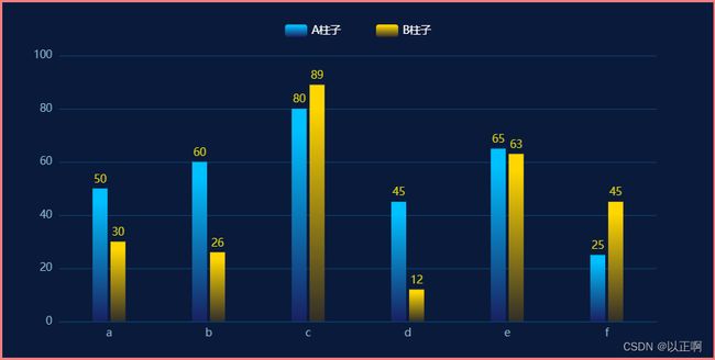
1. 双柱柱状图:
<template>
  <div class="echart">
    <!-- 这个 div 就会被解析为 echarts图 -->
    <div class="barChart" ref="barChart"></div>
  </div>
</template>

<script>
export default {
  mounted() {
    this.initBarChart();
  },
  methods: {
    initBarChart() {
      let myChart = this.$echarts.init(this.$refs.barChart);
      let option = {
        tooltip: {
          trigger: "axis",
          axisPointer: {
            type: "cross",
            crossStyle: {
              color: "#999",
            },
          },
        },
        grid: {
          //调整图表位置
          show: false, //是否显示直角坐标系网格
          top: "15%", // 一下数值可为百分比也可为具体像素值
          right: "8%",
          bottom: "10%",
          left: "8%",
        },
        xAxis: [
          {
            type: "category",
            data: ["a", "b", "c", "d", "e", "f"],
            axisPointer: {
              type: "shadow",
            },
            axisLine: {
              //横轴样式
              lineStyle: {
                color: "#08426D",
              },
            },
            axisLabel: {
              show: true,
              textStyle: {
                color: "#85B0C4",
              },
            },
            axisTick: {
              show: false, //隐藏刻度线
            },
          },
        ],
        yAxis: [
          {
            type: "value",
            // min: 0, 最小值
            // interval: 20, 两根横轴之间的差值,不太建议手动设置
            splitLine: {
              show: true,
              lineStyle: {
                color: ["#08426D"],
                width: 1,
                type: "solid",
              },
              textStyle: {
                color: "green",
              },
            },
            axisLabel: {
              show: true,
              formatter: "{value}",
              textStyle: {
                color: "#85B0C4",
              },
            },
          },
        ],
        legend: {
          top: "5%", // 控制 板块控制器的位置
          right: "center",
          // icon: 'rect',//形状  类型包括 circle,rect,line,roundRect,triangle,diamond,pin,arrow,none
          // itemWidth: 10,  // 设置宽度
          // itemHeight: 4, // 设置高度
          itemGap: 40, // 设置间距
          data: [
            {
              name: "A柱子",
              textStyle: {
                color: "#fff", // 单独设置某一个图列的颜色
              },
            },
            {
              name: "B柱子",
              textStyle: {
                color: "#fff", // 单独设置某一个图列的颜色
              },
            },
          ],
        },
        series: [
          {
            name: "A柱子",
            type: "bar",
            barWidth: "15%", // 柱的宽度
            data: [50, 60, 80, 45, 65, 25],
            itemStyle: {
              color: {
                type: "linear",
                x: 0, // 右
                y: 1, // 下
                x2: 0, // 左
                y2: 0, // 上
                colorStops: [
                  {
                    offset: 0,
                    color: "#192060", // 0% 处的颜色
                  },
                  {
                    offset: 0.9,
                    color: "#00C0FF", // 90% 处的颜色
                  },
                ],
              },
            },
            label: {
              show: true, // 开启显示
              position: "top", // 在上方显示
              distance: 10, // 距离图形元素的距离。当 position 为字符描述值(如 'top'、'insideRight')时候有效。
              verticalAlign: "middle",
              textStyle: {
                // 数值样式
                color: "#D2CC13",
                fontSize: 12,
              },
            },
          },
          {
            name: "B柱子",
            type: "bar",
            barWidth: "15%", // 柱的宽度
            data: [30, 26, 89, 12, 63, 45],
            itemStyle: {
              color: {
                type: "linear",
                x: 0, // 右
                y: 1, // 下
                x2: 0, // 左
                y2: 0, // 上
                colorStops: [
                  {
                    offset: 0,
                    color: "#322E28", // 0% 处的颜色
                  },
                  {
                    offset: 0.9,
                    color: "#FFD600", // 90% 处的颜色
                  },
                ],
              },
            },
            label: {
              show: true, // 开启显示
              position: "top", // 在上方显示
              distance: 10, // 距离图形元素的距离。当 position 为字符描述值(如 'top'、'insideRight')时候有效。
              verticalAlign: "middle",
              textStyle: {
                // 数值样式
                color: "#D2CC13",
                fontSize: 12,
              },
            },
          },
        ],
      };
      myChart.setOption(option);
    },
  },
};
</script>
<style scoped lang="less">
.echart {
  width: 800px;
  height: 400px;
  margin: auto;
  border: 3px solid lightcoral;
  background-color: #0a1a3b;

  //  宽高是必须给的,可以给百分比、具体的像素等....
  .barChart {
    width: 100%;
    height: 400px;
  }
}
</style>
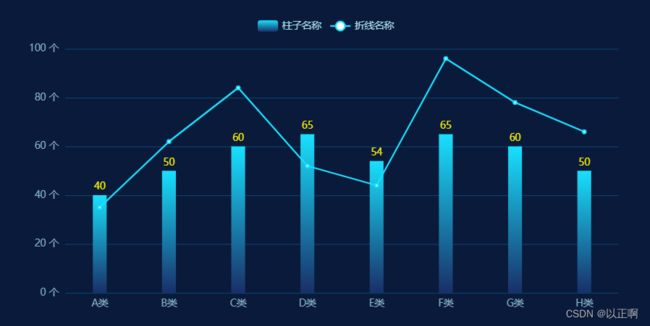
2. 折柱混合图:
<template>
  <div class="echart">
    <!-- 这个 div 就会被解析为 echarts图 -->
    <div class="barChart" ref="barChart"></div>
  </div>
</template>

<script>
export default {
  mounted() {
    this.initBarChart();
  },
  methods: {
    initBarChart() {
      let myChart = this.$echarts.init(this.$refs.barChart);
      let option = {
        tooltip: {
          trigger: "axis",
          axisPointer: {
            type: "cross",
            crossStyle: {
              color: "#fff",
            },
          },
        },
        tooltip: {
          // 图列提示框,默认不显示
          show: true,
          color: "red",
        },
        grid: {
          //调整图表位置
          show: false, //是否显示直角坐标系网格
          top: "15%", // 一下数值可为百分比也可为具体像素值
          right: "5%",
          bottom: "10%",
          left: "10%",
        },
        legend: {
          top: "5%",
          data: [
            {
              name: "柱子名称",
              textStyle: {
                color: "#A9DDEE", // 单独设置某一个图列的颜色
              },
            },
            {
              name: "折线名称",
              textStyle: {
                color: "#A9DDEE", // 单独设置某一个图列的颜色
              },
            },
          ],
        },
        xAxis: [
          {
            type: "category",
            data: ["A类", "B类", "C类", "D类", "E类", "F类", "G类", "H类"],
            axisPointer: {
              type: "shadow",
            },
            axisLine: {
              show: false, //横轴样式
            },
            axisLabel: {
              show: true,
              textStyle: {
                color: "#85B0C4",
              },
            },
            axisTick: {
              show: false, //隐藏刻度线
            },
          },
        ],
        yAxis: [
          {
            type: "value",
            // min: 0,
            // max: 250,
            // interval: 50, // y轴 两刻度之间的差值
            barWidth: "35%",
            axisLabel: {
              formatter: "{value} 个",
            },
            splitLine: {
              show: true,
              lineStyle: {
                color: ["#08426D"],
                width: 1,
                type: "solid",
              },
            },
            axisLabel: {
              // y轴 数据格式和颜色
              show: true,
              formatter: "{value} 个",
              textStyle: {
                color: "#85B0C4",
              },
            },
          },
        ],
        series: [
          {
            name: "柱子名称",
            type: "bar",
            barWidth: "20%",
            tooltip: {
              valueFormatter: function (value) {
                return value + " 个";
              },
            },
            data: [40, 50, 60, 65, 54, 65, 60, 50],
            itemStyle: {
              color: {
                type: "linear",
                x: 0, // 右
                y: 1, // 下
                x2: 0, // 左
                y2: 0, // 上
                colorStops: [
                  {
                    offset: 0,
                    color: "#192F68", // 0% 处的颜色
                  },
                  {
                    offset: 1,
                    color: "#18E0FD", // 90% 处的颜色
                  },
                ],
              },
            },
            label: {
              show: true, // 开启显示
              position: "top", // 在上方显示
              distance: 10, // 距离图形元素的距离。当 position 为字符描述值(如 'top'、'insideRight')时候有效。
              verticalAlign: "middle",
              textStyle: {
                // 数值样式
                color: "#F4EC03",
                fontSize: 12,
              },
            },
          },
          {
            name: "折线名称",
            type: "line",
            // yAxisIndex: 1,
            tooltip: {
              valueFormatter: function (value) {
                return value + " 个";
              },
            },
            data: [35, 62, 84, 52, 44, 96, 78, 66],
            itemStyle: {
              color: {
                type: "linear",
                x: 0, // 右
                y: 1, // 下
                x2: 0, // 左
                y2: 0, // 上
                colorStops: [
                  {
                    offset: 0,
                    color: "#18E0FD", // 0% 处的颜色
                  },
                  {
                    offset: 0.9,
                    color: "#18E0FD", // 90% 处的颜色
                  },
                ],
              },
            },
          },
        ],
      };
      myChart.setOption(option);
    },
  },
};
</script>
<style scoped lang="less">
.echart {
  width: 800px;
  height: 400px;
  margin: auto;
  border: 3px solid lightcoral;
  background-color: #0a1a3b;

  //  宽高是必须给的,可以给百分比、具体的像素等....
  .barChart {
    width: 100%;
    height: 400px;
  }
}
</style>
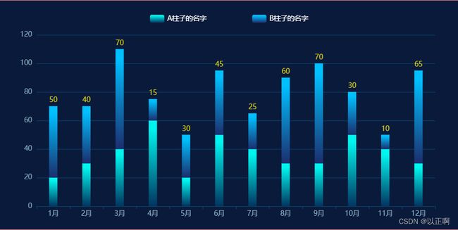
3. 堆叠柱状图:
<template>
  <div class="echart">
    <!-- 这个 div 就会被解析为 echarts图 -->
    <div class="barChart" ref="barChart"></div>
  </div>
</template>

<script>
export default {
  mounted() {
    this.initBarChart();
  },
  methods: {
    initBarChart() {
      let myChart = this.$echarts.init(this.$refs.barChart);
      let option = {
        tooltip: {
          trigger: "axis",
          axisPointer: {
            type: "cross",
            crossStyle: {
              color: "#999",
            },
          },
        },
        grid: {
          //调整图表位置
          show: false, //是否显示直角坐标系网格
          top: "15%", // 一下数值可为百分比也可为具体像素值
          right: "5%",
          bottom: "10%",
          left: "8%",
        },
        legend: {
          top: "5%", // 控制 板块控制器的位置
          // icon: 'rect',//形状  类型包括 circle,rect,line,roundRect,triangle,diamond,pin,arrow,none
          // itemWidth: 10,  // 设置宽度
          // itemHeight: 4, // 设置高度
          itemGap: 80, // 设置顶部图标间距
          right: "center",
          data: [
            {
              name: "A柱子的名字",
              textStyle: {
                color: "#fff", // 单独设置某一个图列的颜色
              },
            },
            {
              name: "B柱子的名字",
              textStyle: {
                color: "#fff", // 单独设置某一个图列的颜色
              },
            },
          ],
        },
        xAxis: [
          {
            type: "category",
            data: [
              "1月",
              "2月",
              "3月",
              "4月",
              "5月",
              "6月",
              "7月",
              "8月",
              "9月",
              "10月",
              "11月",
              "12月",
            ],
            axisPointer: {
              type: "shadow",
            },
            axisLine: {
              //横轴样式
              lineStyle: {
                color: "#08426D",
              },
            },
            axisLabel: {
              show: true,
              textStyle: {
                color: "#85B0C4",
              },
            },
          },
        ],
        yAxis: [
          {
            type: "value",
            splitLine: {
              show: true,
              lineStyle: {
                color: ["#08426D"],
                width: 1,
                type: "solid",
              },
              textStyle: {
                color: "green",
              },
            },
            axisLabel: {
              show: true,
              formatter: "{value}",
              textStyle: {
                color: "#85B0C4",
              },
            },
          },
        ],
        series: [
          {
            name: "A柱子的名字",
            type: "bar",
            barWidth: "25%", // 设置柱子的宽度
            stack: "柱子", //同个类目轴上系列配置相同的stack值可以堆叠放置
            data: [20, 30, 40, 60, 20, 50, 40, 30, 30, 50, 40, 30],
            itemStyle: {
              color: {
                type: "linear",
                x: 0, // 右
                y: 1, // 下
                x2: 0, // 左
                y2: 0, // 上
                colorStops: [
                  {
                    offset: 0,
                    color: "#013560", // 0% 处的颜色
                  },
                  {
                    offset: 0.9,
                    color: "#00F5EE", // 90% 处的颜色
                  },
                ],
              },
            },
          },
          {
            name: "B柱子的名字",
            type: "bar",
            barWidth: "25%", // 设置柱子的宽度
            stack: "柱子", //同个类目轴上系列配置相同的stack值可以堆叠放置
            data: [50, 40, 70, 15, 30, 45, 25, 60, 70, 30, 10, 65],
            itemStyle: {
              color: {
                type: "linear",
                x: 0, // 右
                y: 1, // 下
                x2: 0, // 左
                y2: 0, // 上
                colorStops: [
                  {
                    offset: 0,
                    color: "#1B2E6E", // 0% 处的颜色
                  },
                  {
                    offset: 0.9,
                    color: "#00C0FF", // 90% 处的颜色
                  },
                ],
              },
            },
            label: {
              show: true, // 开启显示
              position: "top", // 在上方显示
              distance: 10, // 距离图形元素的距离。当 position 为字符描述值(如 'top'、'insideRight')时候有效。
              verticalAlign: "middle",
              textStyle: {
                // 数值样式
                color: "#D2CC17",
                fontSize: 12,
              },
            },
          },
        ],
      };
      myChart.setOption(option);
    },
  },
};
</script>
<style scoped lang="less">
.echart {
  width: 800px;
  height: 400px;
  margin: auto;
  border: 3px solid lightcoral;
  background-color: #0a1a3b;

  //  宽高是必须给的,可以给百分比、具体的像素等....
  .barChart {
    width: 800px;
    height: 400px;
  }
}
</style>
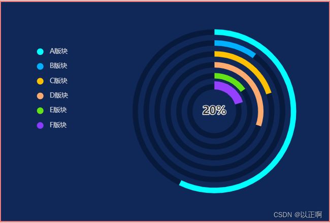
4. 嵌套环形图:
<template>
  <div class="echart">
    <!-- 这个 div 会被解析为 echarts图 -->
    <div class="barChart" ref="barChart"></div>
  </div>
</template>

<script>
export default {
  mounted() {
    this.initBarChart();
  },
  methods: {
    initBarChart() {
      let myChart = this.$echarts.init(this.$refs.barChart);
      // total 和 salary的数据就是各个环的数据
      let total = 100;
      let salayry1 = 40;
      let salayry2 = 10;
      let salayry3 = 20;
      let salayry4 = 30;
      let salayry5 = 15;
      let salayry6 = 20;
      let option = {
        color: [
          "#00FFFF",
          "#00B0FF",
          "#FFC000",
          "#FFAB6F",
          "#63E315",
          "#893BFF",
        ],
        legend: {
          orient: "vertical",
          left: "10%",
          top: "20%",
          itemHeight: 12, //图例的高度
          itemGap: 15, //图例之间的间距
          data: [
            {
              name: "A版块",
              icon: "circle",
              textStyle: {
                color: "#D2D3D8", // 单独设置某一个图列的颜色
              },
            },
            {
              name: "B版块",
              icon: "circle",
              textStyle: {
                color: "#D2D3D8", // 单独设置某一个图列的颜色
              },
            },
            {
              name: "C版块",
              icon: "circle",
              textStyle: {
                color: "#D2D3D8", // 单独设置某一个图列的颜色
              },
            },
            {
              name: "D版块",
              icon: "circle",
              textStyle: {
                color: "#D2D3D8", // 单独设置某一个图列的颜色
              },
            },
            {
              name: "E版块",
              icon: "circle",
              textStyle: {
                color: "#D2D3D8", // 单独设置某一个图列的颜色
              },
            },
            {
              name: "F版块",
              icon: "circle",
              textStyle: {
                color: "#D2D3D8", // 单独设置某一个图列的颜色
              },
            },
          ],
          //图例的名字需要和饼图的name一致,才会显示图例
        },
        series: [
          // A版块
          {
            name: "A版块",
            type: "pie",
            radius: ["70%", "75%"],
            center: ["65%", "50%"],
            //环的位置
            label: {
              show: false,
              position: "center",
            },
            labelLine: {
              normal: {
                show: false,
              },
            },
            emphasis: {
              label: {
                show: true,
                fontSize: "20",
                fontWeight: "bold",
              },
            },
            data: [
              {
                value: 80, //需要显示的数据
                name: 80 + "%",
                itemStyle: {
                  normal: {
                    color: "#00FFFF",
                  },
                },
              },
              {
                value: total - salayry1,
                //不需要显示的数据,颜色设置成和背景一样
                itemStyle: {
                  normal: {
                    color: "#081A3C",
                  },
                },
              },
            ],
          },
          // B版块
          {
            name: "B版块",
            type: "pie",
            radius: ["60%", "65%"],
            center: ["65%", "50%"],
            //环的位置
            label: {
              show: false,
              position: "center",
            },
            labelLine: {
              normal: {
                show: false,
              },
            },
            emphasis: {
              label: {
                show: true,
                fontSize: "20",
                fontWeight: "500",
              },
            },
            data: [
              {
                value: salayry2, //需要显示的数据
                name: salayry2 + "%",
                itemStyle: {
                  normal: {
                    color: "#00B0FF",
                  },
                },
              },
              {
                value: total - salayry2,
                //不需要显示的数据,颜色设置成和背景一样
                itemStyle: {
                  normal: {
                    color: "#081A3C",
                  },
                },
              },
            ],
          },
          // C版块
          {
            name: "C版块",
            type: "pie",
            radius: ["50%", "55%"],
            center: ["65%", "50%"],
            //环的位置
            label: {
              show: false,
              position: "center",
            },
            labelLine: {
              normal: {
                show: false,
              },
            },
            emphasis: {
              label: {
                show: true,
                fontSize: "20",
                fontWeight: "bold",
              },
              itemStyle: {
                normal: {
                  color: "#FFC000",
                },
              },
            },
            data: [
              {
                value: salayry3, //需要显示的数据
                name: salayry3 + "%",
                itemStyle: {
                  normal: {
                    color: "#FFC000",
                  },
                },
              },
              {
                value: total - salayry3,
                //不需要显示的数据,颜色设置成和背景一样
                itemStyle: {
                  normal: {
                    color: "#081A3C",
                  },
                },
              },
            ],
          },
          // D版块
          {
            name: "D版块",
            type: "pie",
            radius: ["40%", "45%"],
            center: ["65%", "50%"],
            //环的位置
            label: {
              show: false,
              position: "center",
            },
            labelLine: {
              normal: {
                show: false,
              },
            },
            emphasis: {
              label: {
                show: true,
                fontSize: "20",
                fontWeight: "bold",
              },
            },
            data: [
              {
                value: salayry4, //需要显示的数据
                name: salayry4 + "%",
                itemStyle: {
                  normal: {
                    color: "#FFAB6F",
                  },
                },
              },
              {
                value: total - salayry4,
                //不需要显示的数据,颜色设置成和背景一样
                itemStyle: {
                  normal: {
                    color: "#081A3C",
                  },
                },
              },
            ],
          },
          // E版块
          {
            name: "E版块",
            type: "pie",
            radius: ["30%", "35%"],
            center: ["65%", "50%"],
            //环的位置
            label: {
              show: false,
              position: "center",
            },
            labelLine: {
              normal: {
                show: false,
              },
            },
            emphasis: {
              label: {
                show: true,
                fontSize: "20",
                fontWeight: "bold",
              },
            },
            data: [
              {
                value: salayry5, //需要显示的数据
                name: salayry5 + "%",
                itemStyle: {
                  normal: {
                    color: "#63E315",
                  },
                },
              },
              {
                value: total - salayry5,
                //不需要显示的数据,颜色设置成和背景一样
                itemStyle: {
                  normal: {
                    color: "#081A3C",
                  },
                },
              },
            ],
          },
          // F版块
          {
            name: "F版块",
            type: "pie",
            radius: ["20%", "25%"],
            center: ["65%", "50%"],
            label: {
              show: false,
              position: "center",
              // normal: {
              //     position: 'inner'
              // }
            },
            labelLine: {
              normal: {
                show: false,
              },
            },
            emphasis: {
              label: {
                show: true,
                fontSize: "20",
                fontWeight: "bold",
              },
            },
            data: [
              {
                value: salayry6,
                name: salayry6 + "%",
                itemStyle: {
                  normal: {
                    color: "#893BFF",
                  },
                },
              },
              {
                value: total - salayry6,
                itemStyle: {
                  normal: {
                    color: "#081A3C",
                  },
                },
              },
            ],
          },
        ],
      };
      myChart.setOption(option);
    },
  },
};
</script>
// 这里不一定非要 less,其他的也是可以的
<style scoped lang="less">
.echart {
  width: 600px;
  height: 400px;
  margin: auto;
  border: 3px solid lightcoral;
  background-color: #0f2858;

  //  宽高是必须给的,可以给百分比、具体的像素等....
  .barChart {
    width: 600px;
    height: 400px;
  }
}
</style>
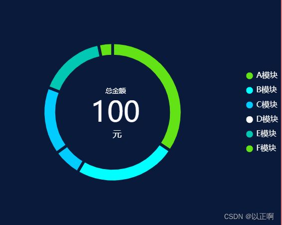
5. 普通环形图:
<template>
  <div class="echart">
    <!-- 这个 div 就会被解析为 echarts图 -->
    <div class="barChart" ref="barChart"></div>
  </div>
</template>

<script>
export default {
  mounted() {
    this.initBarChart();
  },
  methods: {
    initBarChart() {
      let myChart = this.$echarts.init(this.$refs.barChart);
      let option = {
        tooltip: {
          trigger: "item",
          transitionDuration: 0, //让提示框跟随鼠标提示
        },
        //环形图中间文字
        title: {
          text: "总金额",
          subtext: 100,
          textStyle: {
            fontSize: 12,
            color: "#fff",
            fontWeight: 400,
          },
          subtextStyle: {
            fontSize: 50,
            color: "#fff",
            fontWeight: 500,
          },
          textAlign: "center", //图例文字居中显示
          x: "40%", //距离左边的距离
          y: "38%", //距离上边的距离
        },

        color: ["#63E315", "#00FFFF", "#00CCFF", "00B0FF", "#01C8B3"],
        legend: {
          textStyle: {
            color: "black", //设置文字颜色
            fontSize: "14", // 文字大小
          },
          itemWidth: 14, // icon宽度
          itemHeight: 14, // icon高度
          icon: "roundRect", //控制形状,其中包括 circle,rect,roundRect,triangle,diamond,pin,arrow,none
          top: "center", // 控制 板块控制器的位置
          right: "right",
          data: [
            {
              name: "A模块",
              icon: "circle",
              textStyle: {
                color: "#fff", // 单独设置某一个图列的颜色
              },
            },
            {
              name: "B模块",
              icon: "circle",
              textStyle: {
                color: "#fff", // 单独设置某一个图列的颜色
              },
            },
            {
              name: "C模块",
              icon: "circle",
              textStyle: {
                color: "#fff", // 单独设置某一个图列的颜色
              },
            },
            {
              name: "D模块",
              icon: "circle",
              textStyle: {
                color: "#fff", // 单独设置某一个图列的颜色
              },
            },
            {
              name: "E模块",
              icon: "circle",
              textStyle: {
                color: "#fff", // 单独设置某一个图列的颜色
              },
            },
            {
              name: "F模块",
              icon: "circle",
              textStyle: {
                color: "#fff", // 单独设置某一个图列的颜色
              },
            },
          ],
        },
        series: [
          {
            name: "圆环图",
            type: "pie",
            // 第0个元素的是内院的半径,第1个元素表示的是外圆的半径
            radius: ["50%", "62%"],
            //饼图的位置 第一个控制左右,第二个控制上下
            center: ["40%", "center"],
            avoidLabelOverlap: true,
            clockwise: true,
            textStyle: {
              //图例文字颜色
              color: "#fff",
            },
            // 各部分之间得间隔
            itemStyle: {
              borderRadius: 0,
              borderColor: "#0A1A3B",
              borderWidth: 5,
            },
            label: {
              //饼图图形上的文本标签
              normal: {
                show: false,
                position: "outside", //标签的位置
                textStyle: {
                  fontWeight: 400,
                  fontSize: 14, //文字的字体大小
                },
                formatter: "{b}: {c}个 ", // 设置标签格式
              },
            },
            emphasis: {
              //各部分所占百分比
              label: {
                show: true,
                fontSize: "16",
                fontWeight: 700,
              },
            },

            labelLine: {
              show: true,
            },
            // 一次只能选中一个模块
            selectedMode: "single",

            data: [
              { value: 1048, name: "A模块" },
              { value: 735, name: "B模块" },
              { value: 200, name: "C模块" },
              { value: 484, name: "D模块" },
              { value: 484, name: "E模块" },
              { value: 100, name: "F模块" },
            ],
          },
        ],
        graphic: {
          // 添加原生图形元素组件
          elements: [
            {
              type: "text", // 组件类型
              left: "40%", //定位
              top: "58%", // 定位
              // center: ['35%', 'center'],
              style: {
                // 样式
                text: "元", //文字
                fontSize: 16, //文字大小
                textAlign: "center", //定位
                width: 30,
                height: 30,
                fill: "#fff", // 字体颜色
              },
            },
          ],
        },
      };
      myChart.setOption(option);
    },
  },
};
</script>
<style scoped lang="less">
.echart {
  width: 500px;
  height: 400px;
  margin: auto;
  border: 3px solid lightcoral;
  background-color: #0a1a3b;

  //  宽高是必须给的,可以给百分比、具体的像素等....
  .barChart {
    width: 500px;
    height: 400px;
  }
}
</style>