数据可视化
数据可视化
- 一、配置说明
-
- 1.1. 标题
- 1.2. 坐标系
- 1.3. 范例
- 二、图例
-
- 2.1. 柱状图 plt.bar(label,size)
-
- 2.1.1. 简单柱状图
- 2.1.2. 上下独立分布柱状图
- 2.1.3. 叠加柱状图
- 2.1.4. 联合柱状图
- 2.1.5. 范例
- 2.2. 散点图 plt.scatter(x,y)
-
- 2.2.1. 简单散点图
- 2.2.2. 三维散点图
- 2.2.3. 多维散点图
- 2.3. 饼图 plt.pie(size,label)
- 2.4. 统计图
-
- 2.4.1. plt.subplot()
- 2.4.2. 直方图 plt.hist()
- 2.4.3. 箱型图 plt.boxplot()
- 2.4.4. 提琴图 plt.violinplot()
- 2.5. 特殊统计图(针对某些统计结果的可视化)
-
- 2.5.1. 树形图 squarify.plot()
- 2.5.2. 自相关图 ACF、PACF
- 2.5.3. 误差条形图 sns.catplot()
- 2.5.4. 雷达图 plt.plot(projection='polar')
- 2.5.5. 折线图填充
- 三、特殊图形
-
- 3.1. 词云图
- 3.2. Pyechart
-
- 3.2.0. pyecharts的图表样式
- 3.2.1. Line()
- 3.2.2. Bar()
- 3.2.3. Scatter()
- 3.2.4. Pie()
- 3.2.5. Overlap(图像堆叠)
- 3.2.6. Grid(plt.subplot)
- 3.2.7. Page(自动化subplot)
- 3.2.8. Timeline
- 四、作业
-
- 4.1. 作业1
- 4.2. 期中考试
- 4.3. 作业2
-
- 2001-2020年棉花、油料产量比例饼状图随时间变化的时间线
- 2001-2020年棉花、油料增长率柱状图\产量走势折线
- 合并
可视化结果见:
https://www.heywhale.com/mw/project/634931f0a40ed1671d2efaf4
pip install -i https://pypi.tuna.tsinghua.edu.cn/simple jupyter_contrib_nbextensions
jupyter contrib nbextension install --user
一、配置说明
图形的构成
- Figure - 画布
- Axes - 坐标系
- Axis - 坐标轴(X轴,y轴)
- 图形 - plot()折线图,scatter()散点图,bar()柱状图, pie()饼图
- 标题、图例、标签、…
matplotlib的奇妙接口
plt.plot()
plt.scatter()
...

df.plot()
df.plot.scatter()
import os
print(os.path.abspath('.'))
D:\Python\Jupyter workspace\学习\数据可视化
import matplotlib.pyplot as plt
import numpy as np
import pandas as pd

# 画布
plt.figure(figsize=(6,3),   # (宽度 , 高度) 单位inch
           dpi=100,         #  清晰度 dot-per-inch
           facecolor='#CCCCCC', # 画布底色
           edgecolor='black',linewidth=0.2,frameon=True, # 画布边框
           #frameon=False  # 不要画布边框
          )
# 数据
x = np.linspace(0, 2 * np.pi, 50)
y1 = np.sin(x)
y2 = np.cos(x)
df = pd.DataFrame([x,y1,y2]).T
df.columns = ['x','sin(x)','cos(x)']

df.plot() # 最简单的方式,不过得先把数据安排成 y = index 的情况才行

1.1. 标题
# 英文标题 y代表高度
plt.title("sin(x) and cos(x)",loc='center',y=1)
Text(0.5, 1, 'sin(x) and cos(x)')

# 英文标题 y代表高度
plt.title("sin(x) and cos(x)",loc='center',y=0.85)
Text(0.5, 0.85, 'sin(x) and cos(x)')

# 设置全局中文字体
plt.rcParams['font.sans-serif'] = 'SimHei' # 设置全局字体为中文 楷体
plt.rcParams['axes.unicode_minus'] = False # 不使用中文减号
# 常用中文字体

font_dict = {'fontsize': 10, 'fontweight': 'bold', 'color': 'black','fontfamily':'SimSun'}

# 宋体 SimSun
# 黑体 SimHei
# 微软雅黑 Microsoft YaHei
# 微软正黑体 Microsoft JhengHei
# 新宋体 NSimSun
# 新细明体 PMingLiU
# 细明体 MingLiU
# 标楷体 DFKai-SB
# 仿宋 FangSong
# 楷体 KaiTi
# 中文标题, 默认的字体不支持中文
plt.title("三角函数:正弦和余弦",loc='center',y=1, fontdict=font_dict)
Text(0.5, 1, '三角函数:正弦和余弦')

**Markers**

=============   ===============================
character       description
=============   ===============================
``'.'``         point marker
``','``         pixel marker
``'o'``         circle marker
``'v'``         triangle_down marker
``'^'``         triangle_up marker
``'<'``         triangle_left marker
``'>'``         triangle_right marker
``'1'``         tri_down marker
``'2'``         tri_up marker
``'3'``         tri_left marker
``'4'``         tri_right marker
``'8'``         octagon marker
``'s'``         square marker
``'p'``         pentagon marker
``'P'``         plus (filled) marker
``'*'``         star marker
``'h'``         hexagon1 marker
``'H'``         hexagon2 marker
``'+'``         plus marker
``'x'``         x marker
``'X'``         x (filled) marker
``'D'``         diamond marker
``'d'``         thin_diamond marker
``'|'``         vline marker
``'_'``         hline marker
=============   ===============================

**Line Styles**

=============    ===============================
character        description
=============    ===============================
``'-'``          solid line style
``'--'``         dashed line style
``'-.'``         dash-dot line style
``':'``          dotted line style
=============    ===============================

Example format strings::

    'b'    # blue markers with default shape
    'or'   # red circles
    '-g'   # green solid line
    '--'   # dashed line with default color
    '^k:'  # black triangle_up markers connected by a dotted line

**Colors**

The supported color abbreviations are the single letter codes

=============    ===============================
character        color
=============    ===============================
``'b'``          blue
``'g'``          green
``'r'``          red
``'c'``          cyan
``'m'``          magenta
``'y'``          yellow
``'k'``          black
``'w'``          white
=============    ===============================
# 图形 线点风格参数见上
plt.plot(df['x'],df['sin(x)'],'c-.+',label='sin(x)')
plt.plot(df['x'],df['cos(x)'],'r:x',label='cos(x)')
plt.legend()
# plt.legend(labels=['sin','cos']) # 自定义labels,默认使用DataFrame里的index

1.2. 坐标系
# Axes 坐标系设置
ax = plt.gca()  # 获取当前坐标系
ax.set_facecolor('#FEFEFE')  # 设置坐标系参数。。。。
# plt.xlabel()  =>  ax.set_xlabel()
# ax.set_facecolor('#EE2211')
# ax.set_alpha(0.15)
# plt.title() => ax.set_title("AX TITLE")

# X轴标签
plt.xlabel("X轴",loc='center')  # loc: 左中右 left-center-right

# Y轴标签
plt.ylabel("Y轴",loc='top', rotation=0, labelpad=5)   # loc: 上中下 top-center-bottom,横竖 rotation,距离轴的远近 labelpad
Text(0, 1, 'Y轴')
# X轴范围
plt.xlim(0,np.pi)  # 只显示X在0-Pi(3.14)之间的部分
# Y轴范围
plt.ylim([0,1.1])  # 只显示Y在0-1之间的部分
(0.0, 1.1)

# X轴刻度
xticks = np.array([0,1/4,2/4,3/4,1]) * np.pi      # X 轴上刻度的值
labels = ["0",'1/4 Π','1/2 Π','3/4 Π', 'Π']  # X 轴上刻度标签
plt.xticks(xticks, labels)   # 如果没有传入labels,直接使用ticks作为labels
# Y轴刻度
yticks = np.arange(0.0,1.2,0.2)     # X 轴上刻度的值
plt.yticks(yticks)   # 如果没有传入labels,直接使用ticks作为labels

# 根据刻度画网格线
plt.grid() # 默认x,y都画刻度线
# plt.grid(axis='x')  # axis: both, x, y 在哪个轴上画格子

1.3. 范例
df = pd.read_csv(r'Data/unemployment-rate-1948-2010.csv',usecols=['Year','Period','Value'])
df.replace('^M','-',regex=True, inplace=True)
df['year_month'] = df['Year'].astype('U') + df['Period']
plt.figure(figsize=(16,4), dpi=120, facecolor='white', edgecolor='black', frameon=True)

plt.plot(df['year_month'], df['Value'],'r-.+')
xticks = [df['year_month'][i] for i in np.arange(0,df['year_month'].size,12)]
plt.xticks(xticks,rotation=90)
plt.suptitle('unemployment-rate-1948-2010')
plt.title("班级:xxx   姓名:xxxx", loc='right')
plt.xlabel('年月')
plt.ylabel('失业率')
Text(0, 0.5, '失业率')

二、图例
2.1. 柱状图 plt.bar(label,size)
!pip install pymysql
Looking in indexes: https://pypi.tuna.tsinghua.edu.cn/simple
Collecting pymysql
  Downloading https://pypi.tuna.tsinghua.edu.cn/packages/4f/52/a115fe175028b058df353c5a3d5290b71514a83f67078a6482cff24d6137/PyMySQL-1.0.2-py3-none-any.whl (43 kB)
Installing collected packages: pymysql
Successfully installed pymysql-1.0.2
import pymysql  # pip install pymysql安装,用来连接mysql数据库
import pandas as pd # 用来做数据导入(pd.read_sql_query() 执行sql语句得到结果df)
import matplotlib.pyplot as plt # 用来画图(plt.plot()折线图, plt.bar()柱状图,....)

plt.rcParams['font.sans-serif'] = 'SimHei' # 设置中文字体支持中文显示
plt.rcParams['axes.unicode_minus'] = False # 支持中文字体下显示'-'号

# figure 分辨率 800x600
plt.rcParams['figure.figsize'] = (6,4)  # 8x6 inches
plt.rcParams['figure.dpi'] = 100        # 100 dot per inch

# 1. 连接MySQL数据库: 创建数据库连接
conn = pymysql.connect(host='127.0.0.1',port=3306,user='root',password='root',db='mydb')

# 2 创建一个sql语句
# -- 统计每个销售经理2019年的利润总额
sql = r"SELECT MANAGER, SUM(PROFIT) as TotalProfit FROM orders where FY='2019' group by MANAGER"

# 3 执行sql语句获取统计查询结果
df = pd.read_sql_query(sql, conn)
# 查看全表
sql2 = r"SELECT * from orders"
df2 = pd.read_sql_query(sql2,conn)
df2.head(5)
| ORDER_ID | ORDER_DATE | SITE | PAY_MODE | DELIVER_DATE | DELIVER_DAYS | CUST_ID | CUST_NAME | CUST_TYPE | CUST_CITY | ... | PROD_NAME | PROD_CATEGORY | PROD_SUBCATEGORY | PRICE | AMOUNT | DISCOUNT | PROFIT | MANAGER | RETURNED | FY | |
|---|---|---|---|---|---|---|---|---|---|---|---|---|---|---|---|---|---|---|---|---|---|
| 0 | CN-2017-100001 | 2017-01-01 | 海恒店 | 信用卡 | 2017-01-03 | 3 | Cust-18715 | 邢宁 | 公司 | 常德 | ... | 诺基亚_智能手机_整包 | 技术 | 电话 | 1725.360 | 3 | 0.0 | 68.880 | 王倩倩 | 0 | 2017 |
| 1 | CN-2017-100002 | 2017-01-01 | 庐江路 | 信用卡 | 2017-01-07 | 6 | Cust-10555 | 彭博 | 公司 | 沈阳 | ... | Eaton_令_每包_12_个 | 办公用品 | 纸张 | 572.880 | 4 | 0.0 | 183.120 | 郝杰 | 0 | 2017 |
| 2 | CN-2017-100003 | 2017-01-03 | 定远路店 | 微信 | 2017-01-07 | 6 | Cust-15985 | 薛磊 | 消费者 | 湛江 | ... | 施乐_计划信息表_多色 | 办公用品 | 纸张 | 304.920 | 3 | 0.0 | 97.440 | 王倩倩 | 0 | 2017 |
| 3 | CN-2017-100004 | 2017-01-03 | 众兴店 | 信用卡 | 2017-01-07 | 6 | Cust-15985 | 薛磊 | 消费者 | 湛江 | ... | Hon_椅垫_可调 | 家具 | 椅子 | 243.684 | 1 | 0.1 | 108.304 | 王倩倩 | 0 | 2017 |
| 4 | CN-2017-100005 | 2017-01-03 | 燎原店 | 信用卡 | 2017-01-08 | 3 | Cust-12490 | 洪毅 | 公司 | 宁波 | ... | Cuisinart_搅拌机_白色 | 办公用品 | 器具 | 729.456 | 4 | 0.4 | -206.864 | 杨洪光 | 1 | 2017 |
5 rows × 23 columns
# 4. 基于DataFrame结果集作图
font_dict = {'fontsize': 8, 'fontweight': 'bold', 'color': 'black','fontfamily':'SimSun'}

plt.figure(figsize=(6,4),dpi=120)
plt.bar(df['MANAGER'], df['TotalProfit'])
plt.grid()
plt.suptitle('经理销售情况')
plt.title("班级:   姓名:", loc='right', fontdict=font_dict)
plt.ylabel("利润额")
Text(0, 0.5, '利润额')

2.1.1. 简单柱状图
# 基于DataFrame结果集作图
font_dict = {'fontsize': 8, 'fontweight': 'bold', 'color': 'black','fontfamily':'SimSun'}

# dpi 像素点大小,关系到图像大小和清晰情况
plt.figure(figsize=(6,4),dpi=120)

# width 柱状宽度,bottom 起点位置 (相当于你想要体现参差的起点位置),align Bar在grid刻度线中间(center)或者一边(edge)(区别不大)
plt.bar(df['MANAGER'], df['TotalProfit'], width=0.5, align='edge', bottom=100000)
plt.grid(axis='x')
plt.suptitle('经理销售情况')
plt.title("班级:   姓名:", loc='right', fontdict=font_dict)
plt.ylabel("利润额")
Text(0, 0.5, '利润额')

2.1.2. 上下独立分布柱状图
# 基于DataFrame结果集作图
font_dict = {'fontsize': 8, 'fontweight': 'bold', 'color': 'black','fontfamily':'SimSun'}

# dpi 像素点大小,关系到图像大小和清晰情况
plt.figure(figsize=(6,4),dpi=120)

# width 柱状宽度,bottom 起点位置 (相当于你想要体现参差的起点位置),align Bar在grid刻度线中间(center)或者一边(edge)(区别不大)
plt.bar(df['MANAGER'], df['TotalProfit'], width=0.6, align='edge', bottom=0-df['TotalProfit'] )
# 当然这里的副轴可以画其他东西,比如正相关效绩(取负同样参差明显)
plt.bar(df['MANAGER'], df['TotalProfit'], width=0.6, align='edge', bottom=0 )
plt.grid(axis='x')
plt.suptitle('经理销售情况')
plt.title("班级:   姓名:", loc='right', fontdict=font_dict)
plt.ylabel("利润额")
Text(0, 0.5, '利润额')

2.1.3. 叠加柱状图
# 基于DataFrame结果集作图
font_dict = {'fontsize': 8, 'fontweight': 'bold', 'color': 'black','fontfamily':'SimSun'}


txtfile = r'Data/orders.txt'
df_txt = pd.read_csv(txtfile)
profit = df_txt[df_txt['FY']==2019].groupby('OPERATOR')['PROFIT'].sum()
price = df_txt[df_txt['FY']==2019].groupby('OPERATOR')['PRICE'].sum()

plt.figure(figsize=(6,6),dpi=100)
plt.bar(price.index, price.values, label='price' )
plt.bar(profit.index, profit.values, label='profit', bottom=price.values )  # 在price头上画profit

plt.grid(axis='y')
plt.suptitle('经理销售情况')
plt.title("班级:   姓名:", loc='right', fontdict=font_dict)
plt.ylabel("利润额")
plt.legend()

2.1.4. 联合柱状图
import numpy as np
txtfile = r'Data/orders.txt'
df_txt = pd.read_csv(txtfile)
profit = df_txt[df_txt['FY']==2019].groupby('OPERATOR')['PROFIT'].sum()
price = df_txt[df_txt['FY']==2019].groupby('OPERATOR')['PRICE'].sum()

# 基于DataFrame结果集作图
font_dict = {'fontsize': 8, 'fontweight': 'bold', 'color': 'black','fontfamily':'SimSun'}

plt.figure(figsize=(6,3),dpi=100)

# 如果要改变柱子在X轴的位置,需要设置Xticks的数值
x = price.index
x_ticks = np.arange(price.size)

# 将两个柱子的X坐标错开,一个减去柱子宽度的一般,一个加上柱子宽度的一半
# 宽度是蓝bar+橙bar的总和
width = 0.4
plt.bar(x_ticks-(width/2), price.values, label='price', width=width )
plt.bar(x_ticks+(width/2), profit.values, label='profit', width=width)  # 在price头上画profit

plt.xticks(x_ticks,x)

plt.grid(axis='y')
plt.title("每个销售经理2019年的利润总额")
plt.ylabel("利润额")
plt.legend()

import numpy as np
import pandas as pd
import matplotlib.pyplot as plt

font_dict = {'fontsize': 10, 'fontweight': 'bold', 'color': 'black','fontfamily':'SimHei'}

txtfile = r'Data/orders.txt'
df_txt = pd.read_csv(txtfile)
profit = df_txt[df_txt['FY']==2019].groupby('OPERATOR')['PROFIT'].sum()
price = df_txt[df_txt['FY']==2019].groupby('OPERATOR')['PRICE'].sum()

plt.figure(figsize=(10,5),dpi=180)

# 连接两个df再作图
df_data = pd.concat([profit,price], axis=1)
#df_data.plot(kind='bar',position=0.5)
df_data.plot.bar(position=0.5,width=0.8)

plt.grid(axis='y')
plt.title("每个销售经理2019年的利润总额",fontdict=font_dict)
plt.ylabel("利润额",fontdict=font_dict)
plt.legend()

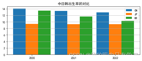
2.1.5. 范例
birth = pd.read_csv(r'Data/birth-rate.csv',index_col='Country')
df = birth.loc[['China','Japan','Korea, Rep.'],['2000','2001','2002']].T
df

x = df.index.astype('int')
h_cn = df['China']
h_jp = df['Japan']
h_kr = df['Korea, Rep.']

plt.figure(figsize=(8,3))

w = 0.3

# 多少个柱,就需要设计排版的位置
# 假设x=0.2,则其他两个同一纬度的柱子就分布在 x1=0.2-width,x2=0.2+width 的位置
# 这里设置的x为index的值,应该是1,2,3这种
plt.bar(x-w,h_cn,label='CN',width=w)
plt.bar(x,h_jp,label='JP',width=w)
plt.bar(x+w,h_kr,label='KR',width=w)
plt.xticks(x)
plt.legend()
plt.grid(axis='y')
plt.title("中日韩出生率的对比")
Text(0.5, 1.0, '中日韩出生率的对比')
2.2. 散点图 plt.scatter(x,y)
# 读取数据集
df = pd.read_csv('Data/iris.csv')
df.head()
| sepal_length | sepal_width | petal_length | petal_width | species | |
|---|---|---|---|---|---|
| 0 | 5.1 | 3.5 | 1.4 | 0.2 | setosa |
| 1 | 4.9 | 3.0 | 1.4 | 0.2 | setosa |
| 2 | 4.7 | 3.2 | 1.3 | 0.2 | setosa |
| 3 | 4.6 | 3.1 | 1.5 | 0.2 | setosa |
| 4 | 5.0 | 3.6 | 1.4 | 0.2 | setosa |
2.2.1. 简单散点图
# 在二维坐标系上,位置表示(x,y)二维数据
x = df.sepal_length
y = df.sepal_width
plt.scatter(x,y)
plt.xlabel('sepal_length')
plt.ylabel('sepal_width')
Text(0, 0.5, 'sepal_width')

2.2.2. 三维散点图
本质上就是用点的形状、大小、颜色深浅、颜色种类来作为描述其他维度的可视化量纲
超过三维就没必要了,花花绿绿的根本看不清表示的意义是啥
# 读取数据
df = pd.read_csv('Data/iris.csv')
# 平面坐标系的位置只能表示2维数据
x = df['sepal_length']
y = df['sepal_width']
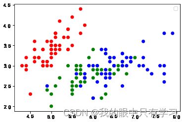
c = df['species'].map({'setosa':'r','versicolor':'g','virginica':'b'})
# 根据X,Y值画散点图, 用不同的颜色标识不同的分类
plt.scatter(x,y, c=c)
plt.legend() # 这时候的legend没有可以描述的对象,因为上面直接采用map对花的种类进行了映射
No handles with labels found to put in legend.
# 读取数据
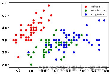
df = pd.read_csv('Data/iris.csv')
# 迭代写标签,才能体现出来
for sp in df['species'].unique():
df_tmp = df[df['species'] == sp]
x = df_tmp['sepal_length']
y = df_tmp['sepal_width']
plt.scatter(x, y, c=c_map[sp], label = sp)
plt.legend()
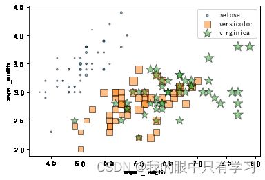
2.2.3. 多维散点图
除了sepal花萼的宽度长度、还有petal花瓣的宽度长度
我们分别用点的大小(s)和颜色深浅(colormap)来标识区分
这时区分种类就不能用颜色(c)来表示了,因为调色板只支持连续数值,所以我们选择用点的类型(marker)来区分种类
plt.cm.coolwarm # 热力图常用

plt.cm.Accent

# 读取数据
df = pd.read_csv('Data/iris.csv')

markermap = {'setosa':'o', 'versicolor':'s', 'virginica':'*'}

for sp in df['species'].unique():
    df_tmp = df[df['species']==sp]
    x = df_tmp.sepal_length  # x 表示花瓣长
    y = df_tmp.sepal_width   # y 表示花瓣宽
    s = (df_tmp.petal_length * df_tmp.petal_width)*np.pi   # s(size) 表示花萼面积,其实上面也可以用面积。。
    plt.scatter(x,y,s=s*5, marker=markermap[sp], edgecolors='k', alpha=0.5,label=sp)

plt.legend()

plt.xlabel('sepal_length')
plt.ylabel('sepal_width')
Text(0, 0.5, 'sepal_width')
# 读取数据
df = pd.read_csv('Data/iris.csv')

markermap = {'setosa':'o', 'versicolor':'s', 'virginica':'*'}

for sp in df['species'].unique():
    df_tmp = df[df['species']==sp]
    x = df_tmp.sepal_length  # x 表示花瓣长
    y = df_tmp.sepal_width   # y 表示花瓣宽
    c = (df_tmp.petal_length * df_tmp.petal_width)*np.pi   # s(size) 表示花萼面积
    plt.scatter(x,y,c=c, marker=markermap[sp], edgecolors='k', alpha=0.5,label=sp)

plt.legend()

plt.xlabel('sepal_length')
plt.ylabel('sepal_width')
Text(0, 0.5, 'sepal_width')

# 读取数据
df = pd.read_csv('Data/iris.csv')

markermap = {'setosa':'o', 'versicolor':'s', 'virginica':'*'}

for sp in df['species'].unique():
    df_tmp = df[df['species']==sp]
    x = df_tmp.sepal_length  # x 表示花瓣长
    y = df_tmp.sepal_width   # y 表示花瓣宽
    s = df_tmp.petal_length*np.pi   # 花萼长度
    c = df_tmp.petal_width*np.pi  # 花萼宽度
    plt.scatter(x,y,s=s*5,c=c,cmap=plt.cm.Accent, marker=markermap[sp], edgecolors='k', alpha=0.5,label=sp)

plt.legend()

plt.xlabel('sepal_length')
plt.ylabel('sepal_width')
Text(0, 0.5, 'sepal_width')

# 读取数据
df = pd.read_csv('Data/iris.csv')
markermap = {'setosa':'o', 'versicolor':'s', 'virginica':'*'}
# 非连续的label就只能单独画图
# 这里有意思的是,拿df画图就可以
for sp in df['species'].unique():
df_tmp = df[df['species']==sp]
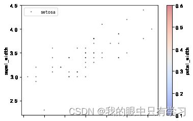
df_tmp.plot.scatter('sepal_length','sepal_width',s='petal_length',c='petal_width',cmap=plt.cm.coolwarm, marker=markermap[sp], edgecolors='k', alpha=0.5,label=sp)
plt.legend()
plt.xlabel('sepal_length')
plt.ylabel('sepal_width')
Text(0, 0.5, 'sepal_width')


2.3. 饼图 plt.pie(size,label)
用公式计算百分比
X = df['总利润额'].tolist()
[ str(round(xi /sum(X)*100))+'%' for xi in X]
import pandas as pd
datafile = pd.read_csv('./Data/orders.csv')
datafile.head(5)
| ORDER_ID | ORDER_DATE | SITE | PAY_MODE | DELIVER_DATE | DELIVER_DAYS | CUST_ID | CUST_NAME | CUST_TYPE | CUST_CITY | ... | PROD_NAME | PROD_TYPE | PROD_SUBCATEGORY | PRICE | AMOUNT | DISCOUNT | PROFIT | OPERATOR | RETURNED | FY | |
|---|---|---|---|---|---|---|---|---|---|---|---|---|---|---|---|---|---|---|---|---|---|
| 0 | CN-2017-100001 | 2017-01-01 | 海恒店 | 信用卡 | 2017-01-03 | 3 | Cust-18715 | 邢宁 | 公司 | 常德 | ... | 诺基亚_智能手机_整包 | 技术 | 电话 | 1725.360 | 3 | 0.0 | 68.880 | 王倩倩 | 0 | 2017 |
| 1 | CN-2017-100002 | 2017-01-01 | 庐江路 | 信用卡 | 2017-01-07 | 6 | Cust-10555 | 彭博 | 公司 | 沈阳 | ... | Eaton_令_每包_12_个 | 办公用品 | 纸张 | 572.880 | 4 | 0.0 | 183.120 | 郝杰 | 0 | 2017 |
| 2 | CN-2017-100003 | 2017-01-03 | 定远路店 | 微信 | 2017-01-07 | 6 | Cust-15985 | 薛磊 | 消费者 | 湛江 | ... | 施乐_计划信息表_多色 | 办公用品 | 纸张 | 304.920 | 3 | 0.0 | 97.440 | 王倩倩 | 0 | 2017 |
| 3 | CN-2017-100004 | 2017-01-03 | 众兴店 | 信用卡 | 2017-01-07 | 6 | Cust-15985 | 薛磊 | 消费者 | 湛江 | ... | Hon_椅垫_可调 | 家具 | 椅子 | 243.684 | 1 | 0.1 | 108.304 | 王倩倩 | 0 | 2017 |
| 4 | CN-2017-100005 | 2017-01-03 | 燎原店 | 信用卡 | 2017-01-08 | 3 | Cust-12490 | 洪毅 | 公司 | 宁波 | ... | Cuisinart_搅拌机_白色 | 办公用品 | 器具 | 729.456 | 4 | 0.4 | -206.864 | 杨洪光 | 1 | 2017 |
5 rows × 23 columns
df = pd.DataFrame(datafile[datafile['FY']==2019].groupby('PROD_TYPE')['PRICE','PROFIT'].sum().reset_index())
df
:1: FutureWarning: Indexing with multiple keys (implicitly converted to a tuple of keys) will be deprecated, use a list instead.
  df = pd.DataFrame(datafile[datafile['FY']==2019].groupby('PROD_TYPE')['PRICE','PROFIT'].sum().reset_index())
| PROD_TYPE | PRICE | PROFIT | |
|---|---|---|---|
| 0 | 办公用品 | 1867400.770 | 286590.698 |
| 1 | 家具 | 2143546.088 | 201174.293 |
| 2 | 技术 | 1919994.028 | 256056.740 |
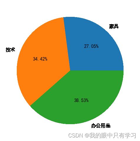
df = datafile.query("FY==2019").groupby('PROD_TYPE')[['PRICE','PROFIT']].sum().reset_index().sort_values(by='PRICE',ascending=False)
df.columns = ['产品分类','总销售额','总利润额']
df
| 产品分类 | 总销售额 | 总利润额 | |
|---|---|---|---|
| 1 | 家具 | 2143546.088 | 201174.293 |
| 2 | 技术 | 1919994.028 | 256056.740 |
| 0 | 办公用品 | 1867400.770 | 286590.698 |
X = df['总利润额'].tolist()
[ str(round(xi /sum(X)*100))+'%' for xi in X]
['27%', '34%', '39%']
import matplotlib.pyplot as plt
plt.rcParams['font.sans-serif'] = ['SimHei']   #显示中文
plt.rcParams['axes.unicode_minus']=False       #正常显示负号

sizes = df['总利润额']
labels = df['产品分类']
plt.figure(figsize=(5,5),dpi=120)
plt.pie(sizes,         # 每个扇区大小
        labels=labels, # 每个扇区标签
        autopct='%.2f%%', # 计算百分比格式 %格式%   %d%% 整数百分比  %.2f%% 小数点后保留2位的浮点数百分比

       )
([,
  ,
  ],
 [Text(0.7262489286243347, 0.8261734041180497, '家具'),
  Text(-1.029190435576041, 0.38828732572516295, '技术'),
  Text(0.38786880318661054, -1.0293482362711788, '办公用品')],
 [Text(0.39613577924963705, 0.45064003860984525, '27.05%'),
  Text(-0.5613766012232951, 0.21179308675917977, '34.42%'),
  Text(0.21156480173815118, -0.5614626743297338, '38.53%')])
df.plot.pie(y='总利润额',figsize=(10,8),labels=df['产品分类'],autopct='%.2f%%',textprops={'fontsize':15,'color':'k'})

explode =[0.05, 0.05, 0.05]        #每一块离开中心距离
df.plot.pie(y='总利润额',figsize=(10,8),
            labels=df['产品分类'],autopct='%.2f%%',
            textprops={'fontsize':15,'color':'k'},
            explode=explode)

需要着重强调某一部分可以让它独立出来一点点
explode =[0.1, 0, 0]        #每一块离开中心距离
df.plot.pie(y='总利润额',figsize=(10,8),
            labels=df['产品分类'],autopct='%.2f%%',
            textprops={'fontsize':15,'color':'k'},
            explode=explode)

df = df.set_index('产品分类')
df
| 总销售额 | 总利润额 | |
|---|---|---|
| 产品分类 | ||
| 家具 | 2143546.088 | 201174.293 |
| 技术 | 1919994.028 | 256056.740 |
| 办公用品 | 1867400.770 | 286590.698 |
# explode =[0.05, 0.05, 0.05]        #每一块离开中心距离
df.plot(kind='pie',subplots=True,legend=True,figsize=(15,10),textprops={'fontsize':15,'color':'k'})
array([, ],
      dtype=object)

2.4. 统计图
一般情况下是通过统计得出结果在不同区间的分布情况(如正太分布啥的)而设置的图形
当然如果要在分布情况确定的前提下,进行预测,则需要用严谨的数学方法进行验证分布后再进行预测,万不可直接画图说它服从xxx分布就开始预测了,非常不科学!!
2.4.1. plt.subplot()
plt.subplot?
import numpy as np
import pandas as pd
import matplotlib.pyplot as plt

t=np.arange(0.0,2.0,0.1)
s=np.sin(t*np.pi)
plt.subplot(2,2,1) #要生成两行两列,这是第一个图
plt.plot(t,s,'b*')
plt.ylabel('y1')
plt.subplot(2,2,2) #两行两列,这是第二个图
plt.plot(2*t,s,'r--')
plt.ylabel('y2')
plt.subplot(2,2,3)#两行两列,这是第三个图
plt.plot(3*t,s,'m--')
plt.ylabel('y3')
plt.subplot(2,2,4)#两行两列,这是第四个图
plt.plot(4*t,s,'k*')
plt.ylabel('y4')
plt.show()

plt.subplot(211) # 二行一列的第一个,因为我这里draw的图只有一张,所以第一个就占二行一列全部

# 同理补全
plt.subplot(211)
plt.subplot(212)
plt.subplot(121) # 二列一行第一个

plt.subplot(121)
plt.subplot(122)

plt.figure(figsize=(6,4),dpi=120)
plt.subplot(121)
plt.subplot(122)

plt.figure(figsize=(10,8))
plt.subplot(221)
plt.title("1",loc='center',y=1)
plt.subplot(222)
plt.title("2",loc='center',y=1)
plt.subplot(223)
plt.title("3",loc='center',y=1)
plt.subplot(224)
plt.title("4",loc='center',y=1)
Text(0.5, 1, '4')

2.4.2. 直方图 plt.hist()
PDF:概率密度函数(probability density function), 在数学中,连续型随机变量的概率密度函数(在不至于混淆时可以简称为密度函数)是一个描述这个随机变量的输出值,在某个确定的取值点附近的可能性的函数。
PMF:概率质量函数(probability mass function), 在概率论中,概率质量函数是离散随机变量在各特定取值上的概率。
CDF:累积分布函数 (cumulative distribution function),又叫分布函数,是概率密度函数的积分,能完整描述一个实随机变量X的概率分布。
import pandas as pd
datafile = pd.read_csv('./Data/orders.csv')
datafile.head(5)
| ORDER_ID | ORDER_DATE | SITE | PAY_MODE | DELIVER_DATE | DELIVER_DAYS | CUST_ID | CUST_NAME | CUST_TYPE | CUST_CITY | ... | PROD_NAME | PROD_TYPE | PROD_SUBCATEGORY | PRICE | AMOUNT | DISCOUNT | PROFIT | OPERATOR | RETURNED | FY | |
|---|---|---|---|---|---|---|---|---|---|---|---|---|---|---|---|---|---|---|---|---|---|
| 0 | CN-2017-100001 | 2017-01-01 | 海恒店 | 信用卡 | 2017-01-03 | 3 | Cust-18715 | 邢宁 | 公司 | 常德 | ... | 诺基亚_智能手机_整包 | 技术 | 电话 | 1725.360 | 3 | 0.0 | 68.880 | 王倩倩 | 0 | 2017 |
| 1 | CN-2017-100002 | 2017-01-01 | 庐江路 | 信用卡 | 2017-01-07 | 6 | Cust-10555 | 彭博 | 公司 | 沈阳 | ... | Eaton_令_每包_12_个 | 办公用品 | 纸张 | 572.880 | 4 | 0.0 | 183.120 | 郝杰 | 0 | 2017 |
| 2 | CN-2017-100003 | 2017-01-03 | 定远路店 | 微信 | 2017-01-07 | 6 | Cust-15985 | 薛磊 | 消费者 | 湛江 | ... | 施乐_计划信息表_多色 | 办公用品 | 纸张 | 304.920 | 3 | 0.0 | 97.440 | 王倩倩 | 0 | 2017 |
| 3 | CN-2017-100004 | 2017-01-03 | 众兴店 | 信用卡 | 2017-01-07 | 6 | Cust-15985 | 薛磊 | 消费者 | 湛江 | ... | Hon_椅垫_可调 | 家具 | 椅子 | 243.684 | 1 | 0.1 | 108.304 | 王倩倩 | 0 | 2017 |
| 4 | CN-2017-100005 | 2017-01-03 | 燎原店 | 信用卡 | 2017-01-08 | 3 | Cust-12490 | 洪毅 | 公司 | 宁波 | ... | Cuisinart_搅拌机_白色 | 办公用品 | 器具 | 729.456 | 4 | 0.4 | -206.864 | 杨洪光 | 1 | 2017 |
5 rows × 23 columns
df = datafile[datafile['FY']==2019]
df[['ORDER_DATE','PROD_TYPE','PRICE','PROFIT']].head(5)
| ORDER_DATE | PROD_TYPE | PRICE | PROFIT | |
|---|---|---|---|---|
| 6128 | 2019-01-01 | 家具 | 456.12 | 118.44 |
| 6129 | 2019-01-01 | 家具 | 591.50 | 194.60 |
| 6130 | 2019-01-01 | 技术 | 1607.34 | 610.68 |
| 6131 | 2019-01-01 | 办公用品 | 3304.70 | 1321.60 |
| 6132 | 2019-01-01 | 家具 | 5288.85 | -634.83 |
datafile[datafile['FY']==2019].groupby('ORDER_DATE')[['PROFIT','PRICE']].sum().head(5)
| PROFIT | PRICE | |
|---|---|---|
| ORDER_DATE | ||
| 2019-01-01 | 1640.310 | 11763.430 |
| 2019-01-02 | 714.560 | 2928.520 |
| 2019-01-03 | 13401.500 | 37470.200 |
| 2019-01-04 | -1699.632 | 17063.144 |
| 2019-01-05 | 66.640 | 515.760 |
import matplotlib.pyplot as plt

df = datafile[datafile['FY']==2019].groupby('ORDER_DATE')[['PROFIT']].sum()
plt.hist(df,bins=20,alpha=0.5,histtype='bar')
(array([  1.,   0.,   0.,   1.,   4.,   8.,  15.,  18., 105.,  63.,  47.,
         34.,  18.,  16.,   4.,   4.,   1.,   4.,   1.,   2.]),
 array([-12282.558 , -10805.5415,  -9328.525 ,  -7851.5085,  -6374.492 ,
         -4897.4755,  -3420.459 ,  -1943.4425,   -466.426 ,   1010.5905,
          2487.607 ,   3964.6235,   5441.64  ,   6918.6565,   8395.673 ,
          9872.6895,  11349.706 ,  12826.7225,  14303.739 ,  15780.7555,
         17257.772 ]),
 )

import numpy as np
from scipy.stats import norm
n,bins,patches=plt.hist(df,bins=20,density=True)

# 创建虚实线,其中y则为正太化bins对应值
y = norm.pdf(bins,df.mean(),df.std())
plt.plot(bins,y,'--')
[]

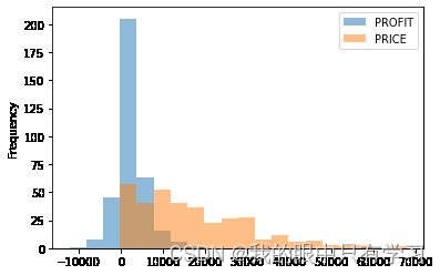
datafile[datafile['FY']==2019].groupby('ORDER_DATE')[['PROFIT','PRICE']].sum().plot(
    kind='hist',bins=20,alpha=0.5,histtype='bar')
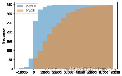
datafile[datafile['FY']==2019].groupby('ORDER_DATE')[['PROFIT','PRICE']].sum().plot(
    kind='hist',bins=20,alpha=0.5,cumulative=True,  # cumulative叠加起来,可以清楚地看到数值在哪个部位开始猛烈增加
    histtype='bar')
2.4.3. 箱型图 plt.boxplot()
import pandas as pd
datafile = pd.read_csv('./Data/orders.csv')
datafile.head(5)
| ORDER_ID | ORDER_DATE | SITE | PAY_MODE | DELIVER_DATE | DELIVER_DAYS | CUST_ID | CUST_NAME | CUST_TYPE | CUST_CITY | ... | PROD_NAME | PROD_TYPE | PROD_SUBCATEGORY | PRICE | AMOUNT | DISCOUNT | PROFIT | OPERATOR | RETURNED | FY | |
|---|---|---|---|---|---|---|---|---|---|---|---|---|---|---|---|---|---|---|---|---|---|
| 0 | CN-2017-100001 | 2017-01-01 | 海恒店 | 信用卡 | 2017-01-03 | 3 | Cust-18715 | 邢宁 | 公司 | 常德 | ... | 诺基亚_智能手机_整包 | 技术 | 电话 | 1725.360 | 3 | 0.0 | 68.880 | 王倩倩 | 0 | 2017 |
| 1 | CN-2017-100002 | 2017-01-01 | 庐江路 | 信用卡 | 2017-01-07 | 6 | Cust-10555 | 彭博 | 公司 | 沈阳 | ... | Eaton_令_每包_12_个 | 办公用品 | 纸张 | 572.880 | 4 | 0.0 | 183.120 | 郝杰 | 0 | 2017 |
| 2 | CN-2017-100003 | 2017-01-03 | 定远路店 | 微信 | 2017-01-07 | 6 | Cust-15985 | 薛磊 | 消费者 | 湛江 | ... | 施乐_计划信息表_多色 | 办公用品 | 纸张 | 304.920 | 3 | 0.0 | 97.440 | 王倩倩 | 0 | 2017 |
| 3 | CN-2017-100004 | 2017-01-03 | 众兴店 | 信用卡 | 2017-01-07 | 6 | Cust-15985 | 薛磊 | 消费者 | 湛江 | ... | Hon_椅垫_可调 | 家具 | 椅子 | 243.684 | 1 | 0.1 | 108.304 | 王倩倩 | 0 | 2017 |
| 4 | CN-2017-100005 | 2017-01-03 | 燎原店 | 信用卡 | 2017-01-08 | 3 | Cust-12490 | 洪毅 | 公司 | 宁波 | ... | Cuisinart_搅拌机_白色 | 办公用品 | 器具 | 729.456 | 4 | 0.4 | -206.864 | 杨洪光 | 1 | 2017 |
5 rows × 23 columns
df = datafile[(datafile['FY']==2019) & (datafile['PRICE']<=10000)]
df.head(5)
| ORDER_ID | ORDER_DATE | SITE | PAY_MODE | DELIVER_DATE | DELIVER_DAYS | CUST_ID | CUST_NAME | CUST_TYPE | CUST_CITY | ... | PROD_NAME | PROD_TYPE | PROD_SUBCATEGORY | PRICE | AMOUNT | DISCOUNT | PROFIT | OPERATOR | RETURNED | FY | |
|---|---|---|---|---|---|---|---|---|---|---|---|---|---|---|---|---|---|---|---|---|---|
| 6128 | CN-2019-100001 | 2019-01-01 | 燎原店 | 支付宝 | 2019-01-03 | 3 | Cust-19900 | 谭珊 | 消费者 | 天津 | ... | Tenex_闹钟_优质 | 家具 | 用具 | 456.12 | 2 | 0.00 | 118.44 | 张怡莲 | 0 | 2019 |
| 6129 | CN-2019-100002 | 2019-01-01 | 定远路店 | 微信 | 2019-01-03 | 3 | Cust-19900 | 谭珊 | 消费者 | 天津 | ... | Deflect-O_分层置放架_一包多件 | 家具 | 用具 | 591.50 | 5 | 0.00 | 194.60 | 张怡莲 | 0 | 2019 |
| 6130 | CN-2019-100003 | 2019-01-01 | 燎原店 | 其它 | 2019-01-03 | 3 | Cust-18715 | 邢宁 | 公司 | 常德 | ... | 贝尔金_记忆卡_实惠 | 技术 | 配件 | 1607.34 | 3 | 0.00 | 610.68 | 王倩倩 | 1 | 2019 |
| 6131 | CN-2019-100004 | 2019-01-01 | 燎原店 | 微信 | 2019-01-03 | 3 | Cust-18715 | 邢宁 | 公司 | 常德 | ... | Rogers_文件车_单宽度 | 办公用品 | 收纳具 | 3304.70 | 5 | 0.00 | 1321.60 | 王倩倩 | 1 | 2019 |
| 6132 | CN-2019-100005 | 2019-01-01 | 临泉路 | 其它 | 2019-01-03 | 3 | Cust-18715 | 邢宁 | 公司 | 常德 | ... | Barricks_圆桌_白色 | 家具 | 桌子 | 5288.85 | 3 | 0.25 | -634.83 | 王倩倩 | 0 | 2019 |
5 rows × 23 columns
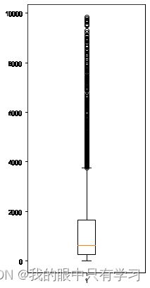
plt.boxplot?
plt.figure(figsize=(3,7))
plt.boxplot(df['PRICE'])
{'whiskers': [,
  ],
 'caps': [,
  ],
 'boxes': [],
 'medians': [],
 'fliers': [],
 'means': []}
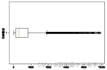
plt.rcParams['font.sans-serif']=['SimHei']
plt.rcParams['axes.unicode_minus']=False

plt.boxplot(df['PRICE'],vert=False)
plt.ylabel('全体数据')
Text(0, 0.5, '全体数据')
N = df['PRICE']
Q0 = np.quantile(N,q=0/4)  # 最小值
Q1 = np.quantile(N,q=1/4)  # 箱子的下边
Q2 = np.quantile(N,q=2/4)  # 箱子的中位数线
Q3 = np.quantile(N,q=3/4)  # 箱子的上边
Q4 = np.quantile(N,q=4/4)  # 最大值

M = np.mean(N)

IQR = Q3-Q1  # 箱子的长度

Upper = Q3 + 1.5*IQR  # 箱线图的上限 (限制,如果值超过这个限度,就是异常值)
Lower = Q1 - 1.5*IQR  # 箱线图的下限 (限制,如果值不超过这个限度,就取不超限的最小值)

print(f"Q3={Q3}, Q1={Q1}, IQR={IQR}, Upper={Upper}, Lower={Lower},M={M} ")

plt.figure(dpi=120)
plt.boxplot(N,meanline=True,showmeans=True)
plt.yticks([0,Lower,Q0,Q1,M,Q2,Q3,Q4,Upper],
           ['0','Lower','Q0','Q1','M','Q2','Q3','Q4','Upper']
          )
plt.grid(axis='y')
Q3=1652.575, Q1=246.68, IQR=1405.895, Upper=3761.4174999999996, Lower=-1862.1624999999997,M=1342.0546853107314

横着放,就vert=False,然后把标签的yticks转换成xticks就行
N = df['PRICE']
Q0 = np.quantile(N,q=0/4)  # 最小值
Q1 = np.quantile(N,q=1/4)  # 箱子的下边
Q2 = np.quantile(N,q=2/4)  # 箱子的中位数线
Q3 = np.quantile(N,q=3/4)  # 箱子的上边
Q4 = np.quantile(N,q=4/4)  # 最大值

M = np.mean(N)

IQR = Q3-Q1  # 箱子的长度

Upper = Q3 + 1.5*IQR  # 箱线图的上限 (限制,如果值超过这个限度,就是异常值)
Lower = Q1 - 1.5*IQR  # 箱线图的下限 (限制,如果值不超过这个限度,就取不超限的最小值)

print(f"Q3={Q3}, Q1={Q1}, IQR={IQR}, Upper={Upper}, Lower={Lower},M={M} ")

plt.figure(dpi=120)
plt.boxplot(N,showmeans=True,meanline='--',vert=False)
plt.xticks([0,Lower,Q0,Q1,M,Q2,Q3,Q4,Upper],
           ['0','Lower','Q0','Q1','M','Q2','Q3','Q4','Upper']
          )
plt.grid(axis='x')
Q3=1652.575, Q1=246.68, IQR=1405.895, Upper=3761.4174999999996, Lower=-1862.1624999999997,M=1342.0546853107314

N = np.random.randn(1000)*0.5 # Normal 产生1000各满足正态分布的随机数数组
plt.figure(dpi=120)
# 一般不适用,因为它这三个图随便哪一个支出很大一截就会消失,一般情况下咱们的数据都不满足标准正太,画不出来
plt.boxplot(N,showbox=False)
plt.scatter(np.full_like(N,2),N,s=0.3,alpha=0.5,)
plt.hist(N,orientation='horizontal',density=True)
(array([0.01246943, 0.0810513 , 0.1995109 , 0.47695574, 0.82609981,
        0.69828814, 0.51436403, 0.21509769, 0.07169923, 0.0218215 ]),
 array([-1.61505489, -1.29427041, -0.97348593, -0.65270144, -0.33191696,
        -0.01113247,  0.30965201,  0.63043649,  0.95122098,  1.27200546,
         1.59278995]),
 )

plt.figure(figsize=(10,5))
# vert是否垂直,whis晶须长度(往两边衍伸的条条)
plt.boxplot([df['PRICE'],df['PROFIT']],whis=6,vert=False)
{'whiskers': [,
  ,
  ,
  ],
 'caps': [,
  ,
  ,
  ],
 'boxes': [,
  ],
 'medians': [,
  ],
 'fliers': [,
  ],
 'means': []}

groups = df.groupby('OPERATOR')
boxes = []  # 列表(box1,box2,box3,...)
boxes_label = []
for 销售员, df_销售员 in groups:  # groupby得到的每一个group包含了分组的键值和被分组的数据
    boxes.append(df_销售员['PRICE'])
    boxes_label.append(销售员)
plt.figure(figsize=(15,7))
plt.boxplot(boxes,vert=False,whis=2,showmeans=True,showbox = True)   # 只调用依次boxplot画多组箱型图
plt.yticks(range(1,len(boxes_label)+1),boxes_label,fontsize=15.0)
plt.xticks(np.arange(0,11000,step=1000))
plt.xlabel('销售额',fontsize=15.0)
plt.ylabel('销售人员',fontsize=15.0)
plt.title('销售人员的销售业绩分析',fontsize=20.0)

plt.show()

plt.figure(figsize=(15,7))
plt.boxplot(boxes,whis=2,showmeans=True,showbox = True)   # 只调用依次boxplot画多组箱型图
plt.xticks(range(1,len(boxes_label)+1),boxes_label,fontsize=15.0)
plt.yticks(np.arange(0,11000,step=1000))
plt.xlabel('销售额',fontsize=15.0)
plt.ylabel('销售人员',fontsize=15.0)
plt.title('销售人员的销售业绩分析',fontsize=20.0)
counts = df.groupby('OPERATOR').count()
plt.plot(np.arange(1,counts.shape[0]+1),counts)

plt.show()

2.4.4. 提琴图 plt.violinplot()
本质上就是更加具现的箱型图
groups = df.groupby('OPERATOR')
boxes = []  # 列表(box1,box2,box3,...)
boxes_label = []
for 销售员, df_销售员 in groups:  # groupby得到的每一个group包含了分组的键值和被分组的数据
    boxes.append(df_销售员['PRICE'])
    boxes_label.append(销售员)


plt.figure(figsize=(15,7))
plt.violinplot(boxes,vert=True,showmeans=True)   # 只调用依次boxplot画多组箱型图
plt.xticks(range(1,len(boxes_label)+1),boxes_label,fontsize=15.0)
plt.yticks(np.arange(0,11000,step=1000))
plt.ylabel('销售额',fontsize=15.0)
plt.xlabel('销售人员',fontsize=15.0)
plt.title('销售人员的销售业绩分析',fontsize=20.0)

plt.show()

2.5. 特殊统计图(针对某些统计结果的可视化)
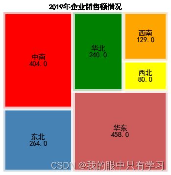
2.5.1. 树形图 squarify.plot()
!pip install squarify
Looking in indexes: https://pypi.tuna.tsinghua.edu.cn/simple
Collecting squarify
  Downloading https://pypi.tuna.tsinghua.edu.cn/packages/0b/2b/2e77c35326efec19819cd1d729540d4d235e6c2a3f37658288a363a67da5/squarify-0.4.3-py3-none-any.whl (4.3 kB)
Installing collected packages: squarify
Successfully installed squarify-0.4.3
import pandas as pd
import numpy as np
import squarify
import matplotlib.pyplot as plt

plt.rcParams['font.sans-serif']=['SimHei']     #显示中文
plt.rcParams['axes.unicode_minus']=False       #正常显示负号

data = pd.read_csv(r'./data/orders.txt')
data_region = np.round( data.groupby('CUST_REGION')['PRICE'].sum()/10000 )
data_region
CUST_REGION
东北    264.0
中南    404.0
华东    458.0
华北    240.0
西北     80.0
西南    129.0
Name: PRICE, dtype: float64
type(data_region)
pandas.core.series.Series
plt.figure(figsize=(6,6))
colors = ['steelblue','red','indianred','green','yellow','orange']   #设置颜色数据
plot_map=squarify.plot(
    sizes=data_region.values,            #指定绘图数据
    label=data_region.index,            #标签
    color=colors,        #指定自定义颜色
    alpha=0.6,           #指定透明度
    value=data_region.values,            #添加数值标签
    edgecolor='w',   #设置边界框白色
    linewidth=8          #设置边框宽度为3
)

plt.rc('font',size=15)      #设置标签大小
plot_map.set_title('2019年企业销售额情况',fontdict={'fontsize':15})    #设置标题及大小
plt.axis('off')    #去除坐标轴
plt.tick_params(top='off',right='off')    #去除上边框和右边框刻度
plt.show()
2.5.2. 自相关图 ACF、PACF
Autocorrelation Function (ACF)自相关函数,指任意时间 t(t=1,2,3…n)的 序列值 X t X_t Xt与其自身的滞后(这里取滞后一阶,即lag=1)值 X t − 1 X_{t-1} Xt−1之间的线性关系
Partical Autocorrelation Coefficient(PAC)偏自相关系数,同自相关系数大同小异,在计算相关性时移除了中间变量的间接影响
import pandas as pd
import matplotlib.pyplot as plt
from statsmodels.graphics.tsaplots import plot_acf, plot_pacf
plt.rcParams['font.sans-serif']=['SimHei','Fangsong','Microsfot YaHei', 'KaiTi']
plt.rcParams['axes.unicode_minus']=False

df = pd.read_csv('./data/stocks.csv')
data = df.sort_values('TRADE_DATE').set_index('TRADE_DATE')

data['CLOSE']
TRADE_DATE
2017-01-03    19881.76
2017-01-04    19942.16
2017-01-05    19899.29
2017-01-06    19963.80
2017-01-09    19887.38
                ...
2019-12-23    29933.81
2019-12-27    29945.04
2019-12-28    29833.68
2019-12-29    29819.78
2019-12-30    29762.60
Name: CLOSE, Length: 755, dtype: float64
fig = plt.figure(figsize=(20,20))
ax1 = plt.subplot(311)
data.iloc[ : , :-1].plot(ax=ax1)

ax2 = plt.subplot(312)
plot_acf(data['CLOSE'],ax=ax2)

ax3 = plt.subplot(313)
plot_pacf(data['CLOSE'],ax=ax3)


2.5.3. 误差条形图 sns.catplot()
import seaborn as sns
import matplotlib.pyplot as plt
# import pandas as pd
sns.set_style('darkgrid')
plt.rcParams['font.sans-serif']=['SimHei','Microsoft Yahei', 'Kaiti', 'Fangsong']
plt.figure(figsize=(12,7))


data = sns.load_dataset('orders',data_home='./data/') # 在data_home目录下寻找 orders.csv
#data = pd.read_csv(r'../data/orders.csv')
data.head()
| ORDER_ID | ORDER_DATE | SITE | PAY_MODE | DELIVER_DATE | DELIVER_DAYS | CUST_ID | CUST_NAME | CUST_TYPE | CUST_CITY | ... | PROD_NAME | PROD_TYPE | PROD_SUBCATEGORY | PRICE | AMOUNT | DISCOUNT | PROFIT | OPERATOR | RETURNED | FY | |
|---|---|---|---|---|---|---|---|---|---|---|---|---|---|---|---|---|---|---|---|---|---|
| 0 | CN-2017-100001 | 2017-01-01 | 海恒店 | 信用卡 | 2017-01-03 | 3 | Cust-18715 | 邢宁 | 公司 | 常德 | ... | 诺基亚_智能手机_整包 | 技术 | 电话 | 1725.360 | 3 | 0.0 | 68.880 | 王倩倩 | 0 | 2017 |
| 1 | CN-2017-100002 | 2017-01-01 | 庐江路 | 信用卡 | 2017-01-07 | 6 | Cust-10555 | 彭博 | 公司 | 沈阳 | ... | Eaton_令_每包_12_个 | 办公用品 | 纸张 | 572.880 | 4 | 0.0 | 183.120 | 郝杰 | 0 | 2017 |
| 2 | CN-2017-100003 | 2017-01-03 | 定远路店 | 微信 | 2017-01-07 | 6 | Cust-15985 | 薛磊 | 消费者 | 湛江 | ... | 施乐_计划信息表_多色 | 办公用品 | 纸张 | 304.920 | 3 | 0.0 | 97.440 | 王倩倩 | 0 | 2017 |
| 3 | CN-2017-100004 | 2017-01-03 | 众兴店 | 信用卡 | 2017-01-07 | 6 | Cust-15985 | 薛磊 | 消费者 | 湛江 | ... | Hon_椅垫_可调 | 家具 | 椅子 | 243.684 | 1 | 0.1 | 108.304 | 王倩倩 | 0 | 2017 |
| 4 | CN-2017-100005 | 2017-01-03 | 燎原店 | 信用卡 | 2017-01-08 | 3 | Cust-12490 | 洪毅 | 公司 | 宁波 | ... | Cuisinart_搅拌机_白色 | 办公用品 | 器具 | 729.456 | 4 | 0.4 | -206.864 | 杨洪光 | 1 | 2017 |
5 rows × 23 columns
rc = {'font.sans-serif': ['WenQuanYi Micro Hei', 'DejaVu Sans', 'Bitstream Vera Sans']}

# seaborn的参数设置方法跟matplotlib不太一样
sns.set(context='notebook', style='ticks', font_scale=0.8, rc=rc)

ax = sns.catplot(kind='bar',data=data,x='SITE',y='PROFIT',col='OPERATOR',col_wrap=3,legend_out=True)

fig = plt.figure(figsize=(12,5))
sns.barplot(data=data,x='PROD_TYPE',y='PROFIT')

2.5.4. 雷达图 plt.plot(projection=‘polar’)
import matplotlib.pyplot as plt
import numpy as np
plt.figure(figsize=(10,5))  # 设置画布

ax1 = plt.subplot(121, projection='polar')  # 左图: projection='polar' 表示极坐标系
ax2 = plt.subplot(122)                      # 右图: 默认是直角坐标系

x = np.linspace(0,2*np.pi,6)   # 0 - 2Π 平均划分成9个点 [0,1/4,1/2,3/4,1,5/4/,3/2,7/4,2]  0pi = 2pi
y = x*10       # y取值,可以预先设置x多少个坑位,而后y设置你想要输入的东西
# y[-1] = y[0]                      # 首位相连,注意!!如果要围成圈圈就相当于你得少用一个萝卜坑!

# 假设你y的属性有九个,要保证首位相连你就得预设10个x
# 由于极坐标被分成了上下八个区块,所以你最好设置成 x= 偶数个+1

ax1.spines['polar'].set_visible(False)  #  # 隐藏最外圈的⚪
ax1.plot(x,y,marker='.')    # 画左图(ax1)  极坐标 (x表示角度,y表示半径)
ax2.plot(x,y,marker='.')    # 画右图(ax2)直角坐标 (x表示横轴,y表示纵轴)


ax1.fill(x,y,alpha=0.3)
ax2.fill(x,y,alpha=0.3)

plt.show()

不用连线填充来画图,换成长短不同的bar来作图
import matplotlib.pyplot as plt
import numpy as np
plt.figure(figsize=(10,5))  # 设置画布

ax1 = plt.subplot(121, projection='polar')  # 左图: projection='polar' 表示极坐标系
ax2 = plt.subplot(122)                      # 右图: 默认是直角坐标系

x = np.linspace(0,2*np.pi,6)   # 0 - 2Π 平均划分成9个点 [0,1/4,1/2,3/4,1,5/4/,3/2,7/4,2]  0pi = 2pi
y = x*10       # 随机9个值
y[-1] = y[0]                      # 首位相连

# 区分两种方法
#ax1.plot(x,y,marker='.')    # 画左图(ax1)  极坐标 (x表示角度,y表示半径)
#ax2.plot(x,y,marker='.')    # 画右图(ax2)直角坐标 (x表示横轴,y表示纵轴)

ax1.bar(x,y,edgecolor='k')
ax2.bar(x,y,edgecolor='k')

ax1.spines['polar'].set_visible(False)
ax1.grid(False)
ax1.set_thetagrids([],[])
ax1.set_rticks([])  # 半径轴


#ax1.fill(x,y,alpha=0.3)
#ax2.fill(x,y,alpha=0.3)

plt.show()

import numpy as np
import matplotlib.pyplot as plt
plt.rcParams['font.sans-serif']=['SimHei']     #显示中文
plt.rcParams['axes.unicode_minus']=False       #正常显示负号

ax1 = plt.subplot(111,polar=True)
ax1.spines['polar'].set_visible(False)
ndim = 3                # 假设维度是 3
angle = 2*np.pi / ndim  # 用2pi除以数据维度得到每个维度的角度单位
x = angle * np.arange(ndim+1)   # 生成维度的角度数值
y = np.full_like(x,2)
# x = [2/3*np.pi,2*2/3*np.pi,3*2/3*np.pi]  # 120° 240° 360°
plt.plot(x,y,linewidth=5,alpha=0.5)
[]

results = [
    {"大学英语": 87, "高等数学": 79, "体育": 95, "计算机基础": 92, "程序设计": 58},
    {"大学英语": 80, "高等数学": 90, "体育": 91, "计算机基础": 85, "程序设计": 88}
]
names = ['张三','李四']
import pandas as pd
df_results = pd.DataFrame(results)

plt.figure(figsize=(12,5))
plt.style.use('default')

plt.rcParams['font.sans-serif']=['SimHei']     #显示中文
plt.rcParams['axes.unicode_minus']=False       #正常显示负号

# 左图:极坐标
plt.subplot(121,projection='polar')
theta = np.linspace(0, 2*np.pi, df_results.columns.size+1)
df_radius = pd.concat([df_results,df_results.iloc[:,0]],axis=1)
x = theta  # 角度

for name,radius in zip(names,df_radius.values):
    y = radius # 半径
    plt.plot(x,y)
    plt.gca().fill(x,y,alpha=0.15,label=name)
plt.xticks(x[:5], df_results.columns)
plt.gca().spines['polar'].set_visible(False)
plt.gca().grid(True)
plt.gca().set_theta_zero_location('N')
plt.gca().set_rlim(50,100)
plt.gca().set_rlabel_position(0)
plt.legend()

plt.tight_layout()

# 右图:直角坐标
plt.subplot(122)
theta = np.linspace(0, 2*np.pi, len(results[0])+1 )
radius = list(results[0].values())
radius.append(radius[0])

for name,radius in zip(names,df_radius.values):
    y = radius # 半径
    plt.plot(x,y)
    plt.gca().fill(x,y,alpha=0.15,label=name)
plt.plot(x,y)
plt.xticks(x[:5], df_results.columns,rotation=90)
plt.tight_layout()
plt.show()

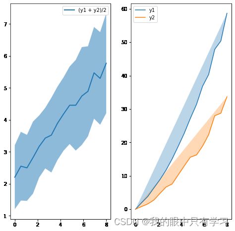
2.5.5. 折线图填充
import matplotlib.pyplot as plt
import numpy as np

# plt.style.use('_mpl-gallery')

# make data
np.random.seed(1)
x = np.linspace(0, 8, 16)
y1 = 3 + 4*x/8 + np.random.uniform(0.0, 0.5, len(x))
y2 = 1 + 3*x/8 + np.random.uniform(0.0, 0.5, len(x))
plt.figure(figsize=(8,8))
ax1 = plt.subplot(121)
ax2 = plt.subplot(122)

plt.figure(figsize=(8,8))
plt.subplot(121)
plt.plot(x, (y1 + y2)/2, linewidth=2,label='(y1 + y2)/2')
plt.legend()
plt.subplot(122)
plt.plot(x, y1*x,label='y1')
plt.plot(x, y2*x,label='y2')
plt.legend()

x = np.linspace(0, 8, 16)
y1 = 3 + 4*x/8 + np.random.uniform(0.0, 0.5, len(x))
y2 = 1 + 3*x/8 + np.random.uniform(0.0, 0.5, len(x))
plt.figure(figsize=(8,8))

plt.subplot(121)
plt.plot(x, (y1 + y2)/2, linewidth=2,label='(y1 + y2)/2')
# 在这里fill
plt.fill_between(x, y1, y2, alpha=.5, linewidth=0)
plt.legend()


plt.subplot(122)
plt.plot(x, y1*x,label='y1')
plt.plot(x, y2*x,label='y2')
# 在这里fill
plt.fill(x,y1*x,alpha=0.3)
plt.fill(x,y2*x,alpha=0.3)

plt.legend()
三、特殊图形
3.1. 词云图
!pip install jieba
Looking in indexes: https://pypi.tuna.tsinghua.edu.cn/simple
Collecting jieba
  Downloading https://pypi.tuna.tsinghua.edu.cn/packages/c6/cb/18eeb235f833b726522d7ebed54f2278ce28ba9438e3135ab0278d9792a2/jieba-0.42.1.tar.gz (19.2 MB)
Building wheels for collected packages: jieba
  Building wheel for jieba (setup.py): started
  Building wheel for jieba (setup.py): finished with status 'done'
  Created wheel for jieba: filename=jieba-0.42.1-py3-none-any.whl size=19314477 sha256=7f6a8527f478a78ccf8f7baa3a9964fb077b2cba581b809ad308b5babaf412d2
  Stored in directory: c:\users\11745\appdata\local\pip\cache\wheels\f3\30\86\64b88bf0241f0132806c61b1e2686b44f1327bfc5642f9d77d
Successfully built jieba
Installing collected packages: jieba
Successfully installed jieba-0.42.1
!pip install -i https://pypi.tuna.tsinghua.edu.cn/simple wordcloud
Looking in indexes: https://pypi.tuna.tsinghua.edu.cn/simple
Requirement already satisfied: wordcloud in c:\users\11745\appdata\roaming\python\python38\site-packages (1.8.1)
Requirement already satisfied: pillow in d:\python\anaconda\lib\site-packages (from wordcloud) (8.4.0)
Requirement already satisfied: matplotlib in c:\users\11745\appdata\roaming\python\python38\site-packages (from wordcloud) (3.4.3)
Requirement already satisfied: numpy>=1.6.1 in c:\users\11745\appdata\roaming\python\python38\site-packages (from wordcloud) (1.19.5)
Requirement already satisfied: pyparsing>=2.2.1 in d:\python\anaconda\lib\site-packages (from matplotlib->wordcloud) (2.4.7)
Requirement already satisfied: python-dateutil>=2.7 in d:\python\anaconda\lib\site-packages (from matplotlib->wordcloud) (2.8.1)
Requirement already satisfied: kiwisolver>=1.0.1 in d:\python\anaconda\lib\site-packages (from matplotlib->wordcloud) (1.3.1)
Requirement already satisfied: cycler>=0.10 in d:\python\anaconda\lib\site-packages (from matplotlib->wordcloud) (0.10.0)
Requirement already satisfied: six in c:\users\11745\appdata\roaming\python\python38\site-packages (from cycler>=0.10->matplotlib->wordcloud) (1.15.0)
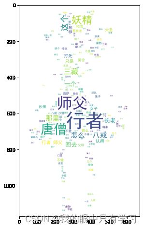
import jieba

with open(r'./data/xiyouji27.txt',encoding='utf-8') as f:
    text = f.read().replace('\n','')

words = " ".join(jieba.lcut(text))
words
Building prefix dict from the default dictionary ...
Dumping model to file cache C:\Users\11745\AppData\Local\Temp\jieba.cache
Loading model cost 0.936 seconds.
Prefix dict has been built successfully.


'却说 三藏 师徒 次日 天明 收拾 前进 , 那镇 元子 与 行者 结为 兄弟 , 两人 情投意合 , 决 不肯 放 , 又 安排 管待 , 一连 住 了 五六日 。 那长老 自服 了 草 还 丹 , 真似 脱胎换骨 , 神爽 体健 。 他 取经 心 重 , 那里 肯 淹留 , 无 已 , 遂行 。 师徒 别 了 上路 , 早见 一座 高山 。 三藏 道 : “ 徒弟 , 前面 有山 险峻 , 恐马 不能 前 , 大家 须 仔细 仔细 。 ” 行者 道 : “ 师父 放心 , 我 等 自然 理会 。 ” 好 猴王 , 他 在 马前 横担 着 棒 , 剖开 山路 , 上 了 高崖 , 看 不尽 : 峰岩 重迭 , 涧 壑 弯环 。 虎狼 成阵 走 , 麂 鹿作 群行 。 无数 獐 羓 钻 簇簇 , 满山 狐兔 聚丛丛 。 千尺 大蟒 , 万丈 长蛇 。 大蟒 喷 愁雾 , 长蛇 吐怪 风 。 道旁 荆棘 牵漫 , 岭上 松 柟 秀丽 。 薜萝 满目 , 芳草 连天 。 影落 沧溟 北 , 云开 斗柄 南 。 万古 常含 元气 老 , 千峰 巍列 日光 寒 。 那长老 马上 心惊 。 孙大圣 布施 手段 , 舞着 铁棒 , 哮吼 一声 , 諕 得 那 狼 虫 颠 窜 , 虎豹 奔逃 。 师徒 们 入 此山 , 正行 到 嵯峨 之 处 , 三藏 道 : “ 悟空 , 我 这 一日 , 肚中 饥 了 , 你 去 那里 化些 斋 吃 。 ” 行者 陪笑 道 : “ 师父 好 不 聪明 。 这 等 半山 之中 , 前不巴村 , 后不着店 , 有钱 也 没 买 处 , 教往 那里 寻斋 ? ” 三藏 心中 不快 , 口里 骂 道 : “ 你 这 猴子 ! 想 你 在 两 界山 , 被 如来 压在 石匣 之内 , 口能言 , 足 不能 行 , 也 亏 我 救 你 性命 , 摩顶 受戒 , 做 了 我 的 徒弟 。 怎么 不肯 努力 , 常怀 懒惰 之心 ? ” 行者 道 : “ 弟子 亦 颇 殷勤 , 何尝 懒惰 ? ” 三藏 道 : “ 你 既 殷勤 , 何不 化斋 我 吃 ? 我肚 饥 怎行 ? 况 此地 山岚 瘴气 , 怎么 得 上 雷音 ? ” 行者 道 : “ 师父 休怪 , 少要 言语 。 我知 你 尊性 高傲 , 十分 违慢 了 你 , 便 要念 那话儿 咒 。 你 下马 稳坐 , 等 我 寻 那里 有 人家 处 化斋 去 。 ” 行者 将身 一纵 , 跳上 云端 里 , 手 搭凉篷 , 睁眼 观看 。 可怜 西方 路 甚 是 寂寞 , 更 无 庄堡 人家 , 正是 多逢 树木 , 少见 人烟 去处 。 看多时 , 只见 正南 上 有 一座 高山 , 那山 向阳处 , 有 一片 鲜红 的 点子 。 行者 按下 云头 道 : “ 师父 , 有 吃 的 了 。 ” 那长老 问 甚 东西 。 行者 道 : “ 这里 没 人家 化饭 , 那 南山 有 一片 红 的 , 想必 是 熟透 了 的 山桃 , 我 去 摘 几个 来 你 充饥 。 ” 三藏 喜道 : “ 出家人 若有 桃子 吃 , 就 为 上 分 了 。 ” 行者 取 了 钵盂 , 纵起 祥光 , 你 看 他 筋斗 幌 幌 , 冷气 飕飕 , 须臾 间 , 奔 南山 摘桃 不题 。 却说 常言 有云 : “ 山高 必有 怪 , 岭峻 却 生精 。 ” 果然 这 山上 有 一个 妖精 , 孙大圣 去 时 , 惊动 那怪 。 他 在 云端 里 踏 着 阴风 , 看见 长老 坐在 地下 , 就 不胜 欢喜 道 :   “ 造化 , 造化 。 几年 家人 都 讲 东土 的 唐和尚 取 大乘 , 他本 是 金蝉子 化身 , 十 世修行 的 原体 , 有人 吃 他 一块 肉 , 长寿 长生 。 真个 今日 到 了 。 ” 那 妖精 上前 就要 拿 他 , 只见 长老 左右 手下 有 两员 大将 护持 , 不敢 拢 身 。 他 说 两员 大将 是 谁 ? 说 是 八戒 、 沙僧 。 八戒 、 沙僧 虽 没 甚么 大 本事 , 然 八戒 是 天 蓬元帅 , 沙僧 是 卷帘 大将 , 他 的 威气尚 不曾 泄 , 故 不敢 拢 身 。 妖精 说 : “ 等 我 且 戏 他 戏 , 看 怎么 说 。 ” 好 妖精 , 停下 阴风 , 在 那 山凹 里 摇身一变 , 变做 个 月貌花容 的 女儿 , 说 不尽 那 眉清目秀 , 齿白唇红 。 左手 提 着 一个 青砂 罐儿 , 右手 提 着 一个 绿 磁瓶 儿 , 从西向东 , 径奔 唐僧 : 圣僧 歇马 在 山岩 , 忽见 裙钗 女 近前 。 翠袖 轻摇笼 玉笋 , 湘裙 斜 拽 显 金莲 。   汗流 粉面 花含露 , 尘 拂 蛾眉 柳带 烟 。 仔细 定睛 观看 处 , 看看 行至 到 身边 。 三藏 见 了 , 叫 : “ 八戒 、 沙僧 , 悟空 才 说 这里 旷野 无人 , 你 看 那里 不 走出 一个 人来 了 ? ” 八戒 道 : “ 师父 , 你 与 沙僧 坐 着 , 等 老猪 去 看看 来 。 ” 那 呆子 放下 钉 钯 , 整整 直裰 , 摆摆 摇摇 , 充作 个 斯文 气象 , 一直 的 腼 面相 迎 。 真个 是 远 看 未实 , 近 看 分明 , 那 女子 生 得 : 冰肌 藏玉骨 , 衫 领 露酥胸 。 柳眉 积翠黛 , 杏眼 闪 银星 。 月样 容仪 俏 , 天然 性格 清 。 体似 燕藏 柳 , 声如莺 啭 林 。 半放 海棠 笼晓日 , 才 开 芍药 弄春晴 。 那 八戒 见 他 生得 俊俏 , 呆子 就动 了 凡心 , 忍不住 胡言乱语 , 叫 道 : “ 女 菩萨 , 往 那里 去 ? 手里 提着 是 甚么 东西 ? ” 分明 是 个 妖怪 , 他 却 不能 认得 。 那 女子 连声 答应 道 : “ 长老 , 我 这 青罐 里 是 香 米饭 , 绿瓶里 是 炒面 筋 。 特 来 此处 无 他 故 , 因 还 誓愿 要 斋 僧 。 ” 八戒 闻言 , 满心欢喜 , 急 抽身 , 就 跑 了 个 猪 颠风 , 报 与 三藏 道 : “ 师父 , ‘ 吉 人 自有 天报 ’ , 师父 饿 了 , 教师 兄去 化斋 , 那 猴子 不知 那里 摘 桃儿 耍子 去 了 。 桃子 吃 多 了 , 也 有些 嘈人 , 又 有些 下坠 。 你 看 那 不是 个 斋 僧 的 来 了 ? ” 唐僧 不 信道 : “ 你 这个 夯货 胡缠 。 我们 走 了 这 向 , 好人 也 不曾 遇着 一个 , 斋 僧 的 从何而来 ! ” 八戒 道 : “ 师父 , 这 不到 了 ? ” 三藏 一见 , 连忙 跳 起身 来 , 合掌 当 胸道 : “ 女 菩萨 , 你 府上 在 何处 住 ? 是 甚 人家 ? 有 甚 愿心 , 来此 斋 僧 ? ” 分明 是 个 妖精 , 那长老 也 不 认得 。 那 妖精 见 唐僧 问 他 来历 , 他 立地 就 起个 虚情 , 花言巧语 , 来 赚 哄 道 : “ 师父 , 此山 叫做 蛇 回兽 怕 的 白虎岭 , 正西 下面 是 我家 。 我 父母 在 堂 , 看经 好善 , 广斋 方上 远近 僧人 。 只 因无子 , 求神 作福 , 生了 奴奴 。 欲 扳 门第 , 配嫁 他人 , 又 恐老来 无 倚 , 只得 将 奴招 了 一个 女婿 , 养老送终 。 ” 三藏 闻言 道 : “ 女 菩萨 , 你 语言 差 了 。 圣经 云 : ‘ 父母 在 , 不 远游 , 游必有方 。 ’ 你 既有 父母 在 堂 , 又 与 你 招 了 女婿 , 有 愿心 , 教 你 男子 还 , 便 也罢 , 怎么 自家 在 山 行走 ? 又 没个 侍儿 随从 。 这个 是 不 遵 妇道 了 。 ” 那 女子 笑吟吟 , 忙 陪 俏 语道 : “ 师父 , 我 丈夫 在 山北 凹里 , 带 几个 客子 锄田 。 这是 奴奴 煮 的 午饭 , 送与 那些 人 吃 的 。 只 为 五黄六月 , 无人 使唤 , 父母 又 年老 , 所以 亲身 来 送 。 忽遇 三位 远来 , 却思 父母 好善 , 故 将 此饭 斋 僧 , 如不弃 嫌 , 愿表芹 献 。 ” 三藏 道 : “ 善哉 ! 善哉 ! 我 有 徒弟 摘 果子 去 了 , 就 来 。 我 不敢 吃 , 假如 我 和尚 吃 了 你 饭 , 你 丈夫 晓得 , 骂 你 , 却 不罪 坐 贫僧 也 ? ” 那 女子 见 唐僧 不肯 吃 , 却 又 满面 春生 道 : “ 师父 啊 , 我 父母 斋僧 , 还是 小可 ; 我 丈夫 更是 个 善人 , 一生 好 的 是 修桥补路 , 爱老怜 贫 。 但 听见 说 这饭 送与 师父 吃 了 , 他 与 我 夫妻情 上 , 比 寻常 更是 不同 。 ” 三藏 也 只是 不吃 。 旁边 却 恼坏 了 八戒 , 那 呆子 努着嘴 , 口里 埋怨 道 : “ 天下 和尚 也 无数 , 不曾 像 我 这个 老和尚 罢软 。 现成 的 饭 , 三分 儿倒 不吃 , 只 等 那 猴子 来 , 做 四分 才 吃 。 ” 他 不容分说 , 一嘴 把 个 罐子 拱 倒 , 就要 动 口 。 只见 那 行者 自 南山 顶上 摘 了 几个 桃子 , 托着 钵盂 , 一 筋斗 , 点将 回来 , 睁 火眼金睛 观看 , 认得 那 女子 是 个 妖精 , 放下 钵盂 , 掣 铁棒 , 当头 就 打 。 諕 得 个 长老 用手 扯住 道 : “ 悟空 , 你 走 将来 打 谁 ? ” 行者 道 : “ 师父 , 你 面前 这个 女子 , 莫 当做 个 好人 , 他 是 个 妖精 , 要来 骗 你 哩 。 ” 三藏 道 : “ 你 这个 猴头 , 当时 倒 也 有些 眼力 , 今日 如何 乱道 ? 这女 菩萨 有 此 善心 , 将 这饭 要 斋 我 等 , 你 怎么 说 他 是 个 妖精 ? ” 行者 笑 道 : “ 师父 , 你 那里 认得 。 老孙 在 水帘洞 里 做 妖魔 时 , 若想 人肉 吃 , 便是 这 等 : 或变 金银 , 或变 庄台 , 或变 醉人 , 或变 女色 。 有 那 等 痴心 的 爱 上 我 , 我 就 迷 他 到 洞里 , 尽意 随心 , 或 蒸 或 煮 受用 ; 吃 不了 , 还要 晒干 了 防 天阴 哩 。 师父 , 我若来 迟 , 你 定入 他 套子 , 遭 他 毒手 。 ” 那唐僧 那里 肯信 , 只 说 是 个 好人 。 行者 道 : “ 师父 , 我 知道 你 了 , 你 见 他 那 等 容貌 , 必然 动 了 凡心 。 若果 有 此意 , 叫 八戒 伐 几棵 树来 , 沙僧寻 些 草来 , 我 做 木匠 , 就 在 这里 搭个 窝铺 , 你 与 他 圆房 成事 , 我们 大家 散 了 , 却 不是 件 事业 ? 何必 又 跋涉 , 取 甚经 去 ? ” 那长老 原是 个 软善 的 人 , 那里 吃 得 他 这句 言语 , 羞得 光头 彻耳 通红 。 三藏 正在 此 羞惭 , 行者 又 发起 性来 , 掣 铁棒 , 望 妖精 劈脸 一下 。 那 怪物 有些 手段 , 使个 “ 解尸法 ” , 见 行者 棍子 来时 , 他 却 抖擞精神 , 预先 走 了 , 把 一个 假 尸首 打死 在 地下 。 諕 得 个 长老 战战兢兢 , 口中 作 念道 : “ 这猴 着然 无礼 , 屡 劝 不 从 , 无故 伤人 性命 。 ” 行者 道 : “ 师父 莫怪 , 你 且 来 看看 这 罐子 里 是 甚 东西 ? ” 沙僧 搀 着 长老 , 近前 看时 , 那里 是 甚香 米饭 , 却是 一 罐子 拖 尾巴 的 长 蛆 ; 也 不是 面筋 , 却是 几个 青蛙 、 癞虾蟆 , 满地 乱 跳 。 长老 才 有 三分 儿信 了 。 怎禁 猪八戒 气 不忿 , 在 傍漏 八分 儿唆 嘴道 : “ 师父 , 说起 这个 女子 , 他 是 此间 农妇 , 因为 送饭 下田 , 路遇 我 等 , 却 怎么 栽 他 是 个 妖怪 ? 哥哥 的 棍重 , 走 将来 试手 打 他 一下 , 不期 就 打 杀 了 。 怕 你 念 甚么 紧箍儿 咒 , 故意 的 使个 障眼法 儿 , 变做 这等样 东西 , 演 幌 你 眼 , 使 不 念咒 哩 。 ” 三藏 自此 一 言 , 就是 晦气 到 了 。 果然 信 那 呆子 撺唆 , 手中 捻 诀 , 口里 念咒 。 行者 就 叫 : “ 头疼 , 头疼 。 莫念 , 莫念 , 有话 便 说 。 ” 唐僧 道 : “ 有 甚话 说 ? 出家人 时 时常 要 方便 , 念念 不 离 善心 , 扫地 恐伤 蝼蚁 命 , 爱惜 飞蛾 纱罩灯 。 你 怎么 步步 行凶 , 打死 这个 无故 平人 , 取将 经来 何用 ? 你 回去 罢 。 ” 行者 道 : “ 师父 , 你 教 我 回 那里 去 ? ” 唐僧 道 : “ 我 不要 你 做 徒弟 。 ” 行者 道 : “ 你 不要 我 做 徒弟 , 只怕 你 西天 路 去不成 。 ” 唐僧 道 : “ 我命 在 天 , 该 那个 妖精 蒸 了 吃 , 就是 煮 了 , 也 算 不过 。 终不然 , 你 救 得 我 的 大限 ? 你 快回去 。 ” 行者 道 : “ 师父 , 我 回去 便 也罢 了 , 只是 不曾 报得 你 的 恩哩 。 ” 唐僧 道 : “ 我 与 你 有 甚恩 ? ” 那 大圣 闻言 , 连忙 跪下 叩头 道 : “ 老孙因 大闹天宫 , 致下 了 伤身 之难 , 被 我 佛压 在 两 界山 。 幸 观音菩萨 与 我 受 了 戒行 , 幸 师父 救 脱吾身 。 若 不 与 你 同 上西天 , 显得 我 知恩 不报 非 君子 , 万古千秋 作 骂名 。 ” 原来 这 唐僧 是 个 慈悯 的 圣僧 , 他 见 行者 哀告 , 却 也 回心转意 道 : “ 既 如此 说 , 且 饶 你 这 一次 , 再休 无礼 。 如若 仍前 作恶 , 这 咒语 颠倒 就念 二十遍 。 ” 行者 道 : “ 三十 遍 也 由 你 , 只是 我 不 打人 了 。 ” 却 才 伏侍 唐僧 上马 , 又 将 摘来 桃子 奉上 。 唐僧 在 马上 也 吃 了 几个 , 权且 充饥 。 却说 那 妖精 脱命 升空 , 原来 行者 那一棒 不曾 打 杀 妖精 , 妖精 出神 去 了 。 他 在 那 云端 里 咬牙切齿 , 暗恨 行者 道 : “ 几年 只闻 得 讲 他 手段 , 今日 果然 话不虚传 。 那唐僧 已 是 不 认得 我 , 将要 吃饭 。 若 低头 闻一闻 儿 , 我 就 一把 捞 住 , 却 不是 我 的 人 了 ? 不期 被 他 走来 , 弄 破 我 这 勾当 , 又 几乎 被 他 打 了 一棒 。 若 饶 了 这个 和尚 , 诚然 是 劳而无功 也 , 我 还 下去 戏 他 一戏 。 ” 好 妖精 , 按落 阴云 , 在 那前 山坡 下 摇身一变 , 变作个 老妇人 , 年满 八旬 , 手 拄着 一根 弯头 竹杖 , 一步 一声 的 哭 着 走来 。 八戒 见 了 , 大惊道 : “ 师父 , 不好 了 , 那 妈妈 儿来 寻人 了 。 ” 唐僧 道 : “ 寻 甚人 ? ” 八戒 道 : “ 师兄 打杀 的 定 是 他 女儿 , 这个 定 是 他 娘 寻 将来 了 。 ” 行者 道 : “ 兄弟 莫 要 胡说 , 那 女子 十八岁 , 这 老妇 有 八十岁 , 怎么 六十多岁 还 生产 ? 断乎 是 个 假 的 , 等 老 孙去 看来 。 ” 好 行者 , 拽 开步 , 走近 前 观看 , 那 怪物 : 假变 一 婆婆 , 两鬓 如 冰雪 。 走路 慢腾腾 , 行步 虚 怯怯 。 弱体 瘦 伶仃 , 脸如 枯 菜叶 。 颧骨 望 上 翘 , 嘴唇 往下别 。 老年 不比 少年 时 , 满脸 都 是 荷叶 折 。 行者 认得 他 是 妖精 , 更 不 理论 , 举棒 照头 便 打 。 那怪 见 棍子 起时 , 依然 抖擞 , 又 出化 了 元 神 , 脱 真儿 去 了 , 把 个 假 尸首 又 打死 在 山路 傍 之下 。 唐僧 一见 , 惊 下马 来 , 睡 在 路 傍 , 更 无 二话 , 只是 把 紧箍儿 咒 颠倒 足足 念 了 二十遍 。 可怜 把 个 行者 头勒得 似个 亚 腰儿 葫芦 , 十分 疼痛 难忍 , 滚 将来 哀告 道 : “ 师父 莫念 了 , 有 甚话 说 了 罢 。 ” 唐僧 道 : “ 有 甚话 说 ? 出家人 耳 听 善言 , 不 堕 地狱 。 我 这般 劝化 你 , 你 怎么 只是 行凶 ? 把 平人 打死 一个 , 又 打死 一个 , 此是 何说 ? ” 行者 道 : “ 他 是 妖精 。 ” 唐僧 道 : “ 这个 猴子 胡说 , 就 有 这 许多 妖怪 ? 你 是 个 无心 向善 之 辈 , 有意 作恶 之 人 , 你 去 罢 。 ” 行者 道 : “ 师父 又 教 我 去 ? 回去 便 也 回去 了 , 只是 一件 不 相应 。 ” 唐僧 道 : “ 你 有 甚么 不 相应 处 ? ” 八戒 道 : “ 师父 , 他 要 和 你 分 行李 哩 。 跟着 你 做 了 这 几年 和尚 , 不成 空 着手 回去 ? 你 把 那 包袱 内 的 甚么 旧 褊衫 , 破 帽子 、 分 两件 与 他 罢 。 ” 行者 闻言 , 气得 暴跳 道 : “ 我 把 你 这个 尖嘴 的 夯货 ! 老孙 一向 秉教 沙门 , 更 无 一毫 嫉妒 之意 , 贪恋 之心 , 怎么 要分 甚么 行李 ? ” 唐僧 道 : “ 你 既 不嫉妒 贪恋 , 如何 不去 ? ” 行者 道 : “ 实不瞒 师父 说 , 老孙 五百年 前 , 居 花果山 水帘洞 大展 英雄 之际 , 收降 七十二 洞 邪魔 , 手下 有 四万七千 小怪 , 头戴 的 是 紫 金冠 , 身穿 的 是 赭黄 袍 , 腰系 的 是 蓝田 带 , 足 踏 的 是 步云履 , 手执 的 是 如意 金箍棒 , 着实 也 曾 为 人 。 自从 涅盘 罪度 , 削发 秉正 沙门 , 跟 你 做 了 徒弟 , 把 这个 金箍 儿勒 在 我 头上 , 若 回去 , 却 也 难见 故乡人 。 师父 果若 不要 我 , 把 那个 松箍儿 咒 念一念 , 退 下 这个 箍子 , 交付 与 你 , 套 在 别人 头上 , 我 就 快活 相应 了 , 也 是 跟 你 一场 。 莫不成 这些 人意儿 也 没有 了 ? ” 唐僧 大惊道 : “ 悟空 , 我 当时 只是 菩萨 暗受 一卷 紧箍儿 咒 , 却 没有 甚么 松箍儿 咒 。 ” 行者 道 : “ 若无松箍儿 咒 , 你 还 带我去 走走 罢 。 ” 长老 又 没奈何 道 : “ 你 且 起来 , 我 再 饶 你 这 一次 , 却 不可 再 行凶 了 。 ” 行者 道 : “ 再 不敢 了 。 再 不敢 了 。 ” 又 伏侍 师父 上马 , 剖路 前进 。 却说 那 妖精 原来 行者 第二 棍 也 不曾 打杀 他 。 那 怪物 在 半空中 夸奖 不尽 道 : “ 好 个 猴王 , 着然 有 眼 , 我 那般 变 了 去 , 他 也 还 认得 我 。 这些 和尚 他 去 得 快 , 若过 此山 , 西 下 四十里 , 就 不伏 我 所管 了 。 若 是 被 别处 妖魔 捞 了 去 , 好道 就 笑 破 他 人口 , 使碎 自家 心 。 我 还 下去 戏 他 一戏 。 ” 好 妖精 , 按耸 阴风 , 在 山坡 下 摇身一变 , 变 做 一个 老公公 , 真个 是 : 白发 如 彭祖 , 苍髯赛 寿星 。 耳中 鸣玉磬 , 眼里 幌 金星 。 手 拄 龙头 拐 , 身穿 鹤氅 轻 。 数珠 掐 在手 , 口诵 南无经 。 唐僧 在 马上 见 了 , 心中 大喜 道 : “ 阿弥陀佛 ! 西方 真是 福地 , 那公 公路 也 走 不 上来 , 逼法 的 还 念经 哩 。 ” 八戒 道 : “ 师父 , 你 且莫 要 夸奖 , 那个 是 祸 的 根哩 。 ”   唐僧 道 : “ 怎么 是 祸根 ? ” 八戒 道 : “ 师兄 打杀 他 的 女儿 , 又 打 杀 他 的 婆子 , 这个 正是 他 的 老儿 寻 将来 了 。 我们 若 撞 在 他 的 怀里 啊 , 师父 , 你 便 偿命 , 该个 死罪 ; 把 老猪 为 从 , 问个 充军 ; 沙僧 喝令 , 问个 摆 站 。 那 师兄 使个 遁法 走 了 , 却 不苦 了 我们 三个 顶缸 ? ” 行者 听见 道 : “ 这个 呆根 , 这 等 胡说 , 可不 諕 了 师父 ? 等 老孙 再 去 看看 。 ” 他 把 棍 藏 在 身边 , 走上 前 , 迎着 怪物 , 叫声 : “ 老 官儿 , 往 那里 去 ? 怎么 又 走路 , 又 念经 ? ” 那 妖精 错认 了 定盘星 , 把 孙大圣 也 当做 个 等闲 的 , 遂 答道 : “ 长老 啊 , 我 老汉 祖居 此地 , 一生 好善 斋 僧 , 看经 念佛 。 命里 无儿 , 止生 得 一个 小女 , 招 了 个 女婿 。 今早 送饭 下田 , 想 是 遭逢 虎口 。 老妻 先来 找寻 , 也 不见 回去 。 全然 不知下落 , 老汉 特来 寻看 。 果然 是 伤残 他命 , 也 没奈何 , 将 他 骸骨 收拾 回去 , 安葬 茔 中 。 ” 行者 笑 道 : “ 我 是 个 做 < 上 齝 下 女 > 虎 的 祖宗 , 你 怎么 袖子 里 笼 了 个 鬼儿 来 哄 我 ? 你 瞒 了 诸人 , 瞒不过 我 , 我 认得 你 是 个 妖精 。 ” 那 妖精 諕 得 顿口无言 。 行者 掣 出棒来 , 自忖 道 : “ 若要 不 打 他 , 显得 他 倒 弄 个 风儿 ; 若要 打 他 , 又 怕 师父 念 那话儿 咒语 。 ” 又 思量 道 : “ 不 打 杀 他 , 他 一时间 抄 空儿 把 师父 捞 了 去 , 却 不 又 费心劳力 去 救 他 ? 还 打 的 是 。 就 一棍子 打 杀 , 师父 念起 那咒 , 常言道 : ‘ 虎毒 不吃 儿 。 ’ 凭着 我巧 言花语 , 嘴伶舌 便 , 哄 他 一 哄 , 好道 也罢 了 。 ” 好 大圣 , 念动 咒语 , 叫 当坊 土地 、 本 处 山神 道 : “ 这 妖精 三番 来 戏弄 我 师父 , 这 一番 却 要 打 杀 他 。 你 与 我 在 半空中 作证 , 不许 走 了 。 ” 众神 听令 , 谁 敢 不 从 , 都 在 云端 里 照应 。 那 大圣 棍起 处 , 打倒 妖魔 , 才 断绝 了 灵光 。 那唐僧 在 马上 又 諕 得 战战兢兢 , 口 不能 言 。 八戒 在 傍边 又 笑 道 : “ 好 行者 , 风发 了 , 只行 了 半日路 , 倒 打死 三个 人 。 ” 唐僧 正要 念咒 , 行者 急到 马前 叫 道 : “ 师父 莫念 , 莫念 , 你 且 来 看看 他 的 模样 。 ” 却是 一堆 粉 骷髅 在 那里 。 唐僧 大惊道 : “ 悟空 , 这个 人才 死 了 , 怎么 就 化作 一堆 骷髅 ? ” 行者 道 : “ 他 是 个 潜灵 作怪 的 僵尸 , 在 此 迷人 败本 , 被 我 打 杀 , 他 就 现 了 本相 。 他 那 脊梁 上 有 一行 字 , 叫做 ‘ 白骨 夫人 ’ 。 ” 唐僧闻 说 , 倒 也 信 了 。 怎禁 那 八戒 傍边 唆嘴 道 : “ 师父 , 他 的 手 重棍 凶 , 把 人 打死 , 只怕 你念 那话儿 , 故意 变化 这个 模样 , 掩 你 的 眼目 哩 。 ” 唐僧 果然 耳软 , 又 信 了 他 , 随复念 起 。 行者 禁 不得 疼痛 , 跪于 路 傍 , 只 叫 : “ 莫念 , 莫念 , 有话 快 说 了 罢 。 ” 唐僧 道 : “ 猴头 , 还有 甚 说话 ? 出家人 行善 , 如 春园 之草 , 不见 其长 , 日 有所 增 ; 行恶 之 人 , 如 磨刀 之石 , 不见 其损 , 日 有所 亏 。 你 在 这 荒郊野外 , 一连 打死 三人 , 还是 无人 检举 , 没有 对头 ; 倘到 城市 之中 , 人烟凑集 之 所 , 你 拿 了 那 哭丧棒 , 一时 不知好歹 , 乱打 起人来 , 撞 出 大祸 , 教 我 怎 的 脱身 ? 你 回去 罢 。 ” 行者 道 : “ 师父 错怪 了 我 也 。 这厮 分明 是 个 妖魔 , 他 实有 心害 你 。 我 倒 打死 他 , 替 你 除了 害 , 你 却 不 认得 , 反信 了 那 呆子 谗言 冷语 , 屡次 逐 我 。 常言道 : ‘ 事不过三 。 ’ 我 若 不 去 , 真是 个 下流 无耻之徒 。 我 去 , 我 去 。 去 便 去 了 , 只是 你 手下 无人 。 ” 唐僧 发怒 道 : “ 这泼 猴 越发 无礼 。 看起来 , 只 你 是 人 , 那悟能 、 悟净 就 不是 人 ? ” 那 大圣 一闻 得 说 他 两个 是 人 , 止不住 伤情 凄惨 , 对 唐僧 道声 : “ 苦 啊 ! 你 那 时节 出 了 长安 , 有 刘伯钦 送 你 上路 。 到 两 界山 , 救 我 出来 , 投 拜你为师 。 我 曾 穿 古洞 , 入 深林 , 擒 魔 捉 怪 , 收 八戒 , 得 沙僧 , 吃 尽 千辛万苦 。 今日 昧 着 惺惺 使 胡涂 , 只教 我 回去 。 这才 是 : ‘ 鸟尽弓藏 , 兔死狗烹 ! ’ 罢 , 罢 , 罢 , 但 只是 多 了 那 紧箍儿 咒 。 ” 唐僧 道 : “ 我 再 不念 了 。 ” 行者 道 : “ 这个 难说 。 若到 那 毒魔 苦难 处 不得 脱身 , 八戒 、 沙僧 救 不得 你 , 那 时节 想起 我来 , 忍不住 又 念诵 起来 。 就是 十万里 路 , 我 的 头 也 是 疼 的 , 假如 再来 见 你 , 不如 不作 此意 。 ” 唐僧见 他言 言语 语 , 越添 恼怒 , 滚鞍 下马 来 , 叫 沙僧 包袱 内 取出 纸笔 , 即于 涧 下 取水 , 石上 磨墨 , 写 了 一纸 贬书 , 递于 行者 道 : “ 猴头 , 执此 为 照 , 再 不要 你 做 徒弟 了 ; 如 再 与 你 相见 , 我 就 堕 了 阿鼻地狱 。 ” 行者 连忙 接 了 贬 书道 : “ 师父 , 不消 发誓 , 老孙去 罢 。 ” 他 将 书 折 了 , 留在 袖内 , 却 又 软款 唐僧 道 : “ 师父 , 我 也 是 跟 你 一场 , 又 蒙 菩萨 指教 , 今日 半涂而废 , 不曾 成得 功果 , 你 请 坐 , 受 我 一拜 , 我 也 去 得 放心 。 ” 唐僧转 回身 不睬 , 口里 唧唧 哝 哝 的 道 : “ 我 是 个 好 和尚 , 不受 你 歹人 的 礼 。 ” 大圣 见 他 不睬 , 又 使个 身外 法 , 把 脑后 毫毛 拔 了 三根 , 吹口 仙气 , 叫 : “ 变 ! ” 即变 了 三个 行者 , 连 本身 四个 , 四面 围住 师父 下 拜 。 那长老 左右 躲不脱 , 好道 也 受 了 一拜 。 大圣 跳 起来 , 把 身一抖 , 收上 毫毛 , 却 又 吩咐 沙僧 道 : “ 贤弟 , 你 是 个 好人 , 却 只要 留心 防 着 八戒 詀言詀语 , 途中 更要 仔细 。 倘 一时 有 妖精 拿 住 师父 , 你 就 说 老孙 是 他 大 徒弟 , 西方 毛 怪闻 我 的 手段 , 不敢 伤 我 师父 。 ” 唐僧 道 : “ 我 是 个 好 和尚 , 不题 你 这 歹人 的 名字 , 你 回去 罢 。 ” 那 大圣 见 长老 三番 两复 , 不肯 转意 回 心 , 没奈何 才 去 。 你 看 他 : 噙 泪 叩头 辞 长老 , 含悲 留意 嘱 沙僧 。 一头 拭 迸坡 前草 , 两 脚蹬 翻 地上 藤 。 上 天下 地如 轮转 , 跨海 飞山 第一 能 。 顷刻之间 不见 影 , 霎时 疾返 旧 途程 。 你 看 他 忍气 别 了 师父 , 纵 筋斗云 , 径回 花果山 水帘洞 去 了 。 独自个 凄凄惨惨 , 忽闻 得 水声 聒耳 。 大圣 在 那 半空 里 看时 , 原来 是 东洋大海 潮发 的 声响 。 一见 了 , 又 想起 唐僧 , 止不住 腮边 泪 坠 , 停云 住步 , 良久方 去 。 毕竟 不知 此去 反复 何如 , 且 听 下回分解 。'

from wordcloud import WordCloud

wc = WordCloud(font_path=r'C:\Windows\Fonts\simhei.ttf',
               min_word_length=2,
               background_color='white',
               relative_scaling=0.75,
               repeat=False,
               )
wc.generate(words)
plt.imshow(wc)

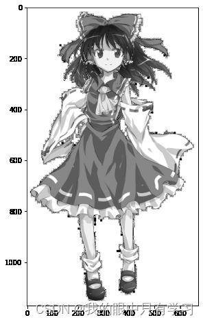
!pip install opencv-python
import matplotlib.pyplot as plt
import cv2
mask = cv2.imread('./data/2.jpeg',cv2.IMREAD_GRAYSCALE)
plt.imshow(mask,plt.cm.gray)
mask[::90,::90]
array([[  0,   0,   0,   0,   0,   0,   0,   0],
       [  0,   0,   0,  33,  48,   0,   0,   0],
       [  0,   0,   5, 219,  86,  43,  13,   0],
       [  0,   0,  81,  58, 138,   1,   0,   0],
       [  0,   0, 255, 135,  94,   4,   0,   0],
       [  0,   0, 195,  92,  67, 255,   0,   0],
       [  0, 207,   7,  93,  93, 222, 255, 110],
       [  0,   0,  95,  93,  92, 135, 136,   0],
       [  0, 171,  93,  93,  93,  93, 201,   0],
       [  0,   0, 202, 255, 243,   0,   0,   0],
       [  0,   0,   0,   0,   0,   0,   0,   0],
       [  0,   0,   0, 255,   0,   0,   0,   0],
       [  0,   0,   0,  72,   0,   0,   0,   0]], dtype=uint8)

for i in range(mask.shape[0]):
    for j in range(mask.shape[1]):
        if mask[i][j] ==0:
            mask[i][j] = 255
plt.figure(figsize=(10,8))
plt.imshow(mask,plt.cm.gray)
wc = WordCloud(font_path=r'C:\Windows\Fonts\simhei.ttf',
               min_word_length=2,
               background_color='white',
               relative_scaling=0.75,
               repeat=False,
               mask=mask
               )

wc.generate(words)
plt.figure(figsize=(10,8))
plt.imshow(wc)
3.2. Pyechart
在使用前因为需要调动render接口,所以一定需要联网,Musk码也一定要改
五分钟上手
!pip install pyecharts
Requirement already satisfied: pyecharts in c:\users\administered\anaconda3\lib\site-packages (1.6.2)
Requirement already satisfied: prettytable in c:\users\administered\anaconda3\lib\site-packages (from pyecharts) (0.7.2)
Requirement already satisfied: jinja2 in c:\users\administered\anaconda3\lib\site-packages (from pyecharts) (2.10.3)
Requirement already satisfied: simplejson in c:\users\administered\anaconda3\lib\site-packages (from pyecharts) (3.17.0)
Requirement already satisfied: MarkupSafe>=0.23 in c:\users\administered\anaconda3\lib\site-packages (from jinja2->pyecharts) (1.1.1)
# 不同的图表引入不同的类,我们这里引入Bar
from pyecharts.charts import Bar
# echarts有很多的配置项,我们引入配置项options
from pyecharts import options as opts

bar = Bar()
bar
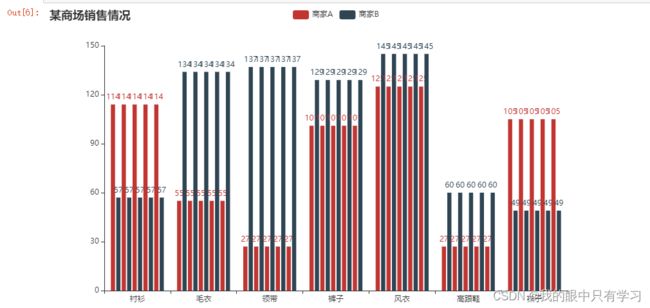
bar.set_global_opts(title_opts=opts.TitleOpts(title="某商场销售情况"))

bar.add_xaxis(["衬衫", "毛衣", "领带", "裤子", "风衣", "高跟鞋", "袜子"])

bar.add_yaxis("商家A", [114, 55, 27, 101, 125, 27, 105])
bar.add_yaxis("商家B", [57, 134, 137, 129, 145, 60, 49])

bar.render_notebook()
import pyecharts.options as opts
from pyecharts.charts import Line
from pyecharts.globals import ThemeType

init_opts = opts.InitOpts(
    width='600px',height='400px',  # 设置画布分辨率 600*400
    theme=ThemeType.WHITE
)


x_data = ["衬衫", "毛衣", "领带", "裤子", "风衣", "高跟鞋", "袜子"]
y_data1 = [114, 55, 27, 101, 125, 27, 105]
y_data2 = [57, 134, 137, 129, 145, 60, 49]

(
    Line(init_opts)
    .set_global_opts(
        tooltip_opts=opts.TooltipOpts(is_show=False),
        xaxis_opts=opts.AxisOpts(type_="category"),  # xaxis "type = category" 代表x为类别type
        yaxis_opts=opts.AxisOpts(
            type_="value",
            axistick_opts=opts.AxisTickOpts(is_show=True),
            splitline_opts=opts.SplitLineOpts(is_show=True),
        ),
        title_opts=opts.TitleOpts(title="某商场销售情况",
                                  subtitle = '第一季度'
#                                   pos_left = '80px',pos_bottom='5%'  # 标题位置迁移
                                 )

    )
    .add_xaxis(xaxis_data=x_data)
    .add_yaxis(
        series_name="商家1",
        y_axis=y_data1,
        symbol="emptyCircle",
        is_symbol_show=True,
        label_opts=opts.LabelOpts(is_show=True),
    )
    .add_yaxis(
        series_name="商家2",
        y_axis=y_data2,
        symbol="emptyCircle",
        is_symbol_show=True,
        label_opts=opts.LabelOpts(is_show=True),
    )
    .render_notebook()
)

3.2.0. pyecharts的图表样式
- 图形类 (pyecharts.charts)
- add_xaxis()
- add_yaxis()
- set_global_opts()
- set_series_opts()
- 配置类 (pyecharts.options)
-
初始化配置项 opts.InitOpts()
-
全局配置项 (设置图元组件)

-
系列配置项 (设置组件样式)
- 图元(点,线,方,片,图,…) Item
- 字体
- 线型
- 标签
- 标记
class TitleOpts(
    # 主标题文本,支持使用 \n 换行。
    title: Optional[str] = None,

    # 主标题跳转 URL 链接
    title_link: Optional[str] = None,

    # 主标题跳转链接方式
    # 默认值是: blank
    # 可选参数: 'self', 'blank'
    # 'self' 当前窗口打开; 'blank' 新窗口打开
    title_target: Optional[str] = None,

    # 副标题文本,支持使用 \n 换行。
    subtitle: Optional[str] = None,

    # 副标题跳转 URL 链接
    subtitle_link: Optional[str] = None,

    # 副标题跳转链接方式
    # 默认值是: blank
    # 可选参数: 'self', 'blank'
    # 'self' 当前窗口打开; 'blank' 新窗口打开
    subtitle_target: Optional[str] = None,

    # title 组件离容器左侧的距离。
    # left 的值可以是像 20 这样的具体像素值,可以是像 '20%' 这样相对于容器高宽的百分比,
    # 也可以是 'left', 'center', 'right'。
    # 如果 left 的值为'left', 'center', 'right',组件会根据相应的位置自动对齐。
    pos_left: Optional[str] = None,

    # title 组件离容器右侧的距离。
    # right 的值可以是像 20 这样的具体像素值,可以是像 '20%' 这样相对于容器高宽的百分比。
    pos_right: Optional[str] = None,

    # title 组件离容器上侧的距离。
    # top 的值可以是像 20 这样的具体像素值,可以是像 '20%' 这样相对于容器高宽的百分比,
    # 也可以是 'top', 'middle', 'bottom'。
    # 如果 top 的值为'top', 'middle', 'bottom',组件会根据相应的位置自动对齐。
    pos_top: Optional[str] = None,

    # title 组件离容器下侧的距离。
    # bottom 的值可以是像 20 这样的具体像素值,可以是像 '20%' 这样相对于容器高宽的百分比。
    pos_bottom: Optional[str] = None,

    # 标题内边距,单位px,默认各方向内边距为5,接受数组分别设定上右下左边距。
    # // 设置内边距为 5
    # padding: 5
    # // 设置上下的内边距为 5,左右的内边距为 10
    # padding: [5, 10]
    # // 分别设置四个方向的内边距
    # padding: [
    #     5,  // 上
    #     10, // 右
    #     5,  // 下
    #     10, // 左
    # ]
    padding: Union[Sequence, Numeric] = 5,

    # 主副标题之间的间距。
    item_gap: Numeric = 10,

    # 主标题字体样式配置项,参考 `series_options.TextStyleOpts`
    title_textstyle_opts: Union[TextStyleOpts, dict, None] = None,

    # 副标题字体样式配置项,参考 `series_options.TextStyleOpts`
    subtitle_textstyle_opts: Union[TextStyleOpts, dict, None] = None,
)
import pyecharts.options as opts
from pyecharts.charts import Line
from pyecharts.globals import ThemeType

init_opts = opts.InitOpts(
    width='600px',height='400px',  # 设置画布分辨率 600*400
    theme=ThemeType.WHITE
)

title_textstyle_opts = opts.TextStyleOpts(
    color = "#993388",
    font_style = "normal", # 'normal','italic','oblique'
    font_weight = "bolder", # 'normal','bold','bolder','lighter'
    font_family = "FangSong",  # 'Arial', 'Courier New', 'Microsoft YaHei'
    font_size = 20,
    #border_color = "black",border_width=10,width='400px',height='200px',align='right',
    #shadow_color = "red"
)

title_opts = opts.TitleOpts(
    title="重庆科技学院",  # 主标题
    title_link = "https://www.cqust.edu.cn/", # 主标题连接
    title_target = "blank",  # 新窗口打开连接
    subtitle = "数理与大数据学院",  # 子标题
    subtitle_link = "http://www.baidu.com/",
    item_gap = 5,  # 主副标题之间的间隔
    # 位置设置参数, 标题离边框的距离, 两种写法 100、100px都是像素值, 20%百分比
#     pos_left="100px",pos_right="100px",  # 两个都设置,以左边为准
#     pos_top="5%",pos_bottom="5%",
    #padding = [100,0,100,500],
    title_textstyle_opts=title_textstyle_opts,   # 设置标题文本样式
)


x_data = ["衬衫", "毛衣", "领带", "裤子", "风衣", "高跟鞋", "袜子"]
y_data1 = [114, 55, 27, 101, 125, 27, 105]
y_data2 = [57, 134, 137, 129, 145, 60, 49]

(
    Line(init_opts)
    .set_global_opts(
        tooltip_opts=opts.TooltipOpts(is_show=False),
        xaxis_opts=opts.AxisOpts(type_="category"),  # xaxis "type = category" 代表x为类别type
        yaxis_opts=opts.AxisOpts(
            type_="value",
            axistick_opts=opts.AxisTickOpts(is_show=True),
            splitline_opts=opts.SplitLineOpts(is_show=True),
        ),
        title_opts=title_opts

    )
    .add_xaxis(xaxis_data=x_data)
    .add_yaxis(
        series_name="商家1",
        y_axis=y_data1,
        symbol="emptyCircle",
        is_symbol_show=True,
        label_opts=opts.LabelOpts(is_show=True),
    )
    .add_yaxis(
        series_name="商家2",
        y_axis=y_data2,
        symbol="emptyCircle",
        is_symbol_show=True,
        label_opts=opts.LabelOpts(is_show=True),
    )
    .render_notebook()
)

opts.MarkPointItem(
    name: Union[str, NoneType] = None,
    type_: Union[str, NoneType] = None,
    value_index: Union[int, float, NoneType] = None,
    value_dim: Union[str, NoneType] = None,
    coord: Union[Sequence, NoneType] = None,
    x: Union[int, float, NoneType] = None,
    y: Union[int, float, NoneType] = None,
    value: Union[int, float, NoneType] = None,
    symbol: Union[str, NoneType] = None,
    symbol_size: Union[int, float, Sequence, NoneType] = None,
    itemstyle_opts: Union[pyecharts.options.series_options.ItemStyleOpts, dict, NoneType] = None,
)
data = [
        opts.MarkPointItem("最大值",type_='max'),
        opts.MarkPointItem("最小值",type_='min'),
        opts.MarkPointItem("平均",type_='average')]
data
[,
 ,
 ]
import pyecharts.options as opts
from pyecharts.charts import Line
from pyecharts.globals import ThemeType
init_opts = opts.InitOpts(
width='600px',height='400px', # 设置画布分辨率 600*400
theme=ThemeType.WHITE
)
# 标记最大最小均值
markpointopts = opts.MarkPointOpts(
data = [
opts.MarkPointItem("最大值",type_='max'),
opts.MarkPointItem("最小值",type_='min'),
opts.MarkPointItem("平均",type_='average')
]
)
# 标记平均线
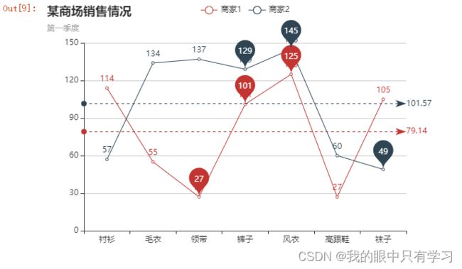
marklineopts = opts.MarkLineOpts(
is_silent=True, # 不可交互
data = [
opts.MarkLineItem("平均值",type_='average')
],
)
x_data = ["衬衫", "毛衣", "领带", "裤子", "风衣", "高跟鞋", "袜子"]
y_data1 = [114, 55, 27, 101, 125, 27, 105]
y_data2 = [57, 134, 137, 129, 145, 60, 49]
(
Line(init_opts)
.set_global_opts(
tooltip_opts=opts.TooltipOpts(is_show=False),
xaxis_opts=opts.AxisOpts(type_="category"), # xaxis "type = category" 代表x为类别type
yaxis_opts=opts.AxisOpts(
type_="value",
axistick_opts=opts.AxisTickOpts(is_show=True),
splitline_opts=opts.SplitLineOpts(is_show=True),
),
title_opts=opts.TitleOpts(title="某商场销售情况",
subtitle = '第一季度'
# pos_left = '80px',pos_bottom='5%' # 标题位置迁移
)
)
.add_xaxis(xaxis_data=x_data)
.add_yaxis(
series_name="商家1",
y_axis=y_data1,
symbol="emptyCircle",
is_symbol_show=True,
label_opts=opts.LabelOpts(is_show=True),
markpoint_opts=markpointopts,markline_opts=marklineopts
)
.add_yaxis(
series_name="商家2",
y_axis=y_data2,
symbol="emptyCircle",
is_symbol_show=True,
label_opts=opts.LabelOpts(is_show=True),
markpoint_opts=markpointopts,markline_opts=marklineopts
)
.render_notebook()
)
3.2.1. Line()
import pyecharts.options as opts
from pyecharts.charts import Line
from pyecharts.globals import ThemeType

init_opts = opts.InitOpts(
    width='600px',height='400px',  # 设置画布分辨率 600*400
    theme=ThemeType.WHITE
)


x_data = ["衬衫", "毛衣", "领带", "裤子", "风衣", "高跟鞋", "袜子"]
y_data1 = [114, 55, 27, 101, 125, 27, 105]
y_data2 = [57, 134, 137, 129, 145, 60, 49]

(
    Line(init_opts)
    .set_global_opts(
        tooltip_opts=opts.TooltipOpts(is_show=False),
        xaxis_opts=opts.AxisOpts(type_="category"),  # xaxis "type = category" 代表x为类别type
        yaxis_opts=opts.AxisOpts(
            type_="value",
            axistick_opts=opts.AxisTickOpts(is_show=True),
            splitline_opts=opts.SplitLineOpts(is_show=True),
        ),
        title_opts=opts.TitleOpts(title="某商场销售情况")
    )
    .add_xaxis(xaxis_data=x_data)
    .add_yaxis(
        series_name="商家1",
        y_axis=y_data1,
        symbol="emptyCircle",
        is_symbol_show=True,
        label_opts=opts.LabelOpts(is_show=True),
    )
    .add_yaxis(
        series_name="商家2",
        y_axis=y_data2,
        symbol="emptyCircle",
        is_symbol_show=True,
        label_opts=opts.LabelOpts(is_show=True),
    )
    .render_notebook()
)

折线填充图
import pyecharts.options as opts
from pyecharts.charts import Line
from pyecharts.globals import ThemeType

init_opts = opts.InitOpts(
    width='600px',height='400px',  # 设置画布分辨率 600*400
    theme=ThemeType.WHITE
)


x_data = ["衬衫", "毛衣", "领带", "裤子", "风衣", "高跟鞋", "袜子"]
y_data1 = [114, 55, 27, 101, 125, 27, 105]
y_data2 = [57, 134, 137, 129, 145, 60, 49]

(
    Line(init_opts)
    .set_global_opts(
        tooltip_opts=opts.TooltipOpts(is_show=False),
        xaxis_opts=opts.AxisOpts(type_="category"),  # xaxis "type = category" 代表x为类别type
        yaxis_opts=opts.AxisOpts(
            type_="value",
            axistick_opts=opts.AxisTickOpts(is_show=True),
            splitline_opts=opts.SplitLineOpts(is_show=True),
        ),
        title_opts=opts.TitleOpts(title="某商场销售情况")
    )
    .add_xaxis(xaxis_data=x_data)
    .add_yaxis(
        series_name="商家1",
        y_axis=y_data1,
        areastyle_opts=opts.AreaStyleOpts(opacity=0.3,color='yellow'),
        z_level=200
    )
    .add_yaxis(
        series_name="商家2",
        y_axis=y_data2,
        areastyle_opts=opts.AreaStyleOpts(opacity=0.3,color='red'),
        z_level=200
    )
    .render_notebook()
)

各种折线图汇总
from pyecharts.faker import Faker
X = Faker.choose()
Y1 = Faker.values()
Y2 = Faker.values()
Y2[3] = None
Y3 = Faker.values()
Y3[3] = None

initopts = opts.InitOpts(width='900px',height='400px',theme=ThemeType.WHITE)
line = Line(init_opts=initopts)

line.add_xaxis(Faker.choose())
# 图形展开时不显示Y1
line.add_yaxis("开始不选中",Y1, is_selected=False)
# 中间的空值直接断开
line.add_yaxis("空值断开",Y2)
line.add_yaxis("空值连续",Y3, is_connect_nones=True)
# 点上不显示值
line.add_yaxis("无数据点",Faker.values(), is_symbol_show=False, symbol='none')
# 'circle', 'rect', 'roundRect', 'triangle', 'diamond', 'pin', 'arrow', 'none'
line.add_yaxis("点样式",Faker.values(), symbol='roundRect',symbol_size=12)
line.add_yaxis("无点动画",Faker.values(), is_hover_animation=False)
line.add_yaxis("曲线",Faker.values(), is_smooth=True)
line.add_yaxis("阶梯线",Faker.values(), is_step=False)
# 相同的z_level优先级由数据本身顺序确定
line.add_yaxis("重叠填充A",Faker.values(), areastyle_opts=opts.AreaStyleOpts(opacity=0.3,color='yellow'),z_level=200)
line.add_yaxis("重叠填充B",Faker.values(), areastyle_opts=opts.AreaStyleOpts(opacity=0.3,color='red'),z_level=100)
line.add_yaxis("堆叠填充A",Faker.values(), areastyle_opts=opts.AreaStyleOpts(opacity=0.3,color='yellow'),z_level=200,stack='a')
line.add_yaxis("堆叠填充B",Faker.values(), areastyle_opts=opts.AreaStyleOpts(opacity=0.3,color='red'),z_level=100,stack='a')
line.add_yaxis("标签定制",Faker.values(), label_opts=opts.LabelOpts())


line.render_notebook()

3.2.2. Bar()
Bar.add_yaxis?
import pyecharts.options as opts
from pyecharts.globals import ChartType,CurrentConfig,RenderType,ThemeType
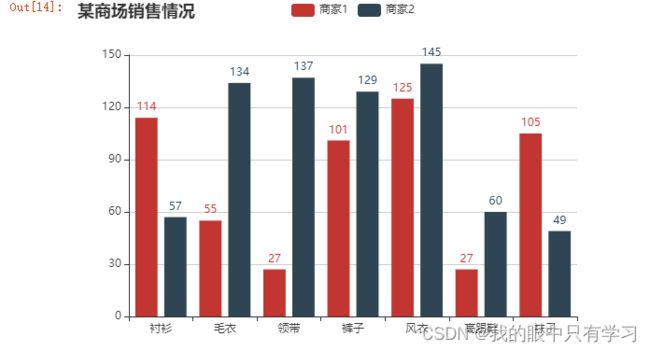
from pyecharts.charts import Bar
x_data = ["衬衫", "毛衣", "领带", "裤子", "风衣", "高跟鞋", "袜子"]
y_data1 = [114, 55, 27, 101, 125, 27, 105]
y_data2 = [57, 134, 137, 129, 145, 60, 49]
init_opts = opts.InitOpts(
width='600px',height='400px', # 设置画布分辨率 600*400
theme=ThemeType.WHITE
)
(
Bar(init_opts)
.set_global_opts(title_opts=opts.TitleOpts(title="某商场销售情况"),
tooltip_opts=opts.TooltipOpts(is_show=True),
xaxis_opts=opts.AxisOpts(type_="category"), # xaxis "type = category" 代表x为类别type
yaxis_opts=opts.AxisOpts(
type_="value",
axistick_opts=opts.AxisTickOpts(is_show=True),
splitline_opts=opts.SplitLineOpts(is_show=True),
)
)
.add_xaxis(xaxis_data=x_data)
.add_yaxis(
series_name="商家1",
y_axis=y_data1 # 这里的接口数据就不是Line下面的y_axis!
)
.add_yaxis(
series_name="商家2",
y_axis=y_data2
)
.render_notebook()
)
)
3.2.3. Scatter()
x_data = ["衬衫", "毛衣", "领带", "裤子", "风衣", "高跟鞋", "袜子"]
y_data1 = [114, 55, 27, 101, 125, 27, 105]
y_data2 = [57, 134, 137, 129, 145, 60, 49]
import pyecharts.options as opts
from pyecharts.charts import Scatter
from pyecharts.globals import ThemeType

init_opts = opts.InitOpts(
    width='600px',height='400px',  # 设置画布分辨率 600*400
    theme=ThemeType.WHITE
)

(
    Scatter(init_opts=init_opts)
    .set_global_opts(title_opts=opts.TitleOpts(title="某商场销售情况"),
    tooltip_opts=opts.TooltipOpts(is_show=True),
    xaxis_opts=opts.AxisOpts(type_="category"),  # xaxis "type = category" 代表x为类别type
    yaxis_opts=opts.AxisOpts(
        type_="value",
        axistick_opts=opts.AxisTickOpts(is_show=True),
        splitline_opts=opts.SplitLineOpts(is_show=True),
    )
                    )
    .add_xaxis(xaxis_data=x_data)
    .add_yaxis(
        series_name="商家1",
        y_axis=y_data1,
        symbol_size=10,
        label_opts=opts.LabelOpts(is_show=True)
    )
    .add_yaxis(
        series_name="商家2",
#         color = 'blue',
        y_axis=y_data2,
        symbol_size=10,
        label_opts=opts.LabelOpts(is_show=True),
    )

    .render_notebook()
)

3.2.4. Pie()
x_data = ["衬衫", "毛衣", "领带", "裤子", "风衣", "高跟鞋", "袜子"]
y_data = [114, 55, 27, 101, 125, 27, 105]
data_pair = [list(z) for z in zip(x_data,y_data )]
data_pair.sort(key=lambda x: x[1])
data_pair
[['领带', 27],
 ['高跟鞋', 27],
 ['毛衣', 55],
 ['裤子', 101],
 ['袜子', 105],
 ['衬衫', 114],
 ['风衣', 125]]
import pyecharts.options as opts
from pyecharts.charts import Pie

init_opts = opts.InitOpts(
    width='600px',height='400px',  # 设置画布分辨率 600*400
#     theme=ThemeType.WHITE,
    bg_color="#2c343c"  # 背景颜色,跟theme作用类似
)

(
    Pie(init_opts=init_opts)
    .set_global_opts(
        title_opts=opts.TitleOpts(
            title="某商场销售情况",
            pos_left="center",
            pos_top="20",
            title_textstyle_opts=opts.TextStyleOpts(color="#fff"),
        ),
        legend_opts=opts.LegendOpts(is_show=False),
    )
    .add(
        series_name="商家1",
         # 输入的数据在这里 类型:[['视频广告', 235], ['联盟广告', 274], ['邮件营销', 310], ['直接访问', 335], ['搜索引擎', 400]]
        data_pair=data_pair,
        rosetype="radius",
        radius="55%",
        center=["50%", "50%"],
        label_opts=opts.LabelOpts(is_show=False, position="center"),
    )
    .set_series_opts(
        tooltip_opts=opts.TooltipOpts(
            trigger="item", formatter="{a}
{b}: {c} ({d}%)"
        ),
        label_opts=opts.LabelOpts(color="rgba(255, 255, 255, 0.3)"),
    )

    .render_notebook()
)

import pyecharts.options as opts
from pyecharts.charts import Scatter
from pyecharts.charts import Pie
from pyecharts.globals import ThemeType

init_opts = opts.InitOpts(
    width='600px',height='400px',  # 设置画布分辨率 600*400
    theme=ThemeType.WHITE
)

(
    Scatter(init_opts=init_opts)
    .set_global_opts(title_opts=opts.TitleOpts(title="某商场销售情况"),
    tooltip_opts=opts.TooltipOpts(is_show=True),
    xaxis_opts=opts.AxisOpts(type_="category"),  # xaxis "type = category" 代表x为类别type
    yaxis_opts=opts.AxisOpts(
        type_="value",
        axistick_opts=opts.AxisTickOpts(is_show=True),
        splitline_opts=opts.SplitLineOpts(is_show=True),
    )
                    )
    .add_xaxis(xaxis_data=x_data)
    .add_yaxis(
        series_name="商家1",
        y_axis=y_data1,
        symbol_size=10,
        label_opts=opts.LabelOpts(is_show=True)
    )
    .add_yaxis(
        series_name="商家2",
#         color = 'blue',
        y_axis=y_data2,
        symbol_size=10,
        label_opts=opts.LabelOpts(is_show=True),
    )
)

(

    Pie(init_opts=init_opts)
    .set_global_opts(
        title_opts=opts.TitleOpts(
            title="某商场销售情况",
            pos_left="center",
            pos_top="20",
            title_textstyle_opts=opts.TextStyleOpts(color="#fff"),
        ),
        legend_opts=opts.LegendOpts(is_show=False),
    )
    .add(
        series_name="商家1",
         # 输入的数据在这里 类型:[['视频广告', 235], ['联盟广告', 274], ['邮件营销', 310], ['直接访问', 335], ['搜索引擎', 400]]
        data_pair=data_pair,
        rosetype="radius",
        radius="55%",
        center=["50%", "50%"],
        label_opts=opts.LabelOpts(is_show=False, position="center"),
    )
    .set_series_opts(
        tooltip_opts=opts.TooltipOpts(
            trigger="item", formatter="{a}
{b}: {c} ({d}%)"
        ),
        label_opts=opts.LabelOpts(color="rgba(255, 255, 255, 0.3)"),
    )
    .render_notebook()
)

3.2.5. Overlap(图像堆叠)
from pyecharts import options as opts
from pyecharts.charts import Bar, Line
from pyecharts.faker import Faker

v1 = [2.0, 4.9, 7.0, 23.2, 25.6, 76.7, 135.6, 162.2, 32.6, 20.0, 6.4, 3.3]  # 蒸发量
v2 = [2.6, 5.9, 9.0, 26.4, 28.7, 70.7, 175.6, 182.2, 48.7, 18.8, 6.0, 2.3]  # 降水量
v3 = [2.0, 2.2, 3.3, 4.5, 6.3, 10.2, 20.3, 23.4, 23.0, 16.5, 12.0, 6.2]     # 平均温度


bar = (
    Bar()
    .add_xaxis(Faker.months)
    .add_yaxis("蒸发量", v1)
    .add_yaxis("降水量", v2)
    .extend_axis(
        yaxis=opts.AxisOpts(
            axislabel_opts=opts.LabelOpts(formatter="{value} °C"), interval=5
        )
    )
    .set_series_opts(label_opts=opts.LabelOpts(is_show=False))
    .set_global_opts(
        title_opts=opts.TitleOpts(title="Overlap-bar+line"),
        yaxis_opts=opts.AxisOpts(axislabel_opts=opts.LabelOpts(formatter="{value} ml")),
    )
)

line = Line().add_xaxis(Faker.months).add_yaxis("平均温度", v3, yaxis_index=1)
bar.overlap(line)
#bar.render("overlap_bar_line.html")
bar.render_notebook()

3.2.6. Grid(plt.subplot)
from pyecharts import options as opts
from pyecharts.charts import Grid, Line, Scatter, Bar, Pie
from pyecharts.faker import Faker

scatter = (
    Scatter()
    .add_xaxis(Faker.choose())
    .add_yaxis("商家A", Faker.values())
    .add_yaxis("商家B", Faker.values())
    .set_global_opts(
        title_opts=opts.TitleOpts(title="Grid-Scatter"),
        legend_opts=opts.LegendOpts(pos_left="20%"),
    )
)

line = (
    Line()
    .add_xaxis(Faker.choose())
    .add_yaxis("商家C", Faker.values())
    .add_yaxis("商家D", Faker.values())
    .set_global_opts(
        title_opts=opts.TitleOpts(title="Grid-Line", pos_right="5%"),  # 这个位置是按照整个图的位置来算
        legend_opts=opts.LegendOpts(pos_right="20%"),
    )
)

grid = (
    Grid()
    .add(scatter, grid_opts=opts.GridOpts(pos_top="55%"))
    .add(line, grid_opts=opts.GridOpts(pos_bottom="55%"))
)

grid.render_notebook()
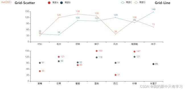
3.2.7. Page(自动化subplot)
from pyecharts import options as opts
from pyecharts.charts import Page, Grid, Line, Scatter, Bar, Pie
from pyecharts.faker import Faker

def make_line():
    line = Line(init_opts=opts.InitOpts(chart_id="line1"))
    line.add_xaxis(Faker.choose())
    line.add_yaxis("商家A", Faker.values())
    line.add_yaxis("商家B", Faker.values())
    line.set_global_opts(
        title_opts=opts.TitleOpts(title="Grid-Line", pos_right="5%"),
        legend_opts=opts.LegendOpts(pos_right="20%"),
    )
    return line


def make_scatter(x,y,title,chart_id='scatter1'):
    scatter = Scatter(init_opts=opts.InitOpts(chart_id=chart_id))
    scatter.add_xaxis(x)
    for yname,ylist in y.items():
        scatter.add_yaxis(yname, ylist)

    scatter.set_global_opts(
        title_opts=opts.TitleOpts(title=title),
        legend_opts=opts.LegendOpts(pos_left="20%"),
    )
    return scatter


def make_chart(x,y,title,chart_id='scatter1',Chart=Scatter):
    from pyecharts.globals import ChartType

    c = Chart(init_opts=opts.InitOpts(chart_id=chart_id))

    if isinstance(c,Pie): # 如果是pie
        c.add("",list(zip(x,y)))
        return c

    c.add_xaxis(x)
    for yname,ylist in y.items():
        c.add_yaxis(yname, ylist)

    c.set_global_opts(
        title_opts=opts.TitleOpts(title=title),
        legend_opts=opts.LegendOpts(pos_left="20%"),
    )
    return c

def make_scatter():
    scatter = Scatter(init_opts=opts.InitOpts(chart_id="scatter1"))
    scatter.add_xaxis(Faker.choose())
    scatter.add_yaxis("商家A", Faker.values())
    scatter.add_yaxis("商家B", Faker.values())
    scatter.set_global_opts(
        title_opts=opts.TitleOpts(title="Grid-Scatter"),
        legend_opts=opts.LegendOpts(pos_left="20%"),
    )
    return scatter

# 构造数据成下面的样子
X = Faker.choose()  # X是一个列表
Y = {"棉花":Faker.values(),
     "油料":Faker.values(),
     "粮食":Faker.values()}   # Y是一个字典,包含{系列名:系列数据(列表)} 这样的键值对


page = Page(page_title='Page示例',layout=Page.DraggablePageLayout)  # 生成可拖拽的页面布局

page.add(
    make_chart(X,Y,"My Scatter","scatter1",Scatter),
    make_chart(X,Y,"My Bar","bar1",Bar),
    make_chart(X,Y,"My Line","line1",Line),
    make_chart(X,Faker.values(),"My Pie","pie",Pie),)
page.render("page.html")  # 生成一个HTML页面
'G:\\数据可视化\\data_visualization\\page.html'
Page.save_resize_html("page.html", cfg_file="./chart_config.json", dest="new_page.html")
'\n\n\n \n Page示例 \n \n \n \n \n\n \n\n\n\n \n \n \n \n \n
\n \n
\n \n
\n \n
\n \n\n\n'
page.render_notebook()

3.2.8. Timeline
from pyecharts import options as opts
from pyecharts.charts import Bar, Timeline
from pyecharts.faker import Faker

x = Faker.choose()
tl = Timeline()
for i in range(2015, 2020):
    bar = (
        Bar()
        .add_xaxis(x)
        .add_yaxis("商家A", Faker.values())
        .add_yaxis("商家B", Faker.values())
        .set_global_opts(title_opts=opts.TitleOpts("某商店{}年营业额".format(i)))
    )
    tl.add(bar, "{}年".format(i))
tl.render("timeline_bar.html")
tl.render_notebook()
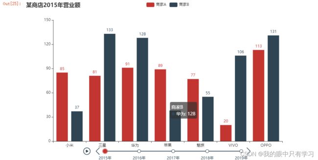
四、作业
4.1. 作业1
import pandas as pd
data = pd.read_excel('./data/粮食产量.xlsx',header=0)
data.head(5)

# 将统计时间中的“年”去除,并转换成int格式
for i in range(len(data['统计时间'])):
    data['统计时间'][i] = int(data['统计时间'][i][:-1])

# 将统计时间设置成为index
data = data.set_index('统计时间')
data.head(5)

# 选取2010以后的粮棉油产值
data_filter1  = data[data.index>=2010][['粮食产量(万吨)','棉花(万吨)','油料(万吨)']]
# 量级不同,转换:
# 粮食产量(万吨)==》 粮食产量(百万吨)
# 油料(万吨)==》油料(十万吨)
data_filter1['粮食产量(百万吨)'] = data_filter1['粮食产量(万吨)']/100

data_filter1['油料(十万吨)'] = data_filter1['油料(万吨)']/10
data_filter1 = data_filter1[['粮食产量(百万吨)','棉花(万吨)','油料(十万吨)']]
data_filter1.head(5)

data_filter2  = data[['粮食产量(万吨)','棉花(万吨)','油料(万吨)']].T
data_filter2[2021].head(5)

data_filter3 = pd.DataFrame()
data_filter3['粮食产值(万元)'] = data['粮食产量(万吨)']*3600
data_filter3['棉花产值(万元)'] = data['棉花(万吨)']*16000
data_filter3['油料产值(万元)'] = data['油料(万吨)']*6000
data_filter3 = data_filter3.T
data_filter3[2021].head(5)

import matplotlib.pyplot as plt
plt.rcParams['font.sans-serif']=['SimHei']     #显示中文
plt.rcParams['axes.unicode_minus']=False       #正常显示负号

plt.figure(figsize=(12,10))      #设置图形大小
plt.suptitle('',x=0.52,y=1.02,fontsize=18)

ax1= plt.subplot(311)
data['棉花(万吨)'].plot(title="2001-2021年棉花产量走势折线图",ax=ax1)

ax2= plt.subplot(312)
data_filter1.plot.bar(title="2010-2021年粮棉油增长率柱状图",ax=ax2)

ax3= plt.subplot(325)
data_filter2.plot.pie(y=2021,title="2021年棉粮油产量比例饼状图",ax=ax3)

ax4= plt.subplot(326)
data_filter3.plot.pie(y=2021,title="2021年棉粮油经济价值比例饼状图",ax=ax4)

plt.tight_layout()
C:\Users\administered\Anaconda3\lib\site-packages\ipykernel_launcher.py:7: SettingWithCopyWarning:
A value is trying to be set on a copy of a slice from a DataFrame

See the caveats in the documentation: http://pandas.pydata.org/pandas-docs/stable/user_guide/indexing.html#returning-a-view-versus-a-copy
  import sys

4.2. 期中考试
import pandas as pd

data_CPI = pd.read_csv(r'./附件/CPI.csv',encoding='GB2312')
data_GDP = pd.read_excel(r'./附件/GDP.xls')
data_global = pd.read_csv(r'./附件/WHO-COVID-19-global-data.csv')

import matplotlib.pyplot as plt
plt.rcParams['font.sans-serif']=['SimHei']     #显示中文
plt.rcParams['axes.unicode_minus']=False       #正常显示负号

data_GDP_filter = data_GDP[['统计时间','国内生产总值季度累计同比增长(%)','第一产业增加值季度累计同比增长(%)','第二产业增加值季度累计同比增长(%)',
          '第三产业增加值季度累计同比增长(%)']]
data_GDP_filter = data_GDP_filter.set_index('统计时间')

# 由图一可见在第一波疫情高峰时是在2020年第一季度
data_bystrack = pd.DataFrame()
data_bystrack["2020第1季度"] = data_GDP_filter.T["2020第1季度"]
for i in range(data_GDP_filter.T["2020第1季度"].shape[0]):
    data_bystrack["2020第1季度"][i] = (data_GDP_filter.T["2020第1季度"][i] - min(data_GDP_filter.T["2020第1季度"]))/(max(data_GDP_filter.T["2020第1季度"])-min(data_GDP_filter.T["2020第1季度"]))

data_CPI_filter = data_CPI[['统计时间','城市消费价格月度同比涨跌(%)','农村消费价格月度同比涨跌(%)']]
data_CPI_filter = data_CPI_filter.set_index('统计时间')

plt.figure(figsize=(15,10))      #设置图形大小
plt.suptitle('',x=0.51,y=1.02,fontsize=18)

ax1= plt.subplot(221)
data_GDP_filter.plot(title="新冠疫情对GDP增长趋势的影响",ax=ax1)

ax2= plt.subplot(222)
explodes = [0.05, 0.05, 0.05,0.05]

data_bystrack.plot.pie(title="第一、二、三产业在第一波疫情高峰时遭受冲击的比例",y='2020第1季度',ax=ax2,autopct='%.2f%%',
            textprops={'fontsize':12,'color':'k'},explode=explodes)

ax3= plt.subplot(212)
data_CPI_filter.plot.bar(title="疫情对城乡居民消费价格的影响", ax=ax3)

plt.tight_layout()

4.3. 作业2
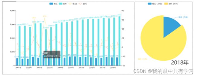
- 2001-2020年棉花、油料产量走势折线图
- 2001-2020年棉花、油料增长率柱状图
- 2001-2020年棉花、油料产量比例饼状图随时间变化的时间线
import pandas as pd

data = pd.read_excel('./data/粮食产量.xls')
data_filter = data[['统计时间','棉花(万吨)','油料(万吨)']]

for i in range(len(data_filter['统计时间'])):
    data_filter['统计时间'][i] = int(data_filter['统计时间'][i][:-1])

data_filter
:7: SettingWithCopyWarning:
A value is trying to be set on a copy of a slice from a DataFrame

See the caveats in the documentation: https://pandas.pydata.org/pandas-docs/stable/user_guide/indexing.html#returning-a-view-versus-a-copy
  data_filter['统计时间'][i] = int(data_filter['统计时间'][i][:-1])
D:\Python\Anaconda\lib\site-packages\IPython\core\interactiveshell.py:3437: SettingWithCopyWarning:
A value is trying to be set on a copy of a slice from a DataFrame

See the caveats in the documentation: https://pandas.pydata.org/pandas-docs/stable/user_guide/indexing.html#returning-a-view-versus-a-copy
  exec(code_obj, self.user_global_ns, self.user_ns)
| 统计时间 | 棉花(万吨) | 油料(万吨) | |
|---|---|---|---|
| 0 | 2001 | 532.35 | 2864.90 |
| 1 | 2002 | 491.62 | 2897.20 |
| 2 | 2003 | 485.97 | 2811.00 |
| 3 | 2004 | 632.35 | 3065.91 |
| 4 | 2005 | 571.42 | 3077.14 |
| 5 | 2006 | 753.28 | 2640.31 |
| 6 | 2007 | 759.71 | 2786.99 |
| 7 | 2008 | 723.23 | 3036.76 |
| 8 | 2009 | 623.58 | 3139.42 |
| 9 | 2010 | 577.04 | 3156.77 |
| 10 | 2011 | 651.89 | 3212.51 |
| 11 | 2012 | 660.80 | 3285.62 |
| 12 | 2013 | 628.16 | 3348.00 |
| 13 | 2014 | 629.94 | 3371.92 |
| 14 | 2015 | 590.74 | 3390.47 |
| 15 | 2016 | 534.28 | 3400.05 |
| 16 | 2017 | 565.25 | 3475.24 |
| 17 | 2018 | 610.28 | 3433.39 |
| 18 | 2019 | 588.90 | 3492.98 |
| 19 | 2020 | 591.05 | 3586.40 |
| 20 | 2021 | 573.00 | 3613.00 |
y_data = data_filter[data_filter['统计时间']==2019][['棉花(万吨)','油料(万吨)']].values.tolist()[0]

y_data
[]
x_data = data_filter.columns.to_list()
x_data = x_data[1:]

x_data
['棉花(万吨)', '油料(万吨)']
data_pair = [list(z) for z in zip(x_data,y_data)]
data_pair.sort(key=lambda x: x[1])

data_pair
[['棉花(万吨)', 588.9], ['油料(万吨)', 3492.98]]
2001-2020年棉花、油料产量比例饼状图随时间变化的时间线
from pyecharts import options as opts
from pyecharts.charts import Pie, Timeline
from pyecharts.globals import ThemeType
import pandas as pd

tl = Timeline(init_opts=init_opts)
init_opts = opts.InitOpts(
#     width='600px',height='400px',  # 设置画布分辨率 600*400
    theme=ThemeType.WHITE
)

data = pd.read_excel('./data/粮食产量.xls')

data_filter = data[['统计时间','棉花(万吨)','油料(万吨)']]
for i in range(len(data_filter['统计时间'])):
    data_filter['统计时间'][i] = int(data_filter['统计时间'][i][:-1])

x_data = data_filter.columns.to_list()[1:]

for i in range(2001, 2022):
    y_data = data_filter[data_filter['统计时间']==i][['棉花(万吨)','油料(万吨)']].values.tolist()[0]
    data_pair = [list(z) for z in zip(x_data,y_data)]
    data_pair.sort(key=lambda x: x[1])

    pie = (
    Pie(init_opts=init_opts)
    .set_global_opts(
        title_opts=opts.TitleOpts(title="{}年棉花、油料产量比例饼状图".format(i),pos_left="center",pos_top="20"),
        legend_opts=opts.LegendOpts(is_show=True),
    )
    .add(
        series_name= "{}年棉花、油料产量比例饼状图".format(i),
        data_pair=data_pair,
        label_opts=opts.LabelOpts(is_show=True),
    )
)
    tl.add(pie, "{}年".format(i))


tl.render_notebook()

import pandas as pd

data = pd.read_excel('./data/粮食产量.xls')
data_filter2 = data[['统计时间','棉花(万吨)','油料(万吨)']]

data_filter2.head()

x_data = data_filter2['统计时间'].values.tolist()

print(x_data)
['2001年', '2002年', '2003年', '2004年', '2005年', '2006年', '2007年', '2008年', '2009年', '2010年', '2011年', '2012年', '2013年', '2014年', '2015年', '2016年', '2017年', '2018年', '2019年', '2020年', '2021年']
y_data1 = data_filter2['棉花(万吨)'].values.tolist()
y_data2 = data_filter2['油料(万吨)'].values.tolist()
import pyecharts.options as opts
from pyecharts.charts import Line
from pyecharts.globals import ThemeType

init_opts = opts.InitOpts()


(
    Line(init_opts)
    .set_global_opts(title_opts=opts.TitleOpts(title="2001-2020年棉花、油料产量走势折线图")
    )
    .add_xaxis(xaxis_data=x_data)
    .add_yaxis(
        series_name="棉花(万吨)",
        y_axis=y_data1,
        symbol="emptyCircle",
        is_symbol_show=True,
        label_opts=opts.LabelOpts(is_show=True),
    )
    .add_yaxis(
        series_name="油料(万吨)",
        y_axis=y_data2,
        symbol="emptyCircle",
        is_symbol_show=True,
        label_opts=opts.LabelOpts(is_show=True),
    )
    .render_notebook()
)
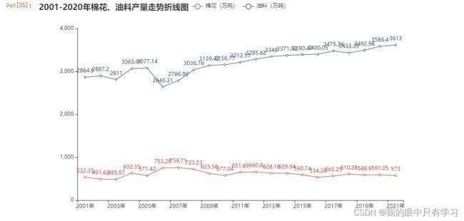
data_filter3 = data[['统计时间','棉花增长(%)','油料增长(%)']]
x_data = data_filter3['统计时间'].values.tolist()

y_data1 = data_filter3['棉花增长(%)'].values.tolist()
y_data2 = data_filter3['油料增长(%)'].values.tolist()
import pyecharts.options as opts
from pyecharts.globals import ChartType,CurrentConfig,RenderType,ThemeType
from pyecharts.charts import Bar

init_opts = opts.InitOpts(
#     width='600px',height='400px',  # 设置画布分辨率 600*400
#     theme=ThemeType.WHITE
)
(
    Bar(init_opts)
    .set_global_opts(title_opts=opts.TitleOpts(title="2001-2020年棉花、油料增长率柱状图"),
        tooltip_opts=opts.TooltipOpts(is_show=True),
        xaxis_opts=opts.AxisOpts(type_="category"),  # xaxis "type = category" 代表x为类别type
        yaxis_opts=opts.AxisOpts(
            type_="value",
            axistick_opts=opts.AxisTickOpts(is_show=True),
            splitline_opts=opts.SplitLineOpts(is_show=True),
        )
                    )
    .add_xaxis(xaxis_data=x_data)
    .add_yaxis(
        series_name="棉花增长(%)",
        y_axis=y_data1  # 这里的接口数据就不是Line下面的y_axis!
    )
    .add_yaxis(
        series_name="油料增长(%)",
        y_axis=y_data2
    )

    .render_notebook()

)

2001-2020年棉花、油料增长率柱状图\产量走势折线
import pyecharts.options as opts
from pyecharts.globals import ChartType,CurrentConfig,RenderType,ThemeType
from pyecharts.charts import Bar, Line

init_opts = opts.InitOpts(
#     width='600px',height='400px',  # 设置画布分辨率 600*400
    theme=ThemeType.LIGHT
)

data_filter2 = data[['统计时间','棉花(万吨)','油料(万吨)']]
data_filter3 = data[['统计时间','棉花增长(%)','油料增长(%)']]

x_data = data_filter3['统计时间'].values.tolist()

y_data_bar1 = data_filter2['棉花(万吨)'].values.tolist()
y_data_bar2 = data_filter2['油料(万吨)'].values.tolist()

y_data_line1 = data_filter3['棉花增长(%)'].values.tolist()
y_data_line2 = data_filter3['油料增长(%)'].values.tolist()

# 设置手动设置条
h_datazoom_opts=opts.DataZoomOpts(
    orient='horizontal',   # 水平:horizontal,  竖直:vertical
    range_start=0,  # 百分比
    range_end=50
)
v_datazoom_opts=opts.DataZoomOpts(
    orient='vertical',   # 水平:horizontal,  竖直:vertical
    range_start=0,  # 百分比
    range_end=100
)
i_datazoom_opts=opts.DataZoomOpts(
    type_='inside',
)

# Bar图
bar = (
    Bar()
    .add_xaxis(x_data)
    .add_yaxis(
        series_name="棉花(万吨)",
        y_axis=y_data_bar1
#         stack='a'
    )
    .add_yaxis(
        series_name="油料(万吨)",
        y_axis=y_data_bar2
#         stack='a'
    )
    .set_series_opts(label_opts=opts.LabelOpts(is_show=True))
    )

# Line图
line = (
    Line(init_opts=init_opts)
    .set_global_opts(title_opts=opts.TitleOpts(title="2001-2020年棉花、油料增长率柱状图/折线图",pos_left="center",pos_top="20"),
                     # 设置手动条box
                     datazoom_opts=[h_datazoom_opts,v_datazoom_opts,i_datazoom_opts],
                     toolbox_opts=opts.ToolboxOpts(feature=opts.ToolBoxFeatureOpts(data_view=None,data_zoom=None,restore=None,brush=None,magic_type=opts.ToolBoxFeatureMagicTypeOpts())),
                     # 设置框框
                     tooltip_opts=opts.TooltipOpts(trigger='axis',trigger_on='mousemove',axis_pointer_type="cross"),
                     # x轴设置
                     xaxis_opts=opts.AxisOpts(
                         name='年度',
                         type_="category",
                         axispointer_opts=opts.AxisPointerOpts(is_show=True, type_="shadow")),
                     # y轴设置
                     yaxis_opts=opts.AxisOpts(
                         name='增长情况(万吨)',
                         type_="value",
                         axistick_opts=opts.AxisTickOpts(is_show=True),
                         splitline_opts=opts.SplitLineOpts(is_show=True))
                    )
    # (只有主图需要)附加轴名称
    .extend_axis(yaxis=opts.AxisOpts(name='增长率(%)'))
    .add_xaxis(x_data)
    .add_yaxis(
        series_name="棉花增长率(%)",
        y_axis=y_data_line1,
        symbol="emptyCircle",
        is_symbol_show=True,
        label_opts=opts.LabelOpts(is_show=False),
        # 让line图使用扩展y轴,且优先级up
        yaxis_index=1,z=100
    )
    .add_yaxis(
        series_name="油料增长率(%)",
        y_axis=y_data_line2,
        symbol="emptyCircle",
        is_symbol_show=True,
        label_opts=opts.LabelOpts(is_show=False),
        # 让line图使用扩展y轴,且优先级up
        yaxis_index=1,z=100
    )
)

line.overlap(bar)
line.render_notebook()
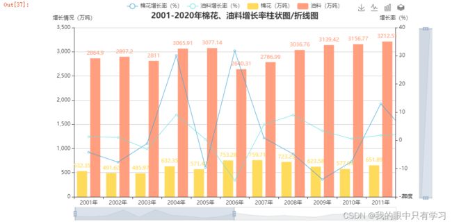
合并
import pyecharts.options as opts
import pandas as pd
from pyecharts.globals import ChartType,CurrentConfig,RenderType,ThemeType
from pyecharts.charts import Bar, Line, Page, Timeline

data = pd.read_excel('./data/粮食产量.xls')

# TimeLine图
tl = Timeline()
init_opts = opts.InitOpts(
    width='600px',height='400px',  # 设置画布分辨率 600*400
    theme=ThemeType.WHITE
)

data_filter = data[['统计时间','棉花(万吨)','油料(万吨)']]
for i in range(len(data_filter['统计时间'])):
    data_filter['统计时间'][i] = int(data_filter['统计时间'][i][:-1])

x_data = data_filter.columns.to_list()[1:]

for i in range(2001, 2021):
    y_data = data_filter[data_filter['统计时间']==i][['棉花(万吨)','油料(万吨)']].values.tolist()[0]
    data_pair = [list(z) for z in zip(x_data,y_data)]
    data_pair.sort(key=lambda x: x[1])

    pie = (
    Pie(init_opts=init_opts)
    .set_global_opts(
        title_opts=opts.TitleOpts(title="2001-2020年棉花、油料产量比例饼状图随时间变化的时间线",pos_left="center",pos_top="20"),
        legend_opts=opts.LegendOpts(is_show=True),
    )
    .add(
        series_name= "{}年棉花、油料产量比例饼状图".format(i),
        data_pair=data_pair,
        label_opts=opts.LabelOpts(is_show=True),
    )
)
    tl.add(pie, "{}年".format(i))

# Line+Bar图
data_filter2 = data[['统计时间','棉花(万吨)','油料(万吨)']]
data_filter3 = data[['统计时间','棉花增长(%)','油料增长(%)']]

x_data = data_filter3['统计时间'].values.tolist()

y_data_line1 = data_filter2['棉花(万吨)'].values.tolist()
y_data_line2 = data_filter2['油料(万吨)'].values.tolist()

y_data_bar1 = data_filter3['棉花增长(%)'].values.tolist()
y_data_bar2 = data_filter3['油料增长(%)'].values.tolist()

bar = (
    Bar()
    .add_xaxis(x_data)
    .add_yaxis(
        series_name="棉花增长率(%)",
        y_axis=y_data_bar1
    )
    .add_yaxis(
        series_name="油料增长率(%)",
        y_axis=y_data_bar2
    )
    .extend_axis(yaxis=opts.AxisOpts(name='增长情况(万吨)'))
    .set_series_opts(label_opts=opts.LabelOpts(is_show=True))
    .set_global_opts(title_opts=opts.TitleOpts(title="2001-2020年棉花、油料增长率柱状图/折线图",pos_left="center",pos_top="20"),
                     xaxis_opts=opts.AxisOpts(type_="category"),  # xaxis "type = category" 代表x为类别type
                     yaxis_opts=opts.AxisOpts(
                         type_="value",
                         axistick_opts=opts.AxisTickOpts(is_show=True),
                         splitline_opts=opts.SplitLineOpts(is_show=True))
                    )
    )

line = (
    Line()
    .set_global_opts()
    .add_xaxis(x_data)
    .add_yaxis(
        series_name="棉花(万吨)",
        y_axis=y_data_line1,
        symbol="emptyCircle",
        is_symbol_show=True,
        label_opts=opts.LabelOpts(is_show=False),yaxis_index=1
    )
    .add_yaxis(
        series_name="油料(万吨)",
        y_axis=y_data_line2,
        symbol="emptyCircle",
        is_symbol_show=True,
        label_opts=opts.LabelOpts(is_show=False), yaxis_index=1
    )
)

bar.overlap(line)

page = Page(page_title='作业2',layout=Page.DraggablePageLayout)  # 生成可拖拽的页面布局

page.add(bar.overlap(line),tl)
page.render("作业2.html")  # 生成一个HTML页面

Page.save_resize_html("作业2.html", cfg_file="./chart_config.json", dest="new_作业2.html")
