matplotlib——饼状图&pie函数
matplotlib——饼状图
实验目的
了解pie函数的每个参数的含义
掌握使用matplotlib画饼状图的方法
实验原理
函数pie如下所示,它画出数组x表示的饼形图,每一份的比例为x/sum(x);如果sum(x)的和小于1,那么,直接用x的值当作比例,不会去标准化它。默认的块是逆时针,从x轴开始。
pie(x, explode=None, labels=None,colors=(‘b’, ‘g’, ‘r’, ‘c’, ‘m’, ‘y’, ‘k’, ‘w’),autopct=None, pctdistance=0.6, shadow=False,labeldistance=1.1, startangle=None, radius=None,counterclock=True, wedgeprops=None, textprops=None,center = (0, 0), frame = False, hold = None, data = None )
参数的意义:
explode: [ None | len(x) sequence ] 为None或者长度为len(x)的数的序列,表明每一块中心与圆心的位移,基本都是小数哦,意思就是让每一块分开一定距离,这样好看;
colors: [ None | color sequence ] 表示每一块的颜色;
labels: [ None | len(x) sequence of strings ] 表示每一块的标签;
autopct: [ None | format string | format function ] 用于标记它们的值(大小为x/sum(x)*100)的文本格式,例如%3.1f%%表示小数有三位,整数有一位的浮点数
pctdistance: scalar 用于控制上面的那个autopct生成显示的值的位置,默认离每一块的中心0.6的比例处;
labeldistance: scalar 文本的位置离圆点的距离,1.1指1.1倍半径的位置;
shadow: [ False | True ] 饼是否有阴影
startangle: [ None | Offset angle ] 开始的位置偏移的角度;
radius: [ None | scalar ] 直径的大小;
counterclock: [ False | True ] 逆时针还是顺时针呢;
wedgeprops: [ None | dict of key value pairs ] 用字典属性指定了块的一些属性;
textprops: [ None | dict of key value pairs ] 用字典属性指定了text的属性,p_texts饼图内部文本的,l_texts饼图外label的文本;
center: [ (0,0) | sequence of 2 scalars ] Center position of the chart. 饼图的中心位置啦;
frame: [ False | True ] 它决定了你要不要显示坐标轴哦;
返回值:
如果没有设置autopct,返回(patches, texts)
如果设置autopct,返回(patches, texts, autotexts)
patches – list --matplotlib.patches.Wedge对象
texts autotexts – matplotlib.text.Text对象
实验环境
Python 3.6.1
PyCharm
实验内容
使用matplotlib.pyplot中的pie函数绘制饼状图。
实验步骤
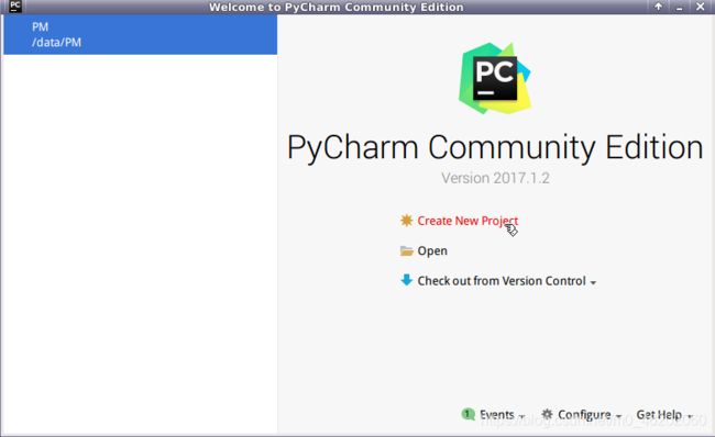
1.打开Pycharm,选择Create New Project,
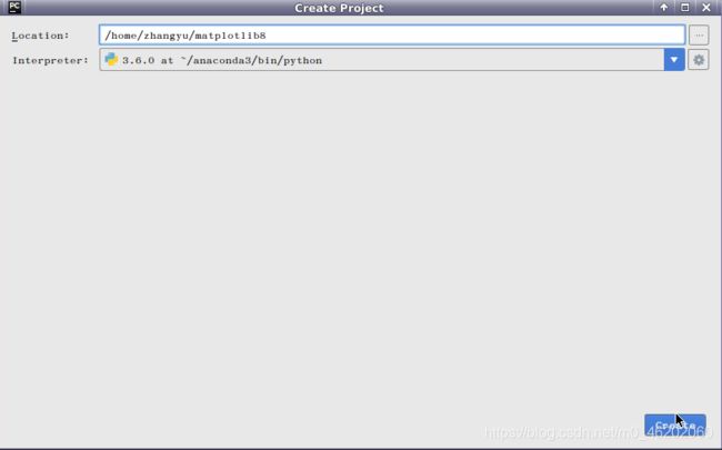
创建名为matplotlib8的项目。
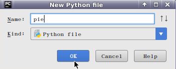
2.打开matplotlib8项目,右键选择New=>Python File,
创建名为pie的Python文件。
3.打开pie.py文件,编写代码,用于绘制饼状图。
导入外包
import numpy as np
import matplotlib.pyplot as plt
4.创建一张图
fig=plt.figure(1)
5.创建一个子图
ax1=plt.subplot(111)
5.使用numpy包中的array函数创建绘图所需的数据。
slices=np.array([7,2,2,13])
6.准备绘制条形图的参数,绘制的每块饼的标签activities,绘制的每块饼的颜色colors,指定某块饼与其它饼隔开explode。
activities=['sleep','eating','working','playing']
colors=['c','m','r','b']
explode = (0, 0.1, 0, 0.1)
7.通过pie函数来绘制饼状图的主体,并传入标签labels=activities,颜色colors=colors,起始角度startangle=90,是否加阴影shadow=False,每一块饼中心与圆心的位移explode=explode,饼上的文本格式autopct=’%1.1f%%'等参数。
ax1.pie(slices,labels=activities,colors=colors,startangle=90,shadow=False,explode=explode,autopct='%1.1f%%')
8.绘制饼图的标题。
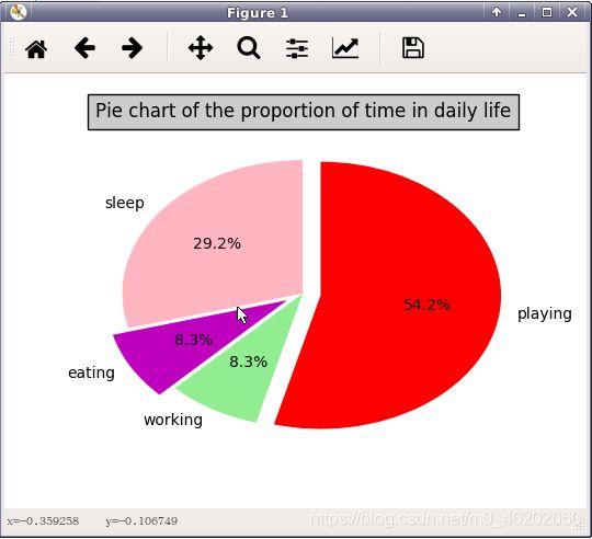
ax1.set_title('Pie chart of the proportion of time in daily life',bbox={'facecolor':'0.8', 'pad':5})
9.显示图像
plt.show()
10.完整代码:
import numpy as np
import matplotlib.pyplot as plt

fig=plt.figure(1)
ax1=plt.subplot(111)

slices=np.array([7,2,2,13])
activities=['sleep','eating','working','playing']
colors=['lightpink','m','lightgreen','r']
explode = (0, 0.1, 0, 0.1)

ax1.pie(slices,labels=activities,colors=colors,startangle=90,shadow=False,explode=explode,autopct='%1.1f%%')
ax1.set_title('Pie chart of the proportion of time in daily life',bbox={'facecolor':'0.8', 'pad':5})
plt.show()
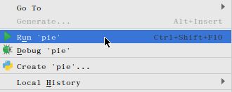
11.代码编写完毕,在pie.py文件内,点击右键=》Run ‘pie’,执行pie.py文件。
12.在屏幕上打印出下面的图。