Python根据csv绘制多折线图(内含批量读取+自定义坐标标签+阴影处理)
实现功能
1.从csv中读取数据
2.数据清洗(大小超出范围的异常值处理)
3.数据累积处理(将每日数据处理为历史累积值)
4.绘制多折线图
0.导入相关包import os
import pandas as pd
import numpy as np
import matplotlib.pyplot as plt
1.从csv格式文件中读取数据
#设置相关文件筛选条件
site='3'
band="NDVI"
sentinel="2-L2A"
#设置路径
path= '../data/dataset/Train_region_csv/S{}/csv/{}-{}.csv'.format(sentinel,site, band)
#从csv中读取数据存为dataframe,index_col为选择原数据集中的某列作为返回的DataFrame的行标签的列
pixel_csv =  pd.read_csv(path, index_col = 0)
拓展:批量读取csv文件,存储为DataFrame格式
(1)从文件夹中读取 全部 / 指定部分文件名 的文件
import glob

sentinel = "2-L2A"
site = '3'
path= '../data/dataset/Train_region_csv/S{}/csv/'.format(sentinel)
#从路径中,读取所有csv格式的文件,返回含有所有csv格式文件名路径的列表file
file = glob.glob(os.path.join(path,"*.csv"))
file_3 = glob.glob(os.path.join(path,"3-*.csv")) #文件名为3-xxx
file_x = glob.glob(os.path.join(path,"{}-*.csv".format(site))) #文件名为变量site的值-xxx
print("file length:",len(file))  #读取到的文件数量
print(file)
(2)批量读取
list2dataframe=[]
for path_file in file:
    list2dataframe.append(pd.read_csv(path_file,index_col = 0))
#假设file中有8个csv文件的路径,则list2dataframe中存放8个对应的dataframe格式的数据
(3)整合(1)(2),封装为函数
def Dataloading_csv (folder_path):
#提取folder_path文件夹下的csv文件,存为Dataframe格式,返回个文件的dataframe的列表
    site='3'
    file = glob.glob(os.path.join(folder_path,"{}-*.csv".format(site)))
    list2dataframe=[]
    for path_file in file:
        list2dataframe.append(pd.read_csv(path_file,index_col = 0))
    return list2dataframe
2.数据清洗-删除超过范围的异常值
for j in range(pixel_csv.shape[1]):#dataframe的列数
    for i in range(pixel_csv.shape[0]):#dataframe的行数
    	# 对大于1或小于0的异常值,设为空值nan
        if (pixel_csv.iloc[i,j]> 1 or pixel_csv.iloc[i,j] < 0):
            pixel_csv.iloc[i,:]=np.nan
3.数据处理-将每日数据处理为历史累积值
 #列为日期,行为各项数据
 for j in range(1,pixel_csv.shape[1]): #第一天不需要做累积处理,从第二天(第二列)开始
    for i in range(pixel_csv.shape[0]):
        x=pixel_sum.iloc[i,j]
        pixel_sum.iloc[i,j]=x+pixel_sum.iloc[i,j-1]
4.绘制多折线图
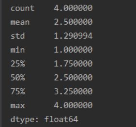
对DataFrame使用describe函数,获得DataFrame的初步统计信息,其中包含min,max,mean
def plot_min_max_mean(data_desc):
    fig=plt.figure()
    ax=fig.add_subplot(1,1,1)
    ax.plot(data_desc.index, data_desc.iloc[:,7],color='crimson',label='Max')#max
    ax.plot(data_desc.index, data_desc.iloc[:,1],color='c',label='Mean')#mean
    ax.plot(data_desc.index, data_desc.iloc[:,3],color='royalblue',label='Min')#min

	#设置x坐标轴的刻度信息
    ax.set_xticks([0,12,25,37,49,62,74,84])#第0,12,25...等位置划分一个刻度
    ax.set_xticklabels(['04-01', '05-01', '06-01', '07-01', '08-01', '09-01','10-01','11-01'],rotation=45,fontsize=12)#设置刻度标签:名称、旋转角度、字体大小、颜色等

    plt.title('Site-3',fontsize=16)#设置图题
    plt.xlabel('Dates',fontsize=14)#设置x轴名称
    plt.ylabel('EVI',fontsize=14)#设置y轴名称
    plt.fill_between(data_desc.index, data_desc.iloc[:,7], data_desc.iloc[:,3], facecolor="orange",alpha=0.1)#在min和max两条曲线内设置阴影、颜色、透明度
    plt.legend()
    plt.show()